Exploratory Data Analysis top 10 Python Libraries: The Ultimate Guide
Introduction
Exploratory Data Analysis, or EDA, is the first and very important step in any data science project. This is meant to familiarize you with the data, offer you insight into patterns, and act as a first-pass quality control check before building models.
You can find trends, missing values, and outliers that will have an impact on the final results during the process of data exploration.The process can prove time-consuming when carried out manually. Python, however, has turned the tedious work into a breeze and has plenty of awesome libraries to do so in no time. Using a few lines of code will make you able to visualize data, clean messy datasets, and generate insights.On this note, let’s take a look at the 10 best Python libraries that help you do EDA with ease.
1. Pandas – The Foundation of EDA
When using data in Python, Pandas is the most important library. It works on almost every aspect when it comes to cleaning, analyzing, and transforming data in quick ways. Whether it is a case of manipulating a few hundred rows or millions, data handling is simple and fast with Pandas.
Why is Pandas important for EDA?
Before building any machine learning model, one needs to get an understanding and work on some elementary preparation of the data to be used. Pandas brings this about by:
- Loading a dataset from CSV, Excel, JSON, or from a database with ease.
- Data inspection and investigation for any missing values, duplicates, or inconsistencies.
- Cleaning and transforming the messy dataset into a workable form for maximum analysis.
- Grouping and filtering data to get patterns that could be looked into.
- Merging and joining datasets to combine information from several other sources.
Key Features Offered by Pandas for Exploratory Data Analysis (EDA)
Pandas is said to offer a good number of important features which make Exploratory Data Analysis (EDA) much simpler.
- Data Manipulation:
- Modify, filter, and restructure data using DataFrames and Series.
- Convert data types, rename columns, and reshape tables.
- Handling Missing Values:
- Using .isnull().sum(), identify missing values.
- Fill in missing values using .fillna(), or drop them using .dropna().
- Grouping and Aggregation:
- Group data using .groupby(), and summarize them in order to find patterns or trends.
- Calculate mean, median, or sum statistics.
- Merging and Joining Datasets:
- Merge several datasets using .merge() and .concat().
- Good for mixing relational data from several sources.
Common Pandas Functions for Exploratory Data Analysis (EDA)
| Function | Purpose |
|---|---|
head() | Displays the first few rows of a data |
info() | Shows datatypes, missing values, and memory usage |
describe() | Summary statistics – mean, median, min, max |
groupby() | Groups data by a particular column for aggregations |
merge() | Combines two datasets based on a common column. |
Example: Loading and Analyzing a Dataset Using Pandas
Let’s load a sample dataset and perform some basic EDA:
import pandas as pd

# Load dataset
df = pd.read_csv('data.csv')

# View first 5 rows
print(df.head())

# Get summary statistics
print(df.describe())

# Check for missing values
print(df.isnull().sum())

# Group data by a category (e.g., "Department")
print(df.groupby('Department')['Salary'].mean())
Breaking Down the Code:
- Load the dataset: A dataset from a CSV file is imported with pd.read_csv(‘data.csv’).
- Preview the data: The head() function allows us to glimpse the first few rows.
- Summarize statistics: The describe function gives relevant pieces of information such as mean, standard deviation, and percentiles.
- Identify missing values: The isnull. sum() function helps in finding the missing entries.
- Group and analyze data: The groupby function averages salaries by department.
Final Thoughts
Pandas is the main EDA platform based on Python. The usage of Pandas would make it faster, easier, and more efficient to handle a data set. If one masters Pandas, the user can efficiently explore, clean, and analyze datasets to gather good insights for better decision-making.
2. NumPy – Fast and Efficient Numerical Computing
NumPy is a very fast and very popular Python library for numerical computing that enables easy manipulation of large arrays and efficient processing of data with the aid of the mathematical operation performed on them. Speed and efficiency are essential when dealing with large datasets, and that is where NumPy comes in.
Why is NumPy Important for Exploratory Data Analysis (EDA)?
NumPy is used by data scientists and data analysts because it allows them to:
- Do big data analyses with ease by means of multidimensional arrays.
- Manage any mathematical or statistical computation very fast.
- Obtain a performance gain against standard Python lists.
- Support scientific computing in connection with machine learning and deep learning.
Key Features of NumPy for Exploratory Data Analysis (EDA)
- Multidimensional Arrays (ndarray)
- This is a type of array that, contrary to Python’s list, moves faster and is quite efficient in memory usage due to the nature of the object itself. This allows for ease in data manipulation while still maintaining high-performance levels even with these large datasets in tow.
- Mathematical Operations
- A NumPy has inbuilt functions for addition, subtraction, multiplication, and division. Supports functionally complex operations, such as trigonometric calculations, logarithms, and exponentials.
- Statistical Analysis
- It may quickly calculate statistical parameters like mean, median, and standard deviation, variance, and percentiles. Describes data distribution insight in Exploratory Data Analysis (EDA).
- Broadcasting and Vectorization
- Perform operations on the entire datasets without the need for slow Python loops. It automatically adjusts the shape of the arrays, therefore it is inherently faster this way.
Common NumPy Functions for Exploratory Data Analysis (EDA)
| Function | Purpose |
|---|---|
array() | Creates a NumPy array |
mean() | Calculates the average of an array |
median() | Finds the middle value of an array |
std() | Computes the standard deviation |
var() | Finds the variance of an array |
sum() | Adds all elements in an array |
max() / min() | Finds the maximum and minimum values |
Example: Calculating Statistical Measures Using NumPy
Let’s see how NumPy can be used to analyze a dataset:
import numpy as np

# Create a NumPy array (Example: Salary Data)
salaries = np.array([45000, 55000, 60000, 75000, 90000, 120000])

# Calculate basic statistical measures
mean_salary = np.mean(salaries)  # Average salary
median_salary = np.median(salaries)  # Middle value
std_dev = np.std(salaries)  # Standard deviation
variance = np.var(salaries)  # Variance

# Display results
print(f"Mean Salary: {mean_salary}")
print(f"Median Salary: {median_salary}")
print(f"Standard Deviation: {std_dev}")
print(f"Variance: {variance}")
Output
Mean Salary: 74166.66666666667
Median Salary: 67500.0
Standard Deviation: 25069.34826081887
Variance: 628472222.2222222
Understanding the code:
- First, create a NumPy array. With the help of np.array(), we create a list of salaries.
- Next, calculate the mean: Find the average salary using np.mean(), which gives the central value of the dataset.
- Find the median salary: Understand what the middle salary is with the help of np.median(), which minimizes the effect of outliers.
- Compute the standard deviation: np.std() tells us how much salaries vary in relation to the mean.
- Calculate variance: Understanding how spread apart the salaries are with np.var().
Why NumPy is Faster Than Python Lists?
Python lists are more flexible when compared to NumPy arrays but tend to be slower for numerical operations. NumPy arrays are much faster mainly because of:
- Storage of data in contiguous memory, hence improving speed.
- Optimized C-based operations leading to reduced execution time.
- Vectorized operations truncating slow loops from Python.
Example of speed difference:
import numpy as np
import time

# Using a Python list
py_list = list(range(1, 1000000))
start = time.time()
sum(py_list)
end = time.time()
print("Python List Time:", end - start)

# Using a NumPy array
np_array = np.array(py_list)
start = time.time()
np.sum(np_array)
end = time.time()
print("NumPy Array Time:", end - start)
Output
Python List Time: 0.027060270309448242
NumPy Array Time: 0.0019342899322509766
📌 NumPy is significantly faster than Python lists when working with large datasets.
Final Thoughts
NumPy powers numerical computing in Python. NumPy will let you analyze data sets, calculate things, or optimize performances. It is a serious must-have for any data scientist, data analyst, or machine learning engineer.
3. Matplotlib – The Go-To Library for Visualizations
Matplotlib is the foremost famous library for data visualization in Python. It lets data analysts, scientists, or engineers create clear, good-looking, and customizable charts for depicting data patterns. From simple plots to complicated statistical visualizations, Matplotlib stands up to the task.
Why is Matplotlib important for Exploratory Data Analysis (EDA)?
Exploratory Data Analysis is all about trying to understand the shape, trends, and distribution of a dataset. With raw numbers, it might be somewhat hard to understand, but the moment they are put in a chart, a clearer understanding naturally sets in, therefore making it easier to interpret valuable insights.
Using Matplotlib you can:
- Make line plots for visualizing data trends.
- Analyze distributions of data using histograms.
- Compare categories of data using bar charts.
- Understand relationships between the data using scatter plots.
Key Features of Matplotlib for Exploratory Data Analysis (EDA)
- Static, Animated, and Interactive Plots
- You can create simple static images or interactive visualizations.
- Generations of animations to show how the data has changed over time.
- Supports Multiple Chart Types
- Multiple Chart Types IncludedLine charts, bar charts, scatter plots, histograms, and more.
- Customizable colors, labels, and styles for better readability.
- Fine-Grained Control
- Adjust axes, labels, gridlines, and fonts to make readable and professional graphs.
- Save plots to multiple formats (PNG, PDF, SVG, JPG) for reports and presentations.
- Works Smoothly with NumPy and Pandas
- Easy data visualization using Pandas DataFrames or NumPy arrays.
- Treats large datasets efficiently.
Common Matplotlib Functions for EDA
| Function | Purpose |
|---|---|
plot() | Creates a line chart to show trends |
hist() | Plots a histogram to analyze data distribution |
scatter() | Creates a scatter plot to visualize relationships between variables |
bar() | Displays bar charts to compare categories |
xlabel() / ylabel() | Adds labels to the X and Y axes |
title() | Sets a title for the chart |
show() | Displays the final plot |
Example: Plotting a Histogram to Analyze Data Distribution
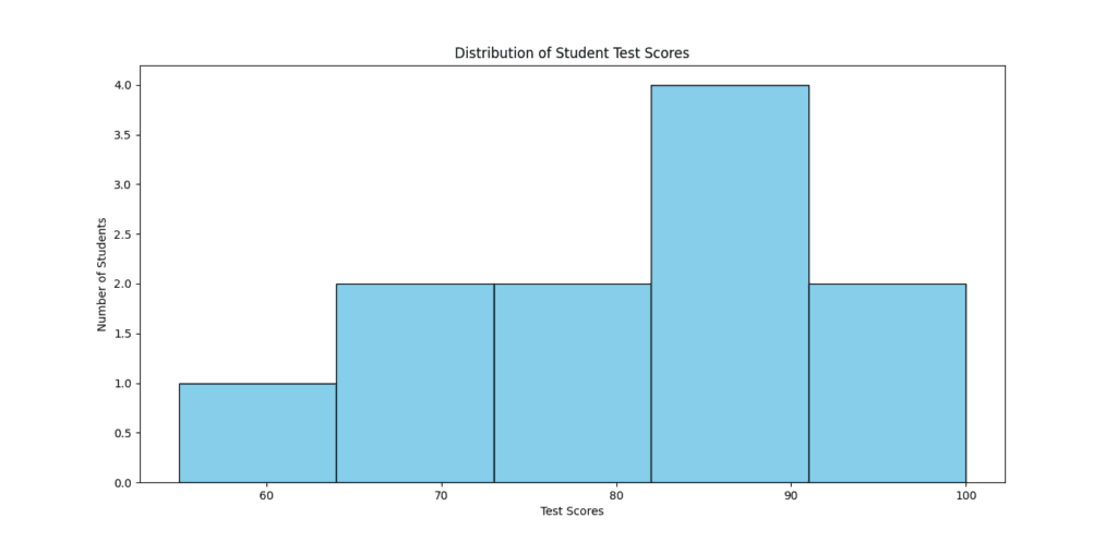
Let’s say we have a dataset of students’ test scores, and we want to understand the distribution of scores. A histogram is the best way to visualize this.
Python Code Example:
import matplotlib.pyplot as plt
import numpy as np

# Sample data: Test scores of students
scores = np.array([55, 65, 70, 75, 80, 85, 85, 90, 90, 95, 100])

# Create histogram
plt.hist(scores, bins=5, color='skyblue', edgecolor='black')

# Add labels and title
plt.xlabel("Test Scores")
plt.ylabel("Number of Students")
plt.title("Distribution of Student Test Scores")

# Show the plot
plt.show()
Understanding the Code:
- Import Matplotlib and NumPy
- First, we Import Matplotlib and NumPy
- import matplotlib.pyplot as plt primarly loads Matplotlib for visualization while import numpy as np helps create numbers numbered data.
- Create an array of test scores
- We use np.array() to wrap around a list of students’ scores.
- Plot the histogram using
hist()- The func. hist() maps onto five bins given the bins=5 parameter; color=’skyblue’ changes bullet color, while edgecolor=’black’ designates a border for the bars.
- Customize the chart
- xlabel() and ylabel() set labels to the axes.
- title() gives explicit labeling for the graph.
- Display the plot using
show()- Plot.show() The graph is rendered by this command. This allows one to clearly see how these scores are distributed.
Why is a Histogram Useful in Exploratory Data Analysis (EDA)?
Reveals data distribution – Shows whether data is normally distributed or skewed.
Identifies outliers – Spots unusually high or low values.
Helps in decision-making – If most scores are low, you might need to improve teaching methods.
Other Types of Plots in Matplotlib
Matplotlib supports many visualization types beyond histograms. Here are some essential ones:
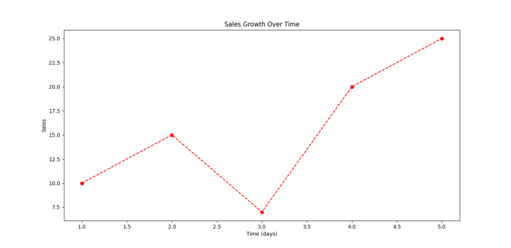
1. Line Plot – Tracking Trends Over Time
Used to visualize trends in data, like stock prices, temperature changes, or sales growth.
from matplotlib import pyplot as plt

x = [1, 2, 3, 4, 5]
y = [10, 15, 7, 20, 25]

plt.plot(x, y, marker='o', linestyle='--', color='red')
plt.xlabel("Time (days)")
plt.ylabel("Sales")
plt.title("Sales Growth Over Time")
plt.show()
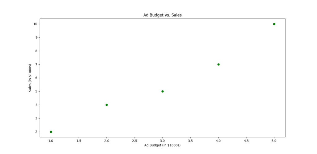
2. Scatter Plot – Finding Relationships Between Variables
Used to see how two variables are related, such as height vs. weight or advertising budget vs. sales.
from matplotlib import pyplot as plt

x = [1, 2, 3, 4, 5]
y = [2, 4, 5, 7, 10]

plt.scatter(x, y, color='green')
plt.xlabel("Ad Budget (in $1000s)")
plt.ylabel("Sales (in $1000s)")
plt.title("Ad Budget vs. Sales")
plt.show()
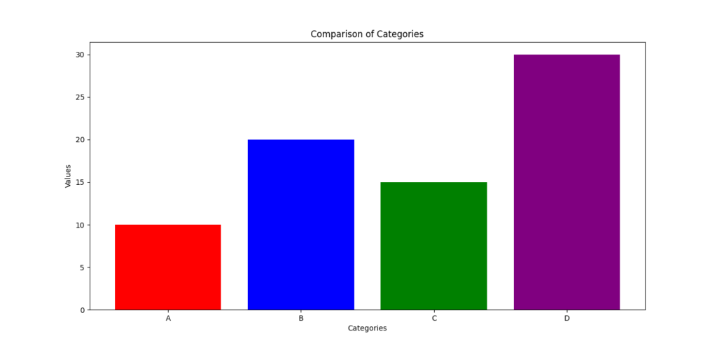
3. Bar Chart – Comparing Categories
Used for comparing different groups, like average income by profession or sales by region.
from matplotlib import pyplot as plt

categories = ["A", "B", "C", "D"]
values = [10, 20, 15, 30]

plt.bar(categories, values, color=['red', 'blue', 'green', 'purple'])
plt.xlabel("Categories")
plt.ylabel("Values")
plt.title("Comparison of Categories")
plt.show()
Final Thoughts
Matplotlib is the most widely used library for creating visualizations in Python. It helps you turn raw data into meaningful insights by displaying trends, patterns, and distributions in an easy-to-understand format. Whether you are analyzing sales data, survey responses, or stock market trends, Matplotlib makes EDA faster and more efficient.
Must Read
- How to Diagnose Overfitting in Machine Learning — 9 Proven Tools
- PyTorch Debugging Checklist: A Systematic Framework to Fix Models That Won’t Learn
- Why sorted() Is Safer Than list.sort() in Production Python Systems
- Monotonic Sequence in Python: 7 Practical Methods With Edge Cases, Interview Tips, and Performance Analysis
- How to Check if Dictionary Values Are Sorted in Python
4. Seaborn – Statistical Data Visualization Made Easy
What is Seaborn?
Seaborn is a powerful Python Visualization Library built at the top of Matplotlib. It is specially designed for statistical viewing of data, which allows you to easily create beautiful informative and professional graphics.
While Matplotlib is ideal for the main fields, Seaborn facilitates work with complex data sets, in particular during the analysis of relationships and distributions. With just a few lines of code, you can generate stunning visualizations that help in Exploratory Data Analysis (EDA).
Why is Seaborn Important for Exploratory Data Analysis (EDA)?
EDA is a question of understanding data models, relationships and distributions before creating models. Seaborn simplifies this process:
- Creation of high -quality visualizations with minimal code
- Easy processing of complex data sets using Pandas integration
- Provide topics built for better aesthetics
- Support for statistical areas for more in -depth analysis
Key Features of Seaborn
1️⃣ Built-in Support for Statistical Plots
- Includes advanced plots like heatmaps, violin plots, and pair plots to explore relationships between variables.
2️⃣ Beautiful and Customizable Visualizations
- Comes with pre-set color palettes and themes for more readable and stylish graphs.
3️⃣ Works Seamlessly with Pandas
- Can directly visualize Pandas DataFrames, making it easy to plot real-world datasets.
4️⃣ Easier Handling of Complex Data
- Helps group, categorize, and compare data with just a few commands.
Common Seaborn Functions for Exploratory Data Analysis (EDA)
| Function | Purpose |
|---|---|
heatmap() | Creates a heatmap to visualize correlations between features |
boxplot() | Displays data distribution and outliers |
pairplot() | Plots pairwise relationships between multiple variables |
violinplot() | Shows the distribution and density of data |
set_style() | Changes the overall style of the plot |
set_palette() | Adjusts color themes for better readability |
Example: Creating a Correlation Heatmap to Understand Feature Relationships
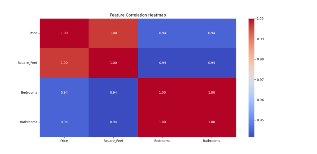
A correlation heatmap is one of the best ways to understand how different numerical variables are related.
For example, if you’re analyzing house prices, you may want to check how features like square footage, number of bedrooms, and location affect the price. A heatmap visually highlights the strength of relationships between different variables.
Python Code Example: Correlation Heatmap
import seaborn as sns
import pandas as pd
import matplotlib.pyplot as plt

# Sample dataset: House prices
data = {
    'Price': [500000, 600000, 700000, 800000, 900000],
    'Square_Feet': [1500, 1800, 2000, 2200, 2500],
    'Bedrooms': [3, 3, 4, 4, 5],
    'Bathrooms': [2, 2, 3, 3, 4]
}

# Convert dictionary to Pandas DataFrame
df = pd.DataFrame(data)

# Calculate correlation matrix
correlation_matrix = df.corr()

# Create a heatmap
plt.figure(figsize=(6, 4))
sns.heatmap(correlation_matrix, annot=True, cmap='coolwarm', fmt=".2f")

# Add title
plt.title("Feature Correlation Heatmap")

# Show plot
plt.show()
Breaking Down the Code:
1️⃣ Import Seaborn, Pandas, and Matplotlib
- Seaborn is used for visualization, Pandas for handling the dataset, and Matplotlib for displaying the plot.
2️⃣ Create a Sample Dataset
- The dataset includes house prices, square footage, bedrooms, and bathrooms.
3️⃣ Compute the Correlation Matrix
- The
df.corr()function calculates the correlation coefficients between all numeric columns.
4️⃣ Generate the Heatmap
sns.heatmap()visualizes the correlation matrix.annot=Truedisplays correlation values inside the heatmap.cmap='coolwarm'applies a color gradient for better readability.
5️⃣ Customize the Chart
plt.title()adds a title to explain the visualization.plt.figure(figsize=(6, 4))sets the size of the plot.
Why is a Correlation Heatmap Useful in Exploratory Data Analysis (EDA)?
✅ Identifies Strong Relationships – Shows which features are most related to the target variable.
✅ Helps Feature Selection – You can remove redundant features with high correlation.
✅ Detects Multicollinearity – Too much correlation between independent variables can hurt predictive models.
Other important Seaborn Plots for EDA
1. Box Plot – Detecting Outliers and Distribution
Box plots help visualize distributions, median values, and outliers in numerical data.
Example: Visualizing House Prices with Box Plots
sns.boxplot(x=df["Price"], color="lightblue")
plt.title("Distribution of House Prices")
plt.show()
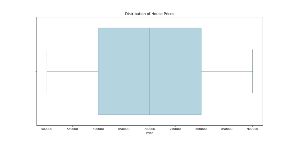
Use case: Find extreme values (outliers) that may need further investigation.
2. Pair Plot – Exploring Relationships Between Features
Pair plots display scatter plots of all numerical variables in a dataset.
Example: Understanding How House Features Are Related
sns.pairplot(df, diag_kind="kde")
plt.show()
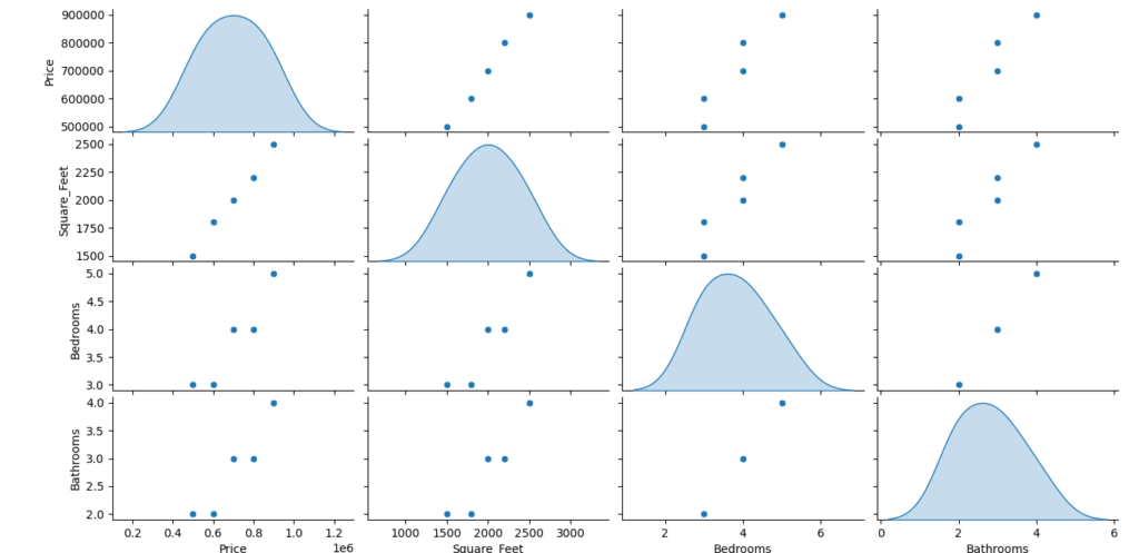
Use case: Helps in detecting trends and correlations between multiple variables.
3. Violin Plot – Combining Box Plots and KDE Plots
A violin plot is a combination of a box plot and a density plot, showing both data distribution and probability density.
Example: Comparing Prices Based on the Number of Bedrooms
sns.violinplot(x=df["Bedrooms"], y=df["Price"], palette="muted")
plt.title("Price Distribution by Number of Bedrooms")
plt.show()
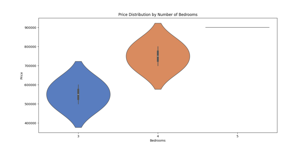
Use case: Understand how price varies for houses with different bedroom counts.
Final Thoughts
Seaborn is an important Python library for creating advanced statistical visualizations with minimal effort. It simplifies EDA, making it easier to explore relationships, detect outliers, and understand distributions.
✅ With Seaborn, you can transform raw data into meaningful insights quickly! 🚀
5. Plotly – Interactive and Dynamic Visualizations
What is Plotly?
Plotly is a Python library that allows you to create interactive and dynamic visualizations. Unlike traditional static plots, Plotly’s graphs are interactive, meaning users can zoom, pan, hover, and explore data in real-time. This makes it especially valuable for Exploratory Data Analysis (EDA), as it allows you to gain deeper insights into your data with an engaging, hands-on approach.
Plotly is widely used in both data science and business intelligence to present data clearly and engage audiences. It’s also perfect for web-based applications, as it supports interactive plots that can be embedded into web pages or shared online.
Why is Plotly Important for Exploratory Data Analysis (EDA)?
EDA is about exploring your data and getting to know it better, which is where Plotly’s interactivity shines. The ability to interact with data visualizations helps you:
✅ Explore Data in Detail – Interact with data points for a better understanding of distributions, trends, and relationships.
✅ Spot Patterns Quickly – Zoom in and out, hover over data points, and filter data to find hidden patterns and anomalies.
✅ Enhance Presentations – Plotly’s interactive visualizations are visually appealing and great for presentations, especially when working with stakeholders or teams.
✅ Share Online – Easily share or embed interactive visualizations in reports, web apps, or dashboards.
Key Features of Plotly
1️⃣ Web-Based Interactive Graphs
- Plotly allows you to create interactive plots that can be shared online, making them web-based and easy to use in dashboards or reports.
- Dynamic graphs enable users to zoom in, hover, and filter, providing a rich experience when exploring data.
2️⃣ Wide Range of Visualization Types
- From scatter plots to 3D surface plots, Plotly supports a variety of chart types, making it suitable for almost any data visualization need.
3️⃣ Easy Integration with Dash
- Plotly integrates easily with Dash, a framework for building interactive web applications. This is great for building data dashboards or real-time data analysis tools.
4️⃣ Customizable Layouts and Styling
- With Plotly, you can fine-tune your visualizations with various color schemes, annotations, labels, and more.
Common Plotly Functions for Exploratory Data Analysis (EDA)
| Function | Purpose |
|---|---|
scatter() | Creates scatter plots to analyze relationships between two continuous variables. |
line() | Draws line charts to visualize trends over time. |
bar() | Generates bar charts to compare categories. |
heatmap() | Displays a heatmap for visualizing matrix-like data or correlation. |
pie() | Builds pie charts to show proportions of categories. |
box() | Generates box plots for data distribution and outlier detection. |
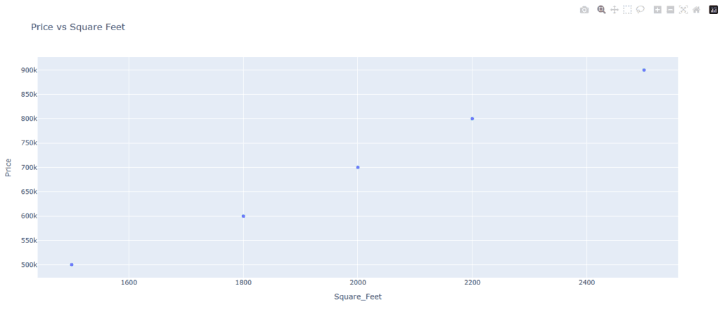
Example: Creating an Interactive Scatter Plot for Deeper Exploration
Interactive scatter plots are an effective way to analyze the relationship between two continuous variables. By interacting with the plot, users can zoom in on data points, hover to see details, and identify trends that might not be obvious in a static plot.
Python Code Example: Interactive Scatter Plot
import plotly.express as px
import pandas as pd

# Sample dataset: House prices and square footage
data = {
    'Price': [500000, 600000, 700000, 800000, 900000],
    'Square_Feet': [1500, 1800, 2000, 2200, 2500]
}

# Convert the dataset to a pandas DataFrame
df = pd.DataFrame(data)

# Create an interactive scatter plot
fig = px.scatter(df, x='Square_Feet', y='Price', title='Price vs Square Feet')

# Show the plot
fig.show()
Breaking Down the Code:
1️⃣ Import Plotly Express and Pandas
plotly.expressis a simplified interface for Plotly that allows you to create interactive plots easily. Pandas is used to handle and manipulate the data.
2️⃣ Create a Sample Dataset
- The dataset includes house prices and square footage. These two variables will be plotted on the x and y axes, respectively.
3️⃣ Create the Scatter Plot
- The
px.scatter()function creates the scatter plot. You specify the data, the variables to be plotted on the x and y axes, and a title for the chart.
4️⃣ Display the Plot
fig.show()renders the interactive plot in the browser, allowing users to interact with the data.
Why is an Interactive Scatter Plot Useful in Exploratory Data Analysis (EDA)?
✅ Explore Relationships – By hovering over points or zooming in, you can clearly see correlations and patterns between variables.
✅ Spot Outliers – Easily detect outliers by inspecting individual data points and seeing where they fall outside the general trend.
✅ Enhance Data Exploration – Interactively explore large datasets, which would be difficult in a static plot.
Other Useful Plotly Visualizations for Exploratory Data Analysis (EDA)
1. Line Chart – Analyzing Trends Over Time
Line charts are great for visualizing time-series data and spotting trends or seasonality.
Example: Visualizing Price Trends Over Time
fig = px.line(df, x='Date', y='Price', title='Price Over Time')
fig.show()
Use case: Track changes in stock prices or sales trends over months or years.
2. Bar Chart – Comparing Categories
Bar charts are excellent for comparing the sizes or counts of different categories.
Example: Sales Comparison by Category
fig = px.bar(df, x='Category', y='Sales', title='Sales by Category')
fig.show()
Use case: Compare sales across regions, product categories, or years.
3. Heatmap – Visualizing Correlations
Heatmaps are perfect for visualizing the correlation matrix between numerical features, like in a Pandas correlation matrix.
Example: Correlation Heatmap
fig = px.imshow(correlation_matrix, text_auto=True, title="Feature Correlation Heatmap")
fig.show()
Use case: Analyze relationships between different variables, especially in datasets with many features.
Final Thoughts
Plotly is an amazing tool for creating interactive, dynamic visualizations that help you explore your data more intuitively. Whether you’re presenting data to a team, analyzing complex relationships, or just exploring your data, Plotly’s features offer a user-friendly way to make better, interactive visualizations.
✅ With Plotly, you can elevate your data analysis and share it in an interactive, engaging way!
6. Missingno – Handling Missing Data with Ease
What is Missingno?
Missingno is a Python library designed specifically for visualizing missing data in datasets. It is incredibly useful when you’re working with real-world data, which often contains missing or incomplete values. Missing data can cause issues in analysis, as many machine learning algorithms and statistical methods can’t handle missing information directly. Missingno helps you identify patterns and understand the extent of missing values so you can handle them efficiently.
With Missingno, you don’t just get a quick glance at missing data; you get clear visualizations that make it easy to spot patterns in the data. This can help you determine whether the missing data is random, systematic, or follows some other pattern. Handling missing data properly is crucial for maintaining the quality and integrity of your analysis.
Why is Missingno Important for Exploratory Data Analysis (EDA)?
During Exploratory Data Analysis (EDA), it’s essential to check for missing data as it can affect the quality of your insights. Missingno makes this process easier by:
✅ Quickly Identifying Missing Data – Use visualizations to spot missing values quickly across large datasets.
✅ Understanding Missing Data Patterns – Visualize if missing data is random or follows specific trends.
✅ Improving Data Quality – Handle missing values by filling them, removing them, or using advanced techniques like imputation.
✅ Enhancing Data Preprocessing – Ensures your data is clean and ready for analysis or machine learning models by addressing missing values early.
Key Features of Missingno
1️⃣ Visualizations of Missing Data
- Missingno generates several types of visualizations to help you understand where and how much data is missing. These visualizations are intuitive and easy to interpret, even for beginners.
2️⃣ Customizable Plots
- Customize plots to suit your needs. You can choose different types of visualizations to get a clear view of missing data across your dataset.
3️⃣ Efficient Identification of Patterns
- Missingno helps you spot patterns in missing data, such as whether data is missing at random or follows a specific pattern (for example, missing values could correlate with specific categories or time periods).
4️⃣ Integration with Pandas
- Missingno works seamlessly with Pandas DataFrames, which are commonly used for data manipulation. This allows you to directly analyze missing data in the context of your existing dataset.
Common Missingno Functions for EDA
| Function | Purpose |
|---|---|
matrix() | Visualizes missing data with a matrix plot to show where values are missing in the dataset. |
bar() | Creates a bar chart showing the count of missing values for each column. |
heatmap() | Displays a heatmap to visualize correlations between missing data across columns. |
dendrogram() | Creates a dendrogram to cluster columns based on missing data patterns. |
Example: Identifying and Handling Missing Data in a Dataset
Let’s say you have a dataset with some missing values, and you want to understand how much data is missing and where. Missingno provides visualizations that help you quickly identify and handle missing data.
Python Code Example: Visualizing Missing Data
import missingno as msno
import pandas as pd

# Load a sample dataset with missing data
df = pd.read_csv('your_dataset.csv')

# Visualize missing data using a matrix plot
msno.matrix(df)
Breaking Down the Code:
1️⃣ Import Libraries
- We import Missingno as
msnoand Pandas aspd. Pandas is used to load the dataset, and Missingno will be used for visualization.
2️⃣ Load the Dataset
- We load the dataset using
pd.read_csv(), which loads the CSV file into a Pandas DataFrame.
3️⃣ Visualize Missing Data
- The
msno.matrix()function generates a matrix plot, which shows the presence of missing data in the dataset. The black lines indicate missing values, while the white lines represent available data.
Understanding the Matrix Plot
In the matrix plot:
- Each vertical line represents a column from the dataset.
- The horizontal lines represent rows in the dataset.
- The black areas represent missing values. The more black pixels you see, the more missing data there is for that column.
This plot allows you to quickly assess where the missing data is and how it is distributed.
Other Useful Missingno Visualizations
1. Bar Chart – Count of Missing Values per Column
This chart helps you see how many missing values there are in each column of your dataset. It provides a clear summary of which columns have the most missing values.
Example Code: Bar Chart Visualization
msno.bar(df)
Use Case: Spot columns with a high number of missing values that may need special attention or removal.
2. Heatmap – Correlations Between Missing Data
A heatmap helps you understand the relationships between columns with missing values. If two columns have similar missing data patterns, this may indicate they are related.
Example Code: Heatmap Visualization
msno.heatmap(df)
Use Case: Detect patterns in missing data, such as whether missing values are correlated with other columns.
Dendrogram – Hierarchical Clustering of Missing Data
A dendrogram provides a hierarchical clustering of columns based on missing data patterns. This visualization can show how different columns are related in terms of missing values.
Example Code: Dendrogram Visualization
msno.dendrogram(df)
Use Case: Identify groups of columns that have similar missing data patterns, which might help in deciding which columns to fill or remove together.
Handling Missing Data – Next Steps
Once you’ve identified where and how much data is missing, there are several ways to handle missing values:
- Remove Missing Data: Drop rows or columns that have a significant amount of missing data.
- Fill Missing Data: Use techniques like mean imputation, median imputation, or even machine learning algorithms to fill in missing values.
- Leave Missing Data: In some cases, it may make sense to leave missing data as is, especially if it doesn’t significantly affect your analysis.
Final Thoughts
Missingno is an excellent tool for visualizing missing data and understanding the extent and patterns of missing values in your dataset. By using its various visualization options, you can quickly identify which columns have missing data and decide on the best strategy for handling it. Clean data is essential for accurate analysis, and Missingno helps you ensure your dataset is in top shape for further exploration or machine learning.
7. SciPy – Advanced Statistical Analysis
What is SciPy?
SciPy is a powerful Python library used for advanced scientific and technical computing. It builds on NumPy (another essential library in Python) and offers a variety of tools that are especially useful for statistical analysis, signal processing, and optimization. SciPy’s ability to handle complex statistical tests and work with different distributions makes it a go-to choice for data scientists and researchers who need to perform detailed data analysis.
While NumPy provides support for numerical computing, SciPy enhances these capabilities by offering additional functionalities for tasks like hypothesis testing, curve fitting, and statistical distributions.
Why is SciPy Important for Exploratory Data Analysis (EDA)?
When conducting Exploratory Data Analysis (EDA), it’s essential to go beyond simple descriptive statistics. SciPy enables you to perform more advanced statistical tests that can help you understand the relationships within your data. For example, you can test if two datasets come from the same distribution or calculate various statistical measures, such as the mean, variance, and standard deviation, to interpret your data’s behavior more effectively.
SciPy simplifies statistical analysis by providing ready-to-use functions for tasks like:
✅ Performing Statistical Tests – Apply tests like the t-test and ANOVA to compare datasets.
✅ Handling Distributions – Work with common distributions like normal, binomial, and Poisson to fit your data.
✅ Signal Processing – Perform tasks like convolution, correlation, and Fourier transforms.
✅ Measuring Statistical Properties – Easily calculate key properties like the mean, median, standard deviation, and interquartile range (IQR).
Key Features of SciPy
1️⃣ Statistical Tests
- SciPy offers a wide range of statistical tests that help you make sense of your data. You can perform tests to check if two distributions are significantly different or if your data follows a specific distribution.
2️⃣ Statistical Distributions
- SciPy provides functions for working with common probability distributions. You can generate random numbers from different distributions, fit your data to these distributions, or compute probabilities and percentiles.
3️⃣ Signal Processing
- SciPy includes tools for analyzing signals, such as filtering and transforming data using techniques like the Fourier transform.
4️⃣ Optimization and Integration
- Beyond statistics, SciPy is also equipped with optimization and integration functions that can help with minimizing functions or solving complex equations.
Common SciPy Functions for Exploratory Data Analysis (EDA)
Here are some of the most commonly used SciPy functions in EDA:
| Function | Purpose |
|---|---|
stats.ttest_ind() | Performs a t-test to compare two independent samples and see if they are significantly different. |
stats.norm() | Allows you to work with the normal distribution, calculate probabilities, and fit data to this distribution. |
stats.iqr() | Computes the interquartile range (IQR), a measure of statistical dispersion. |
stats.pearsonr() | Calculates the Pearson correlation coefficient to determine the linear relationship between two datasets. |
signal.correlate() | Measures the correlation between two signals to identify similarity. |
Example: Performing a t-test to Compare Two Distributions
In many cases, you may want to test whether two groups or distributions are significantly different from each other. For instance, you could use the t-test to compare the test scores of two groups of students and check if one group performed significantly better than the other.
Python Code Example: Performing a t-test
import numpy as np
from scipy import stats

# Example data: Scores from two different groups
group1 = [23, 45, 67, 34, 89, 21, 54]
group2 = [56, 67, 43, 90, 34, 65, 77]

# Perform t-test to compare the two groups
t_stat, p_value = stats.ttest_ind(group1, group2)

# Print the result
print(f"T-statistic: {t_stat}, P-value: {p_value}")
Output:
T-statistic: -1.1974151709525187, P-value: 0.2542631611018139
Breaking Down the Code:
1️⃣ Import Libraries
- We import NumPy (for handling arrays) and SciPy’s stats module (which contains statistical functions).
2️⃣ Define the Data
- Here,
group1andgroup2represent the test scores of two groups.
3️⃣ Perform the t-test
stats.ttest_ind()is used to perform the t-test on the two groups. This function calculates the t-statistic (which measures the difference between the means of the two groups) and the p-value (which indicates whether the observed difference is statistically significant).
4️⃣ Interpret the Results
- The t-statistic helps you determine the magnitude of the difference between the groups, while the p-value tells you whether the difference is significant. A p-value less than 0.05 typically suggests that the groups are significantly different.
Understanding the t-test Results
- T-statistic: This value indicates how much the means of the two groups differ. The higher the t-statistic, the more likely it is that the two distributions are significantly different.
- P-value: The p-value helps you decide if the difference is statistically significant. A low p-value (usually less than 0.05) means there is a statistically significant difference between the two groups.
Other Useful Statistical Functions in SciPy
1. Normal Distribution – Working with the Normal Distribution
You often encounter normal distributions (bell curves) in statistics. SciPy allows you to work with this distribution easily.
Example Code: Generating Random Data from a Normal Distribution
from scipy import stats

# Generate random data following a normal distribution with mean=0 and std=1
data = stats.norm.rvs(loc=0, scale=1, size=1000)
Use Case: Useful for generating synthetic data or fitting your data to a normal distribution.
2. Interquartile Range (IQR) – Measuring Statistical Dispersion
The interquartile range (IQR) is a measure of the spread of data, calculated by subtracting the lower quartile (Q1) from the upper quartile (Q3). SciPy’s stats.iqr() function makes it easy to calculate.
Example Code: Calculating the IQR
from scipy import stats

data = [1, 3, 7, 10, 12, 14, 18, 20, 21, 22]
iqr = stats.iqr(data)
print(f"Interquartile Range (IQR): {iqr}")
Use Case: Helps to understand the spread or variability in the dataset.
3. Pearson Correlation – Measure the Relationship Between Two Variables
The Pearson correlation coefficient measures the strength and direction of the linear relationship between two variables. SciPy’s stats.pearsonr() function is used to calculate this.
Example Code: Pearson Correlation
from scipy import stats

x = [1, 2, 3, 4, 5]
y = [2, 4, 6, 8, 10]

correlation, _ = stats.pearsonr(x, y)
print(f"Pearson Correlation: {correlation}")
Use Case: Helps you understand the linear relationship between two datasets.
SciPy is an important library for advanced statistical analysis in Python. It enhances the capabilities of NumPy by providing a variety of statistical tests, probability distributions, and signal processing tools that are necessary for comprehensive Exploratory Data Analysis (EDA). Whether you’re comparing datasets, calculating statistical measures, or working with data distributions, SciPy has the tools to make your statistical analysis both powerful and efficient.
8. Sweetviz – Automated Exploratory Data Analysis (EDA) Reports
What is Sweetviz?
Sweetviz is a Python library designed to automate and simplify the process of Exploratory Data Analysis (EDA). It quickly generates detailed and interactive reports that help you understand the structure, relationships, and distributions of your data. Unlike traditional EDA methods, Sweetviz eliminates the need for writing repetitive code, making it ideal for data scientists and analysts looking for quick insights into their datasets.
Sweetviz is built on top of Pandas and Matplotlib, so it integrates seamlessly into your workflow. The library’s main strength is its ability to generate reports that are comprehensive, easy to understand, and interactive, making it a valuable tool in the EDA process.
Why is Sweetviz Important for Exploratory Data Analysis (EDA)?
In traditional EDA, a lot of time and effort is spent exploring individual columns, understanding the distribution of values, and comparing features. Sweetviz automates much of this process, allowing you to focus more on the insights rather than the technical details. By using Sweetviz, you can create a detailed EDA report in minutes, saving you time and making your workflow more efficient.
This tool is particularly helpful in the following ways:
✅ Automated Reports – Sweetviz generates detailed EDA reports without writing much code.
✅ Data Comparison – Easily compare multiple datasets (e.g., training vs testing datasets) to see how they differ.
✅ Visualizations – The library provides rich visualizations that give you a deeper understanding of your data’s patterns.
✅ Descriptive Statistics – Sweetviz presents key statistical measures such as mean, median, standard deviation, and percentiles in an easy-to-read format.
Key Features of Sweetviz
1️⃣ Automated EDA Reports
- Sweetviz automatically generates interactive reports that display the distribution of data, correlations between features, and the relationships between variables. This allows you to quickly gain insights into your data without having to manually explore it.
2️⃣ Comparison Reports
- You can compare two datasets side by side using Sweetviz. For example, you might want to compare your training data with your test data to identify differences that could impact your model’s performance.
3️⃣ Visualizations
- Sweetviz generates interactive visualizations that can be explored in detail. These visualizations include bar charts, scatter plots, distribution plots, and more, making it easy to spot patterns or potential issues in the data.
4️⃣ Detailed Descriptive Statistics
- The library provides key statistics like mean, standard deviation, skewness, and kurtosis, which are essential for understanding the underlying distribution of your data.
5️⃣ Correlation Analysis
- Sweetviz calculates correlations between features and provides correlation heatmaps, helping you identify highly related features that might impact your model’s performance.
Common Sweetviz Functions for Exploratory Data Analysis (EDA)
Here are the most commonly used functions in Sweetviz for performing Exploratory Data Analysis:
| Function | Purpose |
|---|---|
analyze() | Analyzes a dataset and generates an EDA report. |
show_html() | Displays the generated EDA report as an interactive HTML page. |
compare() | Compares two datasets (e.g., train vs test) and highlights differences. |
show_html() | Displays the generated report as an HTML file that can be opened in a browser. |
Example: Creating an Automated Comparison Report for Datasets
One of Sweetviz’s best features is its ability to compare two datasets and generate a side-by-side comparison report. This is particularly useful when you want to compare, for example, a training dataset with a test dataset to see if there are any significant differences.
Python Code Example: Comparing Two Datasets with Sweetviz
import sweetviz as sv
import pandas as pd

# Load two datasets: training and testing data
train_data = pd.read_csv('train_data.csv')
test_data = pd.read_csv('test_data.csv')

# Generate a Sweetviz report comparing the two datasets
report = sv.compare([train_data, "Training Data"], [test_data, "Testing Data"])

# Display the report in HTML format
report.show_html("eda_comparison_report.html")
Breaking Down the Code:
1️⃣ Import Libraries
- We import Sweetviz and Pandas. Sweetviz is the main library for generating the EDA report, and Pandas is used for handling the datasets.
2️⃣ Load the Data
- The
train_dataandtest_datarepresent the two datasets that you want to compare. These datasets are loaded from CSV files usingpd.read_csv().
3️⃣ Generate the Comparison Report
- The
sv.compare()function compares the training data with the test data. This will highlight the differences between the two datasets, such as missing values, outliers, and variations in feature distributions.
4️⃣ Display the Report
- The
report.show_html()function generates the HTML report, which can be opened in a web browser. The report includes interactive visualizations and a comprehensive overview of both datasets.
Understanding the Sweetviz Report
The Sweetviz report generated by the show_html() function contains several key sections:
1️⃣ Data Summary:
- A summary table shows the number of rows, missing values, and unique values for each column. This helps you quickly understand the structure of your data.
2️⃣ Feature Distributions:
- Sweetviz presents distributions of each feature (column) using bar charts or histograms, showing how the data is spread across different values.
3️⃣ Comparisons:
- If you used the
compare()function, Sweetviz will display a side-by-side comparison of the datasets, highlighting differences in distributions, missing values, and statistical properties like the mean and standard deviation.
4️⃣ Correlation Analysis:
- The correlation heatmap shows which features are strongly correlated with each other, helping you identify relationships that could be important for modeling.
Benefits of Using Sweetviz
1️⃣ Saves Time:
- Sweetviz automates many of the manual tasks in EDA, saving you time and effort in exploring your data.
2️⃣ Interactive Visualizations:
- The generated reports are interactive, allowing you to click through different sections and explore the data in more detail.
3️⃣ Quick Insights:
- Sweetviz helps you quickly identify potential issues with your data, such as missing values, outliers, and skewed distributions, so you can address them early on.
4️⃣ Comparison Capabilities:
- Comparing datasets (e.g., train vs test) is easy, which is especially useful for machine learning projects where you need to understand if the two datasets are similar or if any discrepancies need to be addressed.
Sweetviz is a game-changer for Exploratory Data Analysis (EDA). By automatically generating detailed, interactive reports, it takes the burden off of data scientists and analysts, allowing them to focus on deriving insights instead of writing repetitive code. Whether you’re analyzing a single dataset or comparing multiple datasets, Sweetviz simplifies the process and provides you with quick, actionable insights into your data.
9. D-Tale – Interactive Pandas Data Exploration
What is D-Tale?
D-Tale is a powerful tool that provides a web-based graphical user interface (GUI) to interactively explore and visualize Pandas DataFrames. It allows data scientists and analysts to perform exploratory data analysis (EDA) in a much more intuitive and user-friendly way compared to working with raw code. With D-Tale, you can explore, clean, and visualize data in real time, making it easier to understand your data without needing to write a lot of code.
D-Tale integrates seamlessly with Pandas, the most widely-used library for data manipulation in Python. This means that you can easily switch between using Pandas functions and the interactive D-Tale interface to view your data, making it an efficient tool for quick insights and cleaning up messy datasets.
Why is D-Tale Important for Exploratory Data Analysis (EDA)?
In traditional data exploration, you would typically write a lot of code to inspect and clean your data. While Pandas is powerful, it can be time-consuming when you need to quickly understand large datasets. D-Tale addresses this by providing an interactive GUI, allowing you to explore your data visually, which makes it easier to spot patterns, identify outliers, handle missing values, and clean the data more effectively.
Key Benefits of Using D-Tale:
- Web-Based Interface: You don’t need to install complex software—just run your code, and the D-Tale interface will appear in your browser.
- Interactive Data Exploration: You can sort, filter, and explore data in a more interactive way.
- Efficient Data Cleaning: Easily detect and handle missing data, duplicates, and outliers.
- Real-Time Updates: As you make changes, the visual representation of your data is updated instantly.
Key Features of D-Tale
1️⃣ Web-Based GUI for Pandas DataFrames
- The main feature of D-Tale is its interactive web interface. Once you load a Pandas DataFrame, you can open a GUI where you can visually inspect your data, perform common data manipulation tasks, and update your dataset in real time. No need for complex Python scripts to see your data!
2️⃣ Data Exploration Made Easy
- With D-Tale, you can explore your data with features like sorting, filtering, and searching through your dataset. You can filter rows based on specific conditions, sort columns, and even highlight missing or duplicate values to quickly spot issues.
3️⃣ Real-Time Updates
- When you make changes in the D-Tale interface, such as cleaning data or applying filters, the changes are reflected immediately in the dataset. This provides a real-time view of your data, making it easier to track changes and update your analysis on the fly.
4️⃣ Data Cleaning Features
- D-Tale comes with several built-in tools that make it easier to clean and prepare your data, including the ability to remove duplicates, handle missing data, and even change data types. These features are vital for ensuring your data is ready for analysis and modeling.
5️⃣ Visualization Options
- D-Tale provides simple data visualizations like scatter plots, bar charts, and line charts. This is helpful for quickly spotting trends, distributions, or outliers in your data without having to use external libraries like Matplotlib or Seaborn.
Common D-Tale Functions for Exploratory Data Analysis (EDA)
Here are some common D-Tale functions that make it easy to work with Pandas DataFrames:
| Function | Purpose |
|---|---|
show() | Launches the interactive GUI for exploring and analyzing your DataFrame. |
set_options() | Customize the D-Tale interface by changing display settings (like column width, number of rows to show). |
get_dataframe() | Retrieve the modified DataFrame after changes made in the GUI. |
clear() | Clears any data or filters applied in the D-Tale interface. |
Example: Using D-Tale to Interactively Explore and Clean Data
Let’s walk through an example where you can use D-Tale to load a dataset, explore it, and clean some data interactively.
Python Code Example: Interactively Exploring and Cleaning Data with D-Tale
import pandas as pd
import dtale

# Load a dataset into a Pandas DataFrame
df = pd.read_csv('sample_data.csv')

# Use D-Tale to launch the interactive web-based GUI
d = dtale.show(df)

# Now, you can interact with your data directly in the browser
Breaking Down the Code:
1️⃣ Import Libraries
- We import Pandas to handle the data and D-Tale for the interactive interface.
2️⃣ Load the Data
- The
dfis a Pandas DataFrame that contains the data you want to analyze. In this example, we load a sample dataset usingpd.read_csv().
3️⃣ Launch the D-Tale Interface
- By calling
dtale.show(df), we open the D-Tale interface in a web browser. This gives us an interactive way to explore and manipulate the dataset visually.
Once the D-Tale interface opens, you’ll be able to see your dataset displayed in a table format, with options to sort, filter, and modify your data as needed. You can perform actions like:
- Removing duplicate rows
- Handling missing data by either filling or dropping missing values
- Sorting columns to view the data in a particular order
- Filtering rows based on specific criteria (e.g., values greater than a threshold)
Understanding the D-Tale Interface
The D-Tale web-based GUI is designed to make your interaction with data as simple as possible. Once you load your dataset, here’s what you can expect:
1️⃣ Data Table View:
- The main section shows your DataFrame in a table, with the ability to scroll, filter, and sort data. You can also perform actions like rename columns or edit data directly within this view.
2️⃣ Column Summary:
- D-Tale provides an overview of each column, displaying key statistics like the number of unique values, missing values, data type, and more. This is useful for quickly assessing the state of your data.
3️⃣ Search and Filter:
- You can easily search for values within specific columns and filter the data by various conditions. For example, you can filter all rows where a particular column’s value is greater than a certain number or contains specific text.
4️⃣ Data Visualization:
- D-Tale provides a simple set of visualizations like histograms, scatter plots, and bar charts. These can be helpful to get a sense of the data distribution, identify trends, or spot outliers.
5️⃣ Data Cleaning Tools:
- The cleaning tools in D-Tale allow you to easily identify and handle missing values, remove duplicates, and make adjustments to the data without writing any code.
Benefits of Using D-Tale for Exploratory Data Analysis (EDA)
1️⃣ Ease of Use:
- D-Tale offers an intuitive, web-based interface that makes data exploration and cleaning much easier for both beginners and experts. It simplifies the often tedious process of cleaning and analyzing data.
2️⃣ Quick Insights:
- With D-Tale, you can immediately spot outliers, missing values, and duplicates through the visual interface, making it easier to clean your data before analysis.
3️⃣ No Need for Extra Tools:
- Unlike other visualization tools, D-Tale integrates directly with Pandas. You don’t need to export your data or use additional libraries to explore and clean it interactively.
4️⃣ Interactive Exploration:
- The real-time interaction with your dataset in the D-Tale interface allows you to experiment with data cleaning and exploration quickly, helping you get insights faster.
D-Tale is an excellent tool for anyone working with Pandas DataFrames and looking for a more interactive and visual way to perform Exploratory Data Analysis (EDA). With its web-based GUI, it makes data cleaning and exploration more efficient and intuitive. Whether you’re handling missing values, spotting outliers, or just trying to understand your data better, D-Tale provides an easy-to-use, powerful solution.
10. Yellowbrick – Visualizing Machine Learning Features
What is Yellowbrick?
Yellowbrick is a Python visualization library specifically designed to help with machine learning model evaluation. It provides an easy way to create visualizations that enhance the interpretability of machine learning algorithms. By visualizing different machine learning features and model performance, Yellowbrick allows you to better understand how well your model is working and how to improve it.
While many visualization libraries like Matplotlib and Seaborn are great for general-purpose plotting, Yellowbrick is tailored to machine learning workflows, offering visualizations that are focused on the intricacies of model evaluation and feature selection. Whether you’re evaluating classification, regression, or clustering models, Yellowbrick helps you visualize important metrics that go beyond just numbers and performance metrics.
Why is Yellowbrick Important for Machine Learning?
In machine learning, it’s crucial not only to train models but also to understand them. Yellowbrick provides the necessary tools to make sense of your data and models. Visualizing features like feature importance, class balance, and model performance can give you deeper insights into how your model is performing. It also helps identify potential problems like imbalanced datasets or poorly performing features.
Key benefits of using Yellowbrick:
- Feature Importance Visualization: Understand which features are most influential in predicting outcomes.
- Model Evaluation: Visualize model performance through various plots that help identify potential improvements.
- Clustering Insights: Visualize how well clustering algorithms are grouping data points.
- Class Distribution: Visualize class balance to check for class imbalances that might affect model training.
Key Features of Yellowbrick
1️⃣ Feature Importance Visualization
One of the most useful aspects of Yellowbrick is the ability to visualize feature importance. Feature importance helps identify which features in your dataset are most influential in predicting the target variable. By understanding this, you can decide whether to keep, remove, or engineer certain features for better model performance.
2️⃣ Class Balance Visualization
Many machine learning algorithms can perform poorly if the dataset has an imbalanced class distribution (i.e., if one class is much more frequent than others). Yellowbrick’s visualizations can help detect and visualize these imbalances, which is crucial for models like classification algorithms. It ensures that your model isn’t biased toward the majority class.
3️⃣ Clustering Visualization
Yellowbrick also supports clustering algorithms, which group data points that share similar characteristics. The SilhouetteVisualizer is particularly helpful for visualizing how well clusters are formed, giving you insights into whether the clustering is meaningful or needs adjustment.
4️⃣ Model Evaluation Visualizations
Yellowbrick provides visual tools to evaluate model performance, such as ROC curves, Precision-Recall curves, and learning curves. These visualizations help you understand how well your model is performing and whether adjustments are necessary.
Common Yellowbrick Functions for Machine Learning
Here are some common Yellowbrick functions that make it easier to visualize your machine learning features and model performance:
| Function | Purpose |
|---|---|
FeatureImportance() | Visualizes the importance of each feature in a dataset based on a fitted machine learning model. |
SilhouetteVisualizer() | Visualizes the quality of clusters created by a clustering algorithm like K-means. |
ClassBalance() | Visualizes the distribution of classes in a classification dataset. |
ResidualsPlot() | Visualizes the residuals of a regression model to check for bias or patterns in the errors. |
ROC_AUC() | Visualizes the Receiver Operating Characteristic curve for binary classification models. |
Example: Visualizing Class Distribution in a Dataset with Yellowbrick
To illustrate how Yellowbrick can be used in a real-world scenario, let’s walk through an example where we visualize the class distribution in a dataset. This is particularly useful when you have imbalanced classes, which can affect the performance of classification models.
Python Code Example: Visualizing Class Distribution with Yellowbrick
from yellowbrick.classifier import ClassBalance
from sklearn.datasets import load_iris
from sklearn.model_selection import train_test_split
from sklearn.ensemble import RandomForestClassifier

# Load the Iris dataset
data = load_iris()
X = data.data
y = data.target

# Split the dataset into training and testing sets
X_train, X_test, y_train, y_test = train_test_split(X, y, test_size=0.3, random_state=42)

# Fit a model (Random Forest in this case)
model = RandomForestClassifier()
model.fit(X_train, y_train)

# Visualize class distribution using Yellowbrick's ClassBalance
visualizer = ClassBalance()
visualizer.fit(y_train)  # Pass only the target labels
visualizer.show()
Breaking Down the Code:
1️⃣ Import Libraries
- We import ClassBalance from Yellowbrick for visualizing the class distribution in a dataset, and RandomForestClassifier from scikit-learn to fit a machine learning model.
2️⃣ Load Data
- The Iris dataset is loaded, which is a classic dataset for machine learning classification tasks. It consists of three classes of flowers with features like petal length and sepal width.
3️⃣ Train a Model
- A Random Forest classifier is trained on the training data. Random Forest is a popular ensemble model for classification tasks.
4️⃣ Visualize Class Distribution
- We use Yellowbrick’s ClassBalance function to visualize the class distribution in the training dataset. This helps us see if the dataset has imbalanced classes.
Understanding the Yellowbrick Visualization
Once the above code is run, Yellowbrick will display an interactive chart that shows the distribution of classes in the dataset. The chart will indicate how many data points belong to each class. If one class is underrepresented, it could point to a potential issue for model performance, especially in algorithms sensitive to class imbalances.
Other Useful Yellowbrick Visualizations
While the class balance is important, there are other Yellowbrick visualizations that can help you better understand your machine learning model:
- Feature Importance: The
FeatureImportance()visualizer can show which features contribute the most to your model’s predictions. For example, in a decision tree, some features might be more influential than others. - Silhouette Score: The
SilhouetteVisualizer()helps evaluate clustering algorithms like K-means by showing how well-defined each cluster is. A higher silhouette score indicates that the clusters are well-separated and meaningful. - Residuals Plot: For regression tasks, the
ResidualsPlot()shows the residuals of your model, allowing you to see if the errors are random or if there are patterns that suggest model improvements.
Benefits of Using Yellowbrick for Machine Learning
1️⃣ Enhanced Model Interpretability:
Yellowbrick’s visualizations help you interpret machine learning models by showing how different features affect predictions, and by providing insights into how well the model is performing.
2️⃣ Improved Model Selection:
Visualizations like ROC curves and Precision-Recall curves help you compare different models and choose the one that best suits your needs based on performance metrics.
3️⃣ Visualizing Clustering:
Yellowbrick’s clustering visualizers help you evaluate the quality of clusters, giving you a better understanding of how well your clustering algorithm is grouping similar data points.
4️⃣ Understanding Data Imbalance:
Class imbalance can severely affect the performance of your models, especially in classification tasks. Yellowbrick’s ClassBalance visualization helps you identify and address these issues.
Yellowbrick is an important tool for anyone working with machine learning. It enhances model interpretability by providing visual insights into key aspects of your data and models, such as feature importance, class balance, and model performance. By leveraging Yellowbrick, you can make your machine learning workflow more transparent and efficient, improving your ability to build better models and understand their behavior.
Conclusion
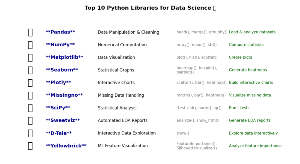
In the world of data science, Exploratory Data Analysis (EDA) is a crucial step that helps us make sense of raw data. By applying the right tools, we can clean, manipulate, and visualize the data to uncover important insights that will guide our modeling decisions. The top 10 Python libraries discussed in this blog post—Pandas, NumPy, Matplotlib, Seaborn, Plotly, Missingno, SciPy, Sweetviz, D-Tale, and Yellowbrick—play a vital role in simplifying and enhancing the EDA process.
Each of these libraries brings unique features to the table, helping us handle missing data, perform statistical analysis, create stunning visualizations, and even automate parts of the analysis. Whether you’re visualizing the distribution of your data with Matplotlib or uncovering hidden patterns with Yellowbrick’s machine learning visualizations, these tools provide a comprehensive and efficient way to dive deep into your data and ensure the best possible outcomes for your projects.
Remember, EDA is more than just about finding the right model; it’s about understanding your data in detail, ensuring your findings are reliable, and setting a solid foundation for building predictive models. With the right Python libraries by your side, this process becomes not only simpler but also more insightful.
FAQs
EDA is the process of analyzing, cleaning, and visualizing data to uncover patterns, detect anomalies, and gain insights before modeling.
Matplotlib, Seaborn, and Plotly are the top libraries for creating clear and interactive data visualizations.
Pandas simplifies data manipulation, handling missing values, grouping data, and merging datasets, making data analysis more efficient.
Yes, libraries like Sweetviz and D-Tale generate automated reports and interactive dashboards, saving time in the analysis process.
External Sources
- Pandas Documentation – https://pandas.pydata.org/docs/getting_started/index.html
- NumPy Documentation – https://numpy.org/doc/stable/user/absolute_beginners.html
- Matplotlib Documentation – https://matplotlib.org/stable/users/explain/quick_start.html
- Seaborn Documentation – https://seaborn.pydata.org/tutorial/introduction.html
- Plotly Documentation – https://plotly.com/python/plotly-express/
- Missingno Documentation – https://github.com/ResidentMario/missingno
- SciPy Documentation – https://docs.scipy.org/doc/scipy-1.14.0/
- Sweetviz GitHub Repository – https://github.com/fbdesignpro/sweetviz
- D-Tale GitHub Repository – https://github.com/man-group/dtale
- Yellowbrick Documentation – https://docs.yellowbrick.com/6.6.0/home.html
These sources provide official documentation and additional learning materials to help readers explore these EDA libraries in more depth.







Leave a Reply