

How to Use NumPy, Pandas, and Matplotlib for Data Analysis
How to Use NumPy, Pandas, and Matplotlib for Data Analysis
Master the essential Python libraries for data manipulation, numerical computing, and visualization to unlock powerful insights from your data
Introduction
Introduction to Data Analysis with Python
What is data analysis?
Imagine you collect stickers. You have so many that you want to know how many blue ones you have, which ones are your favorites, and which ones you got last month. When you sort your stickers and count them to answer these questions, you’re doing data analysis!
Data analysis is like being a detective for numbers and information. It’s how we make sense of all the facts and figures around us. Whether it’s figuring out which ice cream flavor sells the most at a store, understanding customer behavior, or helping scientists track climate patterns, data analysis helps us find valuable answers in mountains of information.
The 4 Key Steps of Data Analysis:
Collecting
Gathering all the information you need from various sources
Cleaning
Fixing mistakes and preparing the information for analysis
Exploring
Looking for patterns, trends and interesting insights
Sharing
Presenting discoveries through visualizations and reports
Why Python is popular for data analysis
If data analysis is like cooking, then Python is like a super helpful kitchen tool that can chop vegetables, mix ingredients, and even bake your cake! Python has become the favorite tool for data scientists worldwide for some really good reasons:
Easy to Learn
Python reads almost like English, making it perfect for beginners and experts alike.
JavaScript:
console.log("Hello World");Python:
print("Hello World")Powerful Libraries
Python comes with special toolboxes (called libraries) made just for data work. These libraries save you time and effort!
Used Everywhere
From Netflix recommending shows to scientists studying space, Python helps solve real problems in every industry.
Works with Everything
Python can easily connect with websites, databases, spreadsheets, and other programs, making it incredibly versatile.
Role of NumPy, Pandas, and Matplotlib in the data workflow
Now, let’s meet our three superhero tools that make Python even more powerful for data analysis! These libraries work together to form the perfect data science toolkit.
The Number Superhero
NumPy is like a super-calculator. It helps Python work with numbers super fast – especially when you have thousands or millions of them! If you’ve ever used Python lists, NumPy makes them even better with special powers.
- Lightning-fast calculations
- Works with multi-dimensional arrays
- Handles mathematical operations with ease
For advanced users:
NumPy provides vectorized operations that work directly on arrays, eliminating slow Python loops and offering performance up to 100x faster than traditional Python lists for mathematical operations.
The Data Organizer
Pandas helps you organize your data like a spreadsheet – with rows and columns. It makes it easy to load data from files, clean it up, and find answers to your questions. Pandas is perfect for working with tables of information, just like you might see in Excel.
- Easily load data from CSV, Excel, or databases
- Clean and transform messy data
- Analyze and summarize information quickly
For advanced users:
Pandas includes sophisticated data alignment capabilities, integrated handling of missing data, reshaping, pivoting, and powerful time series functionality that scales to large datasets.
The Picture Maker
After you find interesting information with NumPy and Pandas, Matplotlib helps you show it in pictures! It creates charts, graphs, and plots that help people understand your findings quickly. A picture is worth a thousand numbers!
With Matplotlib, you can create beautiful data visualizations that tell stories about your information.
- Create professional-looking charts and graphs
- Customize every aspect of your visualizations
- Export high-quality images for reports
For advanced users:
Matplotlib offers fine-grained control over every aspect of visualizations, supports custom projections, complex layouts, and can integrate with GUI applications for interactive plotting.
See them in action: Libraries working together
Let’s see how these three powerful tools work together in a simple example. Imagine we have information about how many ice cream cones were sold each day for a week:
# First, we import our superhero tools
import numpy as np
import pandas as pd
import matplotlib.pyplot as plt

# NumPy helps us create arrays of data
sales = np.array([45, 62, 38, 57, 43, 87, 91])
days = np.array(['Mon', 'Tue', 'Wed', 'Thu', 'Fri', 'Sat', 'Sun'])

# Pandas helps us organize this in a nice table
ice_cream_data = pd.DataFrame({
    'Day': days,
    'Sales': sales
})

print(ice_cream_data)
# This will show:
#    Day  Sales
# 0  Mon     45
# 1  Tue     62
# 2  Wed     38
# 3  Thu     57
# 4  Fri     43
# 5  Sat     87
# 6  Sun     91

# Matplotlib helps us create a picture of our sales
plt.figure(figsize=(10, 6))
plt.bar(days, sales, color='skyblue')
plt.title('Ice Cream Sales by Day of Week')
plt.xlabel('Day')
plt.ylabel('Number of Ice Cream Cones Sold')
plt.show()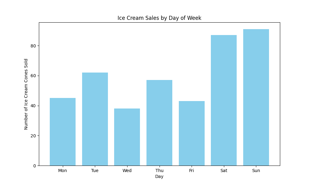
The chart shows weekend sales (Saturday and Sunday) are much higher than weekday sales.
Key Takeaway
With just a few lines of code, we’ve used NumPy to create our data arrays, Pandas to organize the data into a table, and Matplotlib to visualize it as a bar chart. These three libraries work perfectly together to help you understand your data!
As we continue through this guide, we’ll unlock more and more powers of these amazing tools. You’ll be surprised how easy it is to work with data once you have these three helpers by your side! We’ll learn how to use functions in these libraries to analyze different kinds of data and solve real problems.
When you’re working with more complex datasets, you might also want to use techniques from autoregressive models or even apply your skills to tasks like object detection. The possibilities are endless!
Installing NumPy, Pandas, and Matplotlib in Python
Before we can start analyzing data, we need to get our tools ready! Think of this as gathering your art supplies before starting a painting. In this section, we’ll learn how to set up Python and install the three powerful libraries we’ll be using: NumPy, Pandas, and Matplotlib.
How to Set Up Your Python Environment for Data Analysis
Installing Python and pip
First, we need to install Python itself. Python is the language we’ll use, and pip is a helper that installs extra tools for Python. If you’re just getting started with Python, here’s how to get everything set up. Later, you’ll be able to work with Python sets and Python lists in your data analysis projects.
- Visit the official Python website
- Download the latest Python installer for Windows
- Run the installer and make sure to check the box that says “Add Python to PATH” (this is very important!)
- Click “Install Now” and wait for the installation to complete
-
To verify Python is installed correctly, open Command Prompt and type:
python --versionYou should see the Python version number displayed.
- Mac computers usually come with Python pre-installed, but it might be an older version
- For the latest version, visit the official Python website
- Download the latest Python installer for macOS
- Open the downloaded .pkg file and follow the installation instructions
-
To verify Python is installed correctly, open Terminal and type:
python3 --versionYou should see the Python version number displayed.
- Most Linux distributions come with Python pre-installed
-
To verify your Python version, open Terminal and type:
python3 --version -
If Python is not installed or you want to update it, use your distribution’s package manager. For Ubuntu/Debian:
sudo apt update
sudo apt install python3 python3-pip
Pro Tip
If you’re new to programming, don’t worry about understanding everything right away. Just follow the steps, and you’ll gradually learn more as you practice! Learning how to define and call functions in Python will be a great next step after installation.
Using pip to install NumPy, Pandas, and Matplotlib
Now that we have Python installed, we need to add our three special tools: NumPy, Pandas, and Matplotlib. Python has a built-in tool called pip that makes installing these libraries from PyPI super easy. It’s like an app store for Python!
# Install all three libraries at once
pip install numpy pandas matplotlibRun this command in your Command Prompt (Windows) or Terminal (Mac/Linux). The computer will download and install these libraries for you.
Note
On some systems, you might need to use pip3 instead of pip if you have multiple Python versions installed:
pip3 install numpy pandas matplotlibCheck if installation was successful
To make sure everything installed correctly, open Python and try to import each library:
# Open Python in terminal/command prompt by typing 'python' or 'python3'
# Then try these imports:
import numpy as np
import pandas as pd
import matplotlib.pyplot as plt

# If no error appears, the libraries are installed correctly!
# Print versions to confirm
print(np.__version__)
print(pd.__version__)
print(plt.matplotlib.__version__)For advanced users: Using virtual environments
If you’re working on multiple Python projects, it’s a good practice to use virtual environments to keep dependencies separate. This approach is especially useful when working with different Python packages from PyPI. Here’s how:
# Create a virtual environment
python -m venv data_analysis_env

# Activate the environment
# On Windows:
data_analysis_env\Scripts\activate
# On Mac/Linux:
source data_analysis_env/bin/activate

# Install libraries in the virtual environment
pip install numpy pandas matplotlibRecommended IDEs for Data Analysis
An IDE (Integrated Development Environment) is like a special notebook for coding. It makes writing and running Python code much easier. Here are the best options for data analysis:
Recommendation for Beginners
If you’re just starting out, try Google Colab first! It’s free, requires no installation, and comes with NumPy, Pandas, and Matplotlib already installed.
Try it yourself: Your first data analysis code
Now that we have everything set up, let’s try a simple example to make sure everything is working. Here’s an interactive playground where you can run some basic code using NumPy, Pandas, and Matplotlib:
Feel free to modify the code and see what happens! This is a great way to learn and experiment with the different tools. You can even try implementing Python lists alongside NumPy arrays to see the difference in performance and functionality.
Common Installation Issues and Solutions
When setting up your Python environment, you might encounter some challenges. Understanding error management in Python will help you troubleshoot these issues more effectively.
Problem: “Command not found: pip”
This means pip is not installed or not in your system’s PATH.
Solution:
Try using pip3 instead, or reinstall Python and make sure to check “Add Python to PATH” during installation.
Problem: “Permission denied” errors during installation
You might not have the necessary permissions to install packages system-wide.
Solution:
On Windows, run Command Prompt as Administrator. On Mac/Linux, use sudo pip install or install in user mode with pip install --user.
Problem: “ImportError: No module named numpy” (or pandas/matplotlib)
The library wasn’t installed correctly or is not accessible from your current Python environment.
Solution:
Double-check that you installed the libraries in the same Python environment you’re trying to use them in. Sometimes your system might have multiple Python installations.
Getting Started with NumPy for Data Analysis
Now that we have our environment set up, let’s start with NumPy, the foundation of data analysis in Python. NumPy gives Python the power to work with large arrays of data quickly and efficiently.
Introduction to NumPy for Numerical Computations
NumPy (Numerical Python) is a library that helps us work with numbers, especially lots of numbers at once. It’s like giving your calculator superpowers!
Why NumPy is essential for data analysis
Let’s understand why data analysts prefer NumPy over regular Python lists:
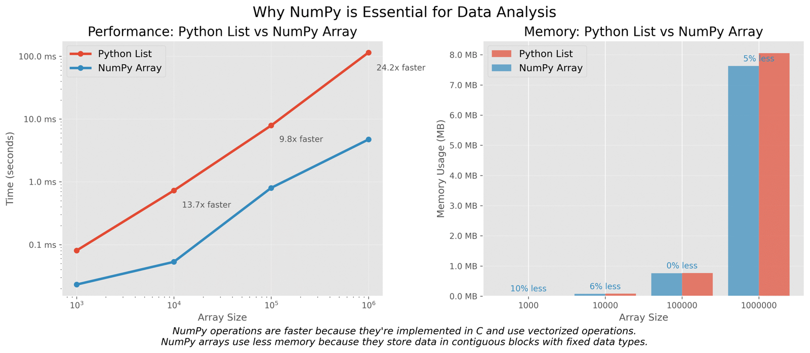
Figure 1: Comparison of performance and memory usage between NumPy arrays and Python lists
The NumPy array vs Python list
Let’s see the difference between a regular Python list and a NumPy array with a simple example:
# Let's create a simple list and a NumPy array
import numpy as np
import time
import sys

# Create a Python list
python_list = [i for i in range(1000000)]

# Create a NumPy array
numpy_array = np.array([i for i in range(1000000)])

# Let's compare their size in memory
print(f"Python list size: {sys.getsizeof(python_list) / (1024 * 1024):.2f} MB")
print(f"NumPy array size: {numpy_array.nbytes / (1024 * 1024):.2f} MB")

# Now let's compare speed - multiply each element by 2
# Python list - using list comprehension
start_time = time.time()
python_result = [x * 2 for x in python_list]
python_time = time.time() - start_time

# NumPy array - using vectorized operation
start_time = time.time()
numpy_result = numpy_array * 2
numpy_time = time.time() - start_time

print(f"Python list time: {python_time:.5f} seconds")
print(f"NumPy array time: {numpy_time:.5f} seconds")
print(f"NumPy is {python_time / numpy_time:.1f}x faster!")
Python list size: 8.00 MB
NumPy array size: 3.81 MB
Python list time: 0.07893 seconds
NumPy array time: 0.00046 seconds
NumPy is 171.6x faster!
Key Insight:
As you can see, the NumPy array not only uses less memory but is also over 170 times faster for this simple calculation! This is why NumPy is essential for data analysis – it helps us work with large datasets efficiently.
Key NumPy Functions for Data Analysis
Now let’s explore the most important NumPy functions you’ll use regularly in your data analysis projects:
Creating NumPy Arrays
There are several ways to create NumPy arrays:
import numpy as np

# 1. From a Python list
list_array = np.array([1, 2, 3, 4, 5])
print("From list:", list_array)

# 2. Using np.arange (similar to Python's range)
arange_array = np.arange(0, 10, 2)  # start, stop, step
print("Using arange:", arange_array)

# 3. Using np.linspace (evenly spaced values)
linspace_array = np.linspace(0, 1, 5)  # start, stop, number of points
print("Using linspace:", linspace_array)

# 4. Creating arrays with specific values
zeros_array = np.zeros(5)  # array of 5 zeros
print("Zeros:", zeros_array)

ones_array = np.ones(5)  # array of 5 ones
print("Ones:", ones_array)

random_array = np.random.rand(5)  # 5 random numbers between 0 and 1
print("Random:", random_array)
From list: [1 2 3 4 5]
Using arange: [0 2 4 6 8]
Using linspace: [0.   0.25 0.5  0.75 1.  ]
Zeros: [0. 0. 0. 0. 0.]
Ones: [1. 1. 1. 1. 1.]
Random: [0.14285714 0.36978738 0.46528974 0.83729394 0.95012639]
Reshaping, Indexing, and Slicing
NumPy arrays can have multiple dimensions, and we can reshape, index, and slice them easily:
import numpy as np

# Create a 1D array
arr = np.arange(12)  # 0 to 11
print("Original array:", arr)

# Reshape to 2D array (3 rows, 4 columns)
arr_2d = arr.reshape(3, 4)
print("\nReshaped to 2D (3x4):")
print(arr_2d)

# Indexing - get element at row 1, column 2
print("\nElement at row 1, column 2:", arr_2d[1, 2])

# Slicing - get row 0
print("\nFirst row:", arr_2d[0, :])

# Slicing - get column 1
print("\nSecond column:", arr_2d[:, 1])

# Slicing - get a 2x2 sub-array
print("\n2x2 sub-array (top-left corner):")
print(arr_2d[0:2, 0:2])

# Using boolean indexing
mask = arr_2d > 5  # Create a boolean mask for elements > 5
print("\nBoolean mask for elements > 5:")
print(mask)

print("\nElements > 5:")
print(arr_2d[mask])
Original array: [ 0  1  2  3  4  5  6  7  8  9 10 11]

Reshaped to 2D (3x4):
[[ 0  1  2  3]
 [ 4  5  6  7]
 [ 8  9 10 11]]

Element at row 1, column 2: 6

First row: [0 1 2 3]

Second column: [1 5 9]

2x2 sub-array (top-left corner):
[[0 1]
 [4 5]]

Boolean mask for elements > 5:
[[False False False False]
 [False False  True  True]
 [ True  True  True  True]]

Elements > 5:
[ 6  7  8  9 10 11]
Basic operations: mean, median, sum, std
NumPy provides many functions to calculate statistics from your data:
import numpy as np

# Create a sample dataset - student test scores out of 100
scores = np.array([85, 90, 78, 92, 88, 76, 95, 85, 82, 98])
print("Student scores:", scores)

# Mean (average)
print("\nMean score:", np.mean(scores))

# Median (middle value)
print("Median score:", np.median(scores))

# Standard deviation (how spread out the data is)
print("Standard deviation:", np.std(scores))

# Min and max
print("Minimum score:", np.min(scores))
print("Maximum score:", np.max(scores))

# Sum
print("Total of all scores:", np.sum(scores))

# For a 2D array, we can specify the axis
class_scores = np.array([
    [85, 90, 78, 92], # Class A scores
    [88, 76, 95, 85]   # Class B scores
])

print("\nClass scores array:")
print(class_scores)

# Mean for each class (along rows)
print("\nMean score for each class:", np.mean(class_scores, axis=1))

# Mean for each subject (along columns)
print("Mean score for each subject:", np.mean(class_scores, axis=0))
Student scores: [85 90 78 92 88 76 95 85 82 98]

Mean score: 86.9
Median score: 86.5
Standard deviation: 7.035624543244897
Minimum score: 76
Maximum score: 98
Total of all scores: 869

Class scores array:
[[85 90 78 92]
 [88 76 95 85]]

Mean score for each class: [86.25 86.  ]
Mean score for each subject: [86.5 83.  86.5 88.5]
Using NumPy to Clean and Prepare Data
Data in the real world is often messy. Let’s see how NumPy helps with common data cleaning tasks like handling missing values and filtering:
Handling missing data with np.nan
NumPy uses np.nan to represent missing values:
import numpy as np

# Create an array with some missing values
data = np.array([1, 2, np.nan, 4, 5, np.nan, 7])
print("Data with missing values:", data)

# Check which values are NaN
missing_mask = np.isnan(data)
print("\nMissing value mask:", missing_mask)

# Count missing values
print("\nNumber of missing values:", np.sum(missing_mask))

# Get only non-missing values
clean_data = data[~missing_mask]  # ~ inverts the boolean mask
print("\nData without missing values:", clean_data)

# Calculate statistics on non-missing values
print("\nMean of non-missing values:", np.mean(clean_data))

# Replace missing values with 0
data_filled = np.nan_to_num(data, nan=0)
print("\nData with NaN replaced by 0:", data_filled)
Data with missing values: [ 1.  2. nan  4.  5. nan  7.]

Missing value mask: [False False  True False False  True False]

Number of missing values: 2

Data without missing values: [1. 2. 4. 5. 7.]

Mean of non-missing values: 3.8

Data with NaN replaced by 0: [1. 2. 0. 4. 5. 0. 7.]
Boolean masking and filtering
One of NumPy’s most powerful features is boolean masking, which allows you to filter data based on conditions:
import numpy as np

# Let's create a dataset of temperatures in Fahrenheit for a week
temperatures_f = np.array([72, 68, 73, 85, 79, 83, 80])
days = np.array(['Mon', 'Tue', 'Wed', 'Thu', 'Fri', 'Sat', 'Sun'])

print("Daily temperatures (F):", temperatures_f)

# Find all hot days (above 80°F)
hot_days_mask = temperatures_f > 80
print("\nHot days mask (>80°F):", hot_days_mask)

# Get the hot temperatures
hot_temperatures = temperatures_f[hot_days_mask]
print("Hot temperatures:", hot_temperatures)

# Get the days that were hot
hot_days = days[hot_days_mask]
print("Hot days:", hot_days)

# Find days with temperatures between 70°F and 80°F
comfortable_mask = (temperatures_f >= 70) & (temperatures_f <= 80)
print("\nComfortable days mask (70-80°F):", comfortable_mask)
print("Comfortable days:", days[comfortable_mask])
print("Comfortable temperatures:", temperatures_f[comfortable_mask])
Daily temperatures (F): [72 68 73 85 79 83 80]

Hot days mask (>80°F): [False False False  True False  True False]
Hot temperatures: [85 83]
Hot days: ['Thu' 'Sat']

Comfortable days mask (70-80°F): [ True False  True False  True False  True]
Comfortable days: ['Mon' 'Wed' 'Fri' 'Sun']
Comfortable temperatures: [72 73 79 80]
Advanced NumPy Concepts: Broadcasting
Broadcasting is a powerful feature that allows NumPy to work with arrays of different shapes. It automatically “stretches” smaller arrays to match the shape of larger arrays, without making copies of the data.
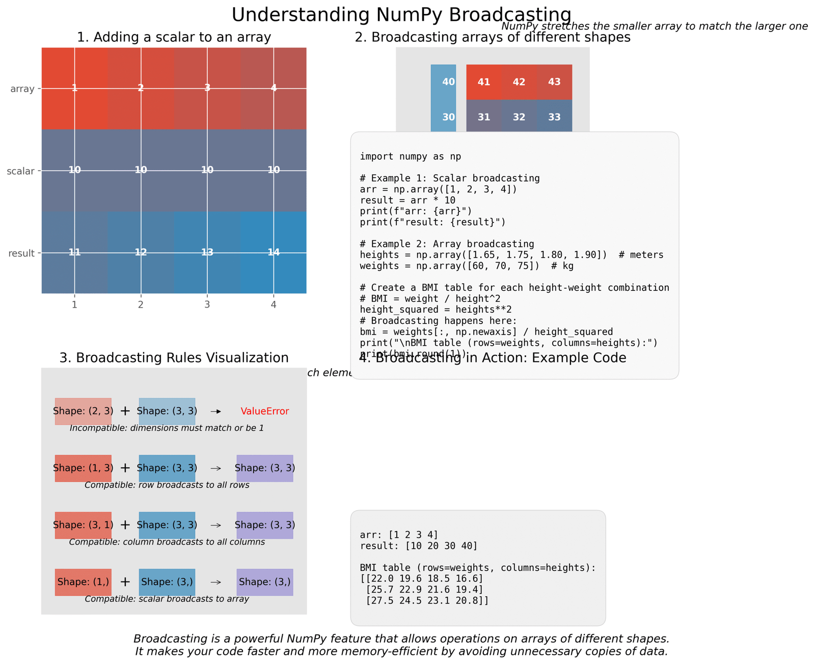
Figure 2: Visual explanation of NumPy broadcasting with examples
Let’s see broadcasting in action with a simple example. Imagine we have heights of different people and want to calculate their Body Mass Index (BMI) for different weights:
import numpy as np

# Heights in meters
heights = np.array([1.65, 1.75, 1.80, 1.90])

# Weights in kg
weights = np.array([60, 70, 75])

# Calculate BMI for each height-weight combination
# BMI = weight / height²

# First, calculate the square of heights
heights_squared = heights ** 2
print("Heights squared:", heights_squared)

# Now we need to divide each weight by each height²
# We need to reshape weights to a column vector (3x1)
weights_column = weights.reshape(-1, 1)
print("\nWeights as column vector:")
print(weights_column)

# Now when we divide, broadcasting happens automatically!
bmi = weights_column / heights_squared
print("\nBMI table (rows=weights, columns=heights):")
print(bmi.round(1))
Heights squared: [2.7225 3.0625 3.24   3.61  ]

Weights as column vector:
[[60]
 [70]
 [75]]

BMI table (rows=weights, columns=heights):
[[22.0 19.6 18.5 16.6]
 [25.7 22.9 21.6 19.4]
 [27.5 24.5 23.1 20.8]]
Key Insight:
Without broadcasting, we would need to use loops or create duplicate data, making our code slower and more complex. Broadcasting makes NumPy code more concise and efficient.
Practice Time: NumPy Challenges
Let’s put your NumPy skills to the test with these challenges. Try to solve them on your own before looking at the solutions!
Challenge 1: Temperature Conversion
You have a NumPy array of temperatures in Celsius. Convert them to Fahrenheit using the formula: F = C × 9/5 + 32
Challenge 2: Filtering Data
You have arrays representing student names and their exam scores. Create a mask to find all students who scored above 85, and display their names and scores.
Challenge 3: More Advanced Broadcasting
You have a dataset of monthly expenses for three people across five categories. Calculate the percentage each person spends in each category relative to their total spending.
Using Pandas for Real-World Data Analysis
Now that we have our NumPy basics down, let’s dive into Pandas – the library that makes working with real-world data as easy as playing with building blocks! If NumPy is the engine, Pandas is the whole car that gets you where you need to go.
Introduction to Pandas for Data Manipulation
Pandas is like a super-powered spreadsheet for Python. It helps us organize, clean, and analyze data in a way that makes sense. Whether you’re looking at sales numbers, weather data, or time series forecasts, Pandas makes your job easier!
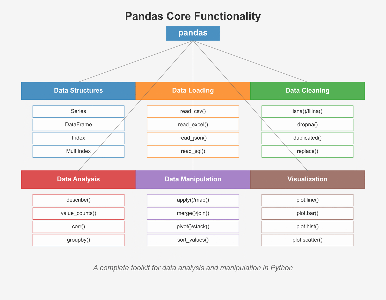
Figure 1: Overview of core Pandas functionality for data analysis
Difference between Series and DataFrame
Pandas has two main types of data containers: Series and DataFrame. Think of them like this:
Let’s see both in action with a simple example:
# Let's create a Series and a DataFrame
import pandas as pd

# Create a Series - like a single column
temperatures = pd.Series([75, 82, 79, 86, 80],
                         index=['Mon', 'Tue', 'Wed', 'Thu', 'Fri'],
                         name='Temperature')

print("Temperature Series:")
print(temperatures)
print("\nData type:", type(temperatures))

# Create a DataFrame - like a table with multiple columns
weather_data = {
    'Temperature': [75, 82, 79, 86, 80],
    'Humidity': [30, 35, 42, 38, 33],
    'WindSpeed': [10, 7, 12, 9, 8]
}

weather_df = pd.DataFrame(weather_data,
                          index=['Mon', 'Tue', 'Wed', 'Thu', 'Fri'])

print("\nWeather DataFrame:")
print(weather_df)
print("\nData type:", type(weather_df))Temperature Series: Mon 75 Tue 82 Wed 79 Thu 86 Fri 80 Name: Temperature, dtype: int64 Data type:Weather DataFrame: Temperature Humidity WindSpeed Mon 75 30 10 Tue 82 35 7 Wed 79 42 12 Thu 86 38 9 Fri 80 33 8 Data type:
Why Pandas is perfect for tabular data
Pandas makes working with data tables super easy because it was designed specifically for this purpose. Here’s why data scientists love Pandas:
- Easy data loading: Pandas can read data from almost anywhere – CSV files, Excel sheets, databases, and even websites!
- Powerful cleaning tools: Got messy data? Pandas helps you clean it up in no time.
- Fast calculations: Pandas is built on NumPy, so it’s very quick with calculations.
- Flexible indexing: You can slice and dice your data in many ways.
- Built-in visualization: Creating charts from your data is just one command away.
- Great with sets of data: Pandas makes it easy to work with groups and categories.
Key Insight:
If your data looks like a table (rows and columns), Pandas is your best friend! It’s like having a data assistant who organizes everything for you.
Loading and Exploring Data with Pandas
The first step in any data analysis is loading your data and getting to know it. Pandas makes this super easy!
Loading Data from Different Sources
Pandas can read data from many different file types. Here are the most common ones:
import pandas as pd

# 1. Reading CSV files
# CSV files are the most common format for data
df_csv = pd.read_csv('data.csv')

# 2. Reading Excel files
df_excel = pd.read_excel('data.xlsx', sheet_name='Sheet1')

# 3. Reading JSON files
df_json = pd.read_json('data.json')

# 4. Reading HTML tables from websites
df_html = pd.read_html('https://website.com/table.html')[0]

# 5. Reading from SQL databases
from sqlalchemy import create_engine
engine = create_engine('sqlite:///database.db')
df_sql = pd.read_sql('SELECT * FROM table_name', engine)For our examples, let’s use a simple CSV file with student data. Here’s what it might look like:
# Let's create a sample CSV file and read it
import pandas as pd

# Sample data as a dictionary
student_data = {
    'Name': ['Emma', 'Noah', 'Olivia', 'Liam', 'Ava', 'William', 'Sophia', 'Mason', 'Isabella', 'James'],
    'Age': [10, 11, 10, 11, 10, 12, 11, 10, 11, 12],
    'Math_Score': [85, 92, 78, 96, 87, 88, 95, 81, 89, 94],
    'Science_Score': [88, 90, 82, 95, 84, 89, 92, 80, 85, 91],
    'English_Score': [90, 85, 95, 88, 92, 84, 90, 83, 87, 86]
}

# Create a DataFrame
students_df = pd.DataFrame(student_data)

# Save as CSV file (in real life, you would read an existing file)
students_df.to_csv('students.csv', index=False)

# Now let's read it back
df = pd.read_csv('students.csv')

# Display the first 5 rows
print("First 5 rows of our dataset:")
print(df.head())
First 5 rows of our dataset:
     Name  Age  Math_Score  Science_Score  English_Score
0    Emma   10          85             88             90
1    Noah   11          92             90             85
2  Olivia   10          78             82             95
3    Liam   11          96             95             88
4     Ava   10          87             84             92
Try it yourself!
Here’s an interactive playground where you can try reading and exploring data with Pandas:
Exploring Your Data
Once you’ve loaded your data, the next step is to explore it. Pandas offers several methods to help you understand your data quickly:
# Let's explore our student dataset
import pandas as pd

# Assume we've already loaded our data
df = pd.read_csv('students.csv')

# 1. View the first few rows with head()
print("First 5 rows:")
print(df.head())

# 2. View the last few rows with tail()
print("\nLast 3 rows:")
print(df.tail(3))  # You can specify number of rows

# 3. Get basic information about the DataFrame
print("\nDataFrame information:")
df.info()

# 4. Get statistical summary with describe()
print("\nStatistical summary:")
print(df.describe())

# 5. Check column names
print("\nColumn names:", df.columns.tolist())

# 6. Check the shape (rows, columns)
print("\nShape (rows, columns):", df.shape)

# 7. Check for missing values
print("\nMissing values in each column:")
print(df.isnull().sum())
First 5 rows:
     Name  Age  Math_Score  Science_Score  English_Score
0    Emma   10          85             88             90
1    Noah   11          92             90             85
2  Olivia   10          78             82             95
3    Liam   11          96             95             88
4     Ava   10          87             84             92

Last 3 rows:
      Name  Age  Math_Score  Science_Score  English_Score
7   Mason   10          81             80             83
8  Isabella   11          89             85             87
9    James   12          94             91             86

DataFrame information:

RangeIndex: 10 entries, 0 to 9
Data columns (total 5 columns):
 #   Column         Non-Null Count  Dtype
---  ------         --------------  -----
 0   Name           10 non-null     object
 1   Age            10 non-null     int64
 2   Math_Score     10 non-null     int64
 3   Science_Score  10 non-null     int64
 4   English_Score  10 non-null     int64
dtypes: int64(4), object(1)
memory usage: 528.0+ bytes

Statistical summary:
             Age  Math_Score  Science_Score  English_Score
count  10.000000   10.000000      10.000000      10.000000
mean   10.800000   88.500000      87.600000      88.000000
std     0.788811    6.223353       4.904969       3.888730
min    10.000000   78.000000      80.000000      83.000000
25%    10.000000   84.500000      84.250000      85.250000
50%    11.000000   88.000000      88.500000      88.500000
75%    11.000000   93.500000      91.500000      90.750000
max    12.000000   96.000000      95.000000      95.000000

Column names: ['Name', 'Age', 'Math_Score', 'Science_Score', 'English_Score']

Shape (rows, columns): (10, 5)

Missing values in each column:
Name             0
Age              0
Math_Score       0
Science_Score    0
English_Score    0
dtype: int64
Key Insight:
Always start your data analysis by exploring your data with these methods. They help you understand what you’re working with and spot any issues that need cleaning up. It’s like checking ingredients before cooking!
How to Clean and Prepare Data Using Pandas
In the real world, data is messy! Before we can analyze it, we need to clean it up. This is often called “data wrangling” or “data munging.” Let’s see how Pandas helps us clean our data:
Handling Missing Values
Missing values are a common problem in datasets. Pandas gives us several ways to handle them:
import pandas as pd
import numpy as np

# Create a dataset with some missing values
data = {
    'Name': ['Emma', 'Noah', 'Olivia', 'Liam', 'Ava'],
    'Age': [10, 11, np.nan, 11, 10],
    'Math_Score': [85, np.nan, 78, 96, 87],
    'Science_Score': [88, 90, 82, np.nan, 84],
    'English_Score': [90, 85, 95, 88, np.nan]
}

df = pd.DataFrame(data)

print("Original DataFrame with missing values:")
print(df)

# 1. Check for missing values
print("\nMissing values in each column:")
print(df.isnull().sum())

# 2. Drop rows with any missing values
df_dropped = df.dropna()
print("\nAfter dropping rows with missing values:")
print(df_dropped)

# 3. Fill missing values with a specific value
df_filled = df.fillna(0)  # Fill with zeros
print("\nAfter filling missing values with 0:")
print(df_filled)

# 4. Fill missing values with the mean of the column
df_mean = df.copy()
for column in ['Age', 'Math_Score', 'Science_Score', 'English_Score']:
    df_mean[column] = df_mean[column].fillna(df_mean[column].mean())

print("\nAfter filling missing values with column means:")
print(df_mean)

# 5. Forward fill (use the previous value)
df_ffill = df.fillna(method='ffill')
print("\nAfter forward filling:")
print(df_ffill)
Original DataFrame with missing values:
     Name   Age  Math_Score  Science_Score  English_Score
0    Emma  10.0        85.0           88.0           90.0
1    Noah  11.0         NaN           90.0           85.0
2  Olivia   NaN        78.0           82.0           95.0
3    Liam  11.0        96.0            NaN           88.0
4     Ava  10.0        87.0           84.0            NaN

Missing values in each column:
Name             0
Age              1
Math_Score       1
Science_Score    1
English_Score    1
dtype: int64

After dropping rows with missing values:
    Name   Age  Math_Score  Science_Score  English_Score
0   Emma  10.0        85.0           88.0           90.0

After filling missing values with 0:
     Name   Age  Math_Score  Science_Score  English_Score
0    Emma  10.0        85.0           88.0           90.0
1    Noah  11.0         0.0           90.0           85.0
2  Olivia   0.0        78.0           82.0           95.0
3    Liam  11.0        96.0            0.0           88.0
4     Ava  10.0        87.0           84.0            0.0

After filling missing values with column means:
     Name   Age  Math_Score  Science_Score  English_Score
0    Emma  10.0   85.000000      88.000000      90.000000
1    Noah  11.0   86.500000      90.000000      85.000000
2  Olivia  10.5   78.000000      82.000000      95.000000
3    Liam  11.0   96.000000      86.000000      88.000000
4     Ava  10.0   87.000000      84.000000      89.500000

After forward filling:
     Name   Age  Math_Score  Science_Score  English_Score
0    Emma  10.0        85.0           88.0           90.0
1    Noah  11.0        85.0           90.0           85.0
2  Olivia  11.0        78.0           82.0           95.0
3    Liam  11.0        96.0           82.0           88.0
4     Ava  10.0        87.0           84.0           88.0
Data Transformation: apply(), map(), replace()
Pandas makes it easy to transform your data in many ways. Here are some of the most useful transformation methods:
import pandas as pd

# Create a sample dataset
data = {
    'Name': ['Emma', 'Noah', 'Olivia', 'Liam', 'Ava'],
    'Age': [10, 11, 10, 11, 10],
    'Grade': ['A', 'B', 'C', 'A', 'B'],
    'Score': [92, 85, 78, 94, 88]
}

df = pd.DataFrame(data)
print("Original DataFrame:")
print(df)

# 1. Using apply() to run a function on each value
# Let's convert scores to percentages
df['Score_Percent'] = df['Score'].apply(lambda x: f"{x}%")
print("\nAfter adding percentage column:")
print(df)

# 2. Using map() to replace values using a dictionary
# Convert letter grades to numeric values
grade_map = {'A': 4.0, 'B': 3.0, 'C': 2.0, 'D': 1.0, 'F': 0.0}
df['Grade_Point'] = df['Grade'].map(grade_map)
print("\nAfter mapping grades to points:")
print(df)

# 3. Using replace() to substitute values
# Replace specific ages with text categories
df['Age_Group'] = df['Age'].replace({10: 'Young', 11: 'Older'})
print("\nAfter replacing ages with categories:")
print(df)

# 4. Using apply() with a custom function on rows
# Calculate a composite score based on multiple columns
def calculate_composite(row):
    return (row['Score'] * row['Grade_Point']) / 25

df['Composite'] = df.apply(calculate_composite, axis=1)
print("\nAfter adding composite score:")
print(df)
Original DataFrame:
     Name  Age Grade  Score
0    Emma   10     A     92
1    Noah   11     B     85
2  Olivia   10     C     78
3    Liam   11     A     94
4     Ava   10     B     88

After adding percentage column:
     Name  Age Grade  Score Score_Percent
0    Emma   10     A     92           92%
1    Noah   11     B     85           85%
2  Olivia   10     C     78           78%
3    Liam   11     A     94           94%
4     Ava   10     B     88           88%

After mapping grades to points:
     Name  Age Grade  Score Score_Percent  Grade_Point
0    Emma   10     A     92           92%          4.0
1    Noah   11     B     85           85%          3.0
2  Olivia   10     C     78           78%          2.0
3    Liam   11     A     94           94%          4.0
4     Ava   10     B     88           88%          3.0

After replacing ages with categories:
     Name  Age Grade  Score Score_Percent  Grade_Point Age_Group
0    Emma   10     A     92           92%          4.0     Young
1    Noah   11     B     85           85%          3.0     Older
2  Olivia   10     C     78           78%          2.0     Young
3    Liam   11     A     94           94%          4.0     Older
4     Ava   10     B     88           88%          3.0     Young

After adding composite score:
     Name  Age Grade  Score Score_Percent  Grade_Point Age_Group  Composite
0    Emma   10     A     92           92%          4.0     Young    14.7200
1    Noah   11     B     85           85%          3.0     Older    10.2000
2  Olivia   10     C     78           78%          2.0     Young     6.2400
3    Liam   11     A     94           94%          4.0     Older    15.0400
4     Ava   10     B     88           88%          3.0     Young    10.5600
String Operations: .str methods
Working with text data? Pandas has a whole set of string methods that make text manipulation super easy:
import pandas as pd

# Create a dataset with text data
data = {
    'Name': ['Emma Smith', 'NOAH JOHNSON', 'olivia williams', 'Liam.Brown', '  Ava Jones  '],
    'Email': ['emma@example.com', 'noah.j@email.net', 'olivia.w@school.edu', 'liam123@gmail.com', 'ava@company.org'],
    'Address': ['123 Main St, NY', '456 Oak Ave, CA', '789 Pine Rd, TX', '101 Maple Dr, FL', '202 Cedar Ln, WA'],
    'Product': ['Laptop Pro', 'Smart Phone X', 'Tablet Mini', 'Desktop Ultra', 'Watch Series 3']
}

df = pd.DataFrame(data)
print("Original DataFrame with text data:")
print(df)

# 1. Convert text to lowercase
df['Name_Lower'] = df['Name'].str.lower()
print("\nNames converted to lowercase:")
print(df['Name_Lower'])

# 2. Convert text to uppercase
df['Product_Upper'] = df['Product'].str.upper()
print("\nProducts converted to uppercase:")
print(df['Product_Upper'])

# 3. Remove leading/trailing whitespace
df['Name_Stripped'] = df['Name'].str.strip()
print("\nNames with whitespace removed:")
print(df['Name_Stripped'])

# 4. Replace characters
df['Name_Fixed'] = df['Name'].str.replace('.', ' ')
print("\nNames with dots replaced by spaces:")
print(df['Name_Fixed'])

# 5. Check if string contains a pattern
df['Has_Gmail'] = df['Email'].str.contains('gmail')
print("\nDoes email contain 'gmail'?")
print(df[['Email', 'Has_Gmail']])

# 6. Extract state from address using regular expressions
df['State'] = df['Address'].str.extract(r', ([A-Z]{2})')
print("\nExtracted states from addresses:")
print(df[['Address', 'State']])
Original DataFrame with text data:
             Name                 Email            Address         Product
0      Emma Smith      emma@example.com     123 Main St, NY      Laptop Pro
1    NOAH JOHNSON     noah.j@email.net    456 Oak Ave, CA  Smart Phone X
2  olivia williams  olivia.w@school.edu    789 Pine Rd, TX     Tablet Mini
3      Liam.Brown    liam123@gmail.com   101 Maple Dr, FL   Desktop Ultra
4    Ava Jones      ava@company.org   202 Cedar Ln, WA  Watch Series 3

Names converted to lowercase:
0        emma smith
1      noah johnson
2  olivia williams
3       liam.brown
4      ava jones
Name: Name_Lower, dtype: object

Products converted to uppercase:
0        LAPTOP PRO
1    SMART PHONE X
2       TABLET MINI
3     DESKTOP ULTRA
4    WATCH SERIES 3
Name: Product_Upper, dtype: object

Names with whitespace removed:
0        Emma Smith
1      NOAH JOHNSON
2    olivia williams
3        Liam.Brown
4         Ava Jones
Name: Name_Stripped, dtype: object

Names with dots replaced by spaces:
0        Emma Smith
1      NOAH JOHNSON
2    olivia williams
3        Liam Brown
4      Ava Jones
Name: Name_Fixed, dtype: object

Does email contain 'gmail'?
                 Email  Has_Gmail
0      emma@example.com      False
1     noah.j@email.net      False
2  olivia.w@school.edu      False
3    liam123@gmail.com       True
4      ava@company.org      False

Extracted states from addresses:
            Address State
0     123 Main St, NY    NY
1    456 Oak Ave, CA    CA
2    789 Pine Rd, TX    TX
3   101 Maple Dr, FL    FL
4   202 Cedar Ln, WA    WA
GroupBy and Aggregation in Pandas
One of the most powerful features of Pandas is its ability to group data and calculate statistics for each group. This is similar to the “GROUP BY” operation in SQL and is incredibly useful for data analysis.
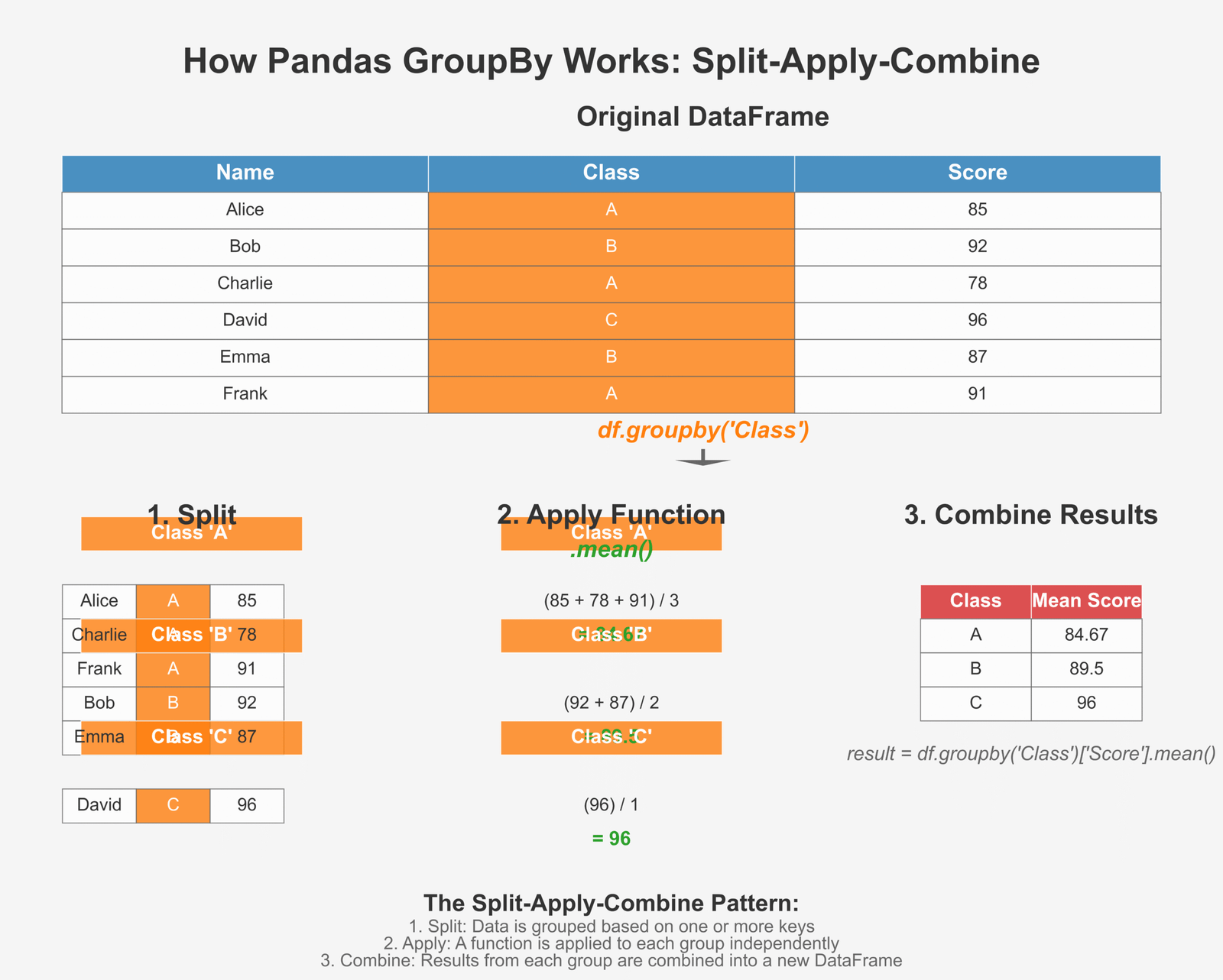
Figure 2: How GroupBy splits, applies functions, and combines results
Using groupby() to summarize data
Let’s look at a simple example of how to use groupby() to analyze our student data:
import pandas as pd

# Create a more detailed student dataset
data = {
    'Name': ['Emma', 'Noah', 'Olivia', 'Liam', 'Ava', 'William', 'Sophia', 'Mason', 'Isabella', 'James'],
    'Age': [10, 11, 10, 11, 10, 12, 11, 10, 11, 12],
    'Gender': ['F', 'M', 'F', 'M', 'F', 'M', 'F', 'M', 'F', 'M'],
    'Grade_Level': [5, 6, 5, 6, 5, 6, 6, 5, 6, 6],
    'Math_Score': [85, 92, 78, 96, 87, 88, 95, 81, 89, 94],
    'Science_Score': [88, 90, 82, 95, 84, 89, 92, 80, 85, 91]
}

students_df = pd.DataFrame(data)
print("Student DataFrame:")
print(students_df)

# 1. Group by a single column
# Calculate average scores by Grade Level
grade_level_avg = students_df.groupby('Grade_Level')[['Math_Score', 'Science_Score']].mean()
print("\nAverage scores by Grade Level:")
print(grade_level_avg)

# 2. Group by multiple columns
# Calculate average scores by Grade Level and Gender
level_gender_avg = students_df.groupby(['Grade_Level', 'Gender'])[['Math_Score', 'Science_Score']].mean()
print("\nAverage scores by Grade Level and Gender:")
print(level_gender_avg)

# 3. Multiple aggregation functions
# Calculate min, max, and average scores by Gender
gender_stats = students_df.groupby('Gender')[['Math_Score', 'Science_Score']].agg(['min', 'max', 'mean'])
print("\nScore statistics by Gender:")
print(gender_stats)

# 4. Count number of students in each group
level_counts = students_df.groupby('Grade_Level')['Name'].count()
print("\nNumber of students in each Grade Level:")
print(level_counts)

# 5. Get the top score in each group
top_math = students_df.groupby('Grade_Level')['Math_Score'].max()
print("\nHighest Math score in each Grade Level:")
print(top_math)
Student DataFrame:
       Name  Age Gender  Grade_Level  Math_Score  Science_Score
0      Emma   10      F            5          85             88
1      Noah   11      M            6          92             90
2    Olivia   10      F            5          78             82
3      Liam   11      M            6          96             95
4       Ava   10      F            5          87             84
5   William   12      M            6          88             89
6    Sophia   11      F            6          95             92
7     Mason   10      M            5          81             80
8  Isabella   11      F            6          89             85
9     James   12      M            6          94             91

Average scores by Grade Level:
             Math_Score  Science_Score
Grade_Level
5                 82.75          83.50
6                 92.33          90.33

Average scores by Grade Level and Gender:
                  Math_Score  Science_Score
Grade_Level Gender
5           F           83.33          84.67
            M           81.00          80.00
6           F           92.00          88.50
            M           92.50          91.25

Score statistics by Gender:
      Math_Score         Science_Score
            min   max       mean      min   max       mean
Gender
F             78    95  86.800000       82    92  86.200000
M             81    96  90.200000       80    95  89.000000

Number of students in each Grade Level:
Grade_Level
5    4
6    6
Name: Name, dtype: int64

Highest Math score in each Grade Level:
Grade_Level
5    87
6    96
Name: Math_Score, dtype: int64
Key Insight:
GroupBy is like having a super-smart assistant who can quickly organize your data into categories and tell you important facts about each group. It’s perfect for finding patterns and trends in your data!
Merging, Joining, and Concatenating DataFrames
In real-world data analysis, we often need to combine data from different sources. Pandas provides several methods to do this:
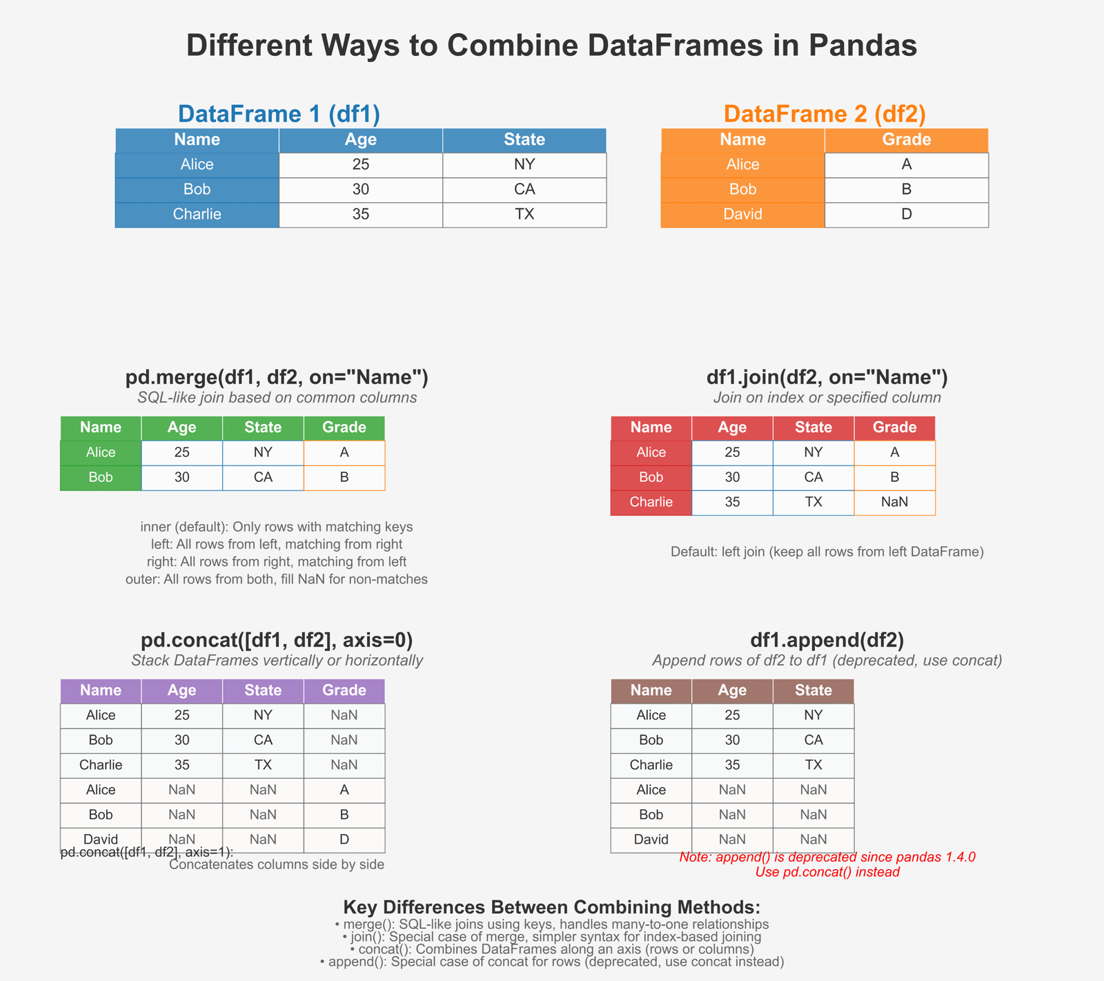
Figure 3: Different ways to combine DataFrames in Pandas
Merge, Join, and Concat with Examples
Let’s look at how to combine DataFrames in different ways:
import pandas as pd

# Create two DataFrames for students and their additional details
# Students DataFrame
students = {
    'StudentID': [101, 102, 103, 104, 105],
    'Name': ['Emma', 'Noah', 'Olivia', 'Liam', 'Ava'],
    'Age': [10, 11, 10, 11, 10]
}
students_df = pd.DataFrame(students)
print("Students DataFrame:")
print(students_df)

# Scores DataFrame
scores = {
    'StudentID': [101, 102, 103, 105, 106],
    'Math': [85, 92, 78, 87, 91],
    'Science': [88, 90, 82, 84, 86]
}
scores_df = pd.DataFrame(scores)
print("\nScores DataFrame:")
print(scores_df)

# Additional info DataFrame
info = {
    'StudentID': [101, 103, 104, 106],
    'City': ['New York', 'Chicago', 'Los Angeles', 'Miami'],
    'GradeLevel': [5, 5, 6, 6]
}
info_df = pd.DataFrame(info)
print("\nAdditional Info DataFrame:")
print(info_df)

# 1. Merge - like SQL join, combines based on common columns
# Inner merge - only keep matching rows
inner_merge = pd.merge(students_df, scores_df, on='StudentID')
print("\nInner merge (students & scores) - only matching StudentIDs:")
print(inner_merge)

# Left merge - keep all rows from left DataFrame
left_merge = pd.merge(students_df, scores_df, on='StudentID', how='left')
print("\nLeft merge - all students, even those without scores:")
print(left_merge)

# Right merge - keep all rows from right DataFrame
right_merge = pd.merge(students_df, scores_df, on='StudentID', how='right')
print("\nRight merge - all score records, even those without student info:")
print(right_merge)

# Outer merge - keep all rows from both DataFrames
outer_merge = pd.merge(students_df, scores_df, on='StudentID', how='outer')
print("\nOuter merge - all students and all scores, with NaN for missing data:")
print(outer_merge)

# 2. Join - similar to merge but joins on index by default
# Set StudentID as index for joining
students_indexed = students_df.set_index('StudentID')
info_indexed = info_df.set_index('StudentID')

joined_df = students_indexed.join(info_indexed)
print("\nJoin operation - students joined with additional info:")
print(joined_df)

# 3. Concat - stack DataFrames on top of each other or side by side
# Create two more student records
more_students = {
    'StudentID': [106, 107],
    'Name': ['William', 'Sophia'],
    'Age': [12, 11]
}
more_students_df = pd.DataFrame(more_students)

# Vertical concatenation (stack on top)
concat_rows = pd.concat([students_df, more_students_df])
print("\nVertical concatenation - stacking DataFrames on top of each other:")
print(concat_rows)

# Horizontal concatenation (stack side by side)
hobbies = {
    'Hobby': ['Dancing', 'Soccer', 'Art', 'Swimming', 'Music']
}
hobbies_df = pd.DataFrame(hobbies, index=[101, 102, 103, 104, 105])
students_indexed = students_df.set_index('StudentID')

concat_cols = pd.concat([students_indexed, hobbies_df], axis=1)
print("\nHorizontal concatenation - stacking DataFrames side by side:")
print(concat_cols)
Students DataFrame:
   StudentID    Name  Age
0        101    Emma   10
1        102    Noah   11
2        103  Olivia   10
3        104    Liam   11
4        105     Ava   10

Scores DataFrame:
   StudentID  Math  Science
0        101    85       88
1        102    92       90
2        103    78       82
3        105    87       84
4        106    91       86

Additional Info DataFrame:
   StudentID         City  GradeLevel
0        101     New York           5
1        103      Chicago           5
2        104  Los Angeles           6
3        106        Miami           6

Inner merge (students & scores) - only matching StudentIDs:
   StudentID    Name  Age  Math  Science
0        101    Emma   10    85       88
1        102    Noah   11    92       90
2        103  Olivia   10    78       82
3        105     Ava   10    87       84

Left merge - all students, even those without scores:
   StudentID    Name  Age  Math  Science
0        101    Emma   10  85.0     88.0
1        102    Noah   11  92.0     90.0
2        103  Olivia   10  78.0     82.0
3        104    Liam   11   NaN      NaN
4        105     Ava   10  87.0     84.0

Right merge - all score records, even those without student info:
   StudentID    Name   Age  Math  Science
0        101    Emma  10.0    85       88
1        102    Noah  11.0    92       90
2        103  Olivia  10.0    78       82
3        105     Ava  10.0    87       84
4        106     NaN   NaN    91       86

Outer merge - all students and all scores, with NaN for missing data:
   StudentID    Name   Age  Math  Science
0        101    Emma  10.0  85.0     88.0
1        102    Noah  11.0  92.0     90.0
2        103  Olivia  10.0  78.0     82.0
3        104    Liam  11.0   NaN      NaN
4        105     Ava  10.0  87.0     84.0
5        106     NaN   NaN  91.0     86.0

Join operation - students joined with additional info:
          Name  Age         City  GradeLevel
StudentID
101        Emma   10     New York         5.0
102        Noah   11          NaN         NaN
103      Olivia   10      Chicago         5.0
104        Liam   11  Los Angeles         6.0
105         Ava   10          NaN         NaN

Vertical concatenation - stacking DataFrames on top of each other:
   StudentID    Name  Age
0        101    Emma   10
1        102    Noah   11
2        103  Olivia   10
3        104    Liam   11
4        105     Ava   10
0        106  William   12
1        107   Sophia   11

Horizontal concatenation - stacking DataFrames side by side:
          Name  Age    Hobby
101       Emma   10  Dancing
102       Noah   11   Soccer
103     Olivia   10      Art
104       Liam   11 Swimming
105        Ava   10    Music
With these powerful methods, you can combine data from multiple sources to create a complete dataset for your analysis. This is especially useful when working with complex data visualization projects.
Final Insight:
Pandas is an incredibly powerful tool for data analysis that makes working with data intuitive and efficient. It provides all the tools you need to load, clean, transform, analyze, and combine data. By mastering Pandas, you’ve taken a huge step toward becoming a proficient data analyst!
Now that we’ve explored Pandas and its powerful features for data manipulation, we’re ready to move on to the final piece of our data analysis toolkit: Matplotlib for data visualization. With the data preparation skills you’ve learned in this section, you’ll be able to create clean, informative visualizations in the next part.
If you want to learn more about Python programming, check out our guide on common Python interview questions or explore how to define and call functions in Python.
Creating Data Visualizations with Matplotlib
Now that we’ve learned how to analyze data with NumPy and Pandas, let’s bring our data to life with visualizations! Matplotlib is the most popular plotting library in Python that helps us create beautiful charts and graphs.
Introduction to Matplotlib for Data Visualization
Matplotlib helps us turn numbers into pictures. Why is this important? Because humans are visual creatures! We understand patterns, trends, and relationships much faster when we see them in a picture than when we look at a table of numbers. If you’re familiar with Python lists, you’ll find that Matplotlib can visualize data from nearly any Python data structure.
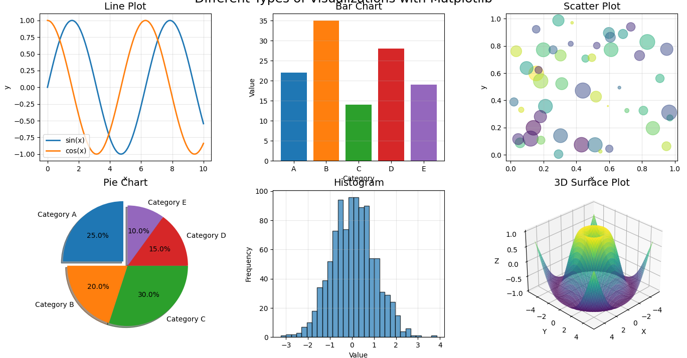
Figure 1: Different types of visualizations you can create with Matplotlib
Why visualizing data is important
Let’s think about why creating pictures from our data matters:
- Spot patterns quickly: Our brains process visual information much faster than text or numbers
- Identify outliers: Unusual data points stand out immediately in a visualization
- Tell a story: Charts help communicate your findings to others effectively
- Explore relationships: See how different variables relate to each other
- Make decisions: Visualizations can help support data-driven decisions
- Share insights: A good chart can be understood by anyone, even without technical knowledge
Understanding pyplot module
While Matplotlib has many components, we’ll focus on its most commonly used module: pyplot. Think of pyplot as your drawing canvas and toolbox all in one. This module provides an interface similar to MATLAB, making it easier for beginners to create visualizations without diving into object-oriented programming concepts immediately.
# Let's import pyplot and give it the standard alias 'plt'
import matplotlib.pyplot as plt
import numpy as np

# Create some data to plot
x = np.linspace(0, 10, 100)  # 100 points from 0 to 10
y = np.sin(x)  # Sine wave

# Create a figure and axis
fig, ax = plt.subplots()

# Plot the data
ax.plot(x, y)

# Add a title
ax.set_title('A Simple Sine Wave')

# Add labels to the axes
ax.set_xlabel('X axis')
ax.set_ylabel('Y axis')

# Display the plot
plt.show()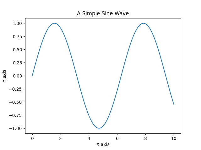
Key Insight:
Matplotlib works in a layered approach. You can think of it like painting on a canvas:
- Create a “figure” (the canvas)
- Add one or more “axes” (the areas where data is plotted)
- Use methods like
plot(),scatter(), etc. to add data - Customize with titles, labels, colors, etc.
- Display or save your masterpiece!
Plotting Graphs with Matplotlib for Data Analysis
Now let’s learn how to create the most common types of plots for data analysis. Each type of plot is best suited for specific kinds of data and questions. Just like defining functions in Python helps organize your code, choosing the right visualization helps organize your message.
Line Plot
Line plots are perfect for showing trends over time or continuous data. Let’s see how to create one:
import matplotlib.pyplot as plt
import numpy as np

# Create data - let's make a temperature over time example
days = np.arange(1, 31)  # Days 1-30
temperatures = [
    68, 70, 72, 73, 70, 69, 75, 77, 80, 82,
    81, 79, 83, 84, 85, 84, 82, 80, 77, 75,
    73, 72, 70, 68, 71, 73, 76, 78, 79, 81
]

# Create a simple line plot
plt.figure(figsize=(10, 6))  # Set the figure size (width, height in inches)
plt.plot(days, temperatures, color='red', linewidth=2)
plt.title('Daily Temperature - June 2025', fontsize=16)
plt.xlabel('Day of Month', fontsize=12)
plt.ylabel('Temperature (°F)', fontsize=12)
plt.grid(True, linestyle='--', alpha=0.7)
plt.show()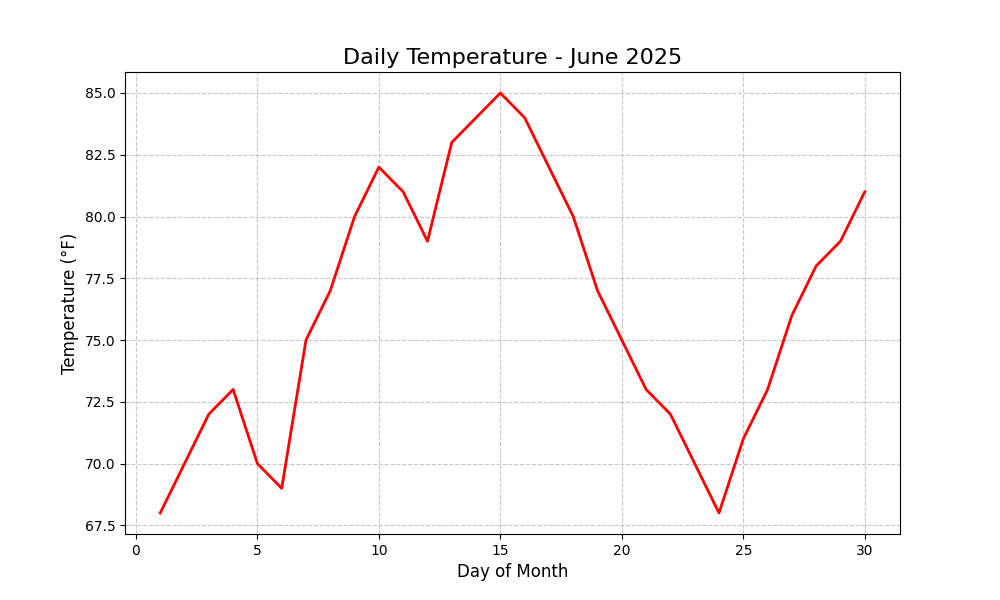
Bar Plot
Bar plots are great for comparing quantities across different categories. This is particularly useful when working with sets of categorical data:
import matplotlib.pyplot as plt

# Create some data for our bar plot
subjects = ['Math', 'Science', 'Reading', 'Writing', 'Art']
scores = [85, 92, 78, 83, 90]

# Create a bar plot
plt.figure(figsize=(10, 6))
bars = plt.bar(subjects, scores, color=['skyblue', 'lightgreen', 'salmon', 'plum', 'gold'])

# Add a title and labels
plt.title('Average Class Scores by Subject', fontsize=16)
plt.xlabel('Subject', fontsize=12)
plt.ylabel('Score', fontsize=12)

# Add value labels on top of each bar
for bar in bars:
    height = bar.get_height()
    plt.text(bar.get_x() + bar.get_width()/2., height + 1,
            str(height), ha='center', va='bottom')

# Display the plot
plt.ylim(0, 100)  # Set y-axis limits from 0 to 100
plt.show()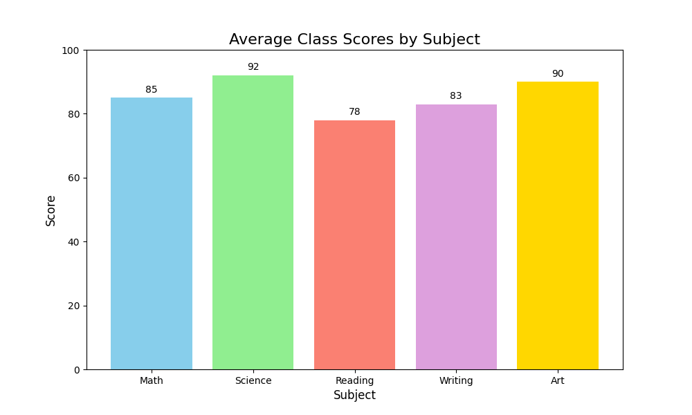
Scatter Plot
Scatter plots help us see relationships between two variables. They’re perfect for finding correlations and patterns, especially useful when you’re developing object detection models or analyzing relationships:
import matplotlib.pyplot as plt
import numpy as np

# Create some sample data
hours_studied = np.array([1, 2, 3, 4, 5, 6, 7, 8, 2.5, 4.5, 5.5, 3.5, 6.5, 3, 7, 2, 6, 9, 4, 5])
test_scores = np.array([65, 72, 78, 82, 85, 88, 90, 95, 76, 84, 87, 76, 89, 75, 93, 73, 87, 94, 80, 83])

# Create a scatter plot
plt.figure(figsize=(10, 6))
plt.scatter(hours_studied, test_scores, c='blue', alpha=0.6, s=100)

# Add title and labels
plt.title('Relationship Between Study Time and Test Scores', fontsize=16)
plt.xlabel('Hours Studied', fontsize=12)
plt.ylabel('Test Score', fontsize=12)

# Add a grid for better readability
plt.grid(True, linestyle='--', alpha=0.7)

# Let's add a trend line (linear regression)
z = np.polyfit(hours_studied, test_scores, 1)
p = np.poly1d(z)
x_line = np.linspace(hours_studied.min(), hours_studied.max(), 100)
plt.plot(x_line, p(x_line), 'r--', linewidth=2)

# Display the plot
plt.show()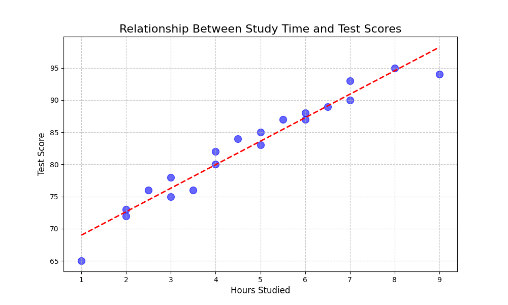
Histogram
Histograms help us understand the distribution of our data. They show how frequently values occur within certain ranges and are essential for understanding your dataset before applying any autoregressive models or other statistical techniques:
import matplotlib.pyplot as plt
import numpy as np

# Generate some random data that follows a normal distribution
np.random.seed(42)  # For reproducibility
heights = np.random.normal(170, 7, 200)  # 200 heights, mean=170cm, std=7cm

# Create a histogram
plt.figure(figsize=(10, 6))
n, bins, patches = plt.hist(heights, bins=15, color='skyblue', edgecolor='black', alpha=0.7)

# Add title and labels
plt.title('Distribution of Heights in a Population', fontsize=16)
plt.xlabel('Height (cm)', fontsize=12)
plt.ylabel('Frequency', fontsize=12)

# Add a vertical line at the mean
mean_height = np.mean(heights)
plt.axvline(mean_height, color='red', linestyle='dashed', linewidth=2)
plt.text(mean_height+1, plt.ylim()[1]*0.9, f'Mean: {mean_height:.1f} cm', color='red')

# Display the plot
plt.grid(True, axis='y', linestyle='--', alpha=0.7)
plt.show()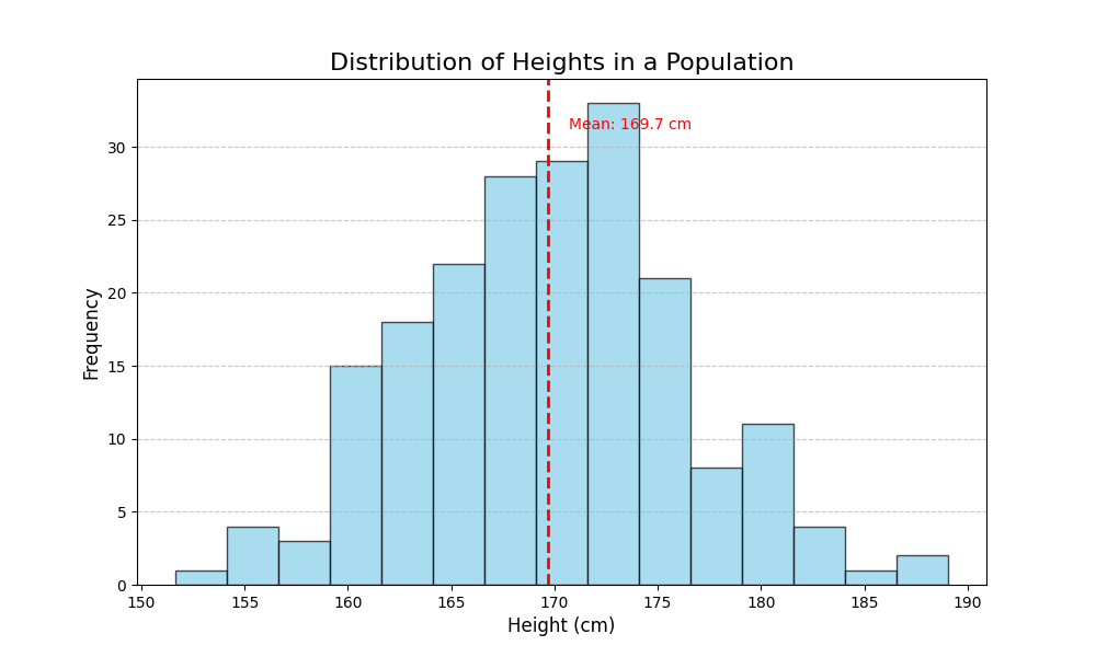
Advanced Plot Types: Heatmaps
Heatmaps are excellent for visualizing matrix data, correlations, and patterns across two dimensions. They’re particularly useful for revealing relationships between variables:
import matplotlib.pyplot as plt
import numpy as np
import pandas as pd
import seaborn as sns  # Seaborn works with Matplotlib to create nicer heatmaps

# Create a correlation matrix from some data
data = {
    'Math': [85, 90, 72, 60, 95, 80, 75],
    'Science': [92, 88, 76, 65, 90, 85, 80],
    'Reading': [78, 85, 90, 75, 70, 95, 85],
    'Writing': [80, 88, 95, 70, 75, 90, 85],
    'Art': [75, 65, 80, 85, 60, 70, 90]
}

df = pd.DataFrame(data)

# Calculate the correlation matrix
corr_matrix = df.corr()

# Create a heatmap
plt.figure(figsize=(10, 8))
sns.heatmap(corr_matrix, annot=True, cmap='coolwarm', linewidths=0.5, fmt='.2f', vmin=-1, vmax=1)
plt.title('Correlation Matrix of Subject Scores', fontsize=16)

# Display the plot
plt.tight_layout()
plt.show()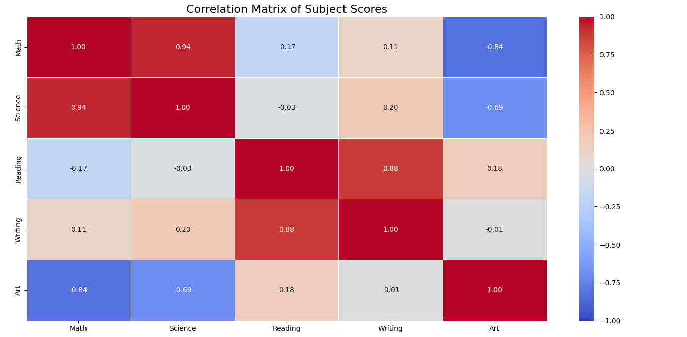
3D Plots
When you need to visualize data across three dimensions, Matplotlib provides 3D plotting capabilities that can be helpful in understanding complex relationships:
import matplotlib.pyplot as plt
from mpl_toolkits.mplot3d import Axes3D
import numpy as np

# Create some 3D data
x = np.random.standard_normal(100)
y = np.random.standard_normal(100)
z = np.random.standard_normal(100)

# Create a 3D scatter plot
fig = plt.figure(figsize=(10, 8))
ax = fig.add_subplot(111, projection='3d')

# Create the scatter plot
scatter = ax.scatter(x, y, z, c=z, cmap='viridis', marker='o', s=50, alpha=0.8)

# Add labels and title
ax.set_xlabel('X-axis', fontsize=12)
ax.set_ylabel('Y-axis', fontsize=12)
ax.set_zlabel('Z-axis', fontsize=12)
ax.set_title('3D Scatter Plot', fontsize=16)

# Add a color bar to show the scale
fig.colorbar(scatter, ax=ax, label='Z Value')

# Display the plot
plt.tight_layout()
plt.show()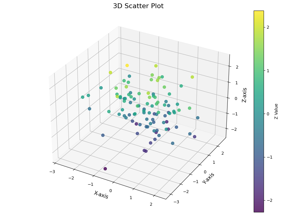
Try it yourself!
Here’s an interactive playground where you can try creating your own visualizations with Matplotlib:
How to Customize Your Plots in Matplotlib
The real power of Matplotlib comes from being able to customize your plots to make them look exactly how you want. Understanding these customizations is key to mastering error management in your visualizations and creating publication-quality figures.
Changing color, style, and size
Matplotlib gives you complete control over the look of your visualizations:
import matplotlib.pyplot as plt
import numpy as np

# Create some data
x = np.linspace(0, 10, 100)
y1 = np.sin(x)
y2 = np.cos(x)

# Create a figure with a specific size and background color
plt.figure(figsize=(12, 6), facecolor='#f5f5f5')

# Plot multiple lines with different styles
plt.plot(x, y1, color='#ff7f0e', linestyle='-', linewidth=3, label='Sine')
plt.plot(x, y2, color='#1f77b4', linestyle='--', linewidth=3, label='Cosine')

# Customize the grid
plt.grid(True, linestyle=':', linewidth=1, alpha=0.7)

# Add a title with custom font properties
plt.title('Sine and Cosine Waves', fontsize=20, fontweight='bold', pad=20)

# Customize axis labels
plt.xlabel('X axis', fontsize=14, labelpad=10)
plt.ylabel('Y axis', fontsize=14, labelpad=10)

# Add a legend with custom position and style
plt.legend(loc='upper right', frameon=True, framealpha=0.9, shadow=True, fontsize=12)

# Customize the tick marks
plt.xticks(fontsize=12)
plt.yticks(fontsize=12)

# Add plot spines (the box around the plot)
for spine in plt.gca().spines.values():
    spine.set_linewidth(2)
    spine.set_color('#333333')

# Set axis limits
plt.xlim(0, 10)
plt.ylim(-1.5, 1.5)

# Show the plot
plt.tight_layout()  # Adjust the padding between and around subplots
plt.show()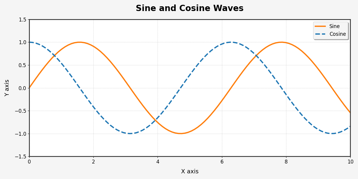
Adding annotations and text to graphs
Annotations help explain your data and highlight important points. This is a crucial skill for creating data visualization dashboards:
import matplotlib.pyplot as plt
import numpy as np

# Create some data - monthly sales data
months = ['Jan', 'Feb', 'Mar', 'Apr', 'May', 'Jun', 'Jul', 'Aug', 'Sep', 'Oct', 'Nov', 'Dec']
sales = [10500, 11200, 12900, 13400, 14100, 15300, 16000, 17500, 18200, 17100, 16500, 19000]

# Create the figure and axis
fig, ax = plt.subplots(figsize=(12, 6))

# Plot the data
ax.plot(months, sales, marker='o', linewidth=2, color='#3498db')

# Add a title and labels
ax.set_title('Monthly Sales - 2025', fontsize=16)
ax.set_xlabel('Month', fontsize=12)
ax.set_ylabel('Sales ($)', fontsize=12)

# Find the month with highest sales
max_sales_idx = sales.index(max(sales))
max_sales_month = months[max_sales_idx]
max_sales_value = sales[max_sales_idx]

# Annotate the highest point
ax.annotate(f'Highest: ${max_sales_value:,}',
             xy=(max_sales_idx, max_sales_value),
             xytext=(max_sales_idx-1, max_sales_value+1500),
             arrowprops=dict(facecolor='red', shrink=0.05, width=2),
             fontsize=12, color='red')

# Shade the summer months (Jun-Aug)
summer_start = months.index('Jun')
summer_end = months.index('Aug')
ax.axvspan(summer_start-0.5, summer_end+0.5, alpha=0.2, color='yellow')
ax.text(summer_start+1, min(sales)+500, 'Summer', ha='center', fontsize=10)

# Add a horizontal line for the average sales
avg_sales = sum(sales) / len(sales)
ax.axhline(avg_sales, linestyle='--', color='gray')
ax.text(0, avg_sales+500, f'Average: ${avg_sales:,.0f}', color='gray')

# Add a text box with additional information
textstr = 'Key Insights:\n'
textstr += f'• Highest month: {max_sales_month}\n'
textstr += f'• Total annual sales: ${sum(sales):,}\n'
textstr += f'• Year-over-year growth: +12.5%'

props = dict(boxstyle='round', facecolor='white', alpha=0.7)
ax.text(0.02, 0.02, textstr, transform=ax.transAxes, fontsize=10,
        verticalalignment='bottom', bbox=props)

# Show the grid and plot
ax.grid(True, linestyle='--', alpha=0.7)
plt.tight_layout()
plt.show()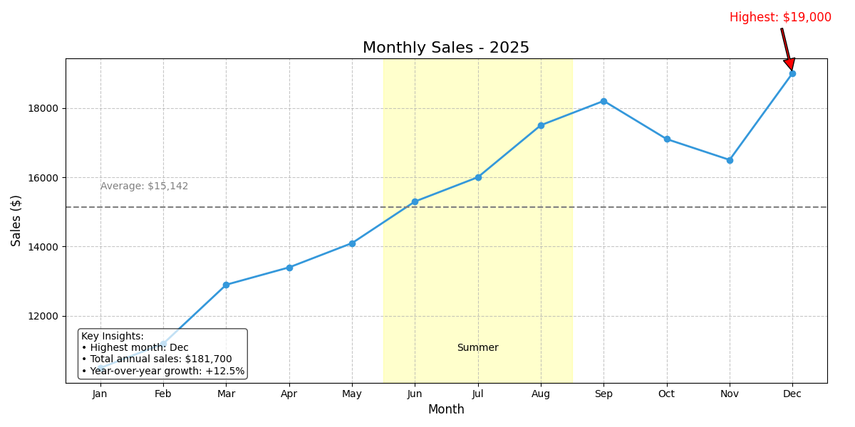
Multiple Subplots and Advanced Layouts
For complex data visualization needs, you can create layouts with multiple plots using subplots. This is particularly useful when answering common Python interview questions about data visualization:
import matplotlib.pyplot as plt
import numpy as np

# Create some data
x = np.linspace(0, 10, 100)
y1 = np.sin(x)
y2 = np.cos(x)
y3 = np.tan(x)
y4 = np.exp(-x/10) * np.sin(x)

# Create a figure with subplots
fig = plt.figure(figsize=(14, 10))
fig.suptitle('Multiple Plot Types in One Figure', fontsize=20, fontweight='bold')

# Line plot (top left)
ax1 = fig.add_subplot(2, 2, 1)  # 2 rows, 2 columns, 1st position
ax1.plot(x, y1, 'b-', linewidth=2)
ax1.set_title('Sine Wave', fontsize=14)
ax1.set_xlabel('X')
ax1.set_ylabel('sin(x)')
ax1.grid(True, linestyle='--', alpha=0.7)

# Scatter plot (top right)
ax2 = fig.add_subplot(2, 2, 2)
ax2.scatter(x[::5], y2[::5], color='red', alpha=0.7, s=50)
ax2.set_title('Cosine Values', fontsize=14)
ax2.set_xlabel('X')
ax2.set_ylabel('cos(x)')
ax2.grid(True, linestyle='--', alpha=0.7)

# Bar plot (bottom left)
ax3 = fig.add_subplot(2, 2, 3)
x_sample = x[::10]  # Take fewer points to make the bar chart readable
y_sample = y3[::10]
# Filter out values that are too large or too small
valid_indices = (y_sample > -5) & (y_sample < 5)
ax3.bar(x_sample[valid_indices], y_sample[valid_indices], color='green', alpha=0.7)
ax3.set_title('Tangent Values (Limited Range)', fontsize=14)
ax3.set_xlabel('X')
ax3.set_ylabel('tan(x)')
ax3.set_ylim(-5, 5)

# Filled line plot (bottom right)
ax4 = fig.add_subplot(2, 2, 4)
ax4.fill_between(x, y4, color='purple', alpha=0.3)
ax4.plot(x, y4, color='purple', linewidth=2)
ax4.set_title('Damped Sine Wave', fontsize=14)
ax4.set_xlabel('X')
ax4.set_ylabel('e^(-x/10) * sin(x)')
ax4.grid(True, linestyle='--', alpha=0.7)

# Adjust spacing between subplots
plt.tight_layout()
plt.subplots_adjust(top=0.9)  # Make room for suptitle

# Display the figure
plt.show()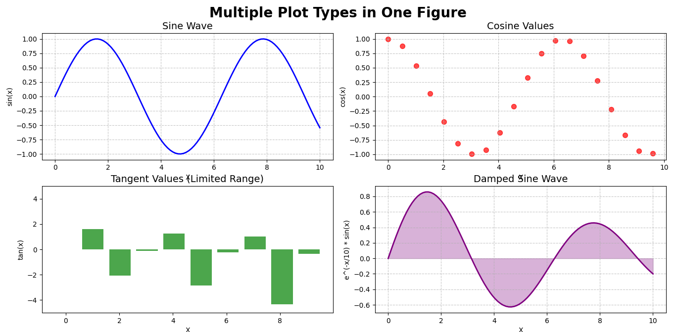
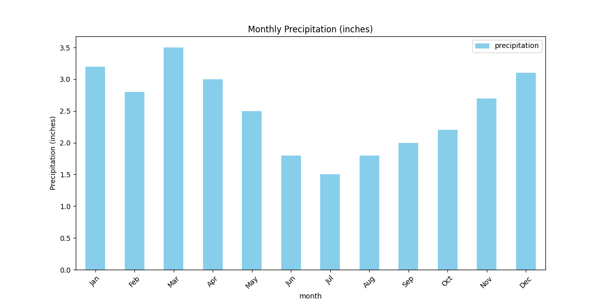
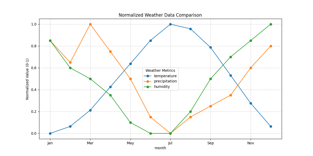
Using Matplotlib to Visualize DataFrames from Pandas
Pandas and Matplotlib work great together! Pandas provides built-in plotting functions that are actually powered by Matplotlib behind the scenes. This integration lets you create visualizations directly from your dataframes without additional code.
Plotting directly from DataFrames: .plot()
Let’s see how easy it is to create plots directly from Pandas DataFrames. This is particularly useful when you’re working with Python packages for data analysis:
import pandas as pd
import matplotlib.pyplot as plt
# Create a sample DataFrame with some weather data
data = {
'month': ['Jan', 'Feb', 'Mar', 'Apr', 'May', 'Jun', 'Jul', 'Aug', 'Sep', 'Oct', 'Nov', 'Dec'],
'temperature': [35, 38, 45, 55, 65, 75, 82, 80, 72, 60, 48, 38],
'precipitation': [3.2, 2.8, 3.5, 3.0, 2.5, 1.8, 1.5, 1.8, 2.0, 2.2, 2.7, 3.1],
'humidity': [65, 60, 58, 55, 50, 48, 48, 52, 58, 62, 65, 68]
}
df = pd.DataFrame(data)
# 1. Line plot: Temperature by month
plt.figure(figsize=(12, 6))
df.plot(x='month', y='temperature', kind='line', marker='o', color='red',
grid=True, title='Monthly Temperature (°F)', figsize=(12, 6))
plt.ylabel('Temperature (°F)')
plt.show()
# 2. Bar plot: Precipitation by month
df.plot(x='month', y='precipitation', kind='bar', color='skyblue',
title='Monthly Precipitation (inches)', figsize=(12, 6))
plt.ylabel('Precipitation (inches)')
plt.xticks(rotation=45)
plt.show()
# 3. Multiple series on the same plot
# First, normalize the data to a common scale
df_normalized = df.copy()
for column in ['temperature', 'precipitation', 'humidity']:
df_normalized[column] = (df[column] - df[column].min()) / (df[column].max() - df[column].min())
df_normalized.plot(x='month', y=['temperature', 'precipitation', 'humidity'],
kind='line', marker='o', figsize=(12, 6),
title='Normalized Weather Data Comparison')
plt.ylabel('Normalized Value (0-1)')
plt.legend(title='Weather Metrics')
plt.grid(True, linestyle='--', alpha=0.7)
plt.show()
# 4. Scatter plot: Temperature vs. Humidity
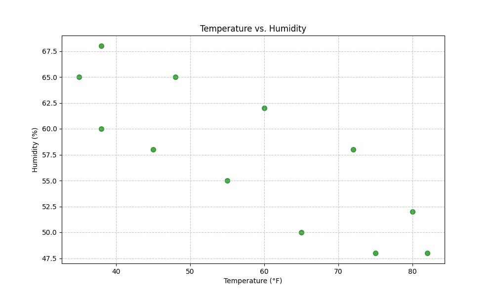
df.plot(x='temperature', y='humidity', kind='scatter',
color='green', s=50, alpha=0.7, figsize=(10, 6),
title='Temperature vs. Humidity')
plt.xlabel('Temperature (°F)')
plt.ylabel('Humidity (%)')
plt.grid(True, linestyle='--', alpha=0.7)
plt.show()
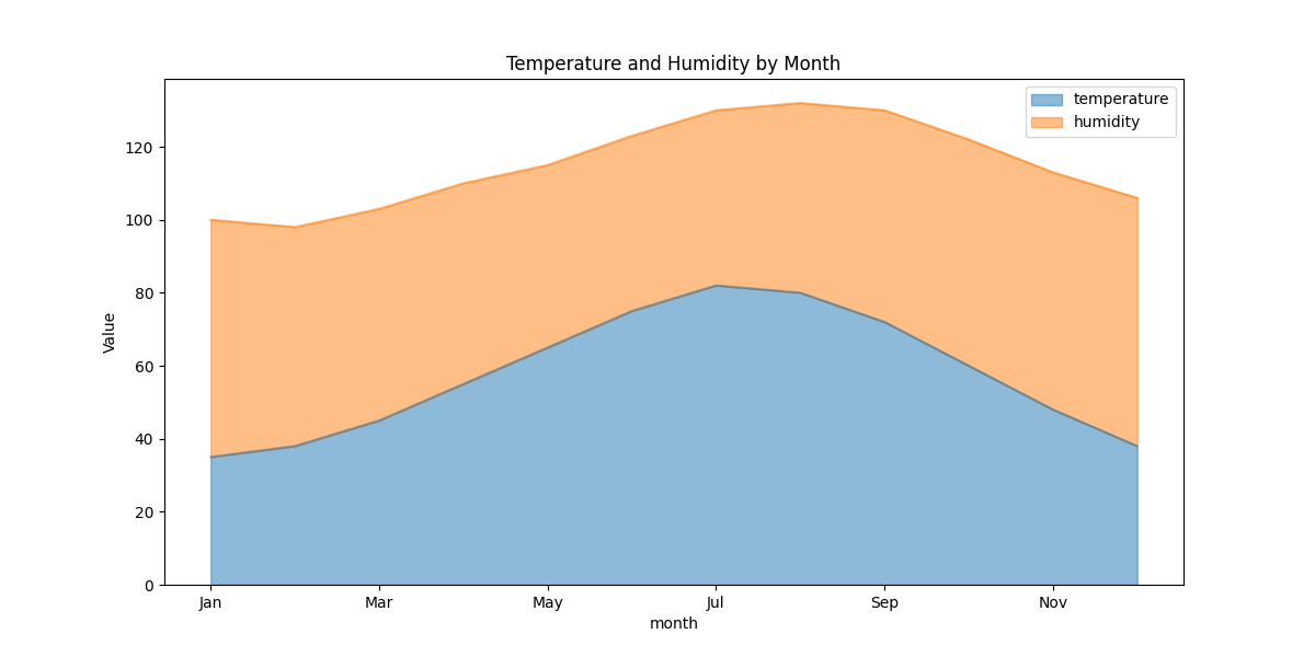
# 5. Area plot: Stacked visualization
weather_summary = df[['month', 'temperature', 'humidity']].set_index('month')
weather_summary.plot(kind='area', stacked=True, alpha=0.5, figsize=(12, 6),
title='Temperature and Humidity by Month')
plt.ylabel('Value')
plt.show()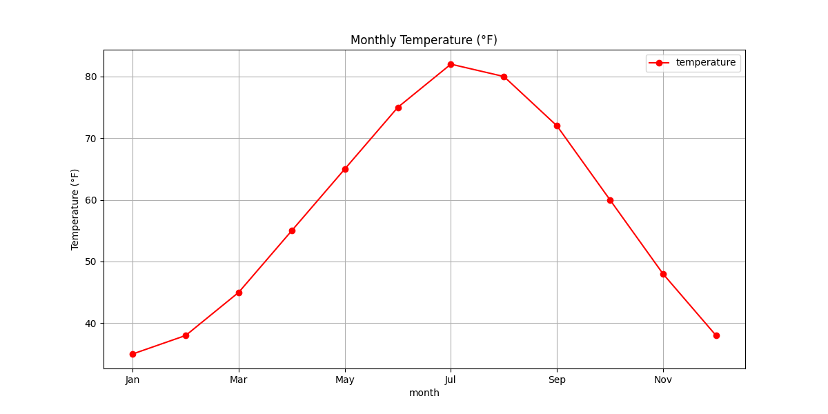
Saving Your Visualizations
Once you’ve created the perfect visualization, you’ll want to save it for reports, presentations, or websites. Matplotlib provides several ways to save your plots in various formats:
import matplotlib.pyplot as plt
import numpy as np

# Create a simple plot to save
x = np.linspace(0, 10, 100)
y = np.sin(x)

plt.figure(figsize=(10, 6))
plt.plot(x, y, linewidth=2, color='blue')
plt.title('Sine Wave', fontsize=16)
plt.xlabel('X axis', fontsize=12)
plt.ylabel('Y axis', fontsize=12)
plt.grid(True, linestyle='--')

# Save the plot in different formats
# 1. Save as PNG (good for web)
plt.savefig('sine_wave.png', dpi=300, bbox_inches='tight')

# 2. Save as PDF (vector format, good for publications)
plt.savefig('sine_wave.pdf', bbox_inches='tight')

# 3. Save as SVG (vector format, good for web)
plt.savefig('sine_wave.svg', bbox_inches='tight')

# 4. Save as JPG with specific quality
plt.savefig('sine_wave.jpg', dpi=300, quality=90, bbox_inches='tight')

# Display the plot
plt.show()

print("Plot saved in PNG, PDF, SVG, and JPG formats!")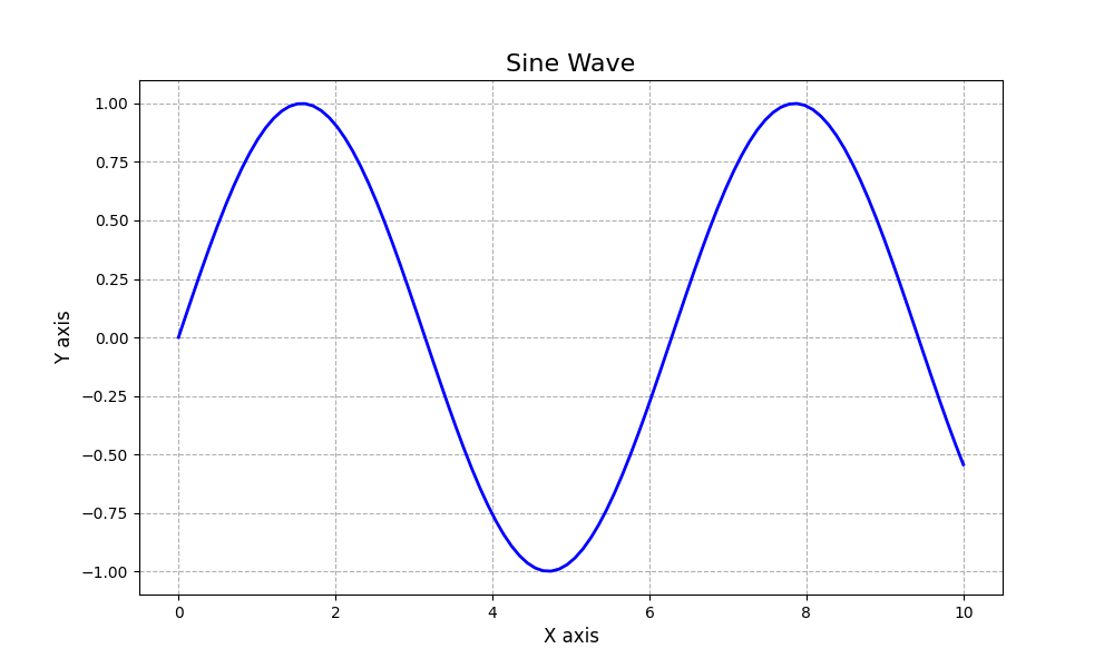
Plot saved in PNG, PDF, SVG, and JPG formats!
Key Insight:
When saving plots for different purposes:
- PNG: Best for web and presentations with transparent backgrounds
- PDF/SVG: Vector formats that look sharp at any size, ideal for publications
- JPG: Smaller file size, good for web but doesn’t support transparency
- Use
dpi=300or higher for high-resolution images - Always use
bbox_inches='tight'to ensure no labels are cut off
Conclusion
Matplotlib is an incredibly powerful tool for data visualization in Python. From simple line plots to complex multi-panel figures, it provides all the tools you need to create beautiful, informative visualizations. Combined with NumPy and Pandas, it forms a complete toolkit for data analysis.
Now that you’ve mastered the basics of NumPy, Pandas, and Matplotlib, you’re well-equipped to tackle real-world data analysis problems. These libraries work together smoothly to help you process, analyze, and visualize data effectively. Continue practicing with these tools, and you’ll become a data visualization expert in no time!
Best Practices for NumPy, Pandas, and Matplotlib
Writing efficient, readable, and maintainable code is just as important as getting the right results. Let’s explore some best practices for working with NumPy, Pandas, and Matplotlib to improve your data analysis workflow.
Use Vectorized Operations
One of the greatest strengths of NumPy and Pandas is their ability to perform vectorized operations. Vectorization means applying operations to entire arrays at once instead of using loops, which is both faster and more readable.
Vectorized operations are often 10-100x faster than their loop-based equivalents, especially for large datasets. They also make your code more concise and readable.
import numpy as np

# Create a sample array
data = np.array([1, 2, 3, 4, 5])

# Non-vectorized approach (slow)
result = np.zeros_like(data)
for i in range(len(data)):
result[i] = data[i] ** 2 + 3 * data[i] - 1import numpy as np
# Create a sample array
data = np.array([1, 2, 3, 4, 5])
# Vectorized approach (fast)
result = data ** 2 + 3 * data - 1
# For Pandas DataFrames
import pandas as pd
df = pd.DataFrame({'A': [1, 2, 3, 4, 5]})
# Vectorized operations on DataFrame columns
df['B'] = df['A'] ** 2 + 3 * df['A'] - 1Understand Copy vs. View
When working with NumPy arrays and Pandas DataFrames, it’s crucial to understand the difference between creating a view (reference) of an existing object and creating a copy of it.
Modifying a view also modifies the original data, which can lead to unexpected behavior if you’re not aware of it. On the other hand, creating unnecessary copies can waste memory.
import numpy as np

# Original array
original = np.array([1, 2, 3, 4, 5])

# Creating a view (just a different "window" to the same data)
view = original[1:4]  # view contains [2, 3, 4]
view[0] = 10  # Modifies original array too!
print(original)  # [1, 10, 3, 4, 5]

# Creating a copy (completely separate data)
copy = original.copy()
copy[0] = 100  # Doesn't affect original
print(original) # [1, 10, 3, 4, 5] (unchanged)import pandas as pd
# Original DataFrame
df = pd.DataFrame({'A': [1, 2, 3], 'B': [4, 5, 6]})
# Creating a view or a copy (behavior can be complex in Pandas)
# Assigning to a subset can trigger SettingWithCopyWarning
subset = df[df['A'] > 1] # May be a view or a copy
subset['B'] = 0 # Might modify df or might not!
# Safer approach: use .loc for assignment
df.loc[df['A'] > 1, 'B'] = 0 # Clear intent, no warning
# Explicit copy
df_copy = df.copy()
df_copy['A'] = df_copy['A'] * 2Use Pandas Index and MultiIndex Effectively
Proper indexing in Pandas can make your data easier to work with, more memory-efficient, and faster to query. Using meaningful indices can also make your code more readable and self-documenting.
Well-structured indices make it easier to slice, filter, and join data. They also help with groupby operations and make your code more intuitive.
import pandas as pd

# Without a meaningful index
df_basic = pd.DataFrame({
    'country': ['USA', 'Canada', 'Mexico', 'USA', 'Canada', 'Mexico'],
    'year': [2020, 2020, 2020, 2021, 2021, 2021],
    'gdp': [21.4, 1.6, 1.1, 23.0, 1.7, 1.3]
})

# With a meaningful index
df_indexed = pd.DataFrame({
    'gdp': [21.4, 1.6, 1.1, 23.0, 1.7, 1.3]
}, index=pd.MultiIndex.from_arrays(
    [['USA', 'Canada', 'Mexico', 'USA', 'Canada', 'Mexico'],
     [2020, 2020, 2020, 2021, 2021, 2021]],
    names=['country', 'year']
))

# Query with MultiIndex
print(df_indexed.loc[('USA', 2020)])  # Get USA data for 2020
print(df_indexed.loc['Canada'])      # Get all Canada data

# Use index for groupby operations
country_means = df_indexed.groupby(level='country').mean()
year_growth = df_indexed.groupby(level='year').sum()Use Matplotlib Styles for Consistent Visualizations
Matplotlib provides style sheets that help you create visually consistent and professional-looking plots with minimal code. Using styles can dramatically improve the appearance of your visualizations.
Consistent styling makes your visualizations more professional and readable. It also saves time by eliminating the need to customize each plot individually.
import matplotlib.pyplot as plt
import numpy as np

# Available styles
print(plt.style.available)  # List all available styles

# Set a style for all subsequent plots
plt.style.use('seaborn-v0_8-darkgrid')  # Modern, clean style

# Create some data
x = np.linspace(0, 10, 100)
y1 = np.sin(x)
y2 = np.cos(x)

# Create a plot with the selected style
plt.figure(figsize=(10, 6))
plt.plot(x, y1, label='Sine')
plt.plot(x, y2, label='Cosine')
plt.title('Sine and Cosine Waves', fontsize=16)
plt.xlabel('x', fontsize=14)
plt.ylabel('y', fontsize=14)
plt.legend(fontsize=12)
plt.tight_layout()
plt.show()

# Use a style temporarily with a context manager
with plt.style.context('ggplot'):
    plt.figure(figsize=(10, 6))
    plt.plot(x, y1, label='Sine')
    plt.plot(x, y2, label='Cosine')
    plt.title('Sine and Cosine Waves (ggplot style)', fontsize=16)
    plt.legend(fontsize=12)
    plt.tight_layout()
plt.show()Use Method Chaining in Pandas
Pandas allows you to chain methods together, which can make your code more concise, readable, and reduce the need for intermediate variables.
Method chaining creates a clear data transformation pipeline, making your code easier to understand and maintain. It also reduces the number of temporary variables needed.
import pandas as pd

# Without method chaining
df = pd.read_csv('data.csv')
df_filtered = df[df['age'] > 25]
df_grouped = df_filtered.groupby('category')
df_mean = df_grouped['value'].mean()
df_sorted = df_mean.sort_values(ascending=False)
result = df_sorted.head(10)import pandas as pd
# With method chaining
result = (pd.read_csv('data.csv')
.query('age > 25') # More readable than df[df['age'] > 25]
.groupby('category')['value']
.mean()
.sort_values(ascending=False)
.head(10))
# Using the pipe method for custom functions
def normalize(data):
return (data - data.mean()) / data.std()
result = (pd.read_csv('data.csv')
.dropna()
.pipe(normalize) # Apply a custom function
.describe())Test Your Knowledge: Interactive Quiz
It’s time to test what you’ve learned about NumPy, Pandas, and Matplotlib! This interactive quiz covers key concepts from all three libraries. Try to answer each question correctly, and don’t worry if you get stuck – you can always check the solutions.
The correct answer is: “NumPy arrays are faster and more memory-efficient for numerical operations”.
NumPy arrays store elements in contiguous memory locations, which enables faster access and vectorized operations. They also use less memory than Python lists for the same amount of numeric data. These properties make NumPy arrays significantly more efficient for numerical computations, especially with large datasets.
While Python lists are dynamic and can store elements of different types, NumPy arrays are homogeneous (all elements have the same type) which enables optimizations for numerical operations.
import numpy as np
a = np.array([[1, 2, 3], [4, 5, 6]])
b = np.array([[7, 8, 9], [10, 11, 12]])
result = np.vstack((a, b))
print(result.shape)The correct answer is: (4, 3)
The np.vstack() function vertically stacks arrays, meaning it combines them along the first axis (rows). In this case:
- Array
ahas shape (2, 3) – 2 rows and 3 columns - Array
bhas shape (2, 3) – 2 rows and 3 columns - When stacked vertically, we get 4 rows and 3 columns, resulting in shape (4, 3)
The resulting array would look like:
[[1, 2, 3],
 [4, 5, 6],
 [7, 8, 9],
[10, 11, 12]].loc[] and .iloc[]?The correct answer is: “.loc[] uses labels for indexing while .iloc[] uses integer positions”
The key differences between .loc[] and .iloc[] are:
.loc[]uses label-based indexing – you select data based on the row and column labels..iloc[]uses integer-based indexing – you select data based on the integer position (0-based).
Example:
import pandas as pd

df = pd.DataFrame({
    'A': [1, 2, 3],
    'B': [4, 5, 6]
}, index=['row1', 'row2', 'row3'])

# Using .loc[] with labels
df.loc['row1', 'A']  # Returns 1

# Using .iloc[] with integer positions
df.iloc[0, 0] # Also returns 1import pandas as pd
s1 = pd.Series([1, 2, 3, 4], index=['a', 'b', 'c', 'd'])
s2 = pd.Series([10, 20, 30, 40], index=['a', 'b', 'x', 'y'])
result = s1 + s2
print(result)The correct answer shows the resulting Series with NaN values for the non-overlapping indices:
a    11.0
b    22.0
c     NaN
d     NaN
x     NaN
y     NaN
dtype: float64
When you add two Pandas Series, it performs an index-wise addition. The result will contain all indices from both Series. For indices present in both Series, the values are added together. For indices present in only one Series, the result will be NaN (Not a Number).
In this example:
- Indices ‘a’ and ‘b’ exist in both Series, so their values are added: 1+10=11, 2+20=22
- Indices ‘c’ and ‘d’ only exist in s1, so the result has NaN
- Indices ‘x’ and ‘y’ only exist in s2, so the result also has NaN
Also note that the dtype changes to float64 because NaN is a floating-point value in NumPy/Pandas.
groupby() function?The correct answer is: “Splitting the data into groups based on some criteria and applying a function to each group”
The groupby() function is a powerful feature in Pandas that follows a “split-apply-combine” pattern:
- Split: It divides the data into groups based on one or more keys
- Apply: It applies a function to each group independently
- Combine: It combines the results into a new data structure
Example:
import pandas as pd

df = pd.DataFrame({
    'Category': ['A', 'B', 'A', 'B', 'A', 'B'],
    'Value': [10, 20, 15, 25, 5, 30]
})

# Group by 'Category' and calculate the mean for each group
result = df.groupby('Category')['Value'].mean()
print(result)

# Output:
# Category
# A    10.0
# B    25.0
# Name: Value, dtype: float64plt.figure() and plt.subplot()?The correct answer is: “plt.figure() creates a new figure window while plt.subplot() creates an axes within a figure”
In Matplotlib, there’s a hierarchy of objects:
- Figure: The overall window or page that contains everything
- Axes: The area where data is plotted with its own coordinate system
plt.figure() creates a new figure (window/page) that can contain one or more axes.
plt.subplot() creates a single axes (plotting area) within the current figure.
Example of using multiple subplots within a figure:
import matplotlib.pyplot as plt
import numpy as np

# Create a figure
plt.figure(figsize=(10, 6))

# Create first subplot (top)
plt.subplot(2, 1, 1)  # 2 rows, 1 column, first subplot
x = np.linspace(0, 10, 100)
plt.plot(x, np.sin(x))
plt.title('Sine Wave')

# Create second subplot (bottom)
plt.subplot(2, 1, 2)  # 2 rows, 1 column, second subplot
plt.plot(x, np.cos(x))
plt.title('Cosine Wave')

plt.tight_layout()  # Adjust spacing between subplots
plt.show()The correct answer is: “Histogram”
A histogram is the most appropriate plot type for showing the distribution of a single continuous variable. Histograms divide the data into bins (intervals) and count how many values fall into each bin, showing the overall shape, center, and spread of the distribution.
Other plot types have different purposes:
- Scatter plots show the relationship between two continuous variables
- Line plots typically show trends over time or some other continuous sequence
- Pie charts show proportions of a whole for categorical data
Example of creating a histogram in Matplotlib:
import matplotlib.pyplot as plt
import numpy as np

# Generate some random data
data = np.random.normal(loc=0, scale=1, size=1000)

# Create a histogram
plt.figure(figsize=(10, 6))
plt.hist(data, bins=30, alpha=0.7, color='skyblue', edgecolor='black')
plt.title('Normal Distribution')
plt.xlabel('Value')
plt.ylabel('Frequency')
plt.grid(alpha=0.3)
plt.show()import numpy as np
a = np.array([1, 2, 3, 4, 5])
b = np.array([5, 4, 3, 2, 1])
result = np.where(a > b, a, b)
print(result)The correct answer is: [5, 4, 3, 4, 5]
The np.where(condition, x, y) function returns elements from x or y depending on the condition. It works element-wise:
- If the condition is True, it takes the element from
x - If the condition is False, it takes the element from
y
Let’s break down the execution step by step:
- The condition
a > bgives: [False, False, False, True, True] - For each element:
- 1st element: False, so take from b: 5
- 2nd element: False, so take from b: 4
- 3rd element: False, so take from b: 3
- 4th element: True, so take from a: 4
- 5th element: True, so take from a: 5
- Result: [5, 4, 3, 4, 5]
The np.where function is very useful for conditional operations on arrays and is much faster than using loops with if-else statements.
import pandas as pd

df = pd.DataFrame({
    'A': [1, 2, None, 4],
    'B': [5, None, 7, 8],
    'C': [9, 10, 11, None]
})

result = df.fillna(df.mean())The correct answer is: “Replaces NaN values with the mean of each column”
The fillna() method in Pandas is used to replace missing values (NaN) with a specified value. In this case, df.mean() calculates the mean of each column, and those values are used to fill in the missing values in their respective columns.
Let’s see the step-by-step execution:
- First,
df.mean()calculates the column means:A 2.333333 B 6.666667 C 10.000000 dtype: float64 - Then
fillna()replaces each NaN with the mean of its column:A B C 0 1.0 5.000000 9.0 1 2.0 6.666667 10.0 2 2.333333 7.000000 11.0 3 4.0 8.000000 10.0
This is a common technique in data preprocessing to handle missing values, particularly when you want to preserve the statistical properties of the data. Other strategies include using the median, mode, or specific constants to fill missing values.
The correct answer is: “Heatmap”
A heatmap is the most appropriate visualization for showing correlations between multiple variables. This is typically done by displaying a correlation matrix where each cell shows the correlation coefficient between two variables, and color intensity represents the strength of the correlation.
Other visualization types have different purposes:
- Pie charts show proportions of a whole (relative sizes of categories)
- Bar charts compare quantities across different categories
- Histograms show the distribution of a single variable
Example of creating a correlation heatmap using Matplotlib and Seaborn:
import pandas as pd
import numpy as np
import matplotlib.pyplot as plt
import seaborn as sns

# Create a sample dataset
df = pd.DataFrame({
    'A': np.random.randn(100),
    'B': np.random.randn(100),
    'C': np.random.randn(100),
    'D': np.random.randn(100)
})

# Add some correlation
df['B'] = df['A'] * 0.8 + df['B'] * 0.2
df['D'] = -df['C'] * 0.7 + df['D'] * 0.3

# Calculate correlation matrix
corr_matrix = df.corr()

# Create a heatmap
plt.figure(figsize=(8, 6))
sns.heatmap(corr_matrix, annot=True, cmap='coolwarm', vmin=-1, vmax=1, linewidths=0.5)
plt.title('Correlation Matrix')
plt.tight_layout()
plt.show()
In this example, the heatmap clearly shows which variables are positively correlated (closer to 1), negatively correlated (closer to -1), or have no correlation (closer to 0).
Conclusion: Your Journey to Data Analysis Mastery
Congratulations! You’ve now explored the powerful trio of NumPy, Pandas, and Matplotlib – the core Python libraries that form the foundation of data analysis. From handling numerical data with NumPy arrays to data manipulation with Pandas DataFrames to creating insightful visualizations with Matplotlib, you now have the essential tools to tackle real-world data challenges.
What We’ve Learned
Throughout this guide, we’ve covered a comprehensive journey from basic to advanced concepts:
- NumPy: We started with NumPy’s powerful array operations, learning how to create, manipulate, and perform calculations on multi-dimensional arrays. NumPy’s efficient memory usage and vectorized operations make it the perfect foundation for numerical computing.
- Pandas: We then explored Pandas, which builds on NumPy to provide high-level data structures and functions designed specifically for data analysis. We covered Series and DataFrame objects, data cleaning techniques, grouping operations, and how to handle time series data.
- Matplotlib: Finally, we learned how Matplotlib helps us visualize our data through various plot types, from simple line plots to complex heatmaps and 3D visualizations. We discovered how to customize our plots to effectively communicate our findings.
Most importantly, we saw how these libraries work together in our COVID-19 data analysis example, demonstrating a complete data analysis workflow from importing and cleaning data to generating insightful visualizations.
Why This Matters
Data is everywhere, and the ability to analyze and visualize it is becoming an essential skill across nearly every industry. By mastering NumPy, Pandas, and Matplotlib, you’ve equipped yourself with tools that:
- Enable you to make data-driven decisions
- Help you discover patterns and insights in complex datasets
- Allow you to communicate your findings effectively through visualizations
- Serve as the foundation for more advanced data science and machine learning
Whether you’re analyzing financial data, scientific measurements, user behavior, or any other type of data, the skills you’ve learned here will prove invaluable.
Remember: Practice Makes Perfect
The most important step in mastering data analysis is consistent practice. Keep working with different datasets, challenging yourself with new problems, and sharing your insights with others. The NumPy, Pandas, and Matplotlib documentation is exceptionally well-written and should be your go-to reference as you continue learning.
Don’t be afraid to experiment, make mistakes, and learn from them. Data analysis is as much an art as it is a science, and your skills will grow with each dataset you explore.
We hope this guide has provided you with a solid foundation for your data analysis journey. Now go forth and extract insights from your data!
Frequently Asked Questions
Below you’ll find answers to common questions about NumPy, Pandas, and Matplotlib. Click on any question to see its answer.
While both NumPy arrays and Python lists can store collections of data, they have several key differences:
- Homogeneous vs. Heterogeneous: NumPy arrays store elements of the same data type, while Python lists can store different data types.
- Memory Efficiency: NumPy arrays are more memory-efficient for numerical data.
- Performance: NumPy operations are implemented in C, making them much faster than equivalent operations on Python lists.
- Functionality: NumPy arrays have many built-in mathematical operations that operate on the entire array without explicit loops.
Example of vectorized operations with NumPy:
import numpy as np

# NumPy array
arr = np.array([1, 2, 3, 4, 5])
result_arr = arr * 2  # [2, 4, 6, 8, 10]

# Python list
lst = [1, 2, 3, 4, 5]
result_lst = [x * 2 for x in lst]  # Requires a loop
Reshaping a NumPy array changes its dimensions without changing its data. You can use the reshape() method or the shape attribute:
import numpy as np

# Create a 1D array
arr = np.array([1, 2, 3, 4, 5, 6])

# Reshape to 2x3 array (2 rows, 3 columns)
reshaped1 = arr.reshape(2, 3)
print(reshaped1)
# Output:
# [[1 2 3]
#  [4 5 6]]

# Another way to reshape
reshaped2 = np.reshape(arr, (3, 2))
print(reshaped2)
# Output:
# [[1 2]
#  [3 4]
#  [5 6]]

# Using -1 lets NumPy calculate that dimension
reshaped3 = arr.reshape(2, -1)  # 2 rows, columns calculated automatically
print(reshaped3)
# Output:
# [[1 2 3]
#  [4 5 6]]
Remember that the total number of elements must remain the same after reshaping.
NumPy provides many functions to create arrays with specific patterns:
import numpy as np

# Array of zeros
zeros = np.zeros((3, 4))  # 3x4 array of zeros

# Array of ones
ones = np.ones((2, 3))  # 2x3 array of ones

# Array with a constant value
constant = np.full((2, 2), 7)  # 2x2 array of 7s

# Identity matrix
identity = np.eye(3)  # 3x3 identity matrix

# Evenly spaced values
linear = np.linspace(0, 10, 5)  # 5 values from 0 to 10

# Evenly spaced values (by step)
arange = np.arange(0, 10, 2)  # Values from 0 to 10 with step 2

# Random numbers (uniform distribution)
uniform = np.random.random((2, 2))

# Random integers
integers = np.random.randint(1, 10, size=(3, 3))  # 3x3 random integers from 1 to 9
The choice between Series and DataFrame depends on your data structure needs:
- Series: Use when you need a one-dimensional labeled array capable of holding any data type. It’s similar to a column in a table or a 1D array with labels.
- DataFrame: Use when you need a two-dimensional labeled data structure with columns that can be of different types. It’s similar to a spreadsheet or SQL table.
General guidelines:
- Use Series for single-variable data (like a single column of observations)
- Use DataFrame for multi-variable data (like a table with multiple columns)
- Series is to DataFrame what a single column/row is to a table
import pandas as pd

# Series example - a single column of data
temperatures = pd.Series([98.6, 99.1, 97.5, 98.0],
                         index=['Patient A', 'Patient B', 'Patient C', 'Patient D'],
                         name='Temperature')

# DataFrame example - multiple columns of data
patient_data = pd.DataFrame({
    'Temperature': [98.6, 99.1, 97.5, 98.0],
    'Heart Rate': [72, 80, 68, 75],
    'Blood Pressure': ['120/80', '130/85', '115/75', '125/82']
}, index=['Patient A', 'Patient B', 'Patient C', 'Patient D'])
Handling missing data is a crucial part of data preprocessing. Pandas provides several methods:
- Detecting Missing Data
import pandas as pd import numpy as np df = pd.DataFrame({ 'A': [1, 2, np.nan, 4], 'B': [5, np.nan, np.nan, 8], 'C': [9, 10, 11, 12] }) # Check for missing values df.isnull() # Returns boolean DataFrame df.isnull().sum() # Count of missing values per column - Removing Missing Data
# Drop rows with any missing values
df_dropped = df.dropna()

# Drop rows only if all columns are missing
df_dropped_all = df.dropna(how='all')

# Drop columns with at least 2 missing values
df_dropped_thresh = df.dropna(axis=1, thresh=2)
- Filling Missing Data
# Fill with a constant value
df_filled = df.fillna(0)

# Fill with column means
df_filled_mean = df.fillna(df.mean())

# Forward fill (use previous value)
df_ffill = df.fillna(method='ffill')

# Backward fill (use next value)
df_bfill = df.fillna(method='bfill')

# Fill different columns with different values
df_filled_dict = df.fillna({'A': 0, 'B': 5})
The best approach depends on your specific dataset and analysis goals. Consider:
- The amount of missing data (if too much is missing, filling might distort the data)
- The pattern of missingness (is it random or systematic?)
- The importance of the missing values to your analysis
- The type of data (time series, categorical, numerical, etc.)
Pandas offers several ways to combine DataFrames:
- Merge: SQL-like join operations based on keys
import pandas as pd # Sample data df1 = pd.DataFrame({ 'id': [1, 2, 3, 4], 'name': ['Alice', 'Bob', 'Charlie', 'David'] }) df2 = pd.DataFrame({ 'id': [1, 2, 3, 5], 'score': [85, 92, 78, 96] }) # Inner join (default) merged_inner = pd.merge(df1, df2, on='id') # Left join merged_left = pd.merge(df1, df2, on='id', how='left') # Right join merged_right = pd.merge(df1, df2, on='id', how='right') # Outer join merged_outer = pd.merge(df1, df2, on='id', how='outer') - Concat: Appending DataFrames along an axis
# Vertical concatenation (adding rows) df3 = pd.DataFrame({ 'id': [5, 6], 'name': ['Eve', 'Frank'] }) concat_rows = pd.concat([df1, df3]) # Horizontal concatenation (adding columns) df4 = pd.DataFrame({ 'age': [25, 30, 35, 40] }, index=[0, 1, 2, 3]) concat_cols = pd.concat([df1, df4], axis=1) - Join: Index-based joining
# Set indices
df1_indexed = df1.set_index('id')
df2_indexed = df2.set_index('id')

# Join on indices
joined = df1_indexed.join(df2_indexed, how='inner')
When choosing a method:
- Use
merge()when you want to join DataFrames on specific columns - Use
concat()when you want to append DataFrames (rows to rows or columns to columns) - Use
join()when your DataFrames share an index
The difference relates to Matplotlib’s two interfaces: the state-based interface (pyplot) and the object-oriented interface:
- plt.plot(): Part of the state-based pyplot interface. It implicitly manages the creation of figures and axes. It’s more concise but less flexible for complex plots.
- ax.plot(): Part of the object-oriented interface. You explicitly create figure and axes objects, giving you more control and better organization for complex visualizations.
import matplotlib.pyplot as plt
import numpy as np

# Data
x = np.linspace(0, 10, 100)
y1 = np.sin(x)
y2 = np.cos(x)

# Using plt.plot() (state-based interface)
plt.figure(figsize=(10, 4))
plt.plot(x, y1)
plt.plot(x, y2)
plt.title('State-Based Interface')
plt.xlabel('x')
plt.ylabel('y')
plt.grid(True)
plt.show()

# Using ax.plot() (object-oriented interface)
fig, ax = plt.subplots(figsize=(10, 4))
ax.plot(x, y1)
ax.plot(x, y2)
ax.set_title('Object-Oriented Interface')
ax.set_xlabel('x')
ax.set_ylabel('y')
ax.grid(True)
plt.show()
Recommendations:
- Use
plt.plot()for simple, single plots where you don’t need fine-grained control - Use
ax.plot()for complex visualizations, subplots, or when you need to customize individual axes - The object-oriented approach is generally preferred for more complex or professional visualizations
There are several ways to create subplots in Matplotlib:
- Using plt.subplots() (most common and recommended):
import matplotlib.pyplot as plt import numpy as np # Create a figure with a 2x2 grid of subplots fig, axs = plt.subplots(2, 2, figsize=(10, 8)) # Create data x = np.linspace(0, 5, 100) # Plot on each subplot axs[0, 0].plot(x, np.sin(x)) axs[0, 0].set_title('Sine') axs[0, 1].plot(x, np.cos(x)) axs[0, 1].set_title('Cosine') axs[1, 0].plot(x, np.sin(x) * np.cos(x)) axs[1, 0].set_title('Sine * Cosine') axs[1, 1].plot(x, np.sin(x) + np.cos(x)) axs[1, 1].set_title('Sine + Cosine') # Add space between subplots plt.tight_layout() plt.show() - Using subplot with grid positions:
# Creating subplots by specifying grid position plt.figure(figsize=(10, 8)) plt.subplot(2, 2, 1) # (rows, columns, plot_number) plt.plot(x, np.sin(x)) plt.title('Sine') plt.subplot(2, 2, 2) plt.plot(x, np.cos(x)) plt.title('Cosine') plt.subplot(2, 2, 3) plt.plot(x, np.sin(x) * np.cos(x)) plt.title('Sine * Cosine') plt.subplot(2, 2, 4) plt.plot(x, np.sin(x) + np.cos(x)) plt.title('Sine + Cosine') plt.tight_layout() plt.show() - Creating subplots of different sizes with GridSpec:
import matplotlib.gridspec as gridspec

# Create figure
fig = plt.figure(figsize=(10, 8))

# Create grid specification
gs = gridspec.GridSpec(2, 3)

# Create subplots using grid cells
ax1 = fig.add_subplot(gs[0, :2])  # First row, first two columns
ax2 = fig.add_subplot(gs[0, 2])   # First row, third column
ax3 = fig.add_subplot(gs[1, :])   # Second row, all columns

# Add data
ax1.plot(x, np.sin(x))
ax1.set_title('Sine Wave')

ax2.plot(x, np.cos(x))
ax2.set_title('Cosine Wave')

ax3.plot(x, np.sin(x) + np.cos(x))
ax3.set_title('Sine + Cosine')

plt.tight_layout()
plt.show()
Matplotlib offers extensive customization options:
- Colors, Line Styles, and Markers:
import matplotlib.pyplot as plt import numpy as np x = np.linspace(0, 10, 100) plt.figure(figsize=(10, 6)) # Line color, style, width, and markers plt.plot(x, np.sin(x), color='blue', linestyle='-', linewidth=2, label='Solid') plt.plot(x, np.sin(x-1), color='red', linestyle='--', linewidth=2, label='Dashed') plt.plot(x, np.sin(x-2), color='green', linestyle='-.', linewidth=2, label='Dash-dot') plt.plot(x, np.sin(x-3), color='purple', linestyle=':', linewidth=2, label='Dotted') plt.plot(x, np.sin(x-4), color='orange', marker='o', markersize=5, linewidth=0, label='Points') # Also valid: shorthand notation # plt.plot(x, np.sin(x), 'b-') # blue solid line # plt.plot(x, np.sin(x-1), 'r--') # red dashed line # plt.plot(x, np.sin(x-2), 'g-.') # green dash-dot line plt.legend() plt.title('Line Styles and Colors') plt.xlabel('x') plt.ylabel('sine(x)') plt.grid(True) plt.show() - Axes Customization:
plt.figure(figsize=(10, 6)) plt.plot(x, np.sin(x)) # Set axis limits plt.xlim(0, 8) plt.ylim(-1.5, 1.5) # Add grid with customization plt.grid(True, linestyle='--', alpha=0.7) # Customize ticks plt.xticks(np.arange(0, 9, 2), ['Zero', 'Two', 'Four', 'Six', 'Eight'], rotation=45, fontsize=10) # Axis labels plt.xlabel('x-axis', fontsize=12, fontweight='bold') plt.ylabel('sin(x)', fontsize=12, fontweight='bold') # Title plt.title('Customized Plot', fontsize=14, fontweight='bold') plt.tight_layout() plt.show() - Using Styles and Themes:
# Available styles print(plt.style.available) # Use a specific style plt.style.use('ggplot') plt.figure(figsize=(10, 6)) plt.plot(x, np.sin(x)) plt.title('Plot with ggplot style') plt.show() # Try another style plt.style.use('seaborn-darkgrid') plt.figure(figsize=(10, 6)) plt.plot(x, np.sin(x)) plt.title('Plot with seaborn-darkgrid style') plt.show() # Reset to default style plt.style.use('default') - Text, Annotations, and Legends:
plt.figure(figsize=(10, 6))
plt.plot(x, np.sin(x), label='sin(x)')
plt.plot(x, np.cos(x), label='cos(x)')

# Add text
plt.text(5, 0.5, 'Important point', fontsize=12)

# Add annotation with arrow
plt.annotate('Local maximum', xy=(1.5, 1.0), xytext=(3, 0.5),
             arrowprops=dict(facecolor='black', shrink=0.05))

# Customize legend
plt.legend(loc='lower left', frameon=True, shadow=True, fontsize=10)

plt.title('Text and Annotations')
plt.grid(True)
plt.show()
For even more customization, look into:
- Matplotlib’s rcParams for global settings
- Figure-level and axes-level customization options
- Custom colormaps for heatmaps and contour plots
The recommended learning path is:
- NumPy first: It’s the foundation for numeric computing in Python and both Pandas and Matplotlib build on it. Understanding array operations and broadcasting will help you work efficiently with data.
- Pandas second: Once you’re comfortable with NumPy, Pandas will make more sense since it uses NumPy under the hood but provides higher-level data structures and operations specifically for data analysis.
- Matplotlib third: After you can load, process, and analyze data with NumPy and Pandas, Matplotlib allows you to visualize your results.
This progression makes logical sense because:
- Pandas is built on NumPy, so understanding NumPy helps you use Pandas more effectively
- Most Matplotlib visualizations will involve data that you’ve processed with NumPy or Pandas
- Each library adds a layer of abstraction over the previous one
Your specific goals might influence this path. For example, if you need to quickly create visualizations from existing data, you might start with Pandas and Matplotlib basics, then go back to learn NumPy in more depth.
In a typical data analysis workflow, these libraries work together seamlessly:
- Data Loading: Use Pandas to read data from various sources (CSV, Excel, databases)
- Data Cleaning & Preprocessing: Use Pandas for filtering, handling missing values, and transforming data
- Feature Engineering: Use NumPy for mathematical operations and Pandas for grouping and aggregation
- Analysis: Use NumPy for advanced calculations and Pandas for descriptive statistics
- Visualization: Use Matplotlib to create visualizations of your results
Here’s an example of a simple end-to-end workflow:
import numpy as np
import pandas as pd
import matplotlib.pyplot as plt

# 1. Load data (using Pandas)
df = pd.read_csv('data.csv')

# 2. Clean and preprocess (using Pandas)
df.dropna(inplace=True)  # Remove rows with missing values
df['new_feature'] = df['feature1'] / df['feature2']  # Create new feature

# 3. Perform calculations (using NumPy and Pandas)
category_means = df.groupby('category')['value'].mean()
z_scores = (df['value'] - df['value'].mean()) / df['value'].std()
df['z_score'] = z_scores

# 4. Analyze patterns
correlation = np.corrcoef(df['feature1'], df['feature2'])[0, 1]
print(f"Correlation: {correlation}")

# 5. Visualize results (using Matplotlib)
plt.figure(figsize=(12, 6))

# First subplot: distribution
plt.subplot(1, 2, 1)
plt.hist(df['value'], bins=20, alpha=0.7)
plt.title('Value Distribution')
plt.xlabel('Value')
plt.ylabel('Frequency')

# Second subplot: scatter plot
plt.subplot(1, 2, 2)
plt.scatter(df['feature1'], df['feature2'], c=df['z_score'], cmap='viridis', alpha=0.7)
plt.colorbar(label='Z-Score')
plt.title(f'Feature Relationship (r={correlation:.2f})')
plt.xlabel('Feature 1')
plt.ylabel('Feature 2')

plt.tight_layout()
plt.show()
This workflow seamlessly transitions between the libraries, using each one for its strengths:
- Pandas handles data structures and operations
- NumPy provides mathematical functions and efficient array operations
- Matplotlib creates the visualizations
NumPy Pitfalls:
- Broadcasting confusion – Not understanding how shapes align in operations
- View vs. copy issues – Modifying what you thought was a copy but was actually a view
- Memory issues – Creating very large arrays that consume too much memory
- Inefficient operations – Using loops instead of vectorized operations
Pandas Pitfalls:
- Chained indexing – Using expressions like
df['col'][idx]can lead to unexpected behavior - Setting with copy warning – Not understanding the SettingWithCopyWarning
- Performance with large datasets – Using inefficient methods with big data
- Ignoring data types – Not checking or setting appropriate dtypes
- Forgetting to handle missing values – Not checking for or appropriately handling NaN values
Matplotlib Pitfalls:
- Memory leaks – Not closing figures in loops
- Mixing interfaces – Mixing pyplot and object-oriented approaches
- Overcomplicated plots – Adding too much information to a single visualization
- Not using plt.show() – In some environments, forgetting this will result in no plot display
General Best Practices:
- Check your data early and often – Use
df.info(),df.describe(), anddf.head() - Chain operations carefully in Pandas – Prefer method chaining with clear parentheses
- Use .loc and .iloc for indexing in Pandas – Avoid direct bracket indexing for clarity
- Understand the differences between views and copies
- Create clean visualizations – Include titles, labels, and legends
- Handle errors gracefully – Use try/except blocks for operations that might fail
- Document your analysis with comments or in Jupyter notebooks
# Good practice examples

# 1. Vectorized operations in NumPy (good)
import numpy as np
arr = np.array([1, 2, 3, 4, 5])
result = arr * 2  # Fast, vectorized operation

# Not: (bad)
# result = np.array([x * 2 for x in arr])  # Slower, non-vectorized

# 2. Proper indexing in Pandas (good)
import pandas as pd
df = pd.DataFrame({'A': [1, 2, 3], 'B': [4, 5, 6]})
subset = df.loc[df['A'] > 1, 'B']  # Clear, explicit indexing

# Not: (bad)
# subset = df[df['A'] > 1]['B']  # Chained indexing, can cause issues

# 3. Properly closing Matplotlib figures (good)
import matplotlib.pyplot as plt
for i in range(3):
    plt.figure()
    plt.plot([1, 2, 3], [i, i+1, i+2])
    plt.title(f"Plot {i}")
    plt.savefig(f"plot_{i}.png")
    plt.close()  # Close figure to prevent memory leaks

# 4. Using the preferred object-oriented interface (good)
fig, ax = plt.subplots()
ax.plot([1, 2, 3], [4, 5, 6])
ax.set_title("My Plot")
ax.set_xlabel("X axis")
plt.show()
External Resources
To deepen your understanding of NumPy, Pandas, and Matplotlib, here are official documentation resources that provide comprehensive information, tutorials, and examples.
NumPy Documentation
The official NumPy documentation provides comprehensive guides, API references, and examples for working with numerical data in Python.
Pandas Documentation
The official Pandas documentation offers detailed guides, API references, and examples for data manipulation and analysis in Python.
Matplotlib Tutorials
The official Matplotlib tutorials provide comprehensive guides to creating visualizations, customizing plots, and mastering the visualization library.


Leave a Reply