

Underrated Data Visualization Tools You Need to Master in 2025
Introduction
Data visualization tools are important for data scientists. They help turn raw data into clear insights. In 2025, we are using interactive charts, big data visualization, and AI-powered dashboards more than ever. While tools like Matplotlib, Seaborn, and Plotly are popular, some lesser-known tools can make your work faster, easier, and more powerful.
In this guide, let’s explore underrated but highly effective data visualization tools. These tools help you handle big datasets, create interactive dashboards, and build 3D visualizations. Adding them to your skill set can make you stand out. Whether you work with Python, Jupyter Notebooks, or web-based visualizations, these tools will enhance how you analyze and present data.
Let’s explore the best underrated tools every data scientist should master in 2025!
1. Datashader – Scalable Visualizations for Big Data
We know that working with big data for visualization is not easy. Usually, we use Matplotlib or Seaborn, but these tools struggle with millions or billions of data points. That’s why we need Datashader.
What is Datashader?
Datashader is a Python library designed for big data visualization. Traditional plotting libraries try to draw every data point, but this is not efficient for large datasets. Datashader works differently—it processes and aggregates the data, so even huge datasets can be visualized clearly and efficiently.
Why is Datashader Underrated?
Now, Let’s see why many data scientists miss out on this powerful tool.
- Less Popular Than Matplotlib or Seaborn – People stick with familiar tools, so Datashader doesn’t get much attention.
- Works Differently from Traditional Tools – Instead of plotting every data point, Datashader first processes and aggregates data. This can feel complex for beginners.
- Best Used with Other Libraries – Datashader works best with Pandas, Dask, or Holoviews, but many people don’t know how to integrate them.
Even with these challenges, Datashader is a must-learn tool in 2025 for handling big data visualization efficiently.
How Does Datashader Work?
Datashader creates fast and scalable visualizations in three steps:
- Data Preparation – It processes raw data using Pandas or Dask.
- Aggregation – Summarizes the data using density maps instead of plotting every point.
- Rendering – It converts the data into a clear and optimized image.
This method makes Datashader faster and more efficient than traditional visualization tools.
Key Features of Datashader
- Handles Huge Data – Works well with billions of data points for big data analysis.
- Smart Data Grouping – Adjusts plots automatically to keep them clear, even with large datasets.
- Fast and Powerful – Uses GPU acceleration for quick rendering.
- Works with Other Tools – Can be used with Matplotlib, Plotly, Bokeh, and Holoviews for interactive charts.
Example: Visualizing 10 Million Points with Datashader
Let’s see how powerful Datashader is by creating a scatter plot with 10 million points using Pandas and Datashader. If we used Matplotlib, the plot would take too long to load. But with Datashader, it works smoothly and quickly.
Python Code for Datashader Visualization
import numpy as np
import pandas as pd
import datashader as ds
import datashader.transfer_functions as tf
import matplotlib.pyplot as plt

# Generate a large dataset
np.random.seed(42)
n = 10_000_000  # 10 million points
df = pd.DataFrame({'x': np.random.randn(n), 'y': np.random.randn(n)})

# Create Datashader canvas
canvas = ds.Canvas(plot_width=800, plot_height=800)
agg = canvas.points(df, 'x', 'y', ds.count())

# Convert to an image
img = tf.shade(agg)

# Convert Datashader Image to NumPy array
img_array = np.array(img)

# Display using Matplotlib
plt.imshow(img_array, aspect='auto')
plt.axis('off')  # Hide axes
plt.show()
This code creates a scatter plot with 10 million points using Datashader and Matplotlib.
Plotting such a huge dataset with Matplotlib alone would be slow and inefficient. But Datashader groups and displays the data quickly and clearly.
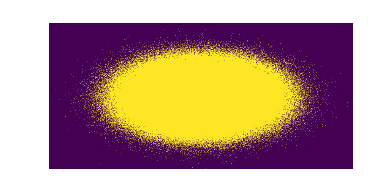
This example creates a scatter plot with 10 million points. Instead of lagging or crashing, Datashader processes the data quickly and generates a clear, high-resolution visualization.
When to Use Datashader?
- Handling big data (millions or billions of rows).
- When other tools are too slow for large datasets.
- For fast, scalable visualizations.
Final Thoughts
Datashader is a hidden gem in 2025 for data visualization.
If you work with big data analytics, geospatial data, or massive scatter plots, learning Datashader will give you an advantage.
Pair it with Holoviews and Bokeh to build powerful, interactive visualizations.
2. Bokeh – Interactive Dashboards Without JavaScript
If you want to create interactive visualizations without writing JavaScript, Bokeh is the perfect choice.
It lets you build beautiful, interactive dashboards using only Python, making it a top data visualization tool in 2025.
Many still use Matplotlib and Seaborn for static charts, but for dynamic, web-ready visualizations, they have limitations. Bokeh fills this gap by providing interactive plots, zoomable maps, and full dashboards—no JavaScript needed!
Why is Bokeh an Underrated Data Visualization Tool?
Even though Bokeh is very powerful, it’s not as popular as Plotly or Dash. Here’s why:
- More people use JavaScript tools – Many data scientists prefer D3.js or Dash, so Bokeh is less known.
- Needs a web browser for full features – Unlike Matplotlib, Bokeh works best in Jupyter Notebooks or web apps.
- Plotly is more popular – Many people choose Plotly first, even though Bokeh is just as powerful and easier to use in Python.
Still, Bokeh is one of the best Python tools for interactive, high-performance charts and dashboards.
How Does Bokeh Work?
Bokeh makes it simple to create interactive charts. Just follow these steps:
- Create the Figure – Start with a blank chart using
figure(). Set the size, title, and axes. - Add Data – Use Pandas or NumPy to add your dataset.
- Make It Interactive – Add hover tools, zoom, sliders, and buttons.
- Show the Chart – Display it in a Jupyter Notebook, web app, or an HTML file.
This step-by-step method helps you turn raw data into interactive charts easily.
Example: Creating an Interactive Scatter Plot with Bokeh
Let’s create an interactive scatter plot using Bokeh. This plot will allow users to zoom in, pan, and hover over points to see details.
Python Code for Interactive Scatter Plot
from bokeh.plotting import figure, show
from bokeh.models import HoverTool, ColumnDataSource
from bokeh.io import output_file
import numpy as np

# Generate random data
np.random.seed(42)
x = np.random.randn(500)
y = np.random.randn(500)
sizes = np.random.randint(10, 50, 500)

# Create a ColumnDataSource
source = ColumnDataSource(data={"x": x, "y": y, "size": sizes})

# Create a new plot with interactive tools
p = figure(title="Interactive Scatter Plot", tools="pan,box_zoom,reset,hover")

# Add scatter points with ColumnDataSource
p.scatter("x", "y", size="size", source=source, color="navy", alpha=0.5)

# Add hover tool with proper field references
hover = p.select(dict(type=HoverTool))
hover.tooltips = [("X Value", "@x"), ("Y Value", "@y")]

# Output to an HTML file and show
output_file("bokeh_scatter.html")
show(p)
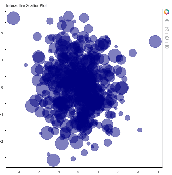
What Happens in This Code?
- Makes a scatter plot with random points.
- Lets you zoom, move, and reset the view.
- Shows values when you move your mouse over points.
- Saves the chart as an HTML file and opens it in a web browser.
With just a few lines of code, you get an interactive chart that Matplotlib and Seaborn can’t do.
Best Use Cases for Bokeh
- Financial Dashboards – Track stocks and see real-time data.
- Interactive Data Exploration – Great for science and business reports.
- Web-Based Data Apps – Works with Flask, Django, and FastAPI.
- Geospatial Charts – Make interactive maps and heatmaps.
If you need interactive charts for big data, finance, or AI, Bokeh is the best tool for the job.
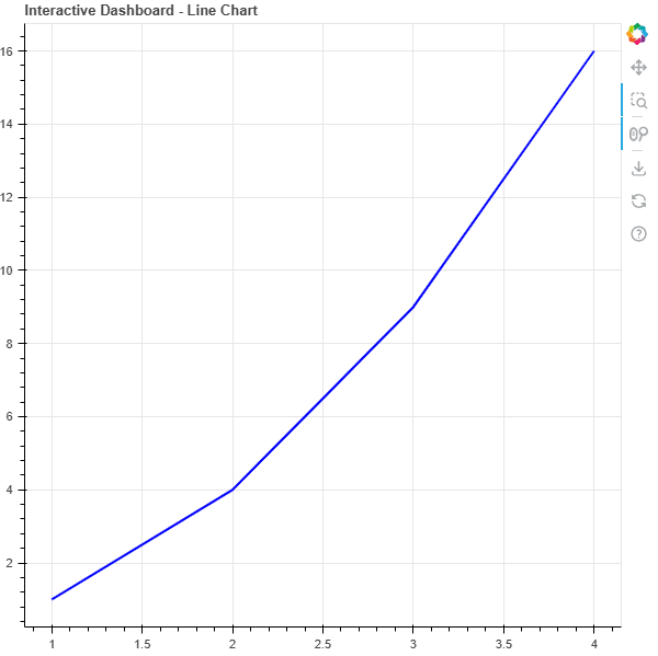
Building Full Dashboards with Bokeh
Bokeh isn’t just for charts—it can create entire dashboards with sliders, buttons, and dropdowns.
Here’s a simple interactive dashboard that updates a chart based on user input.
from bokeh.layouts import column, row
from bokeh.models import Slider, Select, CheckboxGroup, Button
from bokeh.plotting import figure, curdoc

# Create figure
p = figure(title="Interactive Dashboard - Line Chart")
line = p.line([1, 2, 3, 4], [1, 4, 9, 16], line_width=2, color="blue")

# Slider for line width
slider = Slider(start=1, end=10, value=2, step=1, title="Line Width")

# Dropdown for line color
color_select = Select(title="Line Color", value="blue", options=["blue", "red", "green", "black", "purple"])

# Checkbox for grid visibility
grid_checkbox = CheckboxGroup(labels=["Show Grid"], active=[0])

# Reset button
reset_button = Button(label="Reset Chart", button_type="warning")

# Update functions
def update_line_width(attr, old, new):
    line.glyph.line_width = slider.value

def update_line_color(attr, old, new):
    line.glyph.line_color = color_select.value

def toggle_grid(attr, old, new):
    p.xgrid.visible = 0 in grid_checkbox.active
    p.ygrid.visible = 0 in grid_checkbox.active

def reset_chart():
    slider.value = 2
    color_select.value = "blue"
    grid_checkbox.active = [0]

# Add event listeners
slider.on_change("value", update_line_width)
color_select.on_change("value", update_line_color)
grid_checkbox.on_change("active", toggle_grid)
reset_button.on_click(reset_chart)

# Arrange layout and add to document
layout = column(p, row(slider, color_select), row(grid_checkbox, reset_button))
curdoc().add_root(layout)
This creates a live dashboard where the user can adjust the line thickness using a slider.
Save this script as app.py and run it with the Bokeh server:
bokeh serve --show app.py
Why You Should Learn Bokeh in 2025
- No JavaScript Needed – Create interactive dashboards using only Python.
- Faster Than Matplotlib – Handles large datasets and real-time visualizations efficiently.
- Great for AI, ML, and Finance – Ideal for big data exploration and analysis.
- Works with Popular Python Libraries – Seamlessly integrates with Pandas, NumPy, and Flask.
With big data and interactive analytics growing in 2025, Bokeh is a must-have skill for data professionals!
Final Thoughts
If you need interactive charts, dashboards, or web-based data visualizations, Bokeh is one of the best Python data visualization tools. It’s faster, easier, and more Pythonic than JavaScript-based tools like D3.js or Dash.
Must Read
- ML Model Monitoring: How to Detect Data Drift and Model Decay in Production
- Retrain vs Fine-Tune vs Train from Scratch: A Decision Framework for ML Engineers
- Continual Learning in PyTorch: A Practical Guide for ML Engineers
- Online Learning Machine Learning: Building Real-Time Streaming Systems in Python
- How to Prevent Catastrophic Forgetting in PyTorch (Complete Guide)
3. HoloViews – Easier, More Expressive Data Visualizations
When we use data visualization tools, we often spend more time writing code than actually looking at the data. But HoloViews makes this easier by letting you create interactive and high-quality charts with less code.
Instead of writing hundreds of lines in Matplotlib or Bokeh, HoloViews does the hard work for you. You just focus on the data, and it automatically takes care of the rest.
Obviously, this is why HoloViews is one of the most underrated tools you should learn in 2025!
Why is HoloViews an Underrated Data Visualization Tool?
Even though HoloViews is super powerful, many data scientists still don’t use it because:
- Most people stick to Matplotlib or Seaborn – These tools are popular, but they take more work to make interactive charts.
- Many don’t realize it works with Bokeh & Plotly – HoloViews easily integrates with them, making it great for dashboards.
- It’s often overlooked in AI & machine learning – Many still use Pandas plots, even though HoloViews is much faster for big data.
But in 2025, HoloViews will be a must-have for data analysts, AI researchers, and business intelligence experts!
How Does HoloViews Work?
With HoloViews, you don’t have to set up axes, legends, or interactions yourself. You just provide the data, and it creates the best chart for you.
How It Works:
- Define Your Data – Load it with Pandas, NumPy, or Xarray.
- Choose a Chart Type – Pick scatter, bar, line, or heatmap with a simple function.
- Let HoloViews Do the Rest – It automatically sets up labels, axes, and interactions.
This makes HoloViews much easier than Matplotlib or Seaborn, but you can still customize everything when needed!
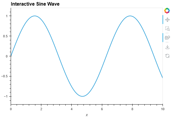
Example: Creating a Line Chart with HoloViews
Let’s create a simple interactive line chart with just a few lines of code.
Python Code for Interactive Line Plot
from bokeh.layouts import column
from bokeh.io import curdoc
import holoviews as hv
import numpy as np

hv.extension('bokeh')

# Generate data
x = np.linspace(0, 10, 100)
y = np.sin(x)

# Create interactive Holoviews plot
line_plot = hv.Curve((x, y), label="Sine Wave").opts(title="Interactive Sine Wave", width=600, height=400)

# Convert to Bokeh layout
doc = curdoc()
doc.add_root(hv.render(line_plot))
What Happens in This Code?
- Creates a sine wave using NumPy.
- Uses HoloViews to make an interactive line plot.
- Automatically enables zooming, panning, and tooltips.
- Uses Bokeh to render the chart, making it web-ready.
With just a few lines of code, HoloViews generates a fully interactive plot—something that would take dozens of lines in Matplotlib or Seaborn.
If you want a complete interactive dashboard, wrap it in a Bokeh server app and run:
bokeh serve --show app.py
Best Use Cases for HoloViews
- Time Series Analysis – Track stock trends, climate data, and AI training logs.
- Geospatial Data – Create heatmaps and interactive maps to understand locations.
- Machine Learning Visualization – Works with TensorFlow, PyTorch, and Pandas.
- Financial Data Dashboards – Get real-time analytics with Bokeh and Plotly.
If you work with big data, AI research, or business intelligence, HoloViews makes visualization faster and easier!
Why You Should Learn HoloViews in 2025
- Faster than Matplotlib & Seaborn – Saves time on plotting and formatting.
- Great for AI, Machine Learning & Big Data – Handles large datasets easily.
- Less Code, More Impact – Focus on data analysis instead of writing extra code.
- Works with Popular Tools – Supports Pandas, NumPy, Bokeh, and Plotly.
As interactive visualizations become standard in AI, finance, and analytics, HoloViews will be a must-have tool in 2025!
4. Altair – Declarative Statistical Visualizations
If you’re tired of writing long and complicated code just to make simple charts, Altair is the perfect tool for you. It lets you say what you want to see, and it figures out the rest for you.
Altair is built on Vega and Vega-Lite, so it’s powerful but easy to use. With simple and clear code, you can quickly create interactive charts.
Obviously, this makes Altair a great choice for data scientists, machine learning engineers, and business analysts in 2025!
Why is Altair an Underrated Data Visualization Tool?
Even though Altair is super easy to use, many people still ignore it because:
- Matplotlib and Seaborn are more popular – But they need more code and extra setup.
- People think Altair isn’t flexible – But it supports interactive charts, animations, and complex stats plots.
- It’s not as famous as Bokeh or Plotly – But it works perfectly with Pandas, Jupyter Notebooks, and AI tools.
If you work with statistical data, analytics, or machine learning, Altair is one of the best tools to learn in 2025!
How Does Altair Work?
Altair makes visualization easy by letting you describe what you want, and it handles the rest.
How it works:
- Load Data – Uses Pandas DataFrames.
- Choose a Chart – Line, bar, scatter, heatmap, etc.
- Set Encodings – Decide which columns go on axes, colors, and tooltips.
- Render the Chart – Altair automates scaling and interaction.
This saves time and makes visualization simple.
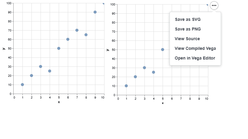
Example: Creating a Simple Scatter Plot with Altair
Let’s create an interactive scatter plot with just a few lines of code.
Python Code for Interactive Scatter Plot
import altair as alt
import pandas as pd
import webbrowser

# Sample dataset
df = pd.DataFrame({
    'x': [1, 2, 3, 4, 5, 6, 7, 8, 9, 10],
    'y': [10, 20, 30, 25, 50, 60, 70, 65, 90, 100]
})

# Create scatter plot
scatter_chart = alt.Chart(df).mark_circle(size=100).encode(
    x='x',
    y='y',
    tooltip=['x', 'y']  # Shows data values on hover
).interactive()  # Enables zooming & panning

# Save the chart as an HTML file
output_file = "scatter_plot.html"
scatter_chart.save(output_file)

# Open the chart in the default web browser
webbrowser.open(output_file)
How It Works
- Creates a scatter plot with Altair.
- Saves the chart as an HTML file.
- Automatically opens the chart in your default browser.
Now, just run the script in PyCharm, and the chart will open in your browser!
Why You Should Learn Altair in 2025
- Faster than Matplotlib & Seaborn – No need to adjust scaling, axes, or interactivity manually.
- Great for Data Science & AI – Easily create complex statistical plots.
- Saves Time with Simple Syntax – Just describe the chart, and Altair handles the rest.
- Perfect for Interactive Dashboards – Works with Streamlit, Jupyter, and web reports.
If you want high-quality, interactive visualizations without writing long code, Altair is the tool to learn in 2025.
5. Plotnine – ggplot2 for Python
If you’re coming from R’s ggplot2 and looking for a Python alternative, Plotnine is exactly what you need. It follows the grammar of graphics method, making it easy to create beautiful charts. This is one of the most useful but less-known tools you should learn in 2025.
What Makes Plotnine Special?
Most Python users prefer Matplotlib, Seaborn, or Plotly, but Plotnine brings the power of ggplot2 to Python.
- Uses the same layered approach as ggplot2 – Define data, aesthetics, and layers to create complex charts easily.
- Flexible and customizable – Helps you make high-quality charts with little effort.
- Works well with Pandas – If you use dataframes, this tool will feel easy to use.
- Great for statistical charts – Perfect for data science, machine learning, and analytics.
While ggplot2 is popular in R, many Python users ignore Plotnine. That makes it an important tool to learn in 2025!
How Does Plotnine Work?
Plotnine uses a layered approach to create charts. Instead of manually setting up axes, labels, and colors, you add layers to your chart. This makes the process more organized and easy to understand.
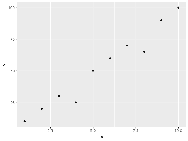
Basic Structure of a Plotnine Chart
import plotnine as p9
from plotnine import ggplot, aes, geom_point
import pandas as pd

# Sample dataset
df = pd.DataFrame({
    'x': [1, 2, 3, 4, 5, 6, 7, 8, 9, 10],
    'y': [10, 20, 30, 25, 50, 60, 70, 65, 90, 100]
})

# Create scatter plot
ggplot(df, aes(x='x', y='y')) + geom_point()
What’s Happening Here?
- Define the dataset (
df) – Uses a Pandas DataFrame. - Set aesthetics (
aes) – Maps x to the x-axis and y to the y-axis. - Add a layer (
geom_point) – Chooses the chart type (scatter plot).
This layered approach makes it easy to build, update, and expand charts without rewriting the whole code.
Best Use Cases for Plotnine
- Statistical Data Analysis – Create regression plots, density plots, and correlation charts.
- Exploratory Data Analysis (EDA) – Quickly explore datasets with multi-variable charts.
- Business & Finance – Analyze time series, market trends, and revenue growth.
- Machine Learning Research – Visualize model evaluation, feature importance, and classification results.
If you need statistical insights in Python, Plotnine is a must-learn tool in 2025!
Comparison: Plotnine vs. Matplotlib vs. Seaborn
| Feature | Plotnine (ggplot2) | Matplotlib | Seaborn |
|---|---|---|---|
| Grammar of Graphics | ✅ Yes | ❌ No | ❌ No |
| Layered Customization | ✅ Yes | ❌ No | ⚠️ Limited |
| Statistical Visualizations | ✅ Built-in | ❌ Requires Manual Setup | ✅ Some |
| Interactivity | ❌ No | ❌ No | ❌ No |
| Pandas Integration | ✅ Yes | ✅ Yes | ✅ Yes |
Matplotlib is low-level and fully customizable, while Seaborn adds high-level statistical charts. But Plotnine uses ggplot2-style syntax, making complex visualizations easier to create.
Final Thoughts
Plotnine is a hidden gem for Python users who want ggplot2-style charts. Its layered approach, smooth Pandas integration, and strong statistical features make it one of the best data visualization tools to learn in 2025.
6. PyGWalker – GUI-Based Data Exploration
PyGWalker (Python Graphic Walker) is a powerful tool for exploring data in Python. It works with Pandas and has a visual interface, making it one of the most useful but less-known tools to learn in 2025.
If you have used Tableau, Power BI, or Excel Pivot Charts, PyGWalker gives you a similar drag-and-drop experience right inside Jupyter Notebook. You don’t need to write complex code—just explore your data visually!
Why PyGWalker?
- No Code Needed – Explore data without writing long scripts.
- Drag-and-Drop Charts – Works like Tableau, Power BI, and Google Data Studio.
- Works with Pandas – Uses dataframes directly.
- Many Chart Types – Create bar charts, line charts, scatter plots, heatmaps, and more.
- Interactive Filters & Groups – Filter, group, and summarize data easily.
- Fast & Easy to Use – Get quick insights without using Matplotlib or Seaborn.
This makes PyGWalker one of the best tools for beginners, analysts, and business users in Python!
How to Install PyGWalker?
To get started, install PyGWalker using pip:
pip install pygwalker
Once installed, you can integrate it with Pandas in a Jupyter Notebook.
Basic Example: Using PyGWalker with Pandas
import pandas as pd
import pygwalker as pyg

# Sample dataset
df = pd.DataFrame({
    'Date': pd.date_range(start='2024-01-01', periods=10, freq='D'),
    'Sales': [100, 150, 200, 250, 180, 300, 280, 320, 400, 350],
    'Category': ['A', 'B', 'A', 'C', 'B', 'C', 'A', 'B', 'C', 'A']
})

# Launch PyGWalker interface
pyg.walk(df)
When you run this, a Tableau-style GUI appears, allowing you to explore data visually with drag-and-drop functionality.
Key Features of PyGWalker
- No Code Needed – Explore data without writing long scripts.
- Drag-and-Drop Charts – Works like Tableau, Power BI, and Google Data Studio.
- Works with Pandas – Uses dataframes directly.
- Many Chart Types – Create bar charts, line charts, scatter plots, heatmaps, and more.
- Interactive Filters & Groups – Filter, group, and summarize data easily.
- Fast & Easy to Use – Get quick insights without using Matplotlib or Seaborn.
This makes PyGWalker one of the best tools for beginners, analysts, and business users in Python!
Comparison: PyGWalker vs. Tableau vs. Seaborn
| Feature | PyGWalker | Tableau | Seaborn |
|---|---|---|---|
| No Code Required | ✅ Yes | ✅ Yes | ❌ No |
| Drag-and-Drop UI | ✅ Yes | ✅ Yes | ❌ No |
| Pandas Integration | ✅ Yes | ❌ No | ✅ Yes |
| Chart Variety | ✅ High | ✅ High | ⚠️ Limited |
| Jupyter Notebook Support | ✅ Yes | ❌ No | ✅ Yes |
| Interactivity | ✅ Yes | ✅ Yes | ❌ No |
Tableau is expensive, and Seaborn requires coding. PyGWalker gives you the best of both by offering no-code visualizations inside Jupyter Notebook.
Why You Should Learn PyGWalker in 2025
- Connects Coding & BI Tools – Bridges the gap between Python and Tableau-like tools.
- Great for Business Users & Analysts – Get Python-powered insights without coding.
- Saves Time – No need to write complex visualization code.
- Hidden Gem – One of the most underrated data visualization tools in Python.
If you’re a data analyst, business professional, or Python beginner, PyGWalker makes data exploration 10x easier!
7. K3D-Jupyter – Real-Time 3D Visualizations
Most Python libraries struggle with real-time 3D visualization. This is where K3D-Jupyter stands out—it lets you create high-performance, interactive 3D charts right in Jupyter Notebook.
Unlike Matplotlib, Plotly, or Seaborn, which focus on 2D charts, K3D-Jupyter is designed for 3D graphics, volumetric data, and point clouds. That makes it one of the most underrated tools to learn in 2025!
Why Use K3D-Jupyter?
- Real-Time 3D Rendering – Handles large datasets, including point clouds, meshes, and volumetric data.
- GPU Acceleration – Uses WebGL for fast, hardware-accelerated graphics.
- Jupyter Notebook Integration – Runs directly inside Jupyter, perfect for data science and AI projects.
- Supports Many Data Types – Visualize surfaces, vectors, parametric plots, and volumetric data.
- Interactive Controls – Rotate, zoom, and modify objects without lag.
- Works with NumPy & Pandas – Compatible with popular Python data science tools.
This makes K3D-Jupyter a must-have for 3D data visualization in Python, especially for scientific computing, AI, and GIS applications!
Installing K3D-Jupyter
To get started, install K3D-Jupyter using pip:
pip install k3d
Then, enable it in Jupyter Notebook:
jupyter nbextension enable --py --sys-prefix k3d
Now, you’re ready to create stunning 3D visualizations!
Basic Example: 3D Scatter Plot with K3D-Jupyter
import k3d
import numpy as np

# Generate random 3D data
n = 1000
x = np.random.rand(n)
y = np.random.rand(n)
z = np.random.rand(n)

# Create a 3D scatter plot
plot = k3d.plot()
points = k3d.points(np.vstack([x, y, z]).T, point_size=0.2, color=0xff0000)
plot += points

# Display the plot
plot.display()
You can rotate, zoom, and interact with the 3D points inside Jupyter Notebook.
Best Use Cases for K3D-Jupyter
- 3D Data Visualization in Python – Perfect for AI, machine learning, and scientific research.
- Volumetric Data & Medical Imaging – Great for CT scans, MRI, and 3D medical data.
- Point Cloud Processing – Ideal for LiDAR, robotics, and geospatial analysis.
- Physics & Engineering Simulations – Simulate fluid dynamics, waves, and mechanical structures.
- 3D AI Model Visualization – Helps in neural network visualizations for AI research.
For data scientists, engineers, and researchers, K3D-Jupyter is a powerful but underrated Python visualization tool in 2025!
Comparison: K3D-Jupyter vs. Matplotlib vs. Plotly
| Feature | K3D-Jupyter | Matplotlib | Plotly |
|---|---|---|---|
| 3D Support | ✅ Yes | ⚠️ Limited | ✅ Yes |
| Real-Time Rendering | ✅ Yes | ❌ No | ✅ Yes |
| GPU Acceleration | ✅ Yes | ❌ No | ✅ Yes |
| Point Clouds & Meshes | ✅ Yes | ❌ No | ⚠️ Limited |
| Jupyter Notebook Integration | ✅ Yes | ✅ Yes | ✅ Yes |
Matplotlib’s 3D support is slow and limited, while Plotly struggles with point clouds and large datasets.
K3D-Jupyter is built for speed, making it the best choice for large-scale 3D visualization in Python!
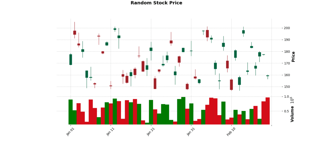
8. mplfinance – Beautiful Financial Charts
When working with financial data, creating clear and visually appealing stock charts is important.
While Matplotlib is great for general data visualization, it lacks built-in support for candlestick charts, moving averages, or trading volume indicators.
That’s why we use mplfinance—a Python library built specifically for financial data visualization.
If you’re into algorithmic trading, stock market analysis, or cryptocurrency visualization, mplfinance is one of the most underrated tools to master in 2025!
Why Use mplfinance?
- Simple & Lightweight – Built on Matplotlib, making it fast and efficient.
- Candlestick & OHLC Charts – Ideal for technical analysis and stock market trends.
- Customizable Indicators – Add moving averages, Bollinger Bands, RSI, MACD, and volume bars.
- Works with Pandas DataFrames – Easily visualize financial data from CSV or online sources.
- Optimized for Large Datasets – Handles years of historical stock data smoothly.
If you’re working with stock price trends, cryptocurrency charts, or financial time-series analysis, mplfinance is a must-learn tool in 2025!
Installing mplfinance
You can install mplfinance with pip:
pip install mplfinance
Once installed, you can start creating professional stock charts with just a few lines of Python code.
Basic Example: Candlestick Chart with mplfinance
import mplfinance as mpf
import pandas as pd

# Load financial data (assumed to be a CSV with Date, Open, High, Low, Close, Volume)
df = pd.read_csv("AAPL_stock_data.csv", index_col="Date", parse_dates=True)

# Plot candlestick chart
mpf.plot(df, type="candle", volume=True, title="Apple Stock Price", style="charles")
This creates a clean candlestick chart with trading volume bars below it.
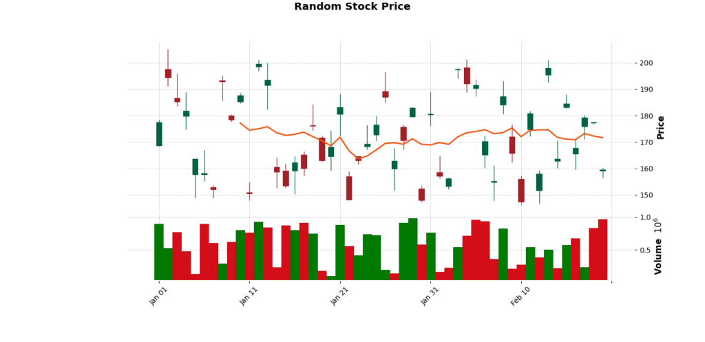
Adding Moving Averages & Custom Styling
mpf.plot(df, type="candle", volume=True,
         mav=(10, 50),  # Moving Averages: 10-day & 50-day
         title="AAPL Stock Price with Moving Averages",
         style="yahoo")  # Use Yahoo Finance chart style
Now, the chart includes 10-day and 50-day moving averages, just like professional trading platforms.
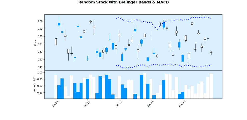
Advanced Example: Adding Bollinger Bands & MACD
from ta.volatility import BollingerBands
from ta.trend import MACD

# Compute Bollinger Bands
indicator_bb = BollingerBands(close=df["Close"], window=20, window_dev=2)
df["BB_High"] = indicator_bb.bollinger_hband()
df["BB_Low"] = indicator_bb.bollinger_lband()

# Compute MACD
macd = MACD(close=df["Close"])
df["MACD"] = macd.macd()
df["Signal"] = macd.macd_signal()

# Plot chart with Bollinger Bands
apds = [mpf.make_addplot(df["BB_High"], color="blue"),
        mpf.make_addplot(df["BB_Low"], color="blue"),
        mpf.make_addplot(df["MACD"], panel=1, color="red"),
        mpf.make_addplot(df["Signal"], panel=1, color="green")]

mpf.plot(df, type="candle", volume=True,
         title="AAPL Stock with Bollinger Bands & MACD",
         style="blueskies", addplot=apds)
This chart includes Bollinger Bands and a MACD indicator panel below the main stock chart.
Best Use Cases for mplfinance
- Stock Market Analysis – Visualize candlestick charts, trends, and technical indicators.
- Algorithmic Trading – Use mplfinance for backtesting trading strategies.
- Cryptocurrency Charts – Track Bitcoin, Ethereum, and altcoin price trends.
- Historical Price Data – Analyze decades of stock price movements.
- Live Market Dashboards – Integrate with real-time stock API data.
For anyone working with financial data, mplfinance is a game-changer in Python.
Comparison: mplfinance vs. Matplotlib vs. Plotly
| Feature | mplfinance | Matplotlib | Plotly |
|---|---|---|---|
| Financial Charts | ✅ Yes | ❌ No | ✅ Yes |
| Candlestick & OHLC | ✅ Yes | ❌ No | ✅ Yes |
| Moving Averages & Indicators | ✅ Yes | ❌ No | ⚠️ Limited |
| Trading Volume Support | ✅ Yes | ❌ No | ✅ Yes |
| Real-Time Market Data | ⚠️ Limited | ❌ No | ✅ Yes |
Matplotlib isn’t designed for financial charts, while Plotly can handle real-time data but lacks the flexibility of mplfinance’s technical analysis tools.
Conclusion
Mastering these data visualization tools in 2025 will help you analyze, explore, and present data more effectively.
Whether you need big data scalability, interactive dashboards, or real-time 3D visualizations, these tools have you covered.
Which one are you excited to try? Share your thoughts!
For more insights, visit Emitech Logic.
FAQs
Which data visualization tool is best for big data?
Can I create interactive dashboards without JavaScript?
What’s the best tool for statistical visualizations?
Is there a Python alternative to ggplot2?
External Resources
Here are some helpful links to learn more about these data visualization tools:
- Datashader Documentation – https://datashader.org/
- Plotnine Tutorials – https://plotnine.readthedocs.io/
- PyGWalker GitHub Repo – https://github.com/Kanaries/pygwalker
- K3D-Jupyter Guide – https://k3d-jupyter.org/
- mplfinance Documentation – https://github.com/matplotlib/mplfinance
For more in-depth tutorials, check out Emitech Logic!


Leave a Reply