

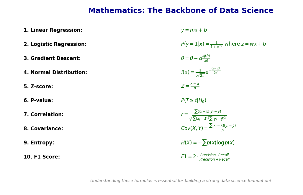
Data Science: Top 10 Mathematical Definitions
Introduction
Mathematics is the backbone of data science, providing the foundational concepts that power models and algorithms. Understanding key mathematical definitions can significantly boost your data science journey. In this post, we’ll explore the first ten must-know mathematical definitions for building a strong data science foundation.
Linear Regression for Data Science
Linear regression is a way to predict a result (dependent variable) based on one or more factors (independent variables). Think of it like trying to predict how much a taxi ride will cost based on the distance traveled.
When you plot your data points on a graph, linear regression tries to find the best straight line that connects those points. This line helps make predictions for values that you don’t have yet. The goal is to minimize the errors (the difference between the predicted and actual values).
Example Scenario
Let’s say you want to predict someone’s salary based on their years of experience. The more experience they have, the higher their salary is likely to be. The graph might look like this:
X-axis: Years of experience
Y-axis: Salary
If we plot these points, linear regression will create a straight line that best fits the data points. Once we have this line, we can predict the salary for any given number of years of experience.
The Formula of Linear Regression
The mathematical formula for simple linear regression is:
y = mx + b
Where:
- y: Predicted value (like salary)
- x: Independent variable (like years of experience)
- m: Slope of the line (how much y changes with x)
- b: Intercept (where the line crosses the Y-axis when x is 0)
In multiple linear regression (when you have more than one factor), the equation becomes:
y = m1x1 + m2x2 + … + mnxn + b
How to Apply Linear Regression in Python
Let’s walk through a basic example to predict salary based on years of experience.
Step 1: Install and Import Libraries
import numpy as np
import matplotlib.pyplot as plt
from sklearn.linear_model import LinearRegression
from sklearn.model_selection import train_test_split
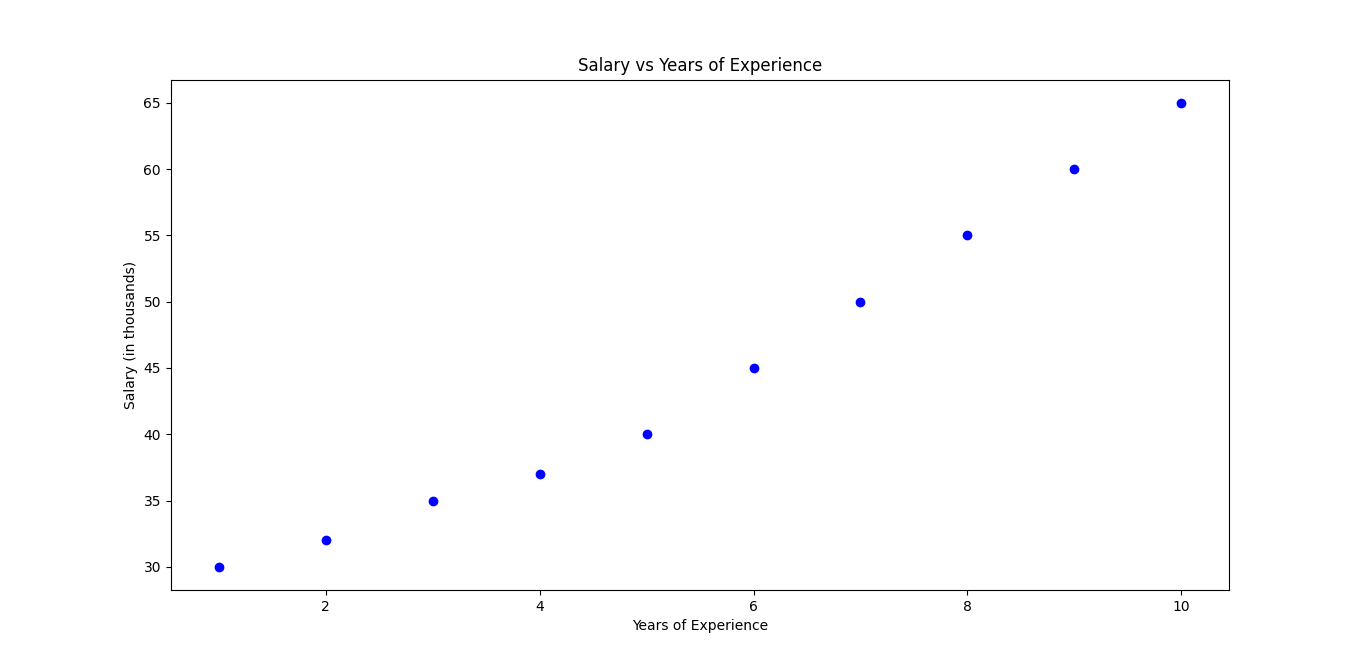
Step 2: Create and Visualize the Dataset
# Years of experience (independent variable)
X = np.array([1, 2, 3, 4, 5, 6, 7, 8, 9, 10]).reshape(-1, 1)

# Corresponding salaries (dependent variable)
y = np.array([30, 32, 35, 37, 40, 45, 50, 55, 60, 65])

# Visualize the data points
plt.scatter(X, y, color='blue')
plt.xlabel('Years of Experience')
plt.ylabel('Salary (in thousands)')
plt.title('Salary vs Years of Experience')
plt.show()
Step 3: Train the Linear Regression Model
# Split the data into training and testing sets
X_train, X_test, y_train, y_test = train_test_split(X, y, test_size=0.2, random_state=42)

# Create and train the model
model = LinearRegression()
model.fit(X_train, y_train)

# Get the slope (m) and intercept (b)
print("Slope (m):", model.coef_[0])
print("Intercept (b):", model.intercept_)
Output
Slope (m): 3.9568965517241383
Intercept (b): 22.86206896551724
Step 4: Make Predictions
# Predict salaries based on years of experience
predictions = model.predict(X_test)

# Compare actual and predicted values
for i in range(len(X_test)):
    print(f"Years of Experience: {X_test[i][0]} | Actual Salary: {y_test[i]} | Predicted Salary: {predictions[i]:.2f}")
Output
Years of Experience: 9 | Actual Salary: 60 | Predicted Salary: 58.47
Years of Experience: 2 | Actual Salary: 32 | Predicted Salary: 30.78
Step 5: Visualize the Regression Line
# Plot the original data points
plt.scatter(X, y, color='blue')

# Plot the regression line
plt.plot(X, model.predict(X), color='red')
plt.xlabel('Years of Experience')
plt.ylabel('Salary (in thousands)')
plt.title('Linear Regression Model')
plt.show()
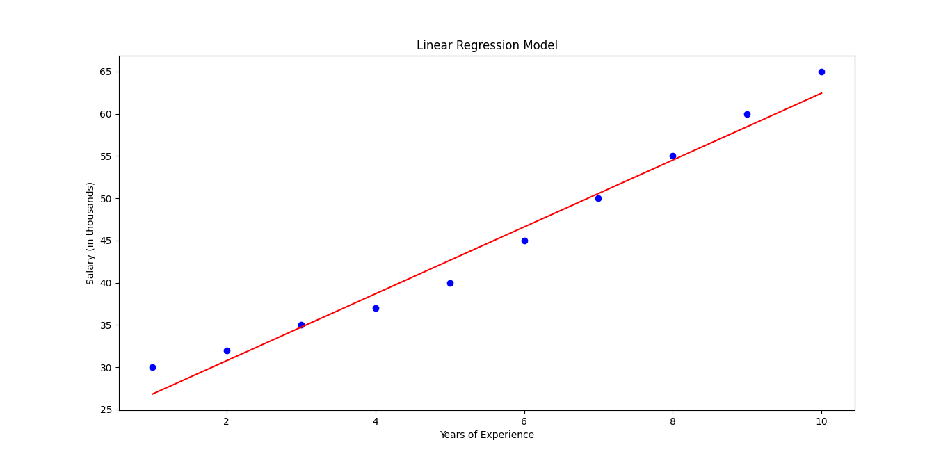
Linear regression is a simple yet powerful tool for predicting relationships between variables. In this example, we used years of experience to predict salary. By following these steps in Python, you can apply linear regression to your own data for forecasting, trend analysis, and decision-making.
Logistic Regression for Data Science
Logistic regression is a machine learning technique used to classify data into categories. Unlike linear regression, which predicts continuous values (like sales or temperatures), logistic regression predicts probabilities.
Real-Life Example
Suppose you want to predict whether a student will pass an exam based on the number of hours they study. The result is either “Pass” or “Fail”—a categorical outcome. Logistic regression helps draw a decision boundary between these categories and predicts the probability that a student passes.
How It Works
The key idea behind logistic regression is the logistic (or sigmoid) function:
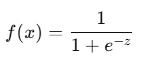
Where:
- z is the input from a linear equation: z = mx + b
- e is Euler’s number (~2.718)
The sigmoid function transforms any input into a value between 0 and 1, representing a probability.
If the probability is greater than 0.5, the algorithm predicts “Pass.” Otherwise, it predicts “Fail.”
Mathematical Formula
The prediction for logistic regression is:
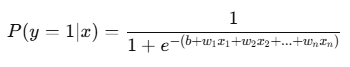
Where:
- P(y = 1 | x) is the probability of the positive class (like “Pass”)
- b: Intercept
- w: Weights for each feature
- x: Feature values
How to Apply Logistic Regression in Python
Let’s predict whether a student passes or fails based on study hours.
Step 1: Install and Import Libraries
import numpy as np
import matplotlib.pyplot as plt
from sklearn.linear_model import LogisticRegression
from sklearn.model_selection import train_test_split
from sklearn.metrics import accuracy_score, confusion_matrix
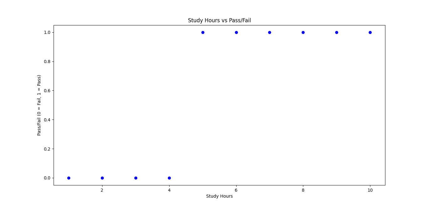
Step 2: Create and Visualize the Dataset
# Study hours and corresponding pass/fail outcomes
X = np.array([1, 2, 3, 4, 5, 6, 7, 8, 9, 10]).reshape(-1, 1)  # Study hours
y = np.array([0, 0, 0, 0, 1, 1, 1, 1, 1, 1])  # 0 = Fail, 1 = Pass

# Visualize the data
plt.scatter(X, y, color='blue')
plt.xlabel('Study Hours')
plt.ylabel('Pass/Fail (0 = Fail, 1 = Pass)')
plt.title('Study Hours vs Pass/Fail')
plt.show()
Step 3: Train the Logistic Regression Model
# Split the data into training and testing sets
X_train, X_test, y_train, y_test = train_test_split(X, y, test_size=0.2, random_state=42)

# Create and train the model
model = LogisticRegression()
model.fit(X_train, y_train)
Step 4: Make Predictions
# Predict pass/fail for the test set
predictions = model.predict(X_test)

# Compare actual and predicted outcomes
for i in range(len(X_test)):
    print(f"Study Hours: {X_test[i][0]} | Actual Outcome: {y_test[i]} | Predicted Outcome: {predictions[i]}")
Step 5: Evaluate the Model
# Accuracy and confusion matrix
accuracy = accuracy_score(y_test, predictions)
conf_matrix = confusion_matrix(y_test, predictions)

print("Model Accuracy:", accuracy)
print("Confusion Matrix:\n", conf_matrix)
Output
Study Hours: 9 | Actual Outcome: 1 | Predicted Outcome: 1
Study Hours: 2 | Actual Outcome: 0 | Predicted Outcome: 0
Model Accuracy: 1.0
Confusion Matrix:
[[1 0]
[0 1]]
Step 6: Visualize the Sigmoid Function
# Plot the sigmoid curve
X_range = np.linspace(0, 12, 100).reshape(-1, 1)
predicted_probabilities = model.predict_proba(X_range)[:, 1]

plt.scatter(X, y, color='blue')
plt.plot(X_range, predicted_probabilities, color='red')
plt.xlabel('Study Hours')
plt.ylabel('Probability of Passing')
plt.title('Sigmoid Curve for Logistic Regression')
plt.show()
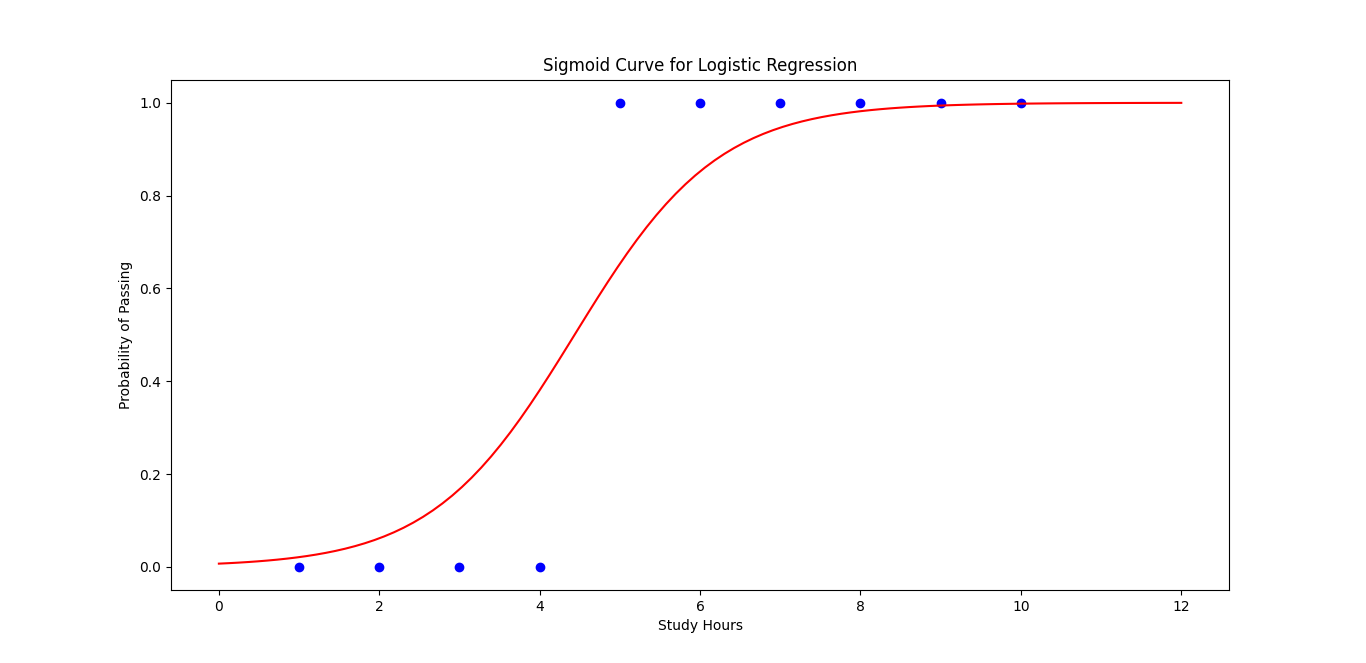
Logistic regression is great for solving classification problems where the outcome is binary (yes/no, pass/fail, etc.). In this example, we used study hours to predict whether a student passes or fails. The sigmoid function plays a key role in converting predictions to probabilities.
Must Read
- How to Diagnose Overfitting in Machine Learning — 9 Proven Tools
- PyTorch Debugging Checklist: A Systematic Framework to Fix Models That Won’t Learn
- Why sorted() Is Safer Than list.sort() in Production Python Systems
- Monotonic Sequence in Python: 7 Practical Methods With Edge Cases, Interview Tips, and Performance Analysis
- How to Check if Dictionary Values Are Sorted in Python
Gradient Descent for Data Science
Gradient descent is an optimization technique used to help machine learning models find the best parameters (like weights and biases) by minimizing an error function (also known as a loss function).
Why Is Gradient Descent Important?
In machine learning, models are trained by minimizing errors between predicted and actual outputs. Gradient descent finds the optimal values for weights and biases to reduce these errors.
How It Works
To visualize gradient descent, think of standing on top of a hill and trying to reach the bottom. You keep moving in the direction where the slope is steepest. This is what gradient descent does—it moves in the direction that decreases the error the fastest.
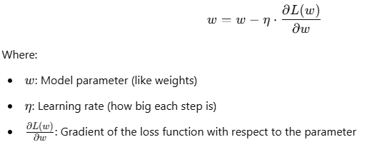
Mathematics Behind Gradient Descent
Given a loss function L(w)L(w)L(w), gradient descent updates the weights using the following rule:
Example of Gradient Descent in Python
Step 1: Define a Simple Loss Function
Let’s minimize a simple quadratic function: L(w) = (w – 3)^2
The goal is to find the value of w that minimizes the loss (which is 3 in this case).
import numpy as np
import matplotlib.pyplot as plt

# Loss function: (w - 3)^2
def loss(w):
    return (w - 3) ** 2

# Gradient of the loss function
def gradient(w):
    return 2 * (w - 3)

# Parameters
learning_rate = 0.1
iterations = 20
w = 0  # Initial guess
loss_history = []

# Gradient descent loop
for i in range(iterations):
    grad = gradient(w)
    w -= learning_rate * grad  # Update weight
    loss_history.append(loss(w))
    print(f"Iteration {i+1}: w = {w:.4f}, Loss = {loss(w):.4f}")
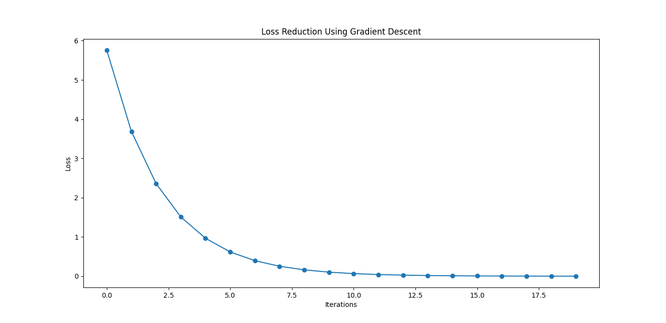
Step 2: Visualize the Loss Reduction
# Plot the loss over iterations
plt.plot(range(iterations), loss_history, marker='o')
plt.xlabel('Iterations')
plt.ylabel('Loss')
plt.title('Loss Reduction Using Gradient Descent')
plt.show()
Key Parameters of Gradient Descent
- Learning Rate (η\etaη)
- A high learning rate may overshoot the optimal solution.
- A low learning rate may take too long to converge.
- Number of Iterations:
- Controls how many steps gradient descent takes.
Challenges of Gradient Descent
- Local Minima: Gradient descent may get stuck in local minima for non-convex functions.
- Learning Rate Sensitivity: Choosing the right learning rate is critical.
- Slow Convergence: Gradient descent can be slow if the function has narrow valleys.
Types of Gradient Descent
- Batch Gradient Descent: Uses the entire dataset for each update.
- Stochastic Gradient Descent (SGD): Uses one data point at a time, making it faster but noisy.
- Mini-Batch Gradient Descent: A balance between batch and stochastic gradient descent.
In machine learning, gradient descent is essential for training models like linear regression, neural networks, and support vector machines. Understanding how it works will give you the confidence to build more efficient models!
Normal Distribution for Data Science
The Normal Distribution (also called the Gaussian Distribution) is a bell-shaped curve used in statistics and data science to represent real-world data distributions. It’s called “normal” because many natural phenomena, such as heights, blood pressure, and test scores, follow this pattern.
Key Properties of Normal Distribution
- Symmetry: The curve is symmetric around the mean (μ).
- Mean, Median, and Mode: In a normal distribution, these three values are identical and located at the center.
- Standard Deviation (σ): Determines the spread of the data. A smaller value creates a narrow curve, while a larger value creates a wider curve.
- 68-95-99.7 Rule (Empirical Rule):
- 68% of data lies within 1 standard deviation from the mean.
- 95% of data lies within 2 standard deviations.
- 99.7% of data lies within 3 standard deviations.
Mathematical Formula
The probability density function (PDF) for a normal distribution is given by:
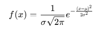
Where:
- μ (mean) is the center of the distribution
- σ (standard deviation) controls the spread
- e is Euler’s number
Real-World Examples
- Height Distribution: Heights of people in a population often follow a normal distribution.
- Exam Scores: Test scores from large student populations tend to form a bell-shaped curve.
- Errors in Measurements: In experiments, errors often exhibit a normal distribution.
How to Apply Normal Distribution in Python
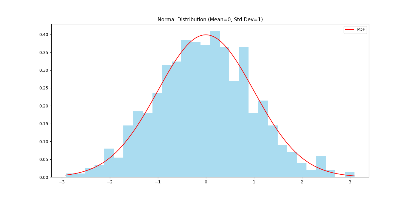
Step 1: Visualize a Normal Distribution
import numpy as np
import matplotlib.pyplot as plt

# Generate data
mean = 0
std_dev = 1
data = np.random.normal(mean, std_dev, 1000)

# Plot the histogram
plt.hist(data, bins=30, density=True, color='skyblue', alpha=0.7)

# Plot the PDF curve
x = np.linspace(min(data), max(data), 1000)
pdf = (1 / (std_dev * np.sqrt(2 * np.pi))) * np.exp(-0.5 * ((x - mean) / std_dev) ** 2)
plt.plot(x, pdf, color='red', label='PDF')

plt.title('Normal Distribution (Mean=0, Std Dev=1)')
plt.legend()
plt.show()
Step 2: Generate Random Data
# Generate random values from a normal distribution
data = np.random.normal(loc=10, scale=2, size=1000)  # Mean=10, Std Dev=2
print(f"Mean: {np.mean(data):.2f}, Std Dev: {np.std(data):.2f}")
Step 3: Probability Calculation (Z-Score)
from scipy.stats import norm

# Calculate probability of value being less than or equal to 1.5 in a standard normal distribution
prob = norm.cdf(1.5)
print(f"Probability of being less than or equal to 1.5: {prob:.4f}")
Output
Mean: 10.10, Std Dev: 2.08
Probability of being less than or equal to 1.5: 0.9332
When to Use Normal Distribution in Data Science
- Data Preprocessing: Assumes data follows a normal distribution for statistical tests.
- Hypothesis Testing: Many tests (like t-tests) require normality assumptions.
- Machine Learning: Algorithms like Linear Discriminant Analysis (LDA) assume input data follows a normal distribution.
By understanding and visualizing the normal distribution, you’ll gain better insights into your datasets and make more informed decisions in data science tasks.
Z-Score for Data Science
The Z-score (also called a standard score) tells you how far a data point is from the mean of a dataset in terms of standard deviations.
If a data point has:
- Z-score of 0: It’s exactly at the mean.
- Positive Z-score: It’s above the mean.
- Negative Z-score: It’s below the mean.
Why is Z-Score Important?
Z-scores help standardize different datasets, making them easier to compare. They are commonly used in:
- Outlier Detection: Identifying data points that are far from the mean.
- Data Normalization: Transforming features in machine learning models.
- Probability Calculations: In normal distributions, Z-scores help calculate probabilities.
Mathematical Formula for Z-Score
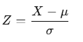
Where:
- Z: Z-score
- X: Data point
- μ: Mean of the dataset
- σ: Standard deviation of the dataset
Real-World Example
Suppose the average height of a group is 170 cm with a standard deviation of 10 cm. If a person’s height is 185 cm, what is their Z-score?
Calculation:
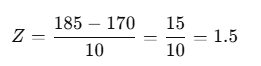
This means the person’s height is 1.5 standard deviations above the mean.
How to Apply Z-Score in Python
Step 1: Calculate Z-Scores for a Dataset
import numpy as np
from scipy.stats import zscore

# Sample dataset
data = [170, 165, 180, 175, 160, 185]

# Calculate Z-scores using SciPy
z_scores = zscore(data)
print("Z-scores:", z_scores)
Step 2: Detect Outliers Using Z-Scores
threshold = 2  # Common threshold for outliers

outliers = [data[i] for i in range(len(z_scores)) if abs(z_scores[i]) > threshold]
print("Outliers:", outliers)
Step 3: Manually Calculate a Z-Score
mean = np.mean(data)
std_dev = np.std(data)
data_point = 185

z_score = (data_point - mean) / std_dev
print(f"Z-score for {data_point}: {z_score:.2f}")
Output
Z-scores: [-0.29277002 -0.87831007 0.87831007 0.29277002 -1.46385011 1.46385011]
Outliers: []
Z-score for 185: 1.46
When to Use Z-Scores in Data Science
- Outlier Detection: Filtering out unusual data points for better model performance.
- Feature Scaling: Normalizing features in machine learning models to ensure they are on the same scale.
- Hypothesis Testing: Standardizing data when comparing different sample distributions.
P-Value for Data Science
A p-value is used in hypothesis testing to measure how well the observed data aligns with the null hypothesis.
- Null Hypothesis (H₀): This is the default assumption that there is no effect or no difference in the population.
- Alternative Hypothesis (H₁): The assumption that there is an effect or difference.
The p-value helps answer: If the null hypothesis were true, what is the probability of observing data as extreme as this?
Mathematical Formula for P-Value
In hypothesis testing, the p-value is calculated based on a test statistic and its distribution. Here’s the general process:
Formula for the Test Statistic
The test statistic varies depending on the type of hypothesis test (t-test, z-test, etc.). Below is the formula for the Z-test (used when the population variance is known):
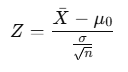
Where:
- Xˉ: Sample mean
- μ0: Population mean under the null hypothesis
- σ: Population standard deviation
- n: Sample size
P-Value Calculation
After calculating the test statistic, the p-value is obtained from the cumulative distribution function (CDF) of the test statistic’s distribution.
For a Z-test (standard normal distribution):
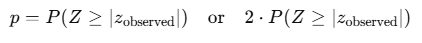
One-Tailed vs. Two-Tailed Tests
- One-Tailed Test: You only consider one side of the distribution.
- Two-Tailed Test: You consider both sides (hence the factor of 2).
How to Interpret P-Value
- High p-value (typically > 0.05): Weak evidence against the null hypothesis → Fail to reject the null hypothesis.
- Low p-value (typically ≤ 0.05): Strong evidence against the null hypothesis → Reject the null hypothesis.
Example Scenario
Suppose a company claims that its new weight loss pill causes an average weight loss of 5 kg. You conduct an experiment and find an average weight loss of 4 kg in a sample of 50 users. How do you know if the difference is significant or just random?
- Null Hypothesis (H₀): The pill causes a 5 kg weight loss (as claimed).
- Alternative Hypothesis (H₁): The pill causes a weight loss different from 5 kg.
After performing the statistical test, you get a p-value of 0.03.
Since 0.03 < 0.05, you have strong evidence to reject the null hypothesis, suggesting the pill may not cause a 5 kg weight loss.
How to Apply P-Value in Python
Step 1: Perform a One-Sample T-Test
import numpy as np
from scipy.stats import ttest_1samp

# Sample data (weight loss results)
data = [4.1, 4.3, 3.8, 4.0, 4.5, 3.9, 4.2, 4.0]

# Null hypothesis mean (company claim: 5 kg weight loss)
population_mean = 5

# Perform the one-sample t-test
statistic, p_value = ttest_1samp(data, population_mean)
print(f"T-statistic: {statistic:.2f}, P-value: {p_value:.4f}")

# Interpretation
if p_value < 0.05:
    print("Reject the null hypothesis: The pill may not cause a 5 kg weight loss.")
else:
    print("Fail to reject the null hypothesis: The pill may indeed cause a 5 kg weight loss.")
Output
T-statistic: -11.22, P-value: 0.0000
Reject the null hypothesis: The pill may not cause a 5 kg weight loss.
Step 2: Using P-Value in Hypothesis Testing
Suppose you conduct a test and get a p-value of 0.01:
- If your threshold (significance level) is 0.05, then 0.01 < 0.05, so you reject the null hypothesis.
- If your threshold is 0.01, then 0.01 = 0.01, and you are at the borderline decision.
Key Takeaways
- Lower p-value: Strong evidence to reject the null hypothesis.
- Higher p-value: Not enough evidence to reject the null hypothesis.
- Significance Level (α): Commonly set at 0.05 for statistical tests.
This simple interpretation can guide better decisions when analyzing data and performing hypothesis tests in real-world scenarios.
Correlation for Data Science
Correlation tells us how two variables are related to each other and whether they move in the same direction or opposite directions.
Types of Correlation
- Positive Correlation:
When one variable increases, the other also increases.
Example: As the temperature rises, ice cream sales go up. - Negative Correlation:
When one variable increases, the other decreases.
Example: As the speed of a car increases, the time to reach a destination decreases. - No Correlation:
No relationship between the two variables.
Example: The number of coffee cups you drink has no effect on your shoe size.
Mathematical Formula for Correlation Coefficient (Pearson’s r)
The correlation coefficient rrr is calculated using this formula:
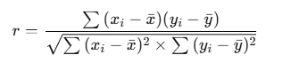
Where:
- x_i, y_i are individual data points
- xˉ,yˉ are the means of the variables
- r ranges from -1 to +1:
- +1: Perfect positive correlation
- -1: Perfect negative correlation
- 0: No correlation
How to Apply Correlation in Python
Step 1: Import Necessary Libraries
import numpy as np
import pandas as pd
import seaborn as sns
import matplotlib.pyplot as plt
Step 2: Create Sample Data
data = {
    'Temperature': [30, 32, 33, 35, 36, 37, 38],
    'IceCreamSales': [100, 150, 200, 300, 400, 500, 600]
}
df = pd.DataFrame(data)
Step 3: Calculate Correlation
correlation = df.corr()
print("Correlation Matrix:")
print(correlation)
Step 4: Visualize the Correlation
sns.heatmap(correlation, annot=True, cmap='coolwarm')
plt.title('Correlation Heatmap')
plt.show()

Output Explanation
Correlation Matrix:
Temperature IceCreamSales
Temperature 1.000000 0.972134
IceCreamSales 0.972134 1.000000
If the correlation between Temperature and Ice Cream Sales is 0.97, it means a strong positive relationship—as temperature increases, ice cream sales also increase.
Key Takeaways
- Correlation helps identify relationships between variables.
- Positive values indicate they increase together; negative values mean they move oppositely.
- Use heatmaps or scatter plots to visually assess relationships.
Covariance for Data Science
Covariance is a statistical measure that shows how two random variables move together. It tells us whether increases in one variable are associated with increases or decreases in another.
Types of Covariance
- Positive Covariance:
When one variable increases, the other tends to increase as well.
Example: As advertising expenses increase, sales revenue often increases too. - Negative Covariance:
When one variable increases, the other tends to decrease.
Example: As the price of a product rises, demand typically decreases. - Zero Covariance:
No relationship between the variables.
Example: The number of coffees consumed and the number of shoes sold likely have no relationship.
Mathematical Formula for Covariance
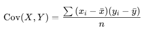
Where:
- xi,yi are the individual data points
- xˉ,yˉ are the means of variables X and Y
- n is the number of data points
How to Apply Covariance in Python
Step 1: Import Libraries
import numpy as np
import pandas as pd
Step 2: Create Sample Data
data = {
    'Advertising': [100, 150, 200, 250, 300],
    'Sales': [10, 20, 30, 40, 50]
}
df = pd.DataFrame(data)
Step 3: Calculate Covariance Matrix
cov_matrix = df.cov()
print("Covariance Matrix:")
print(cov_matrix)
Output
             Advertising  Sales
Advertising         625.0   125.0
Sales               125.0    25.0
Interpretation
- The covariance between Advertising and Sales is 125.0, indicating a positive relationship—both increase together.
- The higher the positive value, the stronger the relationship.
Key Takeaways
- Covariance indicates the direction of the relationship between two variables, but not the strength (for that, correlation is better).
- Positive values indicate they move in the same direction, while negative values suggest they move in opposite directions.
- It’s a valuable measure for financial analysis, portfolio optimization, and machine learning.
Entropy for Data Science
Entropy is a way to measure how random or uncertain something is. In simple terms, it tells us how messy or unpredictable data is.
Example
Imagine you have two jars of candy:
- Jar 1: All candies are red.
- Jar 2: Mixed colors—red, green, blue, yellow.
If someone asks you to pick a candy from each jar, which jar is easier to predict?
- Jar 1 is very predictable (low randomness), so it has low entropy.
- Jar 2 is harder to predict (high randomness), so it has high entropy.
Why Entropy Matters in Data Science
Entropy helps in decision-making tasks like building decision trees.
- If a dataset is very random (high entropy), we need to organize it by making smart decisions (splits).
- If it’s already neat (low entropy), fewer decisions are needed.
Formula for Entropy

Where:
- P(A) and P(B) are the probabilities of different outcomes.
Quick Example
You have a coin:
- Heads = 50% chance
- Tails = 50% chance
Entropy=−(0.5×log2(0.5)+0.5×log2(0.5))
The answer is 1 bit, meaning the result is very random (maximum uncertainty).
Using Entropy in Python
Let’s calculate entropy in Python.
Step 1: Install Libraries
from scipy.stats import entropy
import numpy as np
Step 2: Define Probabilities
probabilities = [0.5, 0.5] # Fair coin probabilities
Step 3: Calculate Entropy
entropy_value = entropy(probabilities, base=2)
print(f"Entropy: {entropy_value} bits")
Output
Entropy: 1.0 bits
Key Points to Remember
- High entropy: Data is random and hard to predict.
- Low entropy: Data is neat and predictable.
- Entropy is used to make smart decisions in decision trees to organize messy data.
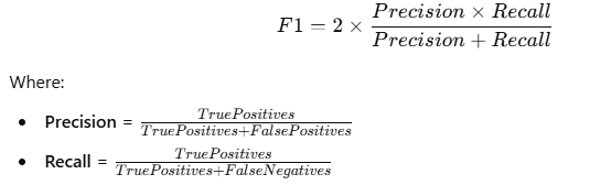
F1 Score for Data Science
What is F1 Score?
The F1 Score is a way to measure how good a classification model is at making predictions. It’s used when we care about both Precision (how many of the predicted positives are actually correct) and Recall (how many of the actual positives were detected by the model).
Since Precision and Recall can sometimes give different results, the F1 Score provides a single number that balances both.
Why Use F1 Score?
Sometimes models can predict too many false positives or false negatives. If your task is critical, like medical diagnosis, you can’t afford mistakes in either direction. The F1 Score helps you balance both errors.
Formula for F1 Score
Quick Example
Suppose you have a spam filter:
- It correctly identifies 70 spam emails out of 100 spam emails.
- It incorrectly flags 10 regular emails as spam.
Step 1: Calculate Precision
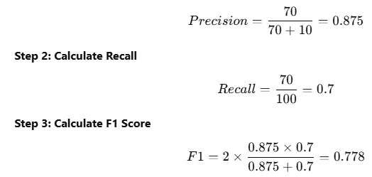
So, the F1 Score is 0.778, indicating a good balance between Precision and Recall.
How to Calculate F1 Score in Python
Step 1: Import Required Libraries
from sklearn.metrics import f1_score
Step 2: Define True and Predicted Values
y_true = [1, 0, 1, 1, 0, 1, 0, 0]  # Actual labels
y_pred = [1, 0, 1, 0, 0, 1, 1, 0]  # Model predictions
Step 3: Compute the F1 Score
score = f1_score(y_true, y_pred)
print(f"F1 Score: {score}")
Output
F1 Score: 0.75
Key Takeaways
- F1 Score is ideal when you need a balance between Precision and Recall.
- It’s particularly useful when data is imbalanced (one class dominates the dataset).
- A perfect F1 Score is 1, and the worst is 0.
- Precision and Recall should both be high to achieve a good F1 Score.
Conclusion
Mastering these 10 important definitions will give you a solid starting point in data science. Each concept plays a crucial role in various tasks, from building models to interpreting results. In our next blog post, we’ll dive into ten more important mathematical definitions to broaden your understanding of data science. Stay tuned!
FAQs
1. Why are mathematical definitions important in data science?
2. What is the most important mathematical concept in data science?
3. How does the Z-score help in data analysis?
4. Is entropy only used in decision trees?
External Resources
1. Linear Algebra and Statistics
- Khan Academy – Linear Algebra: Comprehensive lessons on linear algebra basics essential for machine learning.
- StatQuest – Statistics for Data Science: Engaging video tutorials on probability, distributions, and statistical concepts.
2. Optimization Techniques (Gradient Descent)
- Gradient Descent Explained – Towards Data Science: Detailed tutorials on how gradient descent works in machine learning.


Leave a Reply