Matplotlib’s Hidden Marvel: How to Make Packed Bubble Charts in Python
Introduction
When you think of data visualization, Matplotlib is probably the first library that comes to mind. It’s great for creating everything from simple line graphs to detailed scatter plots. But did you know that Matplotlib also has a hidden gem? Enter the packed bubble chart—a powerful tool that can make your data look more engaging and informative.
Packed bubble charts are a fun and eye-catching way to show data. They work really well when you want to display how things are related or show the size of different categories. Each bubble represents a category, and the size of the bubble shows its value. This makes the data easy to understand and visually appealing.
Packed bubble charts are a feature in Matplotlib that many people don’t use enough. In this guide, we’ll show you how to use this feature to turn your data into clear, impactful visuals. Let’s dive in and learn how to create these charts in Python!
What are Packed Bubble Charts?
Packed bubble charts are an innovative way to display hierarchical data. Unlike traditional charts, they use circles (or bubbles) to represent different data points. The size of each bubble correlates with a specific value, making it easy to compare multiple categories at a glance. This method offers a unique perspective on your data, highlighting relationships and patterns that might be overlooked with other chart types.
If you’re managing a sales team and want to visualize the performance of different regions. A packed bubble chart can show you not just the total sales per region but also the relative size of each region’s contribution. Each bubble’s size and placement provide an intuitive and immediate understanding of the data.
Why Use Packed Bubble Charts?
Packed bubble charts are a fantastic tool for making your data come alive. Let’s explore why these charts are so valuable and how they can transform your data presentation.
Display a Large Number of Categories or Data Points
When you have a large amount of data, traditional charts can become cluttered and difficult to interpret. Packed bubble charts are a great solution for this. They display data using non-overlapping circles, with each bubble representing a category, and the size of the bubble indicating its value. This allows you to present a lot of information in a clear and simple way.
For example, if you want to show sales data for multiple products in a store, a packed bubble chart can represent each product as a bubble. The size of the bubble will reflect the sales volume, making it easy to identify the top-selling products and compare them.
Highlight the Proportion of Each Category Within a Whole
Packed bubble charts are excellent for highlighting proportions. If you need to show how different parts contribute to a whole, these charts do it beautifully. Each bubble’s size is proportional to its value, giving an immediate visual representation of how each category fits into the bigger picture.
If you’re presenting the budget allocation of a project. A packed bubble chart can show different departments’ budgets as bubbles, with the size of each bubble representing the budget amount. This visual makes it clear at a glance which departments have the largest and smallest allocations.
Make Your Data Visualization More Engaging and Interactive
One of the biggest advantages of packed bubble charts is their engaging and interactive nature. The unique arrangement of bubbles can capture attention and make data analysis more enjoyable. Unlike standard bar or line charts, packed bubble charts are visually appealing and can draw in your audience, making them more likely to engage with the information.
For example, if you’re showcasing social media metrics, a packed bubble chart can display engagement metrics (likes, shares, comments) for various posts. The colorful, interactive bubbles can make your presentation livelier and more memorable.
Example with Diagram
Let’s create a packed bubble chart to illustrate these points:
In this chart:
- Product A has the largest bubble, showing its high sales volume.
- Product C has a smaller bubble, indicating lower sales.
- The visual representation helps you quickly understand the sales distribution among different products.
Significance of Packed Bubble Charts
Packed bubble charts offer a fresh perspective on data. They are excellent for presenting hierarchical data, where you need to show relationships and proportions in an intuitive way. This chart type is particularly useful when dealing with large datasets that might seem overwhelming with traditional charts.
Common Use Cases and Advantages
Packed bubble charts shine in various scenarios:
- Business Analytics: Visualize sales data, market shares, or customer segments.
- Social Media Analysis: Display the reach and engagement of different posts or campaigns.
- Website Traffic: Show the distribution of traffic sources, as discussed earlier.
Advantages of packed bubble charts include:
- Clarity: They present complex data in a simple, easy-to-understand format.
- Visual Appeal: Their unique structure is visually engaging, helping to hold the viewer’s attention.
- Insightful Comparisons: They allow for immediate visual comparison of data points, making patterns and relationships stand out.
Comparison with Other Chart Types
When it comes to visualizing data, choosing the right type of chart can make a world of difference. Let’s take a closer look at how packed bubble charts stack up against scatter plots and pie charts.
Packed Bubble Charts vs. Scatter Plots
Scatter plots are great for showing the relationship between two variables. For example, if you’re looking at how advertising spend affects sales, a scatter plot can clearly show this connection. But when there are too many data points, scatter plots can get messy and hard to read. If you are trying to decipher a scatter plot with hundreds of overlapping points—it can quickly become confusing and lose its value.
Packed bubble charts, however, are perfect for comparing quantities across different categories. Unlike scatter plots, they don’t focus on showing relationships between two variables. Instead, they organize data into separate, non-overlapping bubbles. Each bubble represents a category, and its size shows the value or quantity of that category. This setup makes it easy to quickly see the proportions and comparisons.
Here’s a simple example to illustrate the difference:
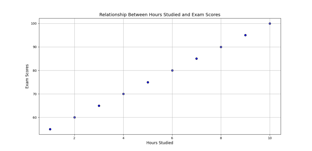
Scatter Plot Example: Plotting the relationship between hours studied and exam scores.
This scatter plot visually demonstrates the relationship between the number of hours studied and the corresponding exam scores.
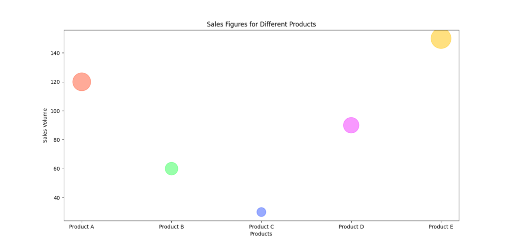
Packed Bubble Chart Example: Comparing the number of units sold across different product categories in a store.
By using different colors for each product category, the chart becomes more visually appealing and makes it easier to distinguish between different categories.
Packed Bubble Charts vs. Pie Charts
Pie Charts are a popular choice for showing parts of a whole. They work well when you have a small number of categories. For example, displaying the market share of a few companies in a specific industry can be effectively done with a pie chart. However, pie charts can become difficult to read and interpret when there are many slices. If each slice represents a different category, the chart can start looking crowded and the individual slices become hard to distinguish.
Packed Bubble Charts handle multiple categories more gracefully. Instead of squeezing everything into a circular format, they spread out the bubbles in a visually appealing way.
Consider these examples:
Pie Chart Example: Showing the distribution of four different types of expenses in a household budget.

Here pie chart visually represents the distribution of four different types of expenses in a household budget.
Packed Bubble Chart Example: Displaying the distribution of various expenses, such as groceries, utilities, rent, entertainment, and more, where the number of categories is larger.
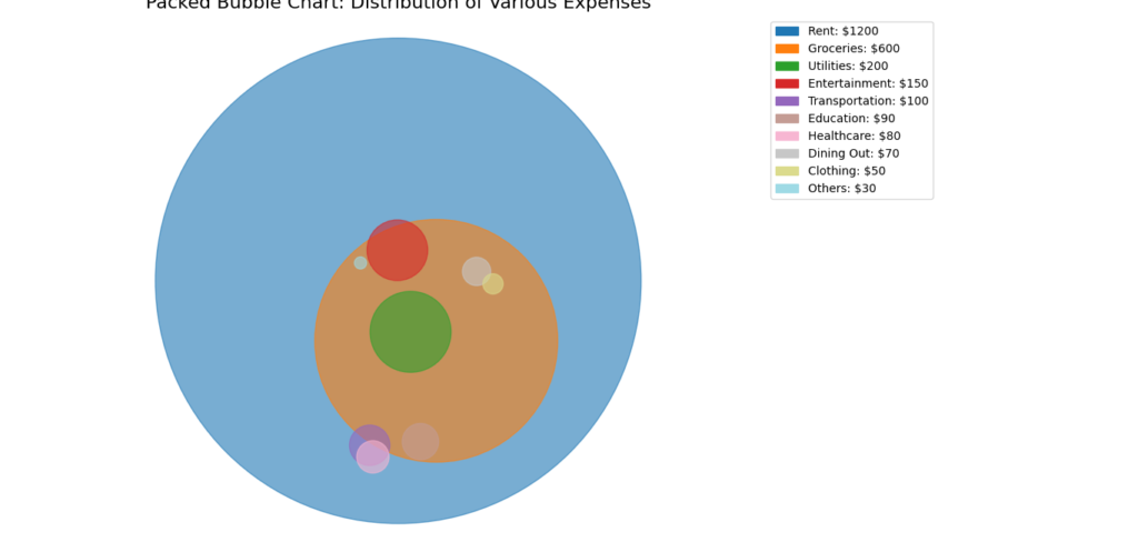
By comparing these chart types, we can see that packed bubble charts offer a clear and visually appealing way to compare multiple categories, especially when dealing with larger datasets. They help in presenting data in a way that is easy to interpret at a glance, avoiding the cluttered appearance that can sometimes hinder scatter plots and pie charts.
Transforming Your Data Visualizations
Using packed bubble charts can transform how you present data. They add a layer of depth and creativity to your visualizations, making them more engaging for your audience. This approach not only makes your data stand out but also helps in uncovering insights that might not be apparent with more conventional charts.
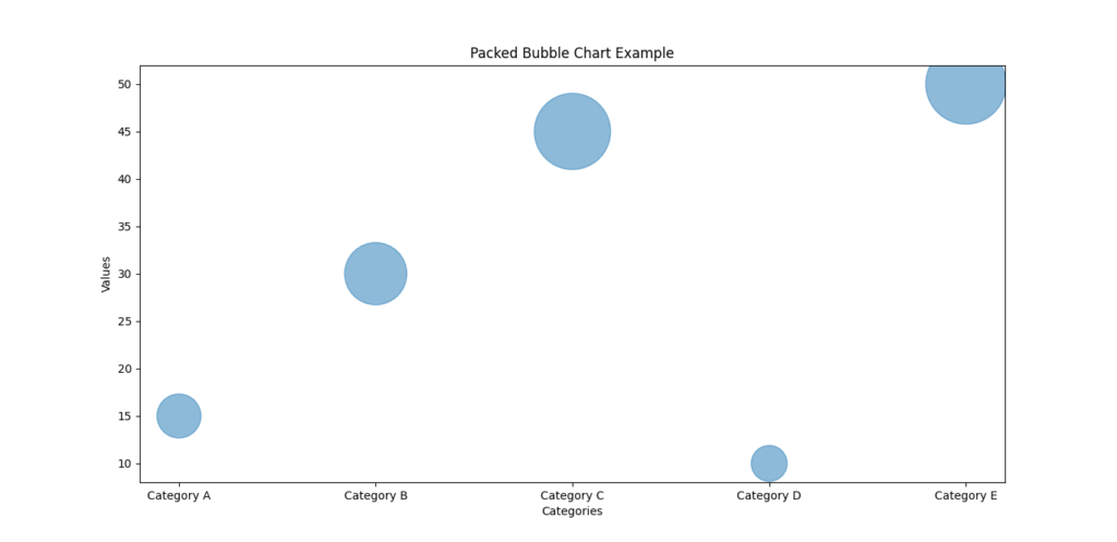
To illustrate, here’s a simple example using Matplotlib to create a packed bubble chart:
import matplotlib.pyplot as plt

# Sample data
data = {'Category A': 15, 'Category B': 30, 'Category C': 45, 'Category D': 10, 'Category E': 50}

# Plot
plt.figure(figsize=(10, 8))
plt.scatter(data.keys(), data.values(), s=[v * 100 for v in data.values()], alpha=0.5)
plt.title('Packed Bubble Chart Example')
plt.xlabel('Categories')
plt.ylabel('Values')
plt.show()
This code snippet generates a packed bubble chart where each category is represented by a bubble, sized according to its value. As you can see, this visualization method offers a fresh and engaging way to present data, making your insights more accessible and memorable.
Must Read
- How to Diagnose Overfitting in Machine Learning — 9 Proven Tools
- PyTorch Debugging Checklist: A Systematic Framework to Fix Models That Won’t Learn
- Why sorted() Is Safer Than list.sort() in Production Python Systems
- Monotonic Sequence in Python: 7 Practical Methods With Edge Cases, Interview Tips, and Performance Analysis
- How to Check if Dictionary Values Are Sorted in Python
Getting Started with Packed Bubble Charts in Matplotlib
To get started with creating packed bubble charts in Python, we first need to make sure we have all the right tools. In this case, we’ll be working with three key libraries: Matplotlib, NumPy, and SciPy. Each one plays a special role in our project.
Installing the Libraries
Matplotlib is our go-to library for creating plots and charts. It provides the basic building blocks for drawing bubbles, lines, and more. But to make packed bubble charts, we need a bit more help, so we’ll also use:
- NumPy: This library is excellent for handling numerical operations and arrays. It helps us perform calculations and manage data effectively.
- SciPy: Known for its scientific computing capabilities, SciPy includes tools that assist with the packing of bubbles into the chart.
To install these libraries, you simply need to run the following command in your terminal:
pip install matplotlib numpy scipy
Step-by-Step Guide to Creating Packed Bubble Charts
1. Import the Required Libraries
To begin, let’s import the important libraries. Matplotlib will handle the plotting, NumPy will assist with numerical operations, and SciPy will provide additional functionality.
import matplotlib.pyplot as plt
import numpy as np
import scipy.spatial
Example Script
Now, let’s walk through a simple example to create a packed bubble chart.
Defining the Data
To get started with packed bubble charts, the first step is to define the data you want to visualize. Let’s use a simple dataset with different categories and their corresponding values. This will help illustrate how each category can be represented as a bubble, with the size of each bubble corresponding to its value.
Here’s how you can define the data in Python:
data = {
    'Category A': 40,
    'Category B': 70,
    'Category C': 30,
    'Category D': 85,
    'Category E': 50,
    'Category F': 65,
}
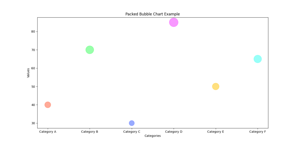
In this example, we have six categories, each with a numerical value. These values will determine the size of the bubbles in our chart. The idea is to represent each category as a bubble, where the size of the bubble makes it easy to compare the different categories at a glance.
Let’s break this down with a simple visualization in mind. Imagine each category as a colored bubble. Category A will have a smaller bubble compared to Category B since it has a lower value. Category D, with the highest value, will have the largest bubble, making it instantly recognizable.
By defining your data this way, you create a clear and structured foundation for your packed bubble chart. This format makes it easy to see relationships and proportions among different categories, which is one of the key benefits of using packed bubble charts.
Example with Diagram
To visualize how this data translates into a packed bubble chart, here’s a snippet:
import matplotlib.pyplot as plt
import numpy as np
import scipy.spatial

# Data
data = {
    'Category A': 40,
    'Category B': 70,
    'Category C': 30,
    'Category D': 85,
    'Category E': 50,
    'Category F': 65,
}

categories = list(data.keys())
values = list(data.values())

# Plot
plt.figure(figsize=(10, 8))
plt.scatter(categories, values, s=np.array(values) * 10, alpha=0.5, color=['#FF5733', '#33FF57', '#3357FF', '#F333FF', '#FFC300', '#33FFF3'])
plt.title('Packed Bubble Chart Example')
plt.xlabel('Categories')
plt.ylabel('Values')
plt.show()
In this example:
- Each category is represented as a bubble.
- The size of each bubble corresponds to its value, multiplied by 10 for better visibility.
- The colors make it easy to distinguish between categories.
Preparing the Data
To make your packed bubble chart look great, you need to prepare the data correctly. This step involves calculating the size of each bubble, which is determined by the values you defined earlier. Here’s how you can get everything ready for plotting.
Calculating the Radius of Each Bubble
In a packed bubble chart, the size of each bubble is crucial. To represent each value accurately, you’ll need to calculate the radius of each bubble. The radius helps ensure that the bubbles are proportionate to the values they represent.
Here’s how you can prepare your data:
- Extract Labels and Sizes: First, get the labels (categories) and sizes (values) from your dataset. This helps in organizing the data for plotting.
- Normalize the Sizes: To make sure the bubble sizes are proportional and visually meaningful, you need to convert the values into radii. This is done using the formula for the radius of a circle.
Here’s the Python code that does this:
import numpy as np

# Data
labels = list(data.keys())
sizes = np.array(list(data.values()))

# Normalize the sizes
radii = np.sqrt(sizes / np.pi)
Breaking Down the Code
- Extract Labels and Sizes:
labelsgets the names of your categories, andsizesconverts the values into a NumPy array for easier calculations. - Normalize the Sizes: The key here is the formula
radii = np.sqrt(sizes / np.pi). This formula calculates the radius of each bubble from its size. By dividing the size by π (pi) and taking the square root, you ensure that the bubble sizes are proportional to the values but not too large or small.
Why Normalize?
Normalization is important because it helps in maintaining a visual balance between bubbles. Without this step, some bubbles could be excessively large or small, making the chart less effective. By calculating the radius in this way, you ensure that each bubble reflects its value proportionally and looks aesthetically pleasing.
Example with Diagram
Let’s use the calculated radii to create a packed bubble chart. Here’s how it all comes together:
import matplotlib.pyplot as plt
import numpy as np

# Data
data = {
    'Category A': 40,
    'Category B': 70,
    'Category C': 30,
    'Category D': 85,
    'Category E': 50,
    'Category F': 65,
}

labels = list(data.keys())
sizes = np.array(list(data.values()))

# Normalize the sizes
radii = np.sqrt(sizes / np.pi)

# Plot
plt.figure(figsize=(10, 8))
plt.scatter(labels, sizes, s=np.pi * np.power(radii, 2), alpha=0.5, color=['#FF5733', '#33FF57', '#3357FF', '#F333FF', '#FFC300', '#33FFF3'])
plt.title('Packed Bubble Chart Example')
plt.xlabel('Categories')
plt.ylabel('Values')
plt.show()
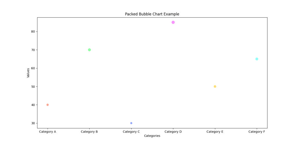
In this plot:
- Each bubble is sized according to its radius, which in turn is based on the value.
- The
s=np.pi * np.power(radii, 2)part ensures that the bubble size reflects the value accurately.
Positioning the Bubbles
Now that we’ve defined and prepared our data, the next step is to position the bubbles on the chart. To make sure the bubbles are packed tightly without overlapping, we’ll use a force-directed algorithm. While this step can get a bit technical, it’s crucial for creating a clear and effective packed bubble chart.
Why Positioning Matters
Proper positioning ensures that each bubble is placed in a way that avoids overlap with other bubbles. This makes the chart easier to read and visually appealing. The force-directed algorithm helps achieve this by simulating a physical system where bubbles push away from each other until they settle into a non-overlapping arrangement.
The Force-Directed Algorithm
Here’s a simple version of how we can position the bubbles:
import numpy as np

def pack_circles(radii):
    positions = []
    for r in radii:
        placed = False
        while not placed:
            x, y = np.random.uniform(-1, 1, size=2)
            position = np.array([x, y])
            if all(np.linalg.norm(position - pos) > (r + radii[i]) for i, pos in enumerate(positions)):
                positions.append(position)
                placed = True
    return np.array(positions)

positions = pack_circles(radii)
Breaking Down the Code
- Function Definition:
pack_circles(radii)is the function that calculates the positions of the bubbles. It takesradii(the sizes of the bubbles) as input and returns their positions. - Initial Setup: We start with an empty list called
positionswhere we’ll store the coordinates of each bubble. - Bubble Placement: For each bubble, we try placing it randomly within a coordinate range. The
np.random.uniform(-1, 1, size=2)function generates random x and y coordinates. - Checking Overlap: Before finalizing the position, we check if the new bubble overlaps with any existing bubbles. This is done using the
np.linalg.norm(position - pos) > (r + radii[i])condition. It ensures that the distance between the new bubble and existing ones is greater than the sum of their radii, preventing overlaps. - Finalizing Position: If the bubble does not overlap, we add its position to the
positionslist and mark it as placed.
Creating the Plot with Packed Bubbles
With everything set up, it’s time to bring your packed bubble chart to life! This step involves plotting the bubbles on a chart so you can see your data visually represented. Let’s walk through how to do this.
Plotting Each Bubble
Here’s the code to create and display your packed bubble chart:
import matplotlib.pyplot as plt

# Create the figure and axis
fig, ax = plt.subplots()
ax.set_aspect('equal')  # Ensure the aspect ratio is equal for a proper circle shape

# Plot each bubble
for i, (label, radius) in enumerate(zip(labels, radii)):
    # Create a circle for each data point
    circle = plt.Circle(positions[i], radius, label=label, alpha=0.5)
    ax.add_patch(circle)  # Add the circle to the plot
    # Add a label to the center of the circle
    ax.text(positions[i][0], positions[i][1], label, ha='center', va='center')

# Set limits for x and y axes
ax.set_xlim(-1.5, 1.5)
ax.set_ylim(-1.5, 1.5)
ax.axis('off')  # Hide the axes to focus on the bubbles
plt.show()
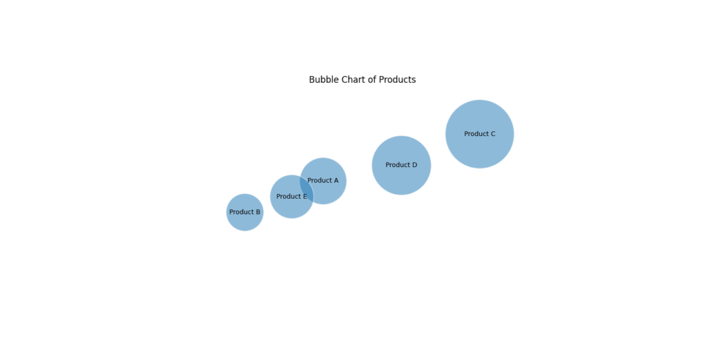
Breaking Down the Code
- Create the Figure and Axis:
fig, ax = plt.subplots()initializes the plotting area.ax.set_aspect('equal')ensures that circles look like circles, not ovals, by setting the aspect ratio to equal. - Plot Each Bubble:
- Circle Creation: For each bubble, we use
plt.Circle(positions[i], radius, label=label, alpha=0.5)to create a circle object.positions[i]determines where the circle is placed,radiussets its size, andalpha=0.5makes the bubble semi-transparent. - Adding Circles:
ax.add_patch(circle)adds each circle to the plot. - Adding Labels:
ax.text(positions[i][0], positions[i][1], label, ha='center', va='center')places the category label in the center of each circle.ha='center'andva='center'ensure the text is centered both horizontally and vertically.
- Circle Creation: For each bubble, we use
- Set Plot Limits:
ax.set_xlim(-1.5, 1.5)andax.set_ylim(-1.5, 1.5)define the range of the x and y axes, ensuring all bubbles fit within the view. - Hide the Axes:
ax.axis('off')removes the axis lines and labels. This makes the chart cleaner and helps the bubbles stand out more.
Customizing Your Packed Bubble Chart
Once you’ve created your packed bubble chart, you might want to make it even more engaging and informative. Customization can help highlight key insights and make your chart visually appealing. Here’s how you can enhance your packed bubble chart:
Adding Colors
Using different colors for each bubble can make your chart lively and easy to understand. Colors help distinguish between different categories at a glance.
Adding Annotations
Annotations are great for providing additional context or information about each bubble. You can add labels directly on the chart or use tooltips to show more details when hovering over a bubble.
Here’s a simple way to add annotations:
for i, (label, radius) in enumerate(zip(labels, radii)):
    circle = plt.Circle(positions[i], radius, color=colors[i], label=label, alpha=0.7)
    ax.add_patch(circle)
    ax.text(positions[i][0], positions[i][1], f'{label}\nValue: {sizes[i]}', ha='center', va='center', color='white', fontsize=10)
In this updated example:
- Each label now includes the value of the category, providing more insight into the data.
Adding Interactive Elements
For an even more engaging experience, you can use libraries like Plotly to create interactive packed bubble charts. With interactive charts, users can hover over bubbles to see more details or zoom in and out.
Customizing your packed bubble chart can turn a basic visualization into a dynamic and insightful tool. Whether you add colors to differentiate categories, annotations to provide extra information, or use interactive libraries like Plotly, these enhancements make your data more engaging and easier to understand. Enjoy experimenting with these customizations to make your charts truly shine!
Advanced Features and Techniques
Once you’re comfortable with creating basic packed bubble charts, there are several advanced features and techniques you can explore. These enhancements can make your charts even more informative and visually striking. Let’s explore some of these advanced techniques:
Advanced Customization
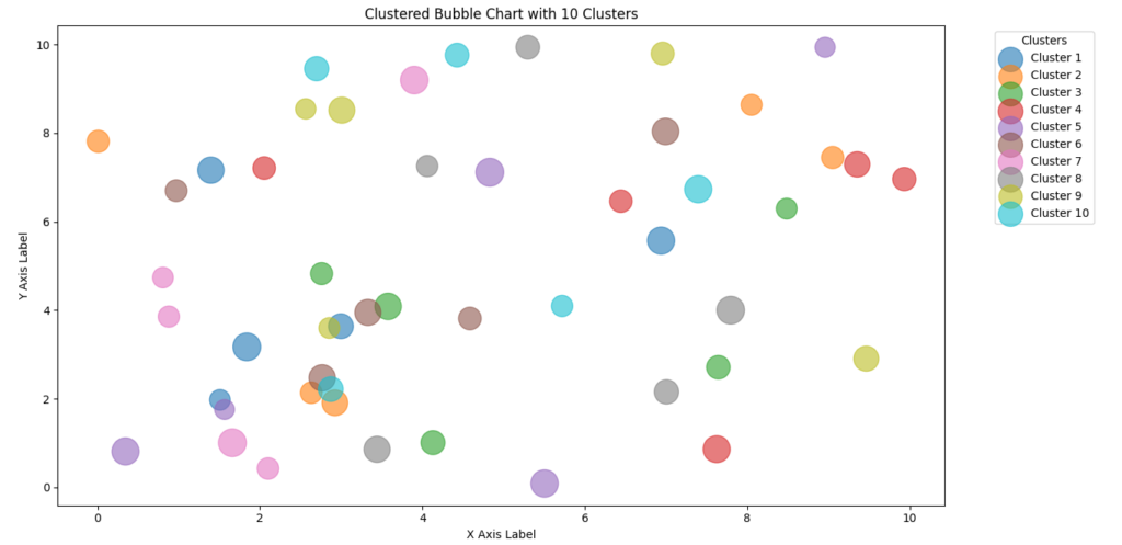
- Bubble Clustering: Bubble clustering involves grouping bubbles based on certain criteria to help visualize data relationships more clearly. This can be useful when you have many categories and want to highlight similar or related groups.Here’s a simple way to approach clustering:
- Define Clusters: Use a clustering algorithm like K-means to group your data into clusters.Plot with Distinct Colors: Assign different colors to each cluster to distinguish between them.
import matplotlib.pyplot as plt
import numpy as np

# Sample Data
num_clusters = 10
clusters = {}
colors = plt.cm.get_cmap('tab10', num_clusters)

for i in range(num_clusters):
    clusters[f'Cluster {i+1}'] = {
        'x': np.random.rand(5) * 10,  # Random x values
        'y': np.random.rand(5) * 10,  # Random y values
        'size': np.random.randint(300, 600, 5),  # Random sizes
        'color': colors(i)  # Unique color for each cluster
    }

# Create a new figure and axis
fig, ax = plt.subplots(figsize=(12, 8))

# Plot each cluster
for cluster, info in clusters.items():
    ax.scatter(info['x'], info['y'], s=info['size'], c=[info['color']], alpha=0.6, label=cluster)

# Add labels and title
ax.set_xlabel('X Axis Label')
ax.set_ylabel('Y Axis Label')
ax.set_title('Clustered Bubble Chart with 10 Clusters')
ax.legend(title='Clusters', bbox_to_anchor=(1.05, 1), loc='upper left')

# Show the plot
plt.tight_layout()
plt.show()
Using Images Within Bubbles
Adding images inside bubbles can make your chart more engaging, especially if you’re dealing with categories that have distinct visual representations.
Handling Large Datasets
When working with large datasets, performance and clarity become crucial. Here are some tips:
- Optimize Data Handling
- Downsampling: Reduce the number of data points by sampling a subset if the dataset is too large to visualize effectively.
- Aggregation: Group similar data points into larger categories to simplify the chart.
- Efficient Rendering
- Use Libraries: For very large datasets, consider using libraries designed for performance, such as Datashader or Plotly. They can handle large volumes of data and offer interactive features.
Example of Downsampling
import pandas as pd
import numpy as np

# Sample large dataset
np.random.seed(0)
large_data = pd.DataFrame({
    'Category': np.random.choice(['A', 'B', 'C', 'D', 'E', 'F'], 1000),
    'Value': np.random.rand(1000) * 100
})

# Aggregate data
aggregated_data = large_data.groupby('Category').agg({'Value': 'mean'}).reset_index()
- This code aggregates a large dataset into average values per category, simplifying the chart.
Advanced Use Cases
- Multi-Category Bubble ChartsIf you want to represent multiple categories within a single bubble, you can create a multi-category packed bubble chart. This is useful for showing complex data with overlapping categories.
Example Code:
import numpy as np
import matplotlib.pyplot as plt
from scipy.spatial import Voronoi, voronoi_plot_2d

# Sample data with sizes
categories = {
    'Category A': {'points': np.random.rand(10, 2) * 100, 'sizes': np.random.rand(10) * 1000},
    'Category B': {'points': np.random.rand(10, 2) * 100 + 50, 'sizes': np.random.rand(10) * 1000},
    'Category C': {'points': np.random.rand(10, 2) * 100 + 100, 'sizes': np.random.rand(10) * 1000}
}
def plot_voronoi_diagram(points, ax, color):
    vor = Voronoi(points)
    voronoi_plot_2d(vor, ax=ax, show_vertices=False, line_colors='white', line_width=2)
    for region in vor.regions:
        if not -1 in region and len(region) > 0:
            polygon = [vor.vertices[i] for i in region]
            ax.fill(*zip(*polygon), alpha=0.4, color=color)

def create_multi_category_bubble_chart(categories):
    fig, ax = plt.subplots(figsize=(10, 10))
    ax.set_xlim(0, 200)
    ax.set_ylim(0, 200)

    colors = ['#ff9999', '#66b3ff', '#99ff99']  # Custom colors for each category
    for i, (category, data) in enumerate(categories.items()):
        points = data['points']
        sizes = data['sizes']
        plot_voronoi_diagram(points, ax, colors[i])
        scatter = ax.scatter(points[:, 0], points[:, 1], s=sizes, label=category, color=colors[i], alpha=0.6, edgecolors='w', linewidth=0.5)
        # Adding labels for better readability
        for j, point in enumerate(points):
            ax.text(point[0], point[1], str(j+1), color='black', fontsize=8, ha='center', va='center')

    ax.legend()
    plt.title("Multi-Category Packed Bubble Chart")
    plt.show()

create_multi_category_bubble_chart(categories)

This chart displays multiple values per category within a single bubble, providing a richer view of the data.
Exploring advanced features and techniques can take your packed bubble charts to the next level. Whether you’re clustering bubbles, incorporating images, handling large datasets, or creating multi-category charts, these enhancements make your visualizations more insightful and captivating.
Common Issues and Troubleshooting
Creating packed bubble charts can be an exciting journey, but sometimes you might run into a few bumps along the way. Don’t worry—these challenges are common, and there are effective ways to address them. Let’s look at some typical issues you might encounter and how to tackle them.
Overlapping Bubbles
One of the most frequent problems is overlapping bubbles. This occurs when bubbles collide with each other, which can make the chart messy and difficult to read.
Solution: Use a force-directed algorithm to position your bubbles. This algorithm simulates physical forces to push bubbles apart until they fit without overlapping. Here’s a refined approach to ensure bubbles don’t overlap:
import numpy as np

def pack_circles(radii, max_attempts=100):
    positions = []
    for r in radii:
        placed = False
        attempts = 0
        while not placed and attempts < max_attempts:
            x, y = np.random.uniform(-1, 1, size=2)
            position = np.array([x, y])
            if all(np.linalg.norm(position - pos) > (r + radii[i]) for i, pos in enumerate(positions)):
                positions.append(position)
                placed = True
            attempts += 1
        if not placed:
            print(f"Warning: Unable to place bubble with radius {r}.")
    return np.array(positions)

positions = pack_circles(radii)
In this updated code:
- We limit the number of attempts to place each bubble to avoid infinite loops.
- A warning message is displayed if a bubble cannot be placed, helping you identify and address issues.
Performance Issues
Handling large datasets can sometimes slow down your chart rendering. Performance issues might make the process sluggish, especially with a lot of data points.
Solution: Here are a few tips to improve performance:
- Downsampling: Reduce the number of data points to make the chart more manageable.
- Efficient Algorithms: Use more efficient algorithms for packing bubbles, such as those implemented in libraries like Datashader or Plotly for large datasets.
Example of downsampling:
import pandas as pd
import numpy as np

# Sample large dataset
np.random.seed(0)
large_data = pd.DataFrame({
    'Category': np.random.choice(['A', 'B', 'C', 'D', 'E', 'F'], 1000),
    'Value': np.random.rand(1000) * 100
})

# Downsample by taking the top 100 entries
downsampled_data = large_data.head(100)
In this code:
- We limit the dataset to the top 100 entries, making it easier to handle and visualize.
Data Clarity
Sometimes, the chart might become cluttered if there are too many bubbles or if the labels overlap. This can make it challenging for viewers to interpret the data.
Solution: Improve clarity by:
- Adjusting Bubble Sizes: Ensure bubbles are proportionate to their values and avoid making them too large.
- Optimizing Label Placement: Use automatic text placement to avoid overlapping labels.
Example of text placement:
for i, (label, radius) in enumerate(zip(labels, radii)):
    circle = plt.Circle(positions[i], radius, color=colors[i], alpha=0.7)
    ax.add_patch(circle)
    ax.text(positions[i][0], positions[i][1], label, ha='center', va='center', fontsize=8, color='black', bbox=dict(facecolor='white', alpha=0.5))
In this example:
- Text Background: Adding a background to the text can improve readability.
Conclusion
Packed bubble charts are a powerful tool for visualizing data in a way that’s both informative and engaging. By showcasing data as bubbles of varying sizes and positions, these charts allow you to represent complex datasets in a visually appealing manner.
Whether you’re looking to display a wide range of categories, highlight proportions within a whole, or create a more interactive experience, packed bubble charts can enhance your data presentations in meaningful ways.
As you explore this visualization technique, don’t hesitate to experiment with your own data. Try different datasets, adjust bubble sizes, and play around with colors and labels. Each adjustment can provide new insights and make your charts even more compelling.
If you’re eager to learn more, here are some helpful resources to further your understanding:
Suggestion
Enjoyed learning about packed bubble charts? There’s so much more to explore! Subscribe to our blog to get the latest tips and tutorials on data visualization and advanced techniques.
Feel free to share this post on social media and engage with us in the comments. Your feedback and experiences can inspire others and contribute to a vibrant community of data enthusiasts.
And don’t forget to follow our blog for future posts. We’re excited to continue sharing innovative approaches to visualizing data and helping you enhance your data storytelling skills.
Happy visualizing, and see you in the next post!
Frequently Asked Questions
1. What is a packed bubble chart?
A packed bubble chart is a type of data visualization that displays bubbles (circles) packed closely together. Each bubble represents a data point, and its size can represent a specific data value, making it easy to compare different categories or values within a dataset.
2. Why should I use packed bubble charts?
Packed bubble charts are useful for displaying a large number of categories or data points in a visually engaging way. They help highlight proportions, relationships, and trends within the data, making it easier to understand complex datasets.
3. Can I customize the colors and sizes of the bubbles in my chart?
Yes, you can customize the colors and sizes of the bubbles. You can specify different colors for each category and use an additional data parameter to set the sizes of the bubbles, as demonstrated in the provided code.
4. What if I have overlapping categories in my data?
Overlapping categories can be visualized effectively with packed bubble charts. By using distinct colors and varying bubble sizes, you can clearly represent overlapping data points and highlight intersections between categories.
5. How can I add labels to the bubbles in my chart?
You can add labels to the bubbles by using the ax.text method in Matplotlib. This allows you to place text within or near the bubbles, making it easier to identify individual data points.







Leave a Reply