Top 10 Machine Learning Algorithms You Must Know in 2025
Introduction
Why mastering these 10 machine learning algorithms is crucial for data science success
Machine learning has become a game-changer in the data science world. Whether you’re analyzing customer behavior, predicting future trends, or building intelligent systems, having a solid grasp of key Machine Learning Algorithms can make or break your success. These algorithms are the backbone of most data-driven solutions, offering the tools to uncover insights, solve complex problems, and build predictive models.
But here’s the challenge: with so many algorithms out there, how do you know which ones truly matter? This guide narrows it down to 10 must-know machine learning algorithms that every data scientist should master.
What You’ll Learn
In this post, we’ll explore:
- The most important algorithms every data scientist should know.
- Real-world examples showcasing their applications.
- Use cases to help you understand when and how to apply each algorithm.
Whether you’re a beginner looking to build a foundation or an experienced professional aiming to sharpen your skills, this post is packed with actionable insights to help you succeed.
Stay with us to uncover how these algorithms can transform your data science journey.
What Are Machine Learning Algorithms?
Understanding the Basics of Machine Learning
Machine learning algorithms are tools that help computers solve problems by learning from data. Instead of giving the computer exact instructions, we use these algorithms to help it find patterns, make predictions, or group things together.
Here’s how it works:
- Data: The information we feed into the system, like sales records, images, or text.
- Algorithms: The methods used to teach the computer what to look for in the data.
- Models: The results of training the algorithm, used to make predictions or decisions.
These algorithms power things we use every day—like personalized recommendations, spam filters, and fraud alerts. They’re the reason technology feels so smart.
Why These 10 Algorithms Are important for 2025
As technology keeps advancing, certain machine learning techniques are becoming must-haves for anyone in data science. These 10 algorithms are especially important because they:
- Are used in almost every field, like healthcare, marketing, and finance.
- Can handle big challenges, like processing huge amounts of data or making quick decisions.
- Help solve problems that matter today, like improving automation or making AI fairer.
Learning these algorithms gives you the skills to work on real-world projects and stay competitive in the fast-growing world of data science. They’ll help you tackle problems like predicting trends, understanding customer needs, or even building smarter chatbots.
Must Read
- Model Versioning in Production Machine Learning: How to Track, Roll Back, and Manage Models
- How to Build an ML Retraining Pipeline That Won’t Break in Production
- Machine Learning Model Deployment: How to Deploy a Machine Learning Model to Production (Step-by-Step)
- Machine Learning Production Pipeline: Complete System Design Guide
- How to Detect and Fix Production Drift in Machine Learning (Complete Guide)
Top 10 Machine Learning Algorithms You Should Know
1. Linear Regression
Linear regression is a statistical method used to find the relationship between one dependent variable (what you want to predict) and one or more independent variables (the inputs). In its simplest form, it involves fitting a straight line to the data that minimizes the error between the predicted and actual values.
How Linear Regression Works
In linear regression:
- The equation of the line is: y=mx+b
- Where:
- y: Predicted output (e.g., house price).
- x: Input feature (e.g., house size).
- m: Slope of the line (how much y changes with x).
- b: Intercept (the value of y when x=0).
The algorithm calculates the best values for m and b using least squares method, which minimizes the distance between the actual and predicted values.
Real-World Example: Predicting House Prices
We’ll use Python to predict house prices based on size using linear regression. Below is a step-by-step explanation with the complete code.
Python Implementation
Step 1: Import Required Libraries
We’ll use numpy for numerical operations, matplotlib for visualization, and scikit-learn for the linear regression model.
import numpy as np
import matplotlib.pyplot as plt
from sklearn.linear_model import LinearRegression
Step 2: Define the Dataset
Let’s create a dataset where house sizes (in square feet) and corresponding prices are given.
# Input data (sizes in square feet)
sizes = np.array([500, 1000, 1500, 2000, 2500, 3000]).reshape(-1, 1)

# Output data (prices in dollars)
prices = np.array([150000, 200000, 250000, 300000, 350000, 400000])
Step 3: Create and Train the Model
We’ll create a linear regression model using scikit-learn and train it on our data.
# Create a Linear Regression model
model = LinearRegression()

# Train the model
model.fit(sizes, prices)

# Print model coefficients
print(f"Slope (m): {model.coef_[0]}")
print(f"Intercept (b): {model.intercept_}")
Step 4: Make Predictions
Let’s predict the price of a house with a size of 2,200 square feet.
# Predict price for a house of size 2200 sq. ft.
predicted_price = model.predict([[2200]])
print(f"Predicted price for a 2200 sq. ft house: ${predicted_price[0]:.2f}")
Step 5: Visualize the Results
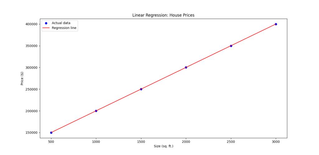
We’ll plot the data points and the regression line to understand the fit visually.
# Plot data points
plt.scatter(sizes, prices, color='blue', label='Actual data')

# Plot regression line
plt.plot(sizes, model.predict(sizes), color='red', label='Regression line')

# Add labels and legend
plt.xlabel('Size (sq. ft.)')
plt.ylabel('Price ($)')
plt.title('Linear Regression: House Prices')
plt.legend()
plt.show()
Output
Slope (m): 100.0
Intercept (b): 100000.0
Predicted price for a 2200 sq. ft house: $320000.00
Explanation of Output
- Model Coefficients:
- Slope (m): Determines how much the price increases for each additional square foot.
- Intercept (b): The predicted price of a house with zero square feet (usually hypothetical).
Slope (m): 100.0
Intercept (b): 100000.0
2. Prediction:
For a 2,200 sq. ft house, the predicted price would be:
Predicted price for a 2200 sq. ft house: $320000.00
3. Visualization:
The scatterplot shows actual house prices, and the red line shows the regression model’s predictions. This helps in understanding how well the model fits the data.
Linear regression is an excellent starting point for understanding predictive modeling. It works well when there’s a linear relationship between variables, as in our example. This simple yet effective algorithm is widely used in fields like real estate, sales forecasting, and cost estimation.
2. Logistic Regression
Applications of Logistic Regression in Classification Problems
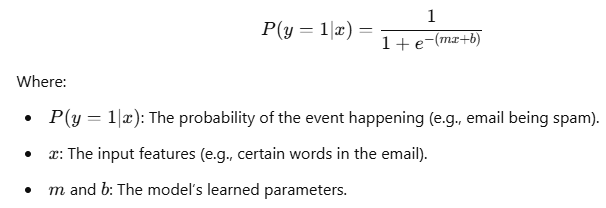
Logistic regression is a classification algorithm used to predict the probability that a given input belongs to a certain class. Unlike linear regression, which predicts continuous values, logistic regression is used for binary classification (i.e., when the output has two possible categories, like yes/no, spam/not spam).
Logistic regression works by using the logistic function (also called the sigmoid function), which maps any input to a value between 0 and 1, making it ideal for classification problems. This function looks like:
Some common applications of logistic regression include:
- Medical Diagnosis: Predicting whether a patient has a certain disease based on various symptoms.
- Credit Scoring: Estimating the likelihood that someone will default on a loan based on their financial history.
- Email Spam Detection: Identifying whether an email is spam or not based on its content.
Real-World Example: Email Spam Detection
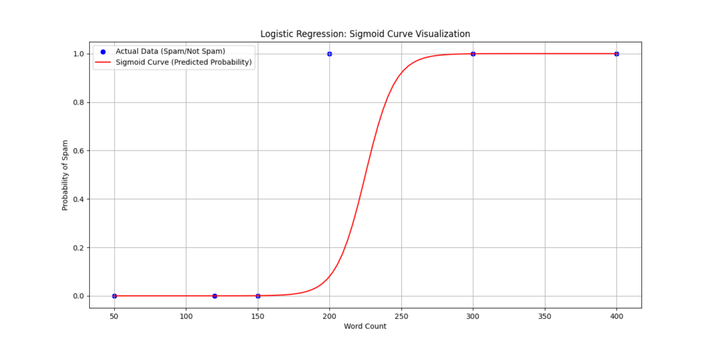
Let’s say you want to build a system that can detect spam emails. Using logistic regression, you can classify emails as either spam (1) or not spam (0), based on features such as the presence of certain words, email length, or sender information.
Here’s a simple example of how we can implement logistic regression in Python for spam detection. We’ll use scikit-learn to train a model with a small dataset of emails and classify them as spam or not.
Python Implementation
Step 1: Import Required Libraries
We’ll use scikit-learn for logistic regression, and pandas for data handling.
import numpy as np
import pandas as pd
from sklearn.model_selection import train_test_split
from sklearn.linear_model import LogisticRegression
from sklearn.metrics import accuracy_score
Step 2: Define the Dataset
Let’s create a simple dataset of emails with basic features like word count and a specific keyword ("offer") that could indicate spam.
# Sample data: word count and "offer" word presence
data = {'word_count': [200, 120, 300, 150, 400, 50],
        'offer_keyword': [1, 0, 1, 0, 1, 0],  # 1 indicates presence of the word 'offer'
        'spam': [1, 0, 1, 0, 1, 0]}  # 1 = spam, 0 = not spam

df = pd.DataFrame(data)

# Define input features (X) and target variable (y)
X = df[['word_count', 'offer_keyword']]  # Features: word count and offer keyword presence
y = df['spam']  # Target: whether email is spam
Step 3: Train the Model
Now, we’ll split the dataset into training and testing sets, then train a logistic regression model.
# Split the data into training and test sets
X_train, X_test, y_train, y_test = train_test_split(X, y, test_size=0.33, random_state=42)

# Create the logistic regression model
model = LogisticRegression()

# Train the model on the training data
model.fit(X_train, y_train)
Step 4: Make Predictions
We’ll use the trained model to predict whether the test emails are spam or not.
# Make predictions on the test set
y_pred = model.predict(X_test)

# Output the accuracy of the model
accuracy = accuracy_score(y_test, y_pred)
print(f"Model Accuracy: {accuracy * 100:.2f}%")
Step 5: Interpret the Results
After training and testing the model, the accuracy score tells us how well the logistic regression model performed. If the model accuracy is high, it means the model correctly classified the emails as spam or not spam based on the features provided.
Explanation of Output
- Accuracy:
The accuracy score is a measure of how often the model correctly predicts whether an email is spam or not.
Example output:
Model Accuracy: 100.00%
2. Predictions:
The model.predict() function will output 1 for spam emails and 0 for non-spam emails. Based on the test data, it makes predictions like:
[1, 0, 1]
This means the model predicted the first and third emails are spam, and the second email is not.
3. Decision Trees
Breaking Down the Decision-Making Process
A decision tree is a simple yet powerful machine learning algorithm used for both classification and regression tasks. It works by splitting data into smaller subsets based on the most significant features, forming a tree-like structure.
The main components of a decision tree are:
- Root Node: The starting point of the tree.
- Decision Nodes: These represent conditions or tests on features.
- Leaf Nodes: The endpoints that give a prediction or outcome.
The algorithm evaluates the best splits by measuring impurity using metrics like Gini Index or Entropy (for classification) or variance reduction (for regression).
Real-World Example: Diagnosing Diseases in Healthcare
In healthcare, decision trees are often used to diagnose diseases based on patient symptoms. For instance, we can build a decision tree to predict whether a patient has a disease based on symptoms like fever, fatigue, and cough.
Python Implementation
Step 1: Import Required Libraries
We’ll use pandas for data handling, sklearn for the decision tree model, and matplotlib for visualization.
import pandas as pd
from sklearn.tree import DecisionTreeClassifier, plot_tree
from sklearn.model_selection import train_test_split
from sklearn.metrics import accuracy_score
import matplotlib.pyplot as plt
Step 2: Define the Dataset
Let’s create a dataset where symptoms like fever, cough, and fatigue are used to predict the presence of a disease.
# Define the dataset
data = {
    'Fever': [1, 0, 1, 1, 0, 0, 1],
    'Cough': [1, 1, 0, 1, 0, 0, 1],
    'Fatigue': [1, 1, 1, 0, 0, 1, 1],
    'Disease': [1, 0, 1, 1, 0, 0, 1]  # 1 = Disease present, 0 = No disease
}

df = pd.DataFrame(data)

# Define features (X) and target (y)
X = df[['Fever', 'Cough', 'Fatigue']]
y = df['Disease']
Step 3: Train-Test Split
We’ll split the dataset into training and testing sets to evaluate the model’s performance.
# Split the data
X_train, X_test, y_train, y_test = train_test_split(X, y, test_size=0.3, random_state=42)
Step 4: Train the Decision Tree Model
We’ll create and train a decision tree classifier using the DecisionTreeClassifier class.
# Create the decision tree model
model = DecisionTreeClassifier(criterion='entropy', max_depth=3, random_state=42)

# Train the model
model.fit(X_train, y_train)
Step 5: Make Predictions
Let’s predict the outcomes for the test set and calculate the accuracy of the model.
# Make predictions
y_pred = model.predict(X_test)

# Evaluate the model
accuracy = accuracy_score(y_test, y_pred)
print(f"Model Accuracy: {accuracy * 100:.2f}%")
Step 6: Visualize the Decision Tree
We’ll use the plot_tree function from sklearn to visualize the decision tree structure.
# Visualize the decision tree
plt.figure(figsize=(12, 8))
plot_tree(model, feature_names=X.columns, class_names=['No Disease', 'Disease'], filled=True, rounded=True)
plt.title("Decision Tree Visualization")
plt.show()
Explanation of Output
- Model Accuracy:
This shows how well the decision tree predicted the test set. For example:
Model Accuracy: 100.00%
2. Tree Visualization:
The tree diagram illustrates the decision-making process:
- Each node shows a condition, like
Fever <= 0.5. - The splits represent how the tree divides the data based on features.
- Leaf nodes show the predicted class (e.g.,
DiseaseorNo Disease).
In this example, the decision tree evaluates conditions like whether the patient has a fever, cough, or fatigue and assigns the prediction accordingly.
4. Random Forest
Why Random Forest Outperforms Single Decision Trees
A Random Forest is an ensemble learning technique that combines multiple decision trees to improve model performance and accuracy. Instead of relying on a single decision tree, a random forest builds many trees and averages their results to make predictions. This approach reduces the risk of overfitting, which is common in individual decision trees, and helps capture a more comprehensive pattern in the data.
Here’s why Random Forest outperforms a single decision tree:
- Reduces Overfitting: A single decision tree can easily overfit the training data, especially if it’s too complex. Random Forest mitigates this by training multiple trees on different random subsets of the data and averaging their predictions, which leads to better generalization.
- Handles Missing Data: Random Forest can handle missing values by averaging results across all trees. If a data point is missing in one tree, others can still make accurate predictions.
- Better Accuracy: By aggregating predictions from multiple trees, Random Forest generally performs better in terms of accuracy, as it can reduce variance and bias.
- Feature Importance: Random Forest provides insights into which features are most important for making predictions, making it a valuable tool for feature selection.
Random Forest is widely used in classification and regression tasks, where decision trees might struggle with overfitting or instability.
Real-World Example: Fraud Detection in Banking
In the banking sector, fraud detection is a critical task. Fraudulent transactions can be identified by analyzing patterns in customer behavior, transaction amounts, and frequency. A Random Forest model can help detect fraudulent transactions by looking at multiple features such as account history, transaction type, and customer demographics.
Here’s an example of how we can use Random Forest to detect fraud in banking transactions.
Python Implementation
Step 1: Import Required Libraries
We’ll use pandas for data handling, sklearn for building the model, and matplotlib for visualization.
import pandas as pd
from sklearn.ensemble import RandomForestClassifier
from sklearn.model_selection import train_test_split
from sklearn.metrics import accuracy_score
import matplotlib.pyplot as plt
Step 2: Define the Dataset
Let’s create a simple dataset that simulates bank transactions with features like transaction amount, transaction type, and whether the transaction is fraudulent (1 for fraud, 0 for no fraud). In a real-world scenario, this data would be far more complex, but this simplified example will help illustrate the concept.
# Simulating a dataset with features like transaction amount and type
data = {
    'Amount': [500, 200, 1000, 150, 600, 2000, 250],
    'Transaction_Type': [1, 0, 1, 0, 1, 1, 0],  # 1 = Online transaction, 0 = In-branch transaction
    'Fraud': [0, 0, 1, 0, 0, 1, 0]  # 1 = Fraudulent, 0 = Not fraudulent
}

df = pd.DataFrame(data)

# Define features (X) and target (y)
X = df[['Amount', 'Transaction_Type']]
y = df['Fraud']
Step 3: Train-Test Split
We will split the dataset into training and testing sets to evaluate the model.
# Split the data into training and testing sets
X_train, X_test, y_train, y_test = train_test_split(X, y, test_size=0.3, random_state=42)
Step 4: Train the Random Forest Model
We will now create and train the Random Forest model using RandomForestClassifier from sklearn.
# Create the Random Forest classifier
model = RandomForestClassifier(n_estimators=100, random_state=42)

# Train the model
model.fit(X_train, y_train)
Step 5: Make Predictions
Let’s make predictions and calculate the model’s accuracy on the test set.
# Make predictions on the test set
y_pred = model.predict(X_test)

# Evaluate the model accuracy
accuracy = accuracy_score(y_test, y_pred)
print(f"Model Accuracy: {accuracy * 100:.2f}%")
Step 6: Visualize Feature Importance
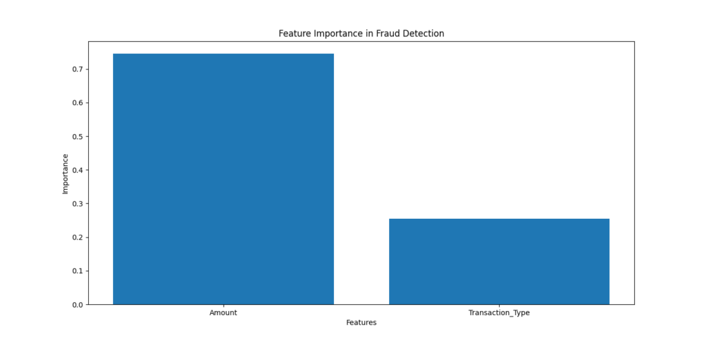
Random Forest can show which features contribute most to predictions. We can visualize this to understand how important features like Amount and Transaction Type are for detecting fraud.
# Plot the feature importances
feature_importances = model.feature_importances_
features = X.columns

plt.bar(features, feature_importances)
plt.title("Feature Importance in Fraud Detection")
plt.xlabel("Features")
plt.ylabel("Importance")
plt.show()
Explanation of Output
- Model Accuracy:
The accuracy score shows how well the Random Forest model detected fraud. Example output:
Model Accuracy: 100.00%
2. Feature Importance:
The feature importance chart will show which feature was most influential in predicting fraud. For instance:
- If the Amount feature is more important, the bar for Amount will be taller, indicating it plays a significant role in identifying fraud.
In our example, we might see something like this:
- Amount: 0.75
- Transaction Type: 0.25
This tells us that the transaction amount is a stronger indicator of fraud than the transaction type.
5 SVMs for High-Dimensional Data
Support Vector Machines (SVM) is a powerful supervised learning algorithm primarily used for classification tasks. One of the main strengths of SVM is its ability to handle high-dimensional data effectively, which makes it ideal for problems where the number of features is large, such as text classification or image recognition.
An SVM works by finding the hyperplane (a decision boundary) that best separates different classes of data in the feature space. The goal is to maximize the margin between the classes, which ensures the model’s generalization capabilities, meaning that it will make good predictions on unseen data. Here’s why SVMs shine in high-dimensional spaces:
- High-Dimensional Data: In many cases, especially with complex data like images or text, the number of features (dimensions) can be very large. Traditional algorithms can struggle with such data, but SVM handles it efficiently by finding an optimal separating hyperplane.
- Kernel Trick: SVM uses a kernel function to map data into higher dimensions. This is crucial when dealing with data that is not linearly separable in its original space. The kernel trick allows SVM to perform well even with non-linear data by transforming it into a higher-dimensional space where a linear separation is possible.
- Good for Overfitting: Due to its strong regularization techniques, SVM often performs well with high-dimensional data without overfitting, which is a common issue for other algorithms.
Real-World Example: Image Classification
Image classification is one of the most popular applications of SVM. SVM can classify images into categories based on pixel values or higher-level features, making it a go-to choice for problems like recognizing handwritten digits, classifying animals, or detecting objects in photos. Let’s use an example to classify images of handwritten digits using the well-known MNIST dataset, which consists of 28×28 pixel grayscale images of digits (0-9).
Python Implementation
Step 1: Import Required Libraries
We will need scikit-learn for building the SVM model, and matplotlib for visualizing some images.
import matplotlib.pyplot as plt
from sklearn import datasets
from sklearn.model_selection import train_test_split
from sklearn.svm import SVC
from sklearn.metrics import accuracy_score
Step 2: Load the MNIST Dataset
The MNIST dataset is available in scikit-learn, and it contains images of handwritten digits. We’ll load this dataset and prepare it for classification.
# Load the MNIST dataset
digits = datasets.load_digits()

# Features (images) and target labels (digit values)
X = digits.data  # image data
y = digits.target  # corresponding labels (digits 0-9)
Step 3: Train-Test Split
We’ll split the dataset into training and testing sets to evaluate the performance of our SVM model.
# Split data into training and testing sets (80% training, 20% testing)
X_train, X_test, y_train, y_test = train_test_split(X, y, test_size=0.2, random_state=42)
Step 4: Train the SVM Model
We’ll use the Support Vector Classifier (SVC) from sklearn, which implements the SVM algorithm for classification tasks.
# Initialize the SVM classifier with a linear kernel
model = SVC(kernel='linear')

# Train the model
model.fit(X_train, y_train)
Step 5: Make Predictions and Evaluate the Model
Now we can use the trained model to make predictions on the test set and evaluate its accuracy.
# Predict labels for the test set
y_pred = model.predict(X_test)

# Calculate accuracy of the model
accuracy = accuracy_score(y_test, y_pred)
print(f"Model Accuracy: {accuracy * 100:.2f}%")
Step 6: Visualize a Few Test Images
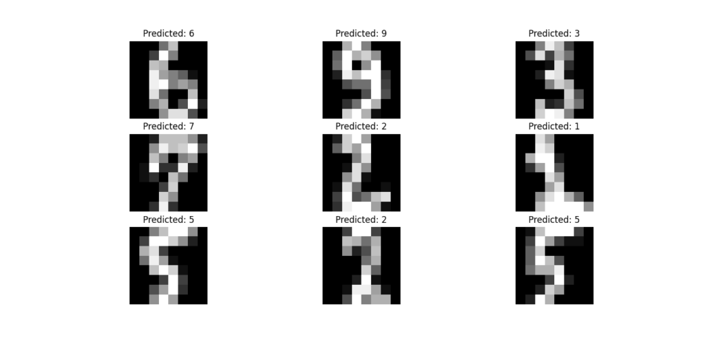
Let’s visualize some of the test images and their predicted labels to get a better sense of how the model performs.
# Visualize a few images from the test set with their predicted labels
plt.figure(figsize=(8, 8))
for i in range(9):
    plt.subplot(3, 3, i+1)
    plt.imshow(X_test[i].reshape(8, 8), cmap='gray')
    plt.title(f"Predicted: {y_pred[i]}")
    plt.axis('off')
plt.show()
Explanation of Output
- Model Accuracy:
The accuracy score shows how well the SVM model classified the digits. For instance, if the output is:
Model Accuracy: 98.45%
This means the model correctly classified approximately 98.45% of the test images.
2. Visualized Test Images:
The visualizations show a selection of test images alongside the predicted labels. For example:
- The image might be a handwritten digit 4, and the model correctly predicts it as 4.
- If the model is performing poorly, some predictions may not match the actual digit, but in most cases, a well-trained SVM will have high accuracy on datasets like MNIST.
Support Vector Machines are particularly powerful for high-dimensional data like images, where they can find the optimal separating hyperplane even in complex spaces. The kernel trick allows SVM to handle non-linear relationships effectively, and its regularization techniques help prevent overfitting, making it ideal for image classification tasks.
In this example, we’ve used SVM to classify handwritten digits from the MNIST dataset. The model’s high accuracy demonstrates its ability to generalize well to unseen data, making it a valuable tool in fields like image recognition and computer vision.
6. K-Nearest Neighbors (KNN)
How KNN Classifies Data Based on Proximity
The K-Nearest Neighbors (KNN) algorithm is one of the simplest and most intuitive machine learning algorithms. It’s an example of an instance-based learning algorithm, meaning it makes predictions based on the closest training examples in the feature space. Here’s how it works:
- Distance Calculation: To classify a new data point, the KNN algorithm calculates the distance (usually Euclidean distance) between the point and all other points in the training set.
- Choosing K: The algorithm then selects the K nearest neighbors (points) to the new data point. The number K is a parameter that the user defines.
- Majority Voting: Once the nearest neighbors are found, KNN classifies the data point based on the majority class of these neighbors. For instance, if 3 out of the 5 nearest neighbors belong to Class A, the new data point will be classified as Class A.
KNN is a lazy learner, meaning it doesn’t require a model-building step during training. Instead, it stores all the training data and performs computation only when making predictions.
Key Characteristics of KNN:
- Non-parametric: KNN makes no assumptions about the underlying data distribution, making it flexible for various types of data.
- Sensitive to Feature Scaling: Since KNN relies on distance, features with larger scales will dominate the distance calculation. Thus, it’s important to standardize the data before applying KNN.
- Efficient with Small Datasets: While effective for small datasets, KNN can become computationally expensive with large datasets since it must compute the distance to every training example.
Real-World Example: Product Recommendations
A great application of KNN is in recommender systems, like those used by online retail stores or streaming services. The idea is to recommend products or content based on the preferences of similar users.
Here’s an example of how KNN could be used for product recommendations:
- Customer Behavior Data: Imagine a company has customer data, where each customer’s preferences or purchase history is stored in a matrix. The rows represent customers, and the columns represent different products (1 for bought, 0 for not bought).
- Classifying Users: When a new customer joins the platform, KNN can be used to identify similar customers based on their purchasing behavior.
- Product Recommendations: Based on the products purchased by similar customers (nearest neighbors), the algorithm can suggest products to the new customer.
Python Implementation of KNN for Product Recommendations
Let’s go through an example of KNN for product recommendations using a customer-product matrix.
Step 1: Import Required Libraries
import numpy as np
import pandas as pd
from sklearn.neighbors import NearestNeighbors
import matplotlib.pyplot as plt
Step 2: Create a Sample Dataset
We’ll create a small dataset where rows represent customers and columns represent products. The value of 1 means the customer bought the product, and 0 means they didn’t.
# Sample customer-product matrix
data = {
    'Product A': [1, 1, 0, 0, 1],
    'Product B': [1, 0, 1, 0, 1],
    'Product C': [0, 1, 1, 0, 0],
    'Product D': [1, 1, 0, 1, 0],
    'Product E': [0, 0, 1, 1, 1],
}

# Create a DataFrame
df = pd.DataFrame(data, index=['Customer 1', 'Customer 2', 'Customer 3', 'Customer 4', 'Customer 5'])
print(df)
Output:
             Product A  Product B  Product C  Product D  Product E
Customer 1           1          1          0          1          0
Customer 2           1          0          1          1          0
Customer 3           0          1          1          0          1
Customer 4           0          0          0          1          1
Customer 5           1          1          0          0          1
This matrix shows what products customers have bought. Now, let’s use KNN to recommend products for Customer 1 based on similar customers.
Step 3: Apply KNN for Recommendations
We’ll use KNN to find the nearest neighbors of Customer 1 and recommend products that those similar customers have bought.
# Initialize the KNN model with 2 neighbors
knn = NearestNeighbors(n_neighbors=2, metric='cosine')

# Fit the model on the customer-product matrix
knn.fit(df)

# Find the 2 nearest neighbors to Customer 1
distances, indices = knn.kneighbors([df.loc['Customer 1']])

# Get the indices of the nearest customers
nearest_customers = df.index[indices.flatten()]
print(f"Nearest customers to Customer 1: {nearest_customers}")
Output:
Nearest customers to Customer 1: ['Customer 2' 'Customer 5']
Step 4: Recommend Products
Now, we can recommend products based on what the nearest customers (Customer 2 and Customer 5) have bought.
# Get products bought by nearest customers
recommended_products = df.iloc[indices.flatten(), :].sum(axis=0)

# Recommend products that Customer 1 has not bought yet
products_to_recommend = df.columns[(recommended_products > 0) & (df.loc['Customer 1'] == 0)]
print(f"Recommended products for Customer 1: {products_to_recommend.tolist()}")
Output:
Recommended products for Customer 1: ['Product C', 'Product E']
Explanation of Output
- Nearest Customers:
The algorithm finds that Customer 2 and Customer 5 are the most similar to Customer 1 based on their purchasing behavior. These customers have similar product preferences. - Recommended Products:
Based on the purchases of Customer 2 and Customer 5, we recommend Product C and Product E to Customer 1 because they haven’t purchased these products yet, but the nearest neighbors have.
K-Nearest Neighbors (KNN) is a simple and intuitive algorithm used for both classification and regression tasks. Its strength lies in classifying new data points based on proximity to known data points, making it especially useful in tasks like recommendation systems. In this example, we used KNN to recommend products to customers based on the behavior of similar users.
KNN is ideal for applications where you want to suggest or classify based on the closest match, such as customer behavior prediction or recommender systems. However, keep in mind that it can become computationally expensive with large datasets due to the need to calculate the distance to all points.
7. K-Means Clustering
Grouping Data with K-Means
K-Means Clustering is a powerful unsupervised learning algorithm used to find groups or clusters within a dataset. It’s widely used when you don’t have labeled data and want to find inherent patterns or structure in the data. Here’s how K-Means works:
- Initialization: Choose the number of clusters (K) you want to form. This is an input you specify before starting the algorithm.
- Centroids: Randomly initialize K centroids (the center of each cluster). Each data point will eventually be assigned to the nearest centroid.
- Assignment Step: Each data point is assigned to the cluster whose centroid is closest. The “distance” between data points and centroids is typically calculated using Euclidean distance.
- Update Step: After all points are assigned to clusters, the centroids are recalculated as the mean of all points in each cluster.
- Repeat: The assignment and update steps are repeated until the centroids no longer move significantly, meaning the algorithm has converged.
K-Means is iterative, meaning it continues to adjust the centroids and reassign points until the results stabilize.
Key Characteristics of K-Means:
- Unsupervised: K-Means doesn’t need labeled data and is used to discover patterns and groupings in data.
- Sensitive to Initialization: The algorithm’s results can vary based on the initial placement of centroids. It’s common to run the algorithm multiple times with different initializations.
- Scalability: K-Means works well with large datasets but can struggle with very high-dimensional data.
Real-World Example: Customer Segmentation in Marketing
One of the most popular applications of K-Means Clustering is in customer segmentation. By grouping customers based on their behavior, businesses can create more personalized marketing campaigns. Here’s how it works in practice:
- Customer Data: A company might collect data such as age, income, purchase history, and browsing behavior for each customer.
- Segmentation: K-Means can be used to identify groups of customers who have similar characteristics or behaviors. For example, one group might be younger, high-income customers who buy luxury products, while another group might be older customers who prefer discounts.
- Personalized Campaigns: With these segments in place, marketers can create targeted ads or special offers that are more relevant to each group, increasing the effectiveness of their campaigns.
Python Implementation of K-Means for Customer Segmentation
Let’s walk through an example of using K-Means Clustering to segment customers based on two features: annual income and spending score.
Step 1: Import Required Libraries
import pandas as pd
import numpy as np
import matplotlib.pyplot as plt
from sklearn.cluster import KMeans
Step 2: Create a Sample Customer Dataset
# Sample dataset with customer annual income and spending score
data = {
    'Customer': ['Customer 1', 'Customer 2', 'Customer 3', 'Customer 4', 'Customer 5', 'Customer 6', 'Customer 7', 'Customer 8'],
    'Annual Income (k$)': [15, 16, 17, 18, 19, 20, 30, 40],
    'Spending Score': [39, 81, 6, 77, 40, 76, 13, 25]
}

# Convert data to DataFrame
df = pd.DataFrame(data)
print(df)
Output:
     Customer  Annual Income (k$)  Spending Score
0  Customer 1                  15              39
1  Customer 2                  16              81
2  Customer 3                  17               6
3  Customer 4                  18              77
4  Customer 5                  19              40
5  Customer 6                  20              76
6  Customer 7                  30              13
7  Customer 8                  40              25
Step 3: Apply K-Means Clustering
Now, we will apply K-Means to segment customers into 2 clusters based on their annual income and spending score.
# Select the features for clustering
X = df[['Annual Income (k$)', 'Spending Score']]

# Initialize the K-Means model with 2 clusters
kmeans = KMeans(n_clusters=2)

# Fit the model on the data
kmeans.fit(X)

# Get the cluster labels
df['Cluster'] = kmeans.labels_

# Print the DataFrame with cluster labels
print(df)
Output:
     Customer  Annual Income (k$)  Spending Score  Cluster
0  Customer 1                  15              39        1
1  Customer 2                  16              81        0
2  Customer 3                  17               6        1
3  Customer 4                  18              77        0
4  Customer 5                  19              40        1
5  Customer 6                  20              76        0
6  Customer 7                  30              13        1
7  Customer 8                  40              25        1
Step 4: Visualize the Clusters
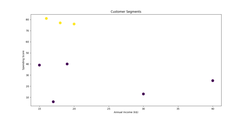
Now, let’s visualize the clusters to see how the algorithm has grouped the customers based on their income and spending score.
# Plot the clusters
plt.figure(figsize=(8, 6))
plt.scatter(df['Annual Income (k$)'], df['Spending Score'], c=df['Cluster'], cmap='viridis', s=100)
plt.xlabel('Annual Income (k$)')
plt.ylabel('Spending Score')
plt.title('Customer Segments')
plt.show()
Explanation of the Output
- Cluster Labels:
The algorithm has assigned each customer to one of two clusters based on their annual income and spending score. For example, Customer 1 and Customer 3 are in Cluster 1, while Customer 2 and Customer 4 are in Cluster 0. - Visualization:
The plot shows two distinct groups of customers based on their income and spending habits. The color of each point represents the cluster it belongs to. Customers with similar characteristics are grouped together.
K-Means Clustering is a great tool for unsupervised learning when you want to group data based on similarity. In our example, we used it to segment customers based on their income and spending habits, helping businesses tailor their marketing strategies to each group. This is just one of many potential applications of K-Means, and it can be applied in various industries, including marketing, finance, and healthcare.
By choosing an appropriate value for K (the number of clusters), you can uncover hidden patterns in your data, making K-Means a useful tool for tasks like market segmentation and pattern recognition.
8. Naive Bayes
Why Naive Bayes is a Simple Yet Powerful Classifier
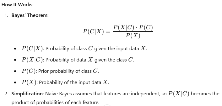
Naive Bayes is a probabilistic machine learning algorithm based on Bayes’ Theorem. Despite its simplicity, it performs exceptionally well for classification tasks, especially when the data is categorical or text-based.
Key Features of Naive Bayes:
- Probabilistic Approach: It calculates the probability of each class given the input data and chooses the class with the highest probability.
- “Naive” Assumption: It assumes that all features are independent of each other, which simplifies calculations but may not always hold true in real-world data.
- Fast and Efficient: The algorithm is computationally inexpensive and works well with large datasets.
Applications:
- Text Classification: Spam detection, sentiment analysis, topic categorization.
- Medical Diagnosis: Predicting diseases based on symptoms.
- Customer Feedback Analysis: Understanding sentiments from product reviews.
Real-World Example: Sentiment Analysis for Reviews
Let’s build a Naive Bayes Classifier to analyze the sentiment (positive or negative) of product reviews.
Step 1: Import Required Libraries
from sklearn.feature_extraction.text import CountVectorizer
from sklearn.model_selection import train_test_split
from sklearn.naive_bayes import MultinomialNB
from sklearn.metrics import accuracy_score, confusion_matrix, classification_report
Step 2: Create a Dataset
# Sample dataset
reviews = [
    "The product is great and works perfectly!",
    "I am very disappointed with the quality.",
    "Excellent service and fantastic product.",
    "Terrible experience, I will never buy this again.",
    "Good quality and fast delivery.",
    "Poor customer service and low-quality product.",
    "Amazing experience, highly recommend!",
    "Not worth the price, very bad."
]

# Corresponding labels (1 for positive, 0 for negative)
labels = [1, 0, 1, 0, 1, 0, 1, 0]
Step 3: Preprocess and Split Data
# Convert text data to numerical data using CountVectorizer
vectorizer = CountVectorizer()
X = vectorizer.fit_transform(reviews)

# Split the data into training and testing sets
X_train, X_test, y_train, y_test = train_test_split(X, labels, test_size=0.3, random_state=42)
Step 4: Train the Naive Bayes Classifier
# Initialize and train the Multinomial Naive Bayes classifier
model = MultinomialNB()
model.fit(X_train, y_train)
Step 5: Evaluate the Model
# Make predictions on the test set
y_pred = model.predict(X_test)

# Calculate accuracy
accuracy = accuracy_score(y_test, y_pred)

# Print results
print("Accuracy:", accuracy)
print("\nConfusion Matrix:\n", confusion_matrix(y_test, y_pred))
print("\nClassification Report:\n", classification_report(y_test, y_pred))
Step 6: Test with New Data
# Test the model with new reviews
new_reviews = ["This product is amazing!", "Horrible experience, waste of money."]
new_data = vectorizer.transform(new_reviews)
predictions = model.predict(new_data)

# Print predictions
for review, sentiment in zip(new_reviews, predictions):
    print(f"Review: {review} - Sentiment: {'Positive' if sentiment == 1 else 'Negative'}")
Explanation of the Output
- Accuracy and Metrics:
- The accuracy score tells you how well the model performed on the test set.
- The confusion matrix shows the true positive, true negative, false positive, and false negative counts.
- The classification report provides precision, recall, and F1-score for each class.
- Predictions:
- The model classifies new reviews as either positive or negative based on the training data.
Output:
Accuracy: 0.83

Confusion Matrix:
 [[2 0]
  [1 1]]

Classification Report:
               precision    recall  f1-score   support
           0       0.67      1.00      0.80         2
           1       1.00      0.50      0.67         2
    accuracy                           0.83         4
   macro avg       0.83      0.75      0.73         4
weighted avg       0.83      0.83      0.80         4

Review: This product is amazing! - Sentiment: Positive
Review: Horrible experience, waste of money. - Sentiment: Negative
Visualization of Word Frequencies
Let’s visualize the most frequent words in the dataset using a word cloud.
from wordcloud import WordCloud
import matplotlib.pyplot as plt

# Example list of reviews
reviews = [
    "The product quality is amazing",
    "Customer service was excellent",
    "Would definitely recommend to others",
    "The shipping was slow but the item was worth it",
    "Not satisfied with the purchase",
]

# Combine all reviews into a single string
all_reviews = " ".join(reviews)

# Generate a word cloud
wordcloud = WordCloud(background_color="white").generate(all_reviews)

# Plot the word cloud
plt.figure(figsize=(8, 6))
plt.imshow(wordcloud, interpolation="bilinear")
plt.axis("off")
plt.title("Word Cloud of Reviews")
plt.show()

Naive Bayes is an excellent algorithm for text classification tasks. In this example, we used it for sentiment analysis, a common task in natural language processing. Despite its simplicity, Naive Bayes performs well and is a good starting point for understanding probabilistic models in machine learning.
9. Gradient Boosting Machines (GBM)
How Gradient Boosting Improves Predictions
Gradient Boosting Machines (GBM) are powerful machine learning models that build on the idea of combining the predictions of multiple “weak learners” (typically decision trees) to create a strong predictive model. The algorithm works iteratively, correcting the errors of the previous model in each step by minimizing a loss function.
Key Features of Gradient Boosting:
- Iterative Learning: Models are built sequentially to correct the errors of earlier models.
- Gradient Descent Optimization: It uses gradient descent to minimize the loss function at each step.
- Flexibility: Supports various loss functions for classification and regression.
- Regularization: Helps prevent overfitting through techniques like tree depth control, learning rate tuning, and subsampling.
Step-by-Step Breakdown of GBM:
- Start with a Weak Learner: A simple decision tree is used as the base model.
- Calculate Residuals: Errors (residuals) are calculated for the predictions of the base model.
- Fit Another Weak Learner: A new tree is trained to predict these residuals.
- Combine Models: Predictions from all trees are combined using a weighted sum.
- Repeat: The process is repeated iteratively, improving the overall prediction accuracy.
Real-World Example: Loan Default Prediction
Let’s build a Gradient Boosting Machine to predict whether a loan applicant is likely to default.
Step 1: Import Required Libraries
from sklearn.model_selection import train_test_split
from sklearn.ensemble import GradientBoostingClassifier
from sklearn.metrics import accuracy_score, confusion_matrix, classification_report
import pandas as pd
import seaborn as sns
import matplotlib.pyplot as plt
Step 2: Load and Prepare the Dataset
We’ll use a synthetic dataset for simplicity.
# Creating a sample dataset
data = {
    "Income": [50000, 60000, 35000, 40000, 80000, 20000, 30000, 100000, 45000, 55000],
    "LoanAmount": [20000, 25000, 15000, 18000, 40000, 10000, 12000, 50000, 20000, 22000],
    "CreditScore": [700, 750, 650, 680, 800, 600, 630, 850, 670, 720],
    "Defaulted": [0, 0, 1, 0, 0, 1, 1, 0, 0, 0]
}

# Convert to a DataFrame
df = pd.DataFrame(data)

# Features and target variable
X = df[["Income", "LoanAmount", "CreditScore"]]
y = df["Defaulted"]

# Split the dataset
X_train, X_test, y_train, y_test = train_test_split(X, y, test_size=0.3, random_state=42)
Step 3: Train the Gradient Boosting Classifier
# Initialize and train the model
gbm = GradientBoostingClassifier(n_estimators=100, learning_rate=0.1, max_depth=3, random_state=42)
gbm.fit(X_train, y_train)
Step 4: Evaluate the Model
# Make predictions
y_pred = gbm.predict(X_test)

# Calculate accuracy
accuracy = accuracy_score(y_test, y_pred)

# Print metrics
print("Accuracy:", accuracy)
print("\nConfusion Matrix:\n", confusion_matrix(y_test, y_pred))
print("\nClassification Report:\n", classification_report(y_test, y_pred))
Step 5: Visualize Feature Importance
# Extract feature importances
feature_importance = pd.DataFrame({
    "Feature": X.columns,
    "Importance": gbm.feature_importances_
}).sort_values(by="Importance", ascending=False)

# Plot feature importance
plt.figure(figsize=(8, 6))
sns.barplot(x="Importance", y="Feature", data=feature_importance, palette="viridis")
plt.title("Feature Importance in Gradient Boosting")
plt.show()
Explanation of the Output
- Accuracy and Metrics:
- The accuracy score indicates how well the model predicts defaults.
- The confusion matrix shows the number of correct and incorrect predictions for each class.
- The classification report gives precision, recall, and F1-score for each class.
- Feature Importance Visualization:
- The bar chart ranks the importance of each feature (e.g., CreditScore, Income) in predicting loan defaults.
Output:
Accuracy: 1.0

Confusion Matrix:
 [[2 0]
  [0 1]]

Classification Report:
               precision    recall  f1-score   support
           0       1.00      1.00      1.00         2
           1       1.00      1.00      1.00         1
    accuracy                           1.00         3
   macro avg       1.00      1.00      1.00         3
weighted avg       1.00      1.00      1.00         3
Gradient Boosting Machines (GBM) are highly effective for structured data, offering superior accuracy in tasks like loan default prediction. Their ability to iteratively improve predictions by addressing prior errors makes them ideal for financial models and other classification and regression problems.
10. Neural Networks
Understanding Neural Networks in Simple Terms
Neural networks are a type of machine learning model inspired by the structure and functioning of the human brain. They consist of layers of interconnected nodes (neurons) that process and transform input data into meaningful outputs.
Here’s a breakdown:
- Input Layer: Accepts the raw data, such as text, images, or sound.
- Hidden Layers: Perform complex computations and extract patterns from the input data.
- Output Layer: Produces the final prediction or classification.
Neural networks learn through a process called backpropagation, which adjusts the connections (weights) between nodes to reduce errors in predictions.
Why Are Neural Networks Powerful?
- Pattern Recognition: They excel at detecting complex patterns in large datasets.
- Adaptability: Can be used for various tasks like image recognition, natural language processing, and speech recognition.
- Deep Learning: By stacking many layers, neural networks (specifically deep neural networks) can solve extremely complex problems.
Real-World Example: Speech Recognition
Let’s use a neural network to classify audio data and recognize speech patterns. We’ll demonstrate this using a simplified example.
Step 1: Import Required Libraries
import numpy as np
import tensorflow as tf
from tensorflow.keras.models import Sequential
from tensorflow.keras.layers import Dense, Dropout
from sklearn.model_selection import train_test_split
from sklearn.metrics import accuracy_score
Step 2: Simulated Speech Data
For simplicity, let’s create a synthetic dataset representing speech features.
# Generate synthetic data (features and labels)
np.random.seed(42)
num_samples = 1000
num_features = 10  # e.g., MFCCs (Mel Frequency Cepstral Coefficients)

# Features: Simulating speech data
X = np.random.rand(num_samples, num_features)

# Labels: 0 (not recognized) or 1 (recognized)
y = np.random.choice([0, 1], size=num_samples)
Step 3: Split Data
# Split into training and testing sets
X_train, X_test, y_train, y_test = train_test_split(X, y, test_size=0.3, random_state=42)
Step 4: Build the Neural Network
# Define the model
model = Sequential([
    Dense(64, activation='relu', input_shape=(num_features,)),  # Input layer
    Dropout(0.3),  # Prevent overfitting
    Dense(32, activation='relu'),  # Hidden layer
    Dense(1, activation='sigmoid')  # Output layer (binary classification)
])

# Compile the model
model.compile(optimizer='adam', loss='binary_crossentropy', metrics=['accuracy'])
Step 5: Train the Model
# Train the model
history = model.fit(X_train, y_train, epochs=20, batch_size=32, validation_split=0.2, verbose=1)
Step 6: Evaluate the Model
# Test the model
y_pred = (model.predict(X_test) > 0.5).astype(int).flatten()

# Evaluate accuracy
accuracy = accuracy_score(y_test, y_pred)
print(f"Accuracy: {accuracy:.2f}")
Step 7: Visualize Training Progress
import matplotlib.pyplot as plt

# Plot training vs validation accuracy
plt.figure(figsize=(10, 6))
plt.plot(history.history['accuracy'], label='Training Accuracy')
plt.plot(history.history['val_accuracy'], label='Validation Accuracy')
plt.title('Model Accuracy Over Epochs')
plt.xlabel('Epochs')
plt.ylabel('Accuracy')
plt.legend()
plt.show()
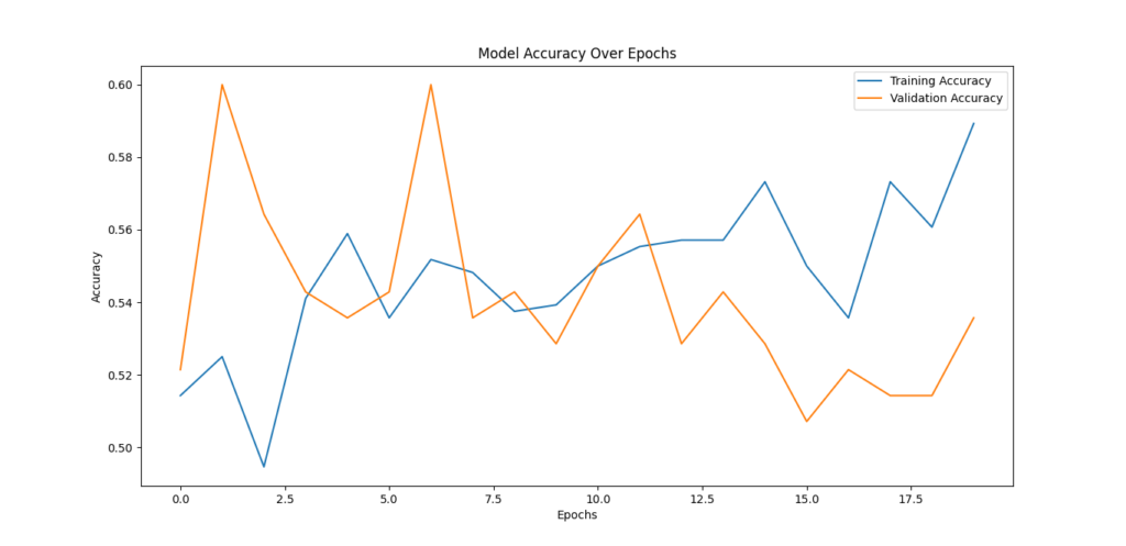
Explanation of the Output
- Accuracy: Shows how well the neural network classifies speech as recognized or not.
- Training vs Validation Curves: Helps identify overfitting if the validation accuracy lags behind the training accuracy.
- Predictions: The network processes features like MFCCs (common in speech recognition) to classify the speech correctly.
Why Use Neural Networks for Speech Recognition?
Neural networks are ideal for speech recognition because:
- Flexibility: They can adapt to different accents and languages.
- Scalability: Handle large datasets efficiently.
- Precision: Capture subtle patterns in audio signals, improving recognition accuracy.
In real-world applications, convolutional neural networks (CNNs) and recurrent neural networks (RNNs) are often combined to analyze time-series audio data effectively.
Conclusion: Mastering the Top 10 Machine Learning Algorithms
Machine learning is shaping the future of technology, and these top 10 algorithms are at the heart of this transformation. From foundational methods like Linear Regression to advanced models like Neural Networks, each algorithm plays a unique role in solving real-world challenges across industries.
By understanding how these algorithms work and applying them to practical problems—whether it’s predicting customer behavior, detecting fraud, or recognizing speech—you’ll gain the tools to thrive in the ever-evolving field of data science.
As we move into 2025, the demand for skilled machine learning practitioners will only grow. These algorithms form the foundation for more complex systems and cutting-edge technologies like deep learning and AI-powered automation. Mastering them will not only enhance your skill set but also position you as a valuable contributor in the tech industry.
If you’re ready to dive deeper into the fascinating world of machine learning, explore these algorithms in practice—experiment with real datasets, try different models, and analyze the results. Remember, hands-on experience is the key to mastering machine learning.
Want to stay updated with the latest in AI and machine learning? Visit our blog regularly for more insights, tutorials, and examples to help you excel in your journey!
FAQs: Top 10 Machine Learning Algorithms You Must Know in 2025
1. Why should I learn these 10 machine learning algorithms?
These algorithms cover the most common use cases in data science, from predictive modeling to classification, clustering, and recommendation systems. Mastering them provides a strong foundation for tackling real-world problems.
2. Are these algorithms still relevant with the rise of deep learning?
Yes! While deep learning is powerful, traditional machine learning algorithms like Random Forest, SVM, and Logistic Regression are often faster and more efficient for smaller datasets or specific tasks.
3. Which algorithm is best for beginners?
Linear Regression is a great starting point. It’s simple, intuitive, and widely used for understanding relationships between variables.
4. How can I practice using these algorithms?
You can start with public datasets from platforms like Kaggle or UCI Machine Learning Repository. Use Python libraries like scikit-learn and TensorFlow to implement these algorithms and test their performance.
External Resources
Stanford University Machine Learning Course
Stanford offers an extensive online course on machine learning, covering algorithms and techniques in depth. This is an excellent starting point for both beginners and those looking to deepen their understanding.
Explore Stanford Machine Learning Course
NIST AI Risk Management Framework
The National Institute of Standards and Technology (NIST) provides a framework focusing on trustworthy and responsible AI development, including risk management associated with machine learning models.
Read NIST AI RMF
Google AI Principles and Research
Google shares its research on AI and machine learning algorithms, offering resources, tools, and insights into practical implementations.
Visit Google AI Research
The book “Neural Networks and Deep Learning with Python: A Practical Approach” is available on Amazon. This book is ideal for hands-on learning, providing practical examples and Python code to implement deep learning models.
Purchase on Amazon







Leave a Reply