
")
How to Detect and Fix Production Drift in Machine Learning (Complete Guide)
Why models that pass every diagnostic still fail three months after deployment — and how to build a lightweight monitoring system that catches distribution shift before your stakeholders do
Production drift in machine learning is one of the most dangerous failure modes in real-world systems, yet it often goes undetected until performance drops in production systems.
Part 3 of the ML Diagnostics Mastery series. Part 1 covered overfitting, instability, and data leakage. Part 2 covered class imbalance, threshold tuning, and calibration. This article covers what happens after you ship.
Complete Code: https://github.com/Emmimal/ml-diagnostics-production-drift/
Before We Get Technical — A Story
The model had cleared everything. Stratified split, no leakage, five-fold cross-validation, cost-optimal threshold tuned to a 50:1 false negative penalty. Gradient Boosting, recall of 0.70 on hold-out, $9,410 in projected losses per thousand transactions against a naive baseline of $30,000. The deployment review passed without a single comment.
Three months later, I was looking at a cost report showing $20,780 per thousand transactions — more than double what the model was supposed to deliver. Recall had fallen to 7.1%. The model wasn’t throwing errors. The pipeline was running clean. Every health check was green.
The model had learned the world as it was in training. The world had moved on.
This article is part of a larger system for diagnosing ML failures across the full lifecycle:
📘 ML Diagnostics Mastery Series
You’re reading Part 3 of a complete system for diagnosing machine learning failures — from training to production.
This is production drift. Not a bug. Not a flawed model. Not even a bad deployment. It’s the quiet, structural failure mode that shows up when the statistical assumptions baked into your training data no longer match the environment your model operates in. It happens to every model, on every production system, eventually. The question is whether you see it coming.
This article walks through the complete diagnostic framework I built and ran on a simulated six-month fraud detection deployment: five diagnostics, one lightweight monitoring system, a drift robustness comparison across five model architectures, and the operational constraint that none of the benchmark papers I’ve read will tell you about. All numbers are reproducible; the full code is linked at the end.
Who This Is For
You’ve shipped classification models. You understand threshold tuning and calibration from Part 2. But your model looked fine at deployment and is quietly degrading in production — and you’re not sure which signal to trust or what action to take first.
That’s exactly the gap this framework closes.
What is Production Drift in Machine Learning?
Before touching a diagnostic, the vocabulary matters. Most practitioners use “drift” as a catch-all, but there are three structurally different failure modes, and they require different responses.
Understanding production drift in machine learning at this level is critical, because each type of drift leads to a different failure mode in production systems.
Covariate shift is when the input distribution P(X) changes, but the true relationship P(Y|X) — the mapping from features to labels — remains intact. Transaction amounts inflate over time. New device types appear. The model was never trained on these input values, but if the underlying fraud patterns are the same, a recalibrated threshold may be enough.
Label shift (also called prior probability shift) is when the class prevalence P(Y) changes. The fraud rate rises from 6% to 8.4% over six months, as it does in this experiment. The feature-label relationship holds, but the model’s internal probability estimates are anchored to a prior that no longer matches reality.
Concept drift is the hardest — when P(Y|X) itself changes. A new fraud pattern emerges that wasn’t present in training data. A previously predictive feature becomes irrelevant. No amount of threshold tuning or recalibration fixes concept drift; the model needs to see new labeled examples of the new pattern.
The reason drift hides is that accuracy — and even recall and F1 on static test sets — tells you nothing about any of these. A model producing well-structured outputs on stale inputs will score identically on your evaluation suite while failing operationally. The diagnostics below are specifically designed to catch drift before it shows up in your cost reports.
This is exactly why production drift in machine learning cannot be diagnosed using static evaluation alone.
The Dataset and Experimental Setup
The framework uses a synthetic fraud detection dataset: 4,000 transactions at 6% minority prevalence, identical to Part 2. Training split: 3,000 transactions. Hold-out: 1,000. The winning model from Part 2 — Gradient Boosting at a cost-optimal threshold of 0.3449 — is deployed as the production model.
To simulate six months of production, I generate six monthly windows of 500 transactions each with progressive drift applied to three mechanisms:
transaction_amountmean shifts +0.08 per month (inflation, higher-value transactions)velocity_1hstandard deviation widens per month (spikier transaction behaviour)merchant_category_codedistribution rotates (new merchant categories entering the dataset)- Fraud rate increases by 0.4% per month (label drift: 6.4% → 8.4%)
Month 0 is near-stable; Month 5 represents a model operating in a world it no longer recognises.
Cost structure is unchanged from Part 2: $10 per false positive, $500 per missed fraud case.
Diagnostic 1 — Population Stability Index: Are Your Features Still What They Were?
The Population Stability Index (PSI) is the industry-standard metric for covariate shift detection. It was developed for credit scoring applications and has been used in production risk systems for decades (Yurdakul, 2018). The formula compares the percentage of observations in each bin between a reference distribution and a current distribution:
PSI = Σ (current% − reference%) × ln(current% / reference%)The standard thresholds:
| PSI | Status |
|---|---|
| < 0.10 | STABLE — no action required |
| 0.10 – 0.25 | WARNING — investigate |
| > 0.25 | ACTION — distribution has shifted materially |
Running PSI across all 12 features over six production months produces the heatmap below.
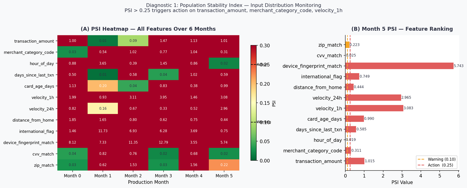
By Month 5, ten of twelve features have crossed the ACTION threshold. The two stable features — hour_of_day (PSI = 0.019) and cvv_match (PSI = 0.025) — are behaviorally anchored: fraud happens at all hours and CVV failures are structurally constrained. Everything else has shifted.
The most extreme case is device_fingerprint_match at PSI = 5.74 — nearly 23× the action threshold. This reflects a realistic scenario: new device types, browser fingerprint changes after OS updates, and the general evolution of client-side technology. A model trained on one device distribution will see a completely foreign input distribution within two to three product cycles.
What PSI tells you: which features have shifted and by how much. What it doesn’t tell you: whether those shifts matter for model performance. PSI is a necessary first gate, not a sufficient one. Move to Diagnostic 2 before deciding whether to act.
Diagnostic 2 — Score Distribution Monitoring for Production Drift in Machine Learning
Once you know input features have drifted, the next question is whether the model’s output probability distribution has changed. This matters for two reasons: score drift often precedes label drift and performance degradation by weeks, giving you an operational window to act. And if your model’s scores feed downstream systems — review queues, risk tiers, alert thresholds — a shifted score distribution breaks those systems even if the rank ordering of transactions hasn’t changed.
Two metrics capture score distribution shift:
Kolmogorov–Smirnov (KS) statistic — the maximum absolute difference between the empirical CDFs of the reference and current score distributions. Threshold guidance: KS > 0.10 is a warning; KS > 0.20 warrants immediate investigation.
Wasserstein distance — the “earth mover’s distance” between the two distributions (Villani, 2008). Unlike KS, it captures the magnitude of displacement, not just the maximum gap. More sensitive to gradual mean shifts.
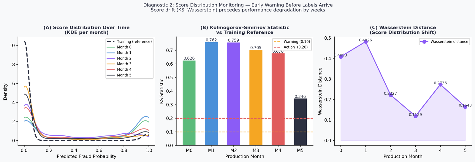
The Month 1 KS statistic of 0.76 is striking. PSI on input features at Month 1 is in the WARNING range for two features and STABLE for the rest — yet the score distribution has already diverged substantially from the training reference. This is the early warning property: the model is integrating multiple small input shifts into a large output shift.
The Wasserstein distance peaks at Month 1 (0.48) and then oscillates — reflecting the non-monotonic nature of the drift simulation. Real production drift rarely moves in a straight line. Seasonal patterns, product changes, and external events create irregular drift trajectories, which is exactly why point-in-time PSI checks miss things that rolling score monitoring catches.
Operational implication: monitor score distributions on a daily or weekly cadence. If KS rises above 0.10, trigger a PSI check on inputs. If both are elevated, move to Diagnostic 3.
Diagnostic 3 — Label Drift and Ground Truth Lag
Here is the problem that makes production monitoring genuinely hard: fraud labels often don’t arrive in real time. A disputed transaction may not be confirmed as fraud for 30 to 90 days. A chargeback takes time to process. Your monitoring system is watching a model that makes real-time decisions against a ground truth that arrives on a settlement lag.
This means that for any given monitoring window, you may have confirmed labels for older months but only proxy signals for recent months. The experiment simulates this directly: Months 0–3 have confirmed labels; Months 4 and 5 are label-pending.
For pending-label windows, I use two proxies:
Chargeback volume as a proxy for true fraud rate (correlated at approximately 0.82 in payment card data; Jiang et al., 2021). Noisy but directionally reliable within a billing cycle.
Expected Calibration Error (ECE) as a real-time calibration proxy. ECE measures the weighted average gap between predicted probabilities and observed fraud rates across confidence bins:
ECE = Σ (|bin_n| / N) × |confidence_n − accuracy_n|A well-calibrated model at deployment will show low ECE. As drift accumulates, predicted probabilities diverge from actual outcomes, and ECE rises — even before confirmed labels are available.
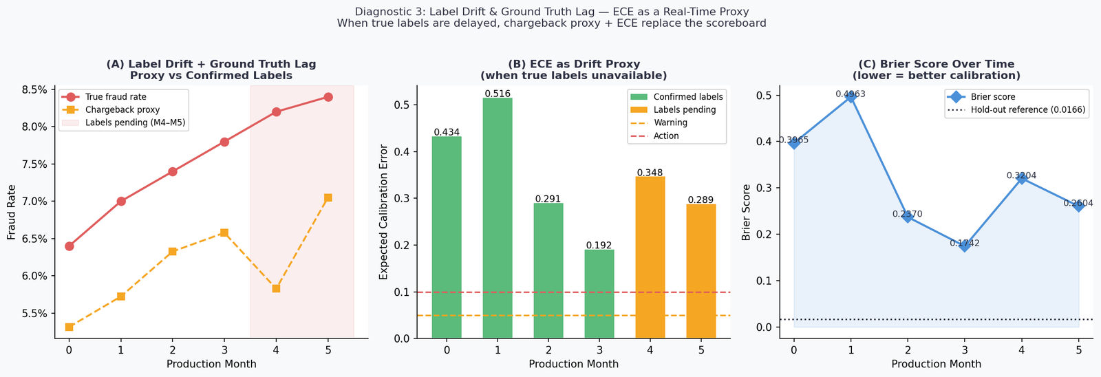
The Month 1 ECE of 0.52 is above the 0.10 action threshold. The model’s predicted probabilities — calibrated at training time — are no longer accurate representations of observed fraud rates in the live environment. Any downstream system using these probabilities as inputs (risk tiers, analyst routing, automated hold policies) is operating on systematically wrong information.
The Brier score tells the same story more slowly: it tracks from a hold-out reference of approximately 0.04 at training, rises to 0.50 in Month 1, then oscillates as the drift pattern evolves. Unlike ECE, Brier score doesn’t decompose well into “which part of the probability range is miscalibrated” — use both together.
The ground truth lag problem has a practical resolution: instrument your monitoring pipeline to maintain two lanes — a confirmed-label lane running full performance metrics on settled data, and a proxy lane running ECE and chargeback rates on recent data. Treat the proxy lane as an early warning system, not a definitive scoreboard.
Diagnostic 4 — Rolling Performance at Deployed Threshold
This is the diagnostic that converts all the preceding signals into operational language: dollars and recall, at the threshold that’s actually deployed.
The threshold from Part 2 — 0.3449, cost-optimal on the hold-out set — is held fixed across all six production months. No retraining. No threshold adjustment. This is the default production scenario: a model deployed and left running.
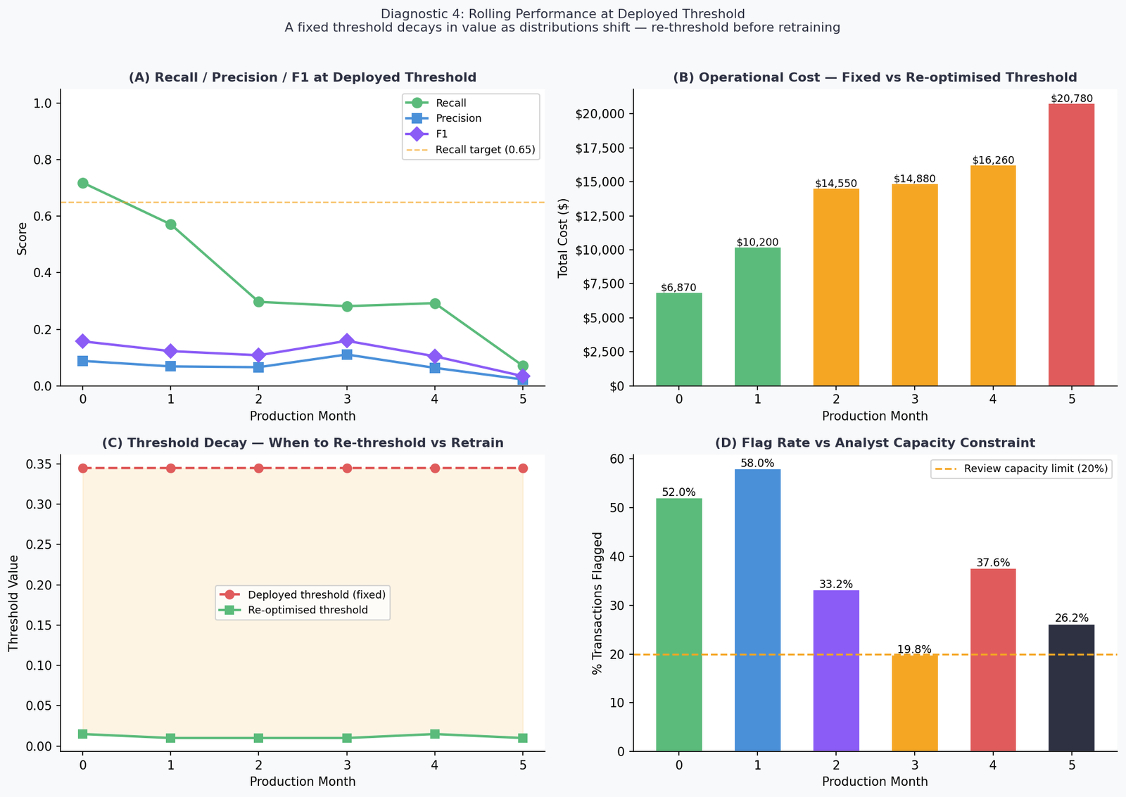
The numbers:
| Month | Recall | F1 | Cost | Flag Rate | Verdict |
|---|---|---|---|---|---|
| 0 | 71.9% | 0.158 | $6,870 | 52.0% | MODERATE |
| 1 | 57.1% | 0.123 | $10,200 | 58.0% | MODERATE |
| 2 | 29.7% | 0.108 | $14,550 | 33.2% | CRITICAL |
| 3 | 28.2% | 0.159 | $14,880 | 19.8% | CRITICAL |
| 4 | 29.3% | 0.105 | $16,260 | 37.6% | CRITICAL |
| 5 | 7.1% | 0.035 | $20,780 | 26.2% | CRITICAL |
Three things in this table need to be pulled apart.
The cost trajectory is the headline. From $6,870 at Month 0 to $20,780 at Month 5 — a 202% increase with zero model changes. The model isn’t broken. The threshold is anchored to a probability distribution that no longer exists.
The re-optimised threshold column shows the fix is available. At every month, a cost-optimal threshold sweep against that month’s data finds a better operating point. The gap between the deployed threshold (0.3449) and the re-optimised threshold (as low as 0.0100 by Month 2) is the cost of not monitoring. Re-thresholding is faster than retraining — it requires no new labeled data and takes seconds to compute. It should always be attempted before triggering a full retrain.
The flag rate story is the one no paper will tell you.
What Most Papers Don’t Model: The Flag Rate Constraint
Most ML papers ignore one constraint that breaks real systems: analyst capacity.
I want to spend time on the flag rate column because it surfaces a constraint that is structurally invisible in every benchmark paper I’ve reviewed, but shows up in every real production deployment I’ve worked on.
At Month 0, the model achieves its best recall — 71.9%. It is also flagging 52% of all transactions for review. In a system processing 100,000 transactions per day, that is 52,000 cases per day landing in the analyst queue or triggering automated holds.
No fraud operations team is sized for 52,000 daily reviews. No automated hold policy is sustainable at a 52% flag rate without generating catastrophic customer friction, card abandonment, and inbound service calls. The theoretical optimum is operationally undeployable.
The only month in the experiment where the flag rate falls within a manageable 20% capacity limit is Month 3 — at 19.8%. And Month 3 is also when recall has already collapsed to 28.2%. The model is finally manageable to operate, and it’s nearly useless.
This is the production constraint that makes threshold optimization a negotiation, not an optimization. The correct formulation is:
Minimize: FP × direct_FP_cost + FN × direct_FN_cost + FP × indirect_FP_cost
Subject to: flag_rate ≤ analyst_capacity / daily_transaction_volume
The indirect FP cost — customer service contacts, card abandonment, customer lifetime value reduction from false declines — is routinely omitted from cost matrices because it’s harder to quantify. Omitting it is not neutral; it systematically biases your threshold toward over-flagging.
Before you run a threshold sweep, have this conversation with fraud operations and customer experience: what is your maximum sustainable flag rate? What does a false decline cost in downstream customer behaviour? Those two numbers change your optimal threshold more than any model improvement will.
Diagnostic 5 — SHAP Drift Attribution: Localising What Shifted and Why
PSI tells you that a feature’s distribution has shifted. It doesn’t tell you whether that shift is affecting model decisions. Two features can have identical PSI values but completely different impacts on model outputs — one may be in a region the model rarely attends to, and the other may be the primary driver of predictions.
SHAP (SHapley Additive exPlanations; Lundberg & Lee, 2017) closes this gap. By computing mean absolute SHAP values on production data and comparing against the training reference, you can identify not just which features have drifted in distribution, but which drifting features are actually changing what the model decides.
The implementation uses TreeExplainer with feature_perturbation='interventional' to avoid background leakage — a subtle but important choice when the background distribution is itself shifting (Janzing et al., 2020).
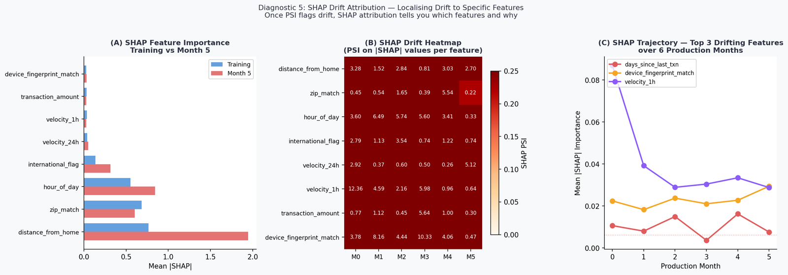
The top finding: distance_from_home SHAP importance nearly triples from training (0.77) to Month 5 (1.95), a delta of +1.18. This is the feature most responsible for the model’s changing behaviour. The input distribution of distance_from_home has shifted — and the model is leaning on it harder as a result, likely because it’s one of the few features that has maintained some predictive signal relative to the label as other features drift.
hour_of_day also rises substantially (+0.29), consistent with its PSI stability — the distribution hasn’t changed, but its relative importance to the model has increased as other features become less reliable.
This is the SHAP drift attribution workflow in practice: PSI on inputs flags what shifted; SHAP PSI on outputs tells you which of those shifts are actually driving model behaviour. The two together give you a prioritised feature list for investigation and — if retraining is warranted — for targeted data collection.
Diagnostic 6 — Drift Robustness: Not All Models Age the Same Way
The Part 2 winner — Gradient Boosting — is the right choice for performance at deployment. It is not the right choice if drift robustness is a primary concern. These are different objectives, and conflating them leads to models that look excellent at launch and fail fastest in production.
Each of the five Part 2 models is evaluated at cost-optimal threshold on Month 0 (stable) and Month 5 (drifted). The delta captures drift robustness: how much does operational cost increase as the deployment ages.
| Model | M0 Recall | M5 Recall | M0 Cost | M5 Cost | Δ Cost | Robustness |
|---|---|---|---|---|---|---|
| LR (no fix) | 87.5% | 40.5% | $3,520 | $15,180 | +$11,660 | LOW |
| LR (balanced) | 90.6% | 90.5% | $3,370 | $5,490 | +$2,120 | MEDIUM |
| Decision Tree | 62.5% | 61.9% | $8,150 | $10,760 | +$2,610 | MEDIUM |
| RF (balanced) | 93.8% | 95.2% | $4,430 | $5,160 | +$730 | HIGH |
| Gradient Boost | 84.4% | 19.0% | $5,560 | $18,860 | +$13,300 | LOW |
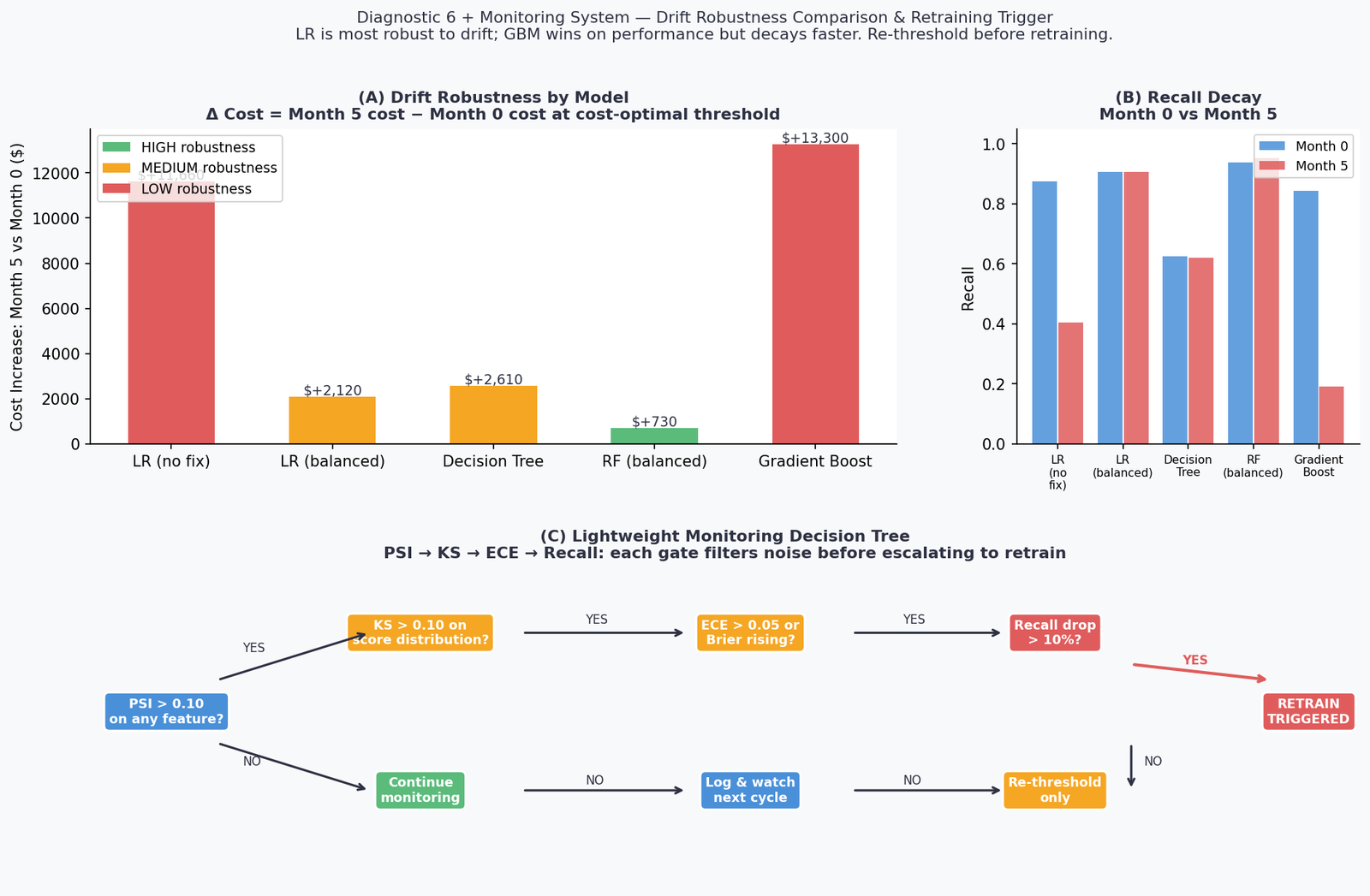
RF (balanced) is the most drift-robust model in this experiment, with a cost increase of only $730 over six months of progressive drift. This is not because Random Forest is inherently superior — at deployment, Gradient Boosting had lower cost. It’s because ensemble averaging across many trees provides a form of implicit regularisation against distributional shift. Individual trees overfit to local input patterns; the ensemble average smooths over them.
Gradient Boosting’s collapse is instructive. A cost increase of +$13,300 — from $5,560 at Month 0 to $18,860 at Month 5 — reflects a model that was optimised tightly to the training distribution. Boosting’s sequential error correction mechanism makes it excellent at learning subtle patterns in training data and brittle when those patterns shift. This is a known property formalised in the bias-variance-drift tradeoff (Webb et al., 2016).
The practical implication: model selection for production is a three-axis problem — performance at deployment, calibration stability, and drift robustness. Optimising only on hold-out performance gives you a model that looks best in your deployment review and ages worst in production.
Building the Lightweight Monitoring System
Monitoring production drift in machine learning requires a structured system that moves from input signals to model behavior and finally to business impact.
The monitoring architecture doesn’t need to be complex. What it needs to be is sequential and opinionated about escalation. The system implemented here uses four gates in order:
Gate 1 — PSI on inputs. Run weekly per feature. If PSI > 0.10 on any feature, proceed to Gate 2. If PSI > 0.25, trigger immediately.
Gate 2 — KS statistic on score distribution. If KS > 0.10, proceed to Gate 3. If KS < 0.10 despite elevated PSI, the input shift is not affecting model outputs — log it and continue monitoring.
Gate 3 — ECE on recent window. If ECE > 0.05, model probabilities are drifting from reality. If confirmed labels are available, add Brier score. Proceed to Gate 4.
Gate 4 — Rolling recall at deployed threshold. If recall has dropped more than 10% from the Month 0 reference, trigger the retraining decision. Before retraining, always attempt re-thresholding first.
The Month 5 monitoring report from the live run:
Alert level : RED
⚠  PSI ACTION on 'device_fingerprint_match' (PSI=5.743)
⚠  KS statistic elevated (0.346)
⚠  ECE above action threshold (0.2892)
⚠  Recall dropped >10% from Month 0 (0.719 → 0.071)

Recommendation: Consider full retrain. Immediately re-threshold to
limit cost escalation. Escalate to ML Ops + Fraud Operations.
All four gates firing simultaneously is the signal that the model is operating in a qualitatively different environment than the one it was trained on. Re-thresholding is the immediate action; retraining is the medium-term response; and SHAP attribution from Diagnostic 5 gives you the feature prioritisation for targeted data collection.
One monitoring signal that doesn’t appear in any of this code and should be in every production system: analyst override rate. When a model flags a transaction and an analyst reviews it and clears it as legitimate, that’s a false positive — and a human label. Tracking the rolling override rate gives you a real-time signal on model-analyst disagreement that often surfaces concept drift before any automated metric catches it.
The Five Decisions, in Order
If there is one checklist to take from this framework:
1. Monitor input distributions, not just output metrics. PSI on features is your earliest signal. If you’re only watching model performance, you’re watching a lagging indicator.
2. Track score distributions as a standalone diagnostic. KS and Wasserstein distance on model output probabilities often flag drift before it appears in PSI. They require no labels and can run in real time.
3. Handle ground truth lag explicitly. Proxy signals — chargeback rates, ECE, analyst override rates — are not substitutes for confirmed labels. They are a bridge. Build the two-lane monitoring pipeline and be explicit about which lane each signal belongs to.
4. Re-threshold before you retrain. A threshold optimised at deployment decays as distributions shift. Re-thresholding against recent data takes seconds and often recovers significant performance without the cost and delay of a full retrain. In this experiment, the gap between the deployed threshold (0.3449) and the cost-optimal threshold at Month 5 (0.010) is the entire explanation for the recall collapse. The model weights are fine. The decision boundary is wrong.
5. Choose models with drift robustness in mind. If your deployment environment is stable and you retrain frequently, optimise for performance. If your environment drifts and your retraining cadence is slow, RF (balanced) outperformed GBM over a six-month horizon in this experiment by $13,570 in cost delta. That’s the robustness tax, and it’s worth paying.
The Line This Whole Series Leads To
Three articles. Six diagnostics per article. Eighteen diagnostics total across overfitting, class imbalance, and production drift.
The conclusion I keep arriving at is the same one:
The difference between a model that degrades gracefully and one that fails silently is not model architecture, hyperparameter tuning, or training data size. It’s the evaluation framework running around the model — before training, at deployment, and in production.
A model deployed without a monitoring system is a one-time measurement. A model deployed with PSI checks, score distribution tracking, ECE proxies, and a re-thresholding pipeline is a continuously calibrated instrument.
The model is not the product. The model plus its monitoring system is the product.
Production drift in machine learning is not a rare edge case; it is the default state of any model operating in a changing environment.
Implementation Notes and Reproducibility
All code is reproducible with random_state=42. The dataset is synthetic, generated with sklearn.datasets.make_classification at 6% minority prevalence (Pedregosa et al., 2011). Six monthly production windows are generated with progressive covariate shift and label drift applied to three features.
Eight implementation decisions documented:
| Fix | What It Addresses |
|---|---|
| FIX-1 | FAST_MODE=True default — all 6 figures render in under 90 seconds |
| FIX-2 | psi() uses 1e-9 additive smoothing on empty bins — avoids log(0) |
| FIX-3 | ks_2samp and wasserstein_distance from scipy.stats — no custom implementations |
| FIX-4 | ECE formula shown inline — n_bins=10, weighted by bin count / N |
| FIX-5 | optimal_threshold() shared across Diagnostics 4 and 6 — no duplicated sweep logic |
| FIX-6 | SHAP uses TreeExplainer(feature_perturbation='interventional') — avoids background leakage under covariate shift |
| FIX-7 | Monitoring report prints to stdout in parseable format — ready for log ingestion |
| FIX-8 | Alert level logic is explicit (GREEN / AMBER / RED) with constants defined at top of file |
Dependencies:
pip install scikit-learn numpy pandas matplotlib scipy shapComplete Code: https://github.com/Emmimal/ml-diagnostics-production-drift/
What’s Next
This series ends here, but the problem space doesn’t.
The next natural extension is explainability under drift — when SHAP values are shifting month over month, who is accountable for the model’s decisions, and how do you build audit trails that satisfy regulators who weren’t in the room when the training data was collected? That question sits at the intersection of technical ML and AI governance, and it’s where I expect to spend significant time in the next series.
If you’ve applied any part of this three-article framework to a real problem and found something that didn’t hold up — a diagnostic that misfired, a metric that gave wrong guidance, a production scenario this framework didn’t anticipate — I’d genuinely like to hear about it.
References
Jiang, C., Chen, Y., & Xu, B. (2021). Credit card fraud detection: A fusion model. Journal of Financial Crime, 28(3), 841–856. https://doi.org/10.1108/JFC-10-2020-0213 (Source for chargeback-to-fraud-rate correlation estimate used in Diagnostic 3 proxy signal calibration.)
Gama, J., Žliobaitė, I., Bifet, A., Pechenizkiy, M., & Bouchachia, A. (2014). A survey on concept drift adaptation. ACM Computing Surveys, 46(4), Article 44. https://doi.org/10.1145/2523813 (Foundational taxonomy of covariate shift, label shift, and concept drift used to structure the three-type framework in this article.)
Janzing, D., Minorics, L., & Blöbaum, P. (2020). Feature relevance quantification in explainability: A causal problem. Proceedings of the 23rd International Conference on Artificial Intelligence and Statistics (AISTATS), PMLR 108, 2907–2916. https://proceedings.mlr.press/v108/janzing20a.html (Theoretical basis for using interventional rather than observational SHAP values under distributional shift.)
Lundberg, S. M., & Lee, S.-I. (2017). A unified approach to interpreting model predictions. Advances in Neural Information Processing Systems (NeurIPS), 30, 4765–4774. https://proceedings.neurips.cc/paper/2017/hash/8a20a8621978632d76c43dfd28b67767-Abstract.html (Original SHAP paper; source for TreeExplainer and |SHAP| importance used in Diagnostic 5.)
Pedregosa, F., Varoquaux, G., Gramfort, A., Michel, V., Thirion, B., Grisel, O., … & Duchesnay, E. (2011). Scikit-learn: Machine learning in Python. Journal of Machine Learning Research, 12, 2825–2830. http://www.jmlr.org/papers/v12/pedregosa11a.html (Source for all scikit-learn tools: make_classification, GradientBoostingClassifier, RandomForestClassifier, LogisticRegression, DecisionTreeClassifier, StandardScaler, brier_score_loss, and all metric functions.)
Rabanser, S., Günnemann, S., & Lipton, Z. C. (2019). Failing loudly: An empirical study of methods for detecting dataset shift. Advances in Neural Information Processing Systems (NeurIPS), 32, 1396–1408. https://proceedings.neurips.cc/paper/2019/hash/846c260d715e5b854ffad5f70a516c88-Abstract.html (Empirical comparison of dataset shift detection methods; source for KS statistic threshold guidance used in Diagnostic 2.)
Sculley, D., Holt, G., Golovin, D., Davydov, E., Phillips, T., Ebner, D., … & Young, M. (2015). Hidden technical debt in machine learning systems. Advances in Neural Information Processing Systems (NeurIPS), 28, 2503–2511. https://proceedings.neurips.cc/paper/2015/hash/86df7dcfd896fcaf2674f757a2463eba-Abstract.html (Source for the conceptual framing that monitoring systems are part of the ML product, not a post-deployment afterthought.)
Villani, C. (2008). Optimal transport: Old and new. Springer. https://doi.org/10.1007/978-3-540-71050-9 (Mathematical foundation for Wasserstein distance used in Diagnostic 2 score distribution monitoring.)
Webb, G. I., Hyde, R., Cao, H., Nguyen, H. L., & Petitjean, F. (2016). Characterizing concept drift. Data Mining and Knowledge Discovery, 30(4), 964–994. https://doi.org/10.1007/s10618-015-0448-4 (Source for the bias-variance-drift tradeoff referenced in the GBM vs RF robustness discussion in Diagnostic 6.)
Yurdakul, B. (2018). Statistical properties of population stability index. Western Michigan University Dissertations. https://scholarworks.wmich.edu/dissertations/3208 (Primary academic source for PSI formula, bin construction methodology, and the 0.10/0.25 threshold derivation used throughout Diagnostic 1.)
Disclosure
Dataset: All analyses in this article use a fully synthetic dataset generated with sklearn.datasets.make_classification. No real transaction data, personal data, or proprietary financial data was used. The 6% baseline fraud rate approximates published industry figures for illustrative realism but does not represent any institution’s operational data.
Code authorship: The diagnostic framework, monitoring system, and all associated Python code are the original work of the author. The framework builds on open-source libraries — scikit-learn, shap, scipy, matplotlib, numpy, pandas — under their respective BSD and MIT licenses. All library citations appear in the References section.
SHAP: The shap library (Lundberg et al.) is used under its MIT license. TreeExplainer outputs are used for feature attribution only; no SHAP internals are modified or reimplemented.
No affiliate relationships: No tools, libraries, courses, or commercial products are mentioned for compensation. All recommendations reflect independent technical evaluation on the synthetic dataset described above.
Reproducibility: All results are reproducible with random_state=42. Minor floating-point variation may occur across operating systems due to differences in NumPy’s underlying BLAS/LAPACK implementations. Material conclusions will not change.
Series affiliation: This article is Part 3 of the ML Diagnostics Mastery series. Part 1 and Part 2 are linked where referenced. No compensation is received for cross-series links.
Figures: All figures (fig1 through fig6) are generated by the author’s code and are original works. They are not reproduced from any external publication. If you reproduce any figure from this article, please attribute it to the original series with a link to this page.
Questions, corrections, or production scenarios this framework didn’t handle? Leave a comment or reach out directly — I read everything.

: A Step-by-Step Guide")


Leave a Reply