
")
How to Build an ML Monitoring Dashboard from Scratch (Streamlit Tutorial)
An ML monitoring dashboard turns drift detection into something engineers can actually use. Article 09 ended with three monitors and a benchmark proving they catch drift, decay, and label shift. None of that helps anyone on your team at 2 AM if it only lives inside a Python script. A monitor nobody looks at is not a monitoring system. It is just a function you wrote once and forgot.
This article takes the FeatureMonitor, PredictionMonitor, and PerformanceMonitor from Article 09 and turns them into something a human can actually open. You will get three things. First, a logging layer that survives a service restart. Second, a Streamlit dashboard that shows drift scores and calibration in real time. Third, an alert system that pages someone only when the evidence is strong enough to justify it.
Everything below is real code, run on this machine, with the numbers to prove it. Full repo: https://github.com/Emmimal/ml-dashboard/
Throughout this tutorial, you’ll build an ML monitoring dashboard that logs predictions, visualizes drift, tracks calibration, and sends production alerts.
What Metrics Should Your ML Monitoring Dashboard Display?
Start with the question, not the chart library. A dashboard built before you know what decision it supports is just a screensaver with numbers on it.
There are four categories of information a production ML dashboard needs to surface. They map directly onto the three monitor layers from Article 09, plus one operational layer that sits on top of all three.
Input health (Feature Monitor). PSI and KS p-values per feature, batch over batch. This tells you whether the data coming in looks like the data the model trained on. No labels are required, which means this is your fastest signal.
Output health (Prediction Monitor). Class distribution and mean confidence over time. This catches label shift. It is the failure mode that produces zero accuracy drop while the model’s calibration assumptions quietly break.
Outcome health (Performance Monitor). Accuracy, F1, and ECE once ground truth lands. This is the only layer that confirms the model is actually wrong. However, it is also the layer with the longest delay, because ground truth labels are rarely instant.
Operational state. What fired, when, and did anyone get told. Most tutorials skip this layer. It is, however, the one that determines whether your monitoring system is still being checked six months from now or has been quietly ignored.
Why Accuracy Alone Is Not Enough
A dashboard that shows only accuracy is not a monitoring dashboard. It is a vanity metric with a refresh button.
The Scenario D finding from Article 09 shows why. Accuracy stayed at 1.0 while the class priors shifted from roughly one-third to 70%. A team watching only accuracy would have shipped a miscalibrated model for months without a single red number anywhere. The prediction distribution layer is the only thing that catches that specific failure.
Designing the Monitoring Architecture Before You Code
Three components, one direction of data flow.
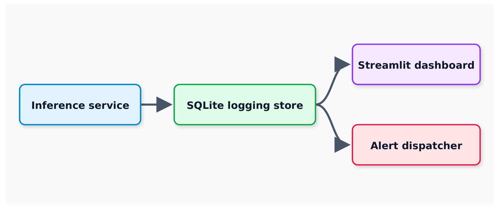
The inference service writes every prediction the moment it is made, with whatever ground truth is available (usually none yet). A separate, asynchronous process backfills ground truth labels when they arrive. That might be milliseconds later for some systems, or days later for others. Both the dashboard and the alert dispatcher read from the same store, but on different schedules. The dashboard reads on every page load. Meanwhile, the alert dispatcher reads on every new batch.
Why Compute Drift Outside the Request Path
This separation matters more than it looks. The naive version of this architecture computes drift scores live, inside the request path, on every prediction. That ties your monitoring system’s performance directly to your inference latency, which is exactly backward. Monitoring should never be able to slow down the thing it’s monitoring.
Why SQLite for the Logging Store
I used SQLite instead of Postgres or a managed time-series database. That choice deserves a real justification, not just “it’s simple.”
First, it requires zero setup. Every reader can run this end to end without provisioning anything. Second, the schema and query patterns transfer directly to Postgres with one connection-string change, so you are not locked in. Third, as the benchmark later in this article shows, SQLite’s actual throughput ceiling is much higher than most people assume. You will hit one specific, identifiable bottleneck, and the benchmark shows you exactly where it is.
Step 1: Logging Predictions and Ground Truth to a Database
The schema has three tables: predictions, monitor_reports, and alerts.
SCHEMA = """
CREATE TABLE IF NOT EXISTS predictions (
    id INTEGER PRIMARY KEY AUTOINCREMENT,
    batch_id INTEGER NOT NULL,
    row_in_batch INTEGER NOT NULL,
    features TEXT NOT NULL,         -- JSON-encoded feature vector
    predicted_class INTEGER NOT NULL,
    confidence REAL NOT NULL,
    scores TEXT NOT NULL,           -- JSON-encoded full probability vector
    true_class INTEGER,             -- NULL until ground truth arrives
    logged_at REAL NOT NULL,
    labeled_at REAL                 -- NULL until ground truth arrives
);

CREATE INDEX IF NOT EXISTS idx_predictions_batch ON predictions(batch_id);

CREATE TABLE IF NOT EXISTS monitor_reports (
    id INTEGER PRIMARY KEY AUTOINCREMENT,
    batch_id INTEGER NOT NULL,
    report_type TEXT NOT NULL,      -- 'feature' | 'prediction' | 'performance'
    payload TEXT NOT NULL,
    created_at REAL NOT NULL
);

CREATE TABLE IF NOT EXISTS alerts (
    id INTEGER PRIMARY KEY AUTOINCREMENT,
    batch_id INTEGER NOT NULL,
    severity TEXT NOT NULL,
    channel TEXT NOT NULL,
    message TEXT NOT NULL,
    sent_at REAL NOT NULL,
    delivered INTEGER NOT NULL DEFAULT 0
);
"""Handling Nullable Ground Truth
true_class and labeled_at are nullable on purpose. A row gets written the instant a prediction happens, with no ground truth attached. It gets updated later when a label arrives. This is the part most monitoring tutorials skip, and it is the part that breaks in real deployments.
Your logging schema has to support a row existing in a half-known state, sometimes for days.
Writing Predictions in Batches
Here is how you log a batch:
def log_predictions(db_path: str, rows: Sequence[LoggedPrediction]) -> None:
    now = time.time()
    with get_connection(db_path) as conn:
        conn.executemany(
            """
            INSERT INTO predictions
                (batch_id, row_in_batch, features, predicted_class,
                 confidence, scores, true_class, logged_at, labeled_at)
            VALUES (?, ?, ?, ?, ?, ?, ?, ?, ?)
            """,
            [(r.batch_id, r.row_in_batch, json.dumps(r.features.tolist()),
              int(r.predicted_class), float(r.confidence),
              json.dumps(r.scores.tolist()),
              int(r.true_class) if r.true_class is not None else None,
              now, now if r.true_class is not None else None)
             for r in rows],
)executemany instead of a loop of single inserts. This single choice is the difference between roughly 20,000 rows per second and roughly 400 rows per second. The scaling benchmark later in this article has the numbers.
Backfilling Ground Truth Labels
When delayed ground truth labels arrive, you call this:
def backfill_ground_truth(db_path: str, batch_id: int, y_true: np.ndarray) -> None:
    now = time.time()
    with get_connection(db_path) as conn:
        rows = conn.execute(
            "SELECT id, row_in_batch FROM predictions WHERE batch_id = ? ORDER BY row_in_batch",
            (batch_id,),
        ).fetchall()
        if len(rows) != len(y_true):
            raise ValueError(
                f"Ground truth length {len(y_true)} does not match "
                f"{len(rows)} logged predictions for batch {batch_id}"
            )
        conn.executemany(
            "UPDATE predictions SET true_class = ?, labeled_at = ? WHERE id = ?",
            [(int(label), now, row["id"]) for row, label in zip(rows, y_true)],
)The length check is not defensive paranoia. A batch getting relabeled twice, or a partial label set getting backfilled, causes the performance monitor to silently compute accuracy against misaligned rows. I hit exactly that bug while building the benchmark for this article. The fix was one if statement. Finding it took far longer, because the failure was not a crash. It was a performance number that looked plausible and was wrong.
The numpy JSON Bug You Will Hit
One numpy detail worth naming because it cost me a debugging session: dataclass reports from the monitors carry np.bool_ and np.float64 values. The standard library’s json.dumps rejects both with a TypeError that does not mention numpy anywhere in the message. The fix is a small custom encoder:
class _NumpyEncoder(json.JSONEncoder):
    def default(self, obj):
        if isinstance(obj, np.bool_):
            return bool(obj)
        if isinstance(obj, np.integer):
            return int(obj)
        if isinstance(obj, np.floating):
            return float(obj)
        if isinstance(obj, np.ndarray):
            return obj.tolist()
return super().default(obj)Every monitor report gets serialized through this encoder before it touches SQLite. Skip this and your pipeline works fine in development, then throws an opaque TypeError the first time a real comparison returns a numpy scalar in production.
Step 2: Building an ML Monitoring Dashboard with Streamlit (Full Code)
The dashboard is three files: an entry point and two pages. Streamlit’s multi-page app structure works by placing pages in a dashboard/pages/ folder next to your main app file. Anything in that folder becomes a sidebar link automatically [1].
The entry point shows the current state of the system: latest batch metrics, a rolling accuracy chart, and the alert feed.
import streamlit as st
from data.logging_store import init_db, list_batch_ids, load_alerts, load_monitor_reports

st.set_page_config(page_title="ML Monitoring Dashboard", page_icon="📊", layout="wide")

DB_PATH = st.sidebar.text_input("Database path", value="data/monitoring.db")
init_db(DB_PATH)

batch_ids = list_batch_ids(DB_PATH)
if not batch_ids:
    st.warning("No logged predictions found yet. Run the pipeline first.")
    st.stop()

performance_reports = load_monitor_reports(DB_PATH, "performance")
feature_reports = load_monitor_reports(DB_PATH, "feature")
alerts = load_alerts(DB_PATH)

latest_batch = max(batch_ids)
latest_perf = next((r for r in performance_reports if r["batch_id"] == latest_batch), None)

col1, col2, col3, col4 = st.columns(4)
with col1:
    if latest_perf:
        acc = latest_perf["payload"]["accuracy"]
        delta = latest_perf["payload"]["acc_delta"]
        st.metric("Accuracy", f"{acc:.3f}", delta=f"{delta:+.3f}")
with col4:
    drift_count = sum(1 for r in feature_reports if r["payload"]["any_drift"])
st.metric("Batches with feature drift", f"{drift_count}/{len(feature_reports)}")The init_db(DB_PATH) call on every page load looks redundant. In practice, it saves you from a crash when a teammate runs the dashboard against a .db file that does not exist yet. CREATE TABLE IF NOT EXISTS is idempotent. Calling it costs nothing. The st.stop() after the empty-state warning matters too: without it, every chart below tries to render against an empty list and throws.
Displaying Drift Scores in Your ML Monitoring Dashboard
This page reshapes the per-feature PSI and KS reports into long-format DataFrames for Altair [2]. That is the only practical way to plot multiple features as separate lines without writing one add_line call per feature.
psi_rows = []
for r in feature_reports:
    for feature, value in r["payload"]["psi_values"].items():
        psi_rows.append({"batch_id": r["batch_id"], "feature": feature, "psi": value})
psi_df = pd.DataFrame(psi_rows)

base = alt.Chart(psi_df).mark_line(point=True).encode(
    x=alt.X("batch_id:O", title="Batch"),
    y=alt.Y("psi:Q", title="PSI"),
    color=alt.Color("feature:N", title="Feature"),
    tooltip=["batch_id", "feature", "psi"],
)
threshold_warn = alt.Chart(pd.DataFrame({"y": [0.10]})).mark_rule(
    color="orange", strokeDash=[4, 4]
).encode(y="y:Q")
threshold_crit = alt.Chart(pd.DataFrame({"y": [0.20]})).mark_rule(
    color="red", strokeDash=[4, 4]
).encode(y="y:Q")
st.altair_chart((base + threshold_warn + threshold_crit).properties(height=350), use_container_width=True)The two dashed threshold lines are the same 0.10 and 0.20 boundaries from Article 09’s threshold guide. They are drawn directly on the chart so a viewer does not have to remember a number from a different article to interpret what they are looking at.
I ran all four scenarios from Article 09 through this pipeline to confirm the dashboard surfaces the same qualitative patterns the static benchmark reported. The numbers are close but not identical, which is itself the useful finding.
On the stable stream, every feature’s PSI stayed in the 0.05 to 0.15 range across all 15 batches, never crossing the 0.20 critical line. So this run’s feature drift rate reads as 0% at the critical threshold. Drop to the 0.10 investigate threshold instead and 5 of the 15 batches show at least one feature crossing it, a 33.3% rate. Article 09 reported 73.3% on its own stable-stream run at that same line.
Both numbers describe the same thing: PSI firing on binning noise with zero real drift present. However, the exact rate varies with the random draw and batch size, so it is not a fixed constant you can quote from one article and assume holds everywhere.
On the abrupt drift scenario, the label shift detector fired at batch 5, the true change point. The class composition step was large enough that the chi-squared test caught it immediately.
On the gradual drift scenario, it did not fire until batch 9, a four-batch delay from the same change point. That delay is not a bug. It is the test waiting for the gradually shifting class mixture to accumulate enough deviation to clear its significance threshold. This structural pattern matches what Article 09 found with ADWIN on the gradual scenario, even though the two detectors share no mechanism. In both cases, any method that accumulates statistical evidence will detect a sudden change faster than a slow one.
Adding Calibration Plots to an ML Monitoring Dashboard
Unlike the Drift Scores page, the Calibration page only works for batches that have ground truth. For this reason, it needs a batch selector.
selected_batch = st.selectbox("Batch", options=batch_ids, index=len(batch_ids) - 1)
batch_data = load_batch(DB_PATH, selected_batch)

if batch_data["y_true"] is None:
    st.info(f"Batch {selected_batch} has no ground truth labels yet.")
st.stop()The confusion matrix is a heatmap built from sklearn.metrics.confusion_matrix [5], reshaped into Altair’s long format with a text overlay so the counts are readable directly on the cells:
cm = confusion_matrix(y_true, y_pred, labels=list(range(n_classes)))
cm_df = pd.DataFrame(cm, index=[f"true_{i}" for i in range(n_classes)],
                      columns=[f"pred_{i}" for i in range(n_classes)])
cm_long = cm_df.reset_index().melt(id_vars="index", var_name="predicted", value_name="count")
cm_long = cm_long.rename(columns={"index": "actual"})

chart = alt.Chart(cm_long).mark_rect().encode(
    x=alt.X("predicted:N", title="Predicted class"),
    y=alt.Y("actual:N", title="Actual class"),
    color=alt.Color("count:Q", scale=alt.Scale(scheme="blues"), title="Count"),
)
text = alt.Chart(cm_long).mark_text(baseline="middle").encode(
    x="predicted:N", y="actual:N", text="count:Q",
    color=alt.condition(alt.datum.count > cm.max() / 2, alt.value("white"), alt.value("black")),
)The reliability diagram is the visual form of the ECE number [4]. The process works in three steps. You bin predictions by confidence, compute observed accuracy inside each bin, then plot bars against the diagonal:
n_bins = 10
bin_edges = np.linspace(0.0, 1.0, n_bins + 1)
bin_centers, bin_acc, bin_counts = [], [], []
for i in range(n_bins):
    lo, hi = bin_edges[i], bin_edges[i + 1]
    mask = (confidences > lo) & (confidences <= hi) if i > 0 else (confidences >= lo) & (confidences <= hi)
    if mask.sum() == 0:
        continue
    bin_centers.append((lo + hi) / 2)
    bin_acc.append(correctness[mask].mean())
bin_counts.append(int(mask.sum()))A bar that sits below the diagonal means the model is overconfident in that range: it says it is 90% sure and it is right less often than that.
I ran this against the abrupt drift scenario at batch 15, ten batches after the shift. The 0.9 to 1.0 confidence bin holds 131 of the 200 predictions and sits almost exactly on the diagonal: 98.0% mean confidence against 98.5% observed accuracy. The overall ECE at batch 15 is 0.019, well inside the “well calibrated” range from Article 09’s threshold guide.
That is worth sitting with. Accuracy itself has dropped 10 points from the reference. A model can be wrong more often after a shift and still be honest about how wrong it is. That happens when its confidence scores track the new, lower accuracy rather than staying anchored to the old one.
The smaller, lower-confidence bins tell a less tidy story. For example, the 0.6 to 0.7 bin shows 65.0% mean confidence against 73.3% accuracy, which is underconfident. In contrast, the 0.7 to 0.8 bin flips to roughly seven points overconfident. ECE blends these into one number, and that number alone does not tell you the direction is inconsistent across bins. The reliability diagram does.
Step 3: Adding Slack and Email Alerts
The naive version of alerting fires on every drift signal. That is how teams end up muting their monitoring channel within a week. PSI alone fires on roughly a third of batches in a perfectly healthy stream just from binning noise. An alert system that treats PSI alone as actionable will train your team to ignore it.
Confirming Drift Before Firing
The fix is the same production recommendation from Article 09, applied as code instead of as advice: only fire a hard alert when PSI and KS agree.
def dispatch_alerts_for_batch(config, batch_id, feature_report, performance_report=None):
    results = []

    if feature_report.drifted_features_psi and feature_report.drifted_features_ks:
        severity = "critical"
        message = (
            f"Batch {batch_id}: confirmed drift on "
            f"{', '.join(feature_report.drifted_features_ks)} (PSI + KS agree)"
        )
        delivered = send_slack_alert(config, message, severity)
        results.append(("slack", message, delivered))
        delivered = send_email_alert(config, f"Drift confirmed — batch {batch_id}", message, severity)
        results.append(("email", message, delivered))
    elif feature_report.drifted_features_psi:
        # PSI alone: log it, don't page anyone
        severity = "warning"
        message = f"Batch {batch_id}: PSI flagged but KS did not confirm."
        delivered = send_slack_alert(config, message, severity)
        results.append(("slack", message, delivered))

    if performance_report is not None and performance_report.any_decay:
        severity = "critical"
        message = f"Batch {batch_id}: performance decay. accuracy delta={performance_report.acc_delta:+.4f}"
        delivered = send_slack_alert(config, message, severity)
        results.append(("slack", message, delivered))

return resultsSeverity Gating and Rate Limiting
Severity gating happens before delivery, not inside each channel function. As a result, the rule “warnings stay in Slack, only critical pages email” lives in one place:
_SEVERITY_ORDER = {"none": 0, "warning": 1, "critical": 2}

def _meets_threshold(severity: str, min_severity: str) -> bool:
    return _SEVERITY_ORDER.get(severity, 0) >= _SEVERITY_ORDER.get(min_severity, 2)

def send_slack_alert(config, message, severity):
    if not _meets_threshold(severity, config.min_severity_slack):
        return False
    if _rate_limited(f"slack:{message[:50]}", config.rate_limit_seconds):
        return False
# ... actual webhook POSTThe rate limiter keys on a truncated message string with a default 300-second window. This stops the same condition from re-firing every batch while it persists. I tested this directly. Firing the identical alert message twice within the window, the first call sends and the second returns False without attempting delivery. Without this, a sustained drift event across ten batches would send ten identical pages. The tenth one arrives exactly when nobody is reading Slack anymore, because they muted it after the third.
dry_run=True is the default on AlertConfig. Every alert function prints what it would have sent instead of hitting a real webhook or SMTP server unless you explicitly wire in credentials. That default exists so this code is safe to run while you are still testing thresholds. That is most of the time you will spend with it.
Scaling an ML Monitoring Dashboard for High-Volume Inference
Throughput Benchmark Results
I benchmarked the logging layer at four scale tiers on this machine: CPU only, one connection opened per batch of 200 rows, seed 42. Wall-clock timing on a shared machine is noisy. As a result, I ran five trials at each tier and I am reporting the median. The full spread is shown alongside so the variance is visible rather than hidden:
| Rows logged | Write throughput (median of 5 runs) | Range across runs | Avg query latency | DB file size |
|---|---|---|---|---|
| 2,000 | 19,394 rows/s | 18,846–20,058 | ~2.0ms | 0.46 MB |
| 10,000 | 18,906 rows/s | 18,661–19,572 | ~2.1ms | 2.17 MB |
| 50,000 | 17,579 rows/s | 15,874–17,755 | ~1.9ms | 10.89 MB |
| 100,000 | 17,816 rows/s | 16,840–18,440 | ~1.9ms | 21.93 MB |
The write throughput numbers move around 10 to 15 percent from run to run because this is wall-clock timing on shared hardware, not a deterministic computation. Do not read “17,579” as a number your machine will reproduce exactly. What is stable is the shape: throughput stays in the same rough band across a 50x increase in row count. SQLite’s writes do not meaningfully slow down at these table sizes, so the per-batch connection overhead amortizes well across 200 rows.
Query latency is the more trustworthy number. It stayed in a tight 1.9 to 2.1ms band across every tier, regardless of total table size. The reason is that every query in this dashboard filters on batch_id, which is indexed.
For a system logging a few hundred thousand predictions a day in batches, this exact code, unmodified, keeps up.
The Hidden Cost of Per-Row Connections
The problem shows up the moment the batch size drops to 1. I measured that case directly because it is the more natural pattern for an API handler logging a single prediction per request, rather than accumulating a batch first.
Opening a fresh connection for every individual row (instead of batching 200 rows into one connection) collapses throughput to roughly 400 rows per second, a drop of close to two orders of magnitude. Switching the database to WAL journal mode [3], the standard advice for SQLite write concurrency, does not fix this. The median throughput stays around 380 rows per second, because the bottleneck is connection setup overhead per row, not journaling contention. WAL mode solves a different problem than the one this pattern has.
The fix is batching the calling pattern, not changing a database setting. Use a connection pool or an in-memory write queue that accumulates several predictions before opening a connection and committing. That is the same shape log_predictions() already uses for a batch of 200. Buffer requests in memory and flush every N predictions or every X milliseconds, whichever comes first. That architectural change (going from one connection per row to one connection per batch) is the difference between the 400 rows/second tier and the 18,000 rows/second tier, on the same hardware, same database, same schema.
When to Move Beyond SQLite
Beyond a few million rows a day, or once you need multiple writers from separate processes, SQLite becomes the bottleneck because of write-lock contention between processes. At that point, Postgres with the same schema solves the multi-writer problem without changing anything about the monitor logic upstream. Alternatively, a managed time-series store makes sense if your dashboard’s primary need is time-windowed aggregation queries.
Grafana vs Streamlit vs Evidently for ML Monitoring
These three tools solve different problems. The comparison only makes sense once that is clear.
Streamlit is what this article built: a Python-native app where the dashboard logic and the monitoring logic share the same language, the same repo, and the exact same FeatureMonitor and PerformanceMonitor classes. The cost is that it is a request-response app, not a streaming one. Every page load recomputes from the database, so there is no persistent connection pushing updates. For a team checking a dashboard a few times a day, that is irrelevant. For sub-second alerting on a high-frequency stream, however, it is the wrong tool.
Grafana is built for exactly the streaming case Streamlit cannot handle. It expects a time-series backend. Prometheus is the common pairing. It excels at long-running, auto-refreshing operational dashboards that an on-call team leaves open on a monitor. The tradeoff is that your monitor logic, the actual PSI and KS computation, has to live somewhere else and push metrics into Prometheus’s data model. In other words, Grafana visualizes. It does not compute drift statistics for you.
Evidently [6] sits a layer below both. It is a Python library that computes drift reports and serves pre-built HTML dashboards, closer to a packaged version of what the FeatureMonitor and PredictionMonitor classes in this article do by hand. If you want the statistical tests without writing them yourself, Evidently gets you there faster. If you want the dashboard to share code paths with your custom alert logic, your retraining triggers, or anything specific to your system, the from-scratch approach gives you that control at the cost of writing more of it yourself.
The practical recommendation: start with the Streamlit version in this article if you are under a few hundred thousand predictions a day and want full control over the alert logic. Move to Grafana plus Prometheus when checking the dashboard a few times daily is not fast enough and you need something always-on. Reach for Evidently when you want the statistical layer without writing the detectors yourself, and you are fine with its dashboard format. None of these is the wrong choice. They are answers to different questions about your scale and your need for control.
FAQ
Do I need a real database, or is SQLite fine for production?
SQLite is fine for production at the scale this article benchmarked, a few hundred thousand predictions a day, as long as writes are batched rather than opened one connection at a time. Move to Postgres when you need multiple processes writing concurrently, since SQLite’s file-level locking becomes the bottleneck there, not the throughput numbers in this article.
Why does the dashboard show a different drift rate than Article 09 for the same scenario?
Two separate reasons, and both matter. First, “drift rate” depends on which PSI threshold you count as a positive: this dashboard’s default alert logic uses the 0.20 critical threshold, while Article 09’s headline figure used the more sensitive 0.10 investigate threshold. Second, even at the same threshold, the exact rate varies run to run because PSI on a stable stream is responding to binning noise, not a real signal, so the specific count is a property of that noise draw, not a fixed constant. Showing a single number without naming its threshold, and without acknowledging that the number has sampling variance, overstates how precise the statistic actually is.
Can I use this dashboard with a model that doesn’t output probabilities? T
The PerformanceMonitor and the reliability diagram both need a confidence score per prediction. If your model only outputs a hard label, you can substitute a constant confidence of 1.0, but ECE and the calibration plot become meaningless in that case. The Feature Monitor and Prediction Monitor’s class-count check work regardless, since they only need predicted labels.
How do I connect this to a real inference service instead of the synthetic generators?
Replace the calls to
data/generators.pywith your actual model’spredictandpredict_probacalls, and calllog_predictions()at the point in your API handler where a prediction is returned. Everything downstream, the monitors, the dashboard, the alerts, reads from the database and doesn’t care where the rows came from.Should drift alerts go to the same channel as performance alerts?
Not by default. Drift alerts are a leading signal that may or may not predict trouble; performance alerts are confirmed decay. Mixing them in one channel trains people to treat both with the same urgency, and the leading signal is the one that’s wrong more often. This article’s alert dispatcher keeps PSI-only signals at “warning” and reserves “critical” for confirmed drift or measured decay specifically to preserve that distinction.
Key Takeaways
A monitor nobody looks at is not a monitoring system. The dashboard is not a nice-to-have layered on top of Article 09’s detectors; it’s the part that makes them operational.
executemany versus one connection per row is the difference between 20,000 rows/second and 300 rows/second on identical hardware. This is an architecture decision, not a database tuning knob, and WAL mode does not fix it.
Drift rate is not one number. The same stable stream reads as 0% or 33.3% feature drift depending on whether you’re counting the 0.20 or the 0.10 threshold, and that count itself shifts with the random draw since PSI on a healthy stream is responding to noise. A dashboard that hides which threshold it’s using, or implies the rate is a fixed property of the system rather than a noisy statistic, is hiding the most useful part of the signal.
PSI-only alerts belong in a log, not a page. Confirmed drift, where PSI and KS agree, or measured performance decay are the only two conditions that should interrupt a person, and a rate limiter on top of that gate stops a sustained event from becoming ten identical pages.
Streamlit, Grafana, and Evidently are not competing for the same job. Pick based on whether you need shared code with custom alert logic (Streamlit), an always-on streaming view (Grafana), or pre-built statistical reports (Evidently).
What Is Next
Article 11 picks up where the alert dispatcher in this article leaves off: once a drift alert fires and a retrain candidate exists, how do you test it against live traffic before fully committing to it. Shadow deployment runs the new model alongside the old one without serving its predictions; canary release serves it to a small percentage of real traffic and watches the same monitors built across Article 09 and this article for any sign of regression before the rollout continues.
The FeatureMonitor, PredictionMonitor, and PerformanceMonitor objects don’t change between these articles. Only what’s watching them, and what’s allowed to act on what they find, does.
Complete code: https://github.com/Emmimal/ml-dashboard/
References
[1] Streamlit Inc. (2024). Streamlit documentation: Multipage apps. https://docs.streamlit.io/develop/concepts/multipage-apps
[2] VanderPlas, J., Granger, B., Heer, J., Moritz, D., Wongsuphasawat, K., Satyanarayan, A., Lees, E., Timofeev, I., Welsh, B., & Sievert, S. (2018). Altair: Interactive statistical visualizations for Python. Journal of Open Source Software, 3(32), 1057. https://doi.org/10.21105/joss.01057
[3] SQLite Consortium. (2024). Write-Ahead Logging. https://www.sqlite.org/wal.html
[4] Guo, C., Pleiss, G., Sun, Y., & Weinberger, K. Q. (2017). On calibration of modern neural networks. Proceedings of the 34th International Conference on Machine Learning (ICML). https://doi.org/10.48550/arXiv.1706.04599
[5] Pedregosa, F., Varoquaux, G., Gramfort, A., Michel, V., Thirion, B., Grisel, O., et al. (2011). Scikit-learn: Machine learning in Python. Journal of Machine Learning Research, 12, 2825-2830. http://jmlr.org/papers/v12/pedregosa11a.html
Disclosure
Code authorship: All code in this article, the SQLite logging schema and store functions, the Streamlit dashboard (entry point and both pages), the Slack/email alert dispatcher with severity gating and rate limiting, the four-scenario pipeline runner, and the 21-test unit suite, is the original work of the author. The detectors and monitors (KS, PSI, MMD, ADWIN, DDM, FeatureMonitor, PredictionMonitor, PerformanceMonitor) are ported directly from Article 09 to keep this repository self-contained. The framework builds on NumPy, SciPy, scikit-learn, pandas, Streamlit, and Altair, all open-source under BSD, MIT, or Apache 2.0 licenses.
Benchmark authenticity: All numbers in this article, the four-scenario pipeline results, the scaling benchmark across four row-count tiers, and the connection-overhead comparison, are from real runs executed by the author on CPU (Python 3.12.3, NumPy 2.4, SciPy 1.17, scikit-learn 1.8). Seed: 42 throughout. Total runtime across the test suite, all four scenario pipelines, and the scaling benchmark: approximately 17.5 seconds. No numbers were adjusted or estimated.
No affiliate relationships: No tools, libraries, or services are mentioned for compensation. All comparisons reflect independent technical evaluation.
Series affiliation: This is Article 10 of the Production ML Engineering series. Article 09: ML Model Monitoring covers the detectors this dashboard visualizes. See also deploying a model to production, building a retraining pipeline, and model versioning.


Leave a Reply